How can I display a simple line graph using my comment topics with my dates for everyday for a year? | XM Community
Solved

How can I display a simple line graph using my comment topics with my dates for everyday for a year?


Badge +1

If I want to create a simple line graph using my comment topics with dates for everyday for one year, I cannot create a topic for everyday as the maximum amount of topics I can have is 350. I have tried to use the raw data itself, but it doesn't sort automatically, I have to sort it manually if I want the dates in order. Is there a way to use everyday for a graph while also having it sort automatically?
Current Date format: M/DD/YYYY ex. 7/16/2020
image.png
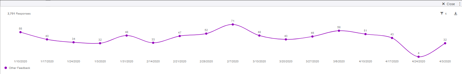
Edit (8/7/2020) - Figured out solution

icon

Best answer by MMQT_Team 12 August 2020, 18:49

View original

2 replies

Badge +6

MMQT_Team , Why don't you map the comment field as a date field and specify the custom date format? using this you can plot a graph with metrics "Count" and Date field on X-Axis

If creating topic is necessary because of garbage data, add extra zero before month (i.e. 07/16/2020).

Badge +1

Edit: Found Solution - SOLVED

Leave a Reply