I am wondering what feature and/or products people are using to report data collected through Qualtrics?
One of my colleagues is having trouble with the stability of built in Results (he will make changes and they don't appear to save/show up the next time he logs in) and Reports (the widgets just spin but never populate). So we are brainstorming what kind of workaround to use while simultaneously working with Qualtrics Support to address the problem.
So, if you don't mind sharing, I would love to hear what you are using to share your results - formatted views in Qualtics Results, Qualtrics Report, Tableau Integration, pulling the data by hand into Word/PowerPoint, SPSS, etc.

What are you using for reporting?

Userlevel 7
 +38
+38

@bstrahin, our office is very frustrated with Qualtrics reporting too. We still tend to stick with the results reports out of convenience. When our clients need anything other than an online report we have been exporting to Word and running some macros to clean it up. We typically only export the tables to Word because the graphs always look awful. If graphs are needed we build them from scratch in Word.

Userlevel 7
 +20
+20
You can try Qualtrics vocalize instead (if it's included in your Qualtrics license). Vocalize has more widget and much better presentation.
https://www.qualtrics.com/support/vocalize/getting-started-vocalize/vocalize-introduction/
You can easily provide an access to the dashboard with some restriction (if needed) or you can export the dashboard in PDF.
https://www.qualtrics.com/support/vocalize/getting-started-vocalize/vocalize-introduction/
You can easily provide an access to the dashboard with some restriction (if needed) or you can export the dashboard in PDF.
Userlevel 7
+38
@Mohammedali_Rajapakar_Ugam we did explore Vocalize. The cost was prohibitive and its limited use to Qualtrics versus other dashboarding tools that can connect to things like Google Analytics made it less appealing. So right now, I am exploring very low cost to free options as well as wanting to gather what others are using for reporting as supporting arguments for the purchase of necessary analytics tools. To be transparent we compared Vocalize to Tableau and Domo. We have a preference within my team but have to prove to central purchasing that is not duplicative of other tools currently available on our campus.

Userlevel 6
 +45
+45
@bstrahin we use a combination of tools for reporting. If it is a one time report (or even once a year) then we'll use the default report in Qualtrics, export to word, do a little formatting, and save as a PDF. If it is a report that I want individuals to be able to access on their own, we use Vocalize and set up permissions. However, it sounds like that is not an option for you. Our third approach is to export the raw data and then build a report in Tableau (we don't have Tableau integration). If the data are sensitive, the report can be emailed or saved on a secure platform to be opened with Tableau Reader. Alternatively, reports can be published to Tableau public (which is free but has a space limit) if the data are not sensitive. Here are some links to our public facing dashboards built from Qualtrics surveys:
https://public.tableau.com/profile/winston.salem.state.university.institutional.assessment.research#!/vizhome/LongitudinalSurveyDashboard/SurveyInformation
https://public.tableau.com/profile/winston.salem.state.university.institutional.assessment.research#!/vizhome/StudentLearningOutcomes/WSSUSLOReport
https://public.tableau.com/profile/winston.salem.state.university.institutional.assessment.research#!/vizhome/2015-2016Report/UniversityPercents

Userlevel 7
+33
i prefer to pull spss data and running crosstabs, datacuts and than preparing powerpoint reports using these data cuts.
Userlevel 7
 +6
+6
@bstrahin - Tableau can pretty amazing for data visualizations and isn't very costly. The real benefit is the ability to join multiple data sources and I believe Qualtrics even has some sort of automatic integration (can't verify as I don't use Tableau with my new company). The only real downside of Tableau is that isn't an ETL tool, but that didn't really slow me down in the past.
Userlevel 7
+38
@Akdashboard I think we will end up having to move to Tableau at some point but being a new user it will be a rather large hurdle to learn. I also wasn't seeing a way to have an automatic live connection to Qualtrics. There is an integration but from what I could tell reading, I had to go in and hit a button to get it to refresh. So we weren't in love with it as a solution for those two reasons. But if it's the solution that a lot of others have found useful then the investment in learning to use the product becomes more appealing.
Userlevel 7
+6
@bstrahin - I am sorry I misspoke. The Tableau integration does require pulling data in on a regular basis. I am sure there is a way to automate it, but I never bothered as updating every morning was often enough for my org.
I will say that Tableau knowledge is a good skill to have. Even if you learn just a little to make what you are doing now easier, it is still a skill you can include on your resume. More and more I see positions with "Tableau knowledge preferred".
I will say that Tableau knowledge is a good skill to have. Even if you learn just a little to make what you are doing now easier, it is still a skill you can include on your resume. More and more I see positions with "Tableau knowledge preferred".

Userlevel 7
 +13
+13
As new users to Qualtrics we are asking similar questions. Add to that my company prohibits importing customer data into Qualtrics for security reasons, so we use Qualtrics reporting for only the most basic analysis...not because of limitations.
We have the luxury of dedicated Alteryx/Tableau resources to integrate Qualtrics with other data. This works OK. Tableau produces very attractive graphics, but is challenged by the peculiarities of survey data (e.g. multi-response questions). Likely you'll need a skilled Tableau user to really make it work well with Qualtrics or anything beyond sales data. Shortly, we'll be moving to PowerBI visualization on top of Excel for ETL.
Right now I use SPSS (long time advanced user) for ETL, stat analysis and some graphing. With most projects pulled into Excel for ETL, computation & analysis and visualization in PowerPoint. Time consuming, but honors our internal data security requirements and corporate expectation for PPT deck final results.

Userlevel 3
 +11
+11
Because I have 20+ years experience in Excel, I normally export the Qualtrics reports as a CSV file. I have a number of Excel chart templates saved, so once the data is in Excel I can quickly turn them into charts that look exactly how I want them to look. Then they go into PowerPoint. I've spent time crafting the templates, which saves much more time on every project.
For some datasets, I've also found it easier to export the data, turn them into a pivot table, and do the work there.
For some datasets, I've also found it easier to export the data, turn them into a pivot table, and do the work there.
 +1
+1
I use the qualtRics R package to run regular exports and produce a variety reports as R Studio Notebooks. https://rmarkdown.rstudio.com/r_notebooks this lets me take advantage of the Tidyverse for data munging and ggplot2 for graphics. I also heavily utilize Quanteda for text analysis in addition to text2vec and Spacyr for POS tagging, Collocations and Topic modeling.
We also have Vocalize that is used by our managers in the field to keep a pulse on their location. Ultimately, I would like to set up a database for our responses and utilize Power BI since our organization has licenses and I think it's a better reporting tool than Vocalize.
We also have Vocalize that is used by our managers in the field to keep a pulse on their location. Ultimately, I would like to set up a database for our responses and utilize Power BI since our organization has licenses and I think it's a better reporting tool than Vocalize.

Userlevel 4
+3
Though, vocalize would be best option as we have managed to run complex data but also achieved comparison with different data sets. Qualtrics is the only tool provides integration of both survey creation and eye popping dashboards. We have tried other tools as well but the kind of customization and widgets available makes Vocalize different from other tools.
Userlevel 4
+21
I am thrilled with Reporting within Qualtrics Research Core. Meets our objectives. Once I created a template, we copied and reused the report by changing each query within each report. The steps of repeating each report (300 Times) required a lot of "GRIT" and being "SCRAPPY", but in the end the solution was great.
+3
@GeorgeIssa any advice you can give on the setup you use? Platform + browser you use?
Trying to create a template in Reports>Reports but it's incredibly buggy/lagging. Exactly like @bstrahin was describing.
Trying to create a template in Reports>Reports but it's incredibly buggy/lagging. Exactly like @bstrahin was describing.
Userlevel 4
+21
Hello @Hester
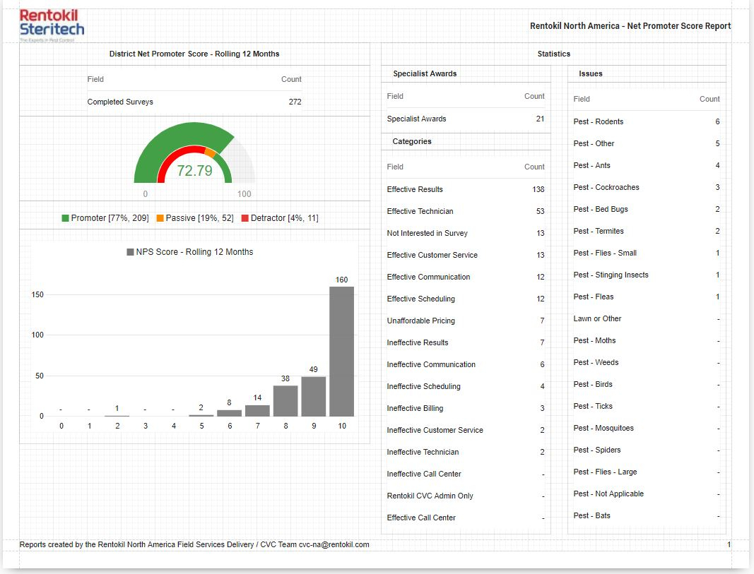
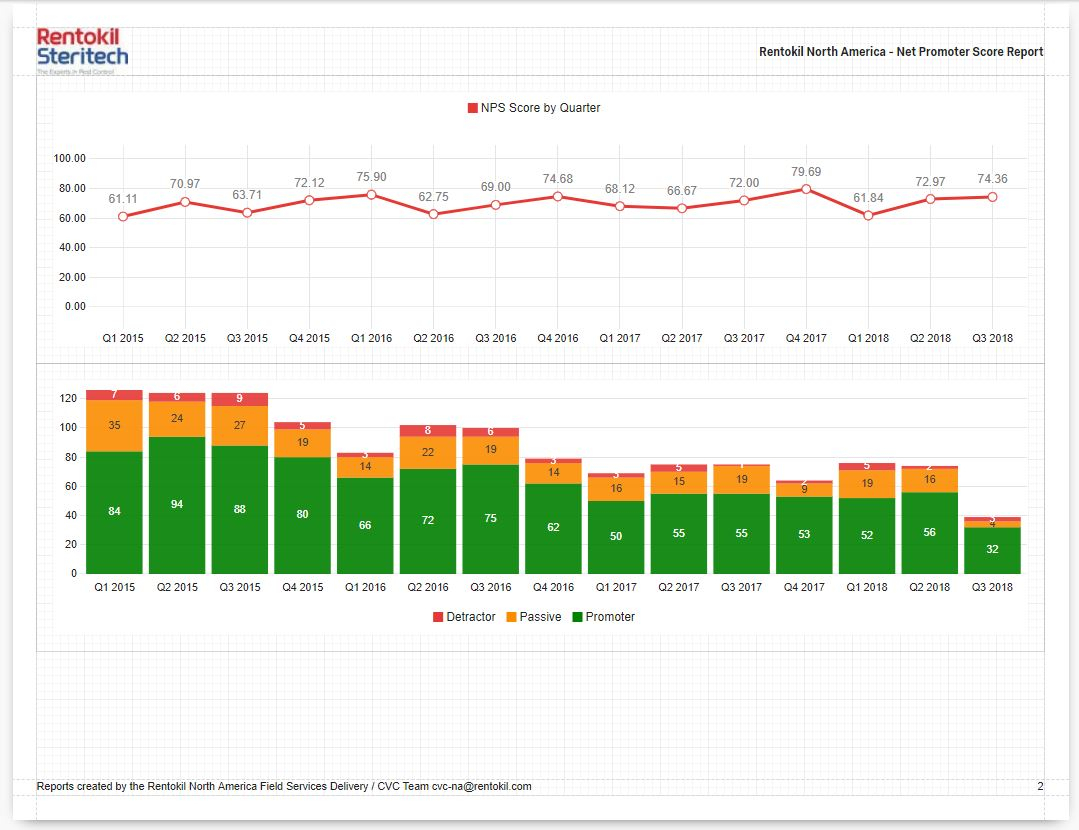
As a Dashboard Developer, I like to use the full canvas for my reports. I also like being consistent with the colors and themes. I have included 2 screenprints of the report that I have created. This report includes the following:
» 12 month NPS score
» Gauge Chart with NPS Value Ranges
» Breakdown Bar (made small enough to hide the visual and only show the Legend)
» Bar Chart
» Line Chart
» Stacked Bar Chart
» Data Table Choice Counts
» Data Table Results (includes survey results with detailed info, not shown)
We have a field in our Embedded Data to include each of our Field Offices, so this is one of the our dimension to filter on and create custom reports for each Office. (we actually have several ED fields that we use as slicing dimensions to build upon).
Once I create the template, I reuse and create a Report for each field office, changing each of the related filters. Then create a Public Link and share with each Team. Reports are updated as new surveys are completed, and entries greater than 365 are removed. The NPS by Quarter Charts display a historical perspective.
Personally I like the Qualtrics Reporting platform. More importantly my colleagues find these useful.
!
!
Userlevel 2
 +8
+8
I'm a bit late to this comment thread but figure I'd share what we use for reporting. The simple answer is that we use Microsoft Power BI for most of our reporting. A more complex description of our setup can be found below (from a previous thread on a similar subject):
"Before I begin, I'll start by saying the solution we have developed isn't ideal. The ideal solution would be Power BI directly connecting to Qualtrics via their web service and bringing in survey responses on a regular basis. As far as I am aware, this is not possible. I have found that using the Qualtrics API to bring survey responses into either Excel or Power BI comes with a few annoying difficulties. The issue with the old API (version 2.5) was that any changes or additions to your survey which created extra columns in your data would often break the query. Also, version 2.5 of the Qualtrics API often failed after too many requests in a certain amount of time. This is difficult for our organization as we need to report our survey results as close to real-time as possible. The issue with the new Qualtrics API (version 3) is that survey responses are broken up into multiple JSON files after a certain number of responses. After a few attempts, I could not figure out a way of building a query in either Excel or Power BI that can bring in multiple JSON files from an API.
This is what led me to our current solution... I discovered one of the Qualtrics APIs for contact lists, specifically the "List Contacts" API, can be used to bring an entire Contact List (formerly known as a Panel) into Excel or Power BI using power query. This required me to develop some code which works beautifully. Of course, this is of no use unless your survey results are embedded into your contact list. However, pushing your survey responses to a contact list is possible using the Qualtrics webservice within your survey flow (this is the less than ideal part). This requires you to create embedded data from the responses to each of the questions in your survey, then create a webservice that pushes all that embedded data into the contact list you'd like to report from. Next, you would download your contact list (which now has your survey responses) into either Excel or Power BI using Power Query and the code I developed. From there, you can create all the tables, charts and dashboards your heart desires.
I developed this process about a year ago. Since then I have created countless reports and dashboards for our clients with very little issues. If anyone is interested in learning more about this process or if you'd like to use the code I developed to bring contact lists into Excel or Power BI via Power Query, please feel free to contact me."

Userlevel 7
 +23
+23
Vocalize is good for visual representation and another plus is that we can enable Vocalize tab in our SF, but in terms of analysis it is quite limited, also in terms of using different kind of information from different sources. So Excel and Tableau are our friends
Leave a Reply
Enter your username or e-mail address. We'll send you an e-mail with instructions to reset your password.