Hello,
I am doing an exit survey for our company. I ask employees their reason for leaving, and there are about 10 options. They get to choose up to three reasons for leaving. How do I chart all the responses in Customer XM? I want to show each possible reason for leaving and how many answered that reason as their #1, #2, and #3 choices.
In Excel, I have to do a PowerPivot to be able to display the data in a chart like this.
Thanks in advance!
Below is how I did it in Excel: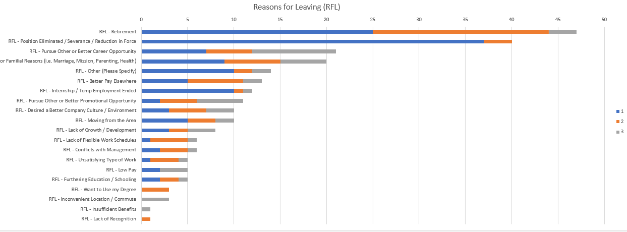 As a follow-up (Dec. 31, 2020), I know how to do this with matrix questions, using the following two help files, but the example above is different:
Field Groups (CX) (qualtrics.com)
Matrix Statements in a Single Widget (qualtrics.com)

Charting multiple answers in Customer XM dashboards
 +1
+1
Be the first to reply!
Leave a Reply
Enter your username or e-mail address. We'll send you an e-mail with instructions to reset your password.