


Based on recommendations and other posts here on the same topic, I understand now that the better approach is to use a a Tooltip where computer users can hover and mobile users can "click" the label to display the text. I slightly modified some of the example script available for use on Qualtrics. It works great in the computer version of the survey and I've been able to make visual tweaks for text to appear at top, at bottom, or relative to label. However, I can't seem to make it play nice in the mobile version. As well, it seems there may be differences in the appearance on an iPhone vs. an Android.
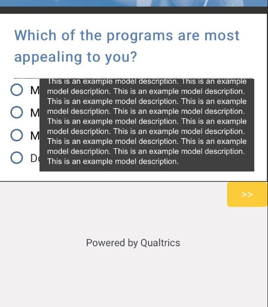
Below is the CSS text I currently have in place. Also below is a screenshot from the mobile (iPhone) version.
On the mobile device, the tooltip window will only display between the dotted line (separating question text and responses) and the line just above the next button. The tooltip window is cutoff at the top or bottom no matter where I place the Tooltip window.
Can anyone recommend what parameters are needed to optimize for mobile devices?
Z-index does not seem to bring Tooltip ahead of question frame. Ideally, the Tooltip window would be displayed just below the label of the hovered or clicked response label, it would be brought to the very front, and would be scrollable (either within tooltip or on page when extends beyond bottom of page). I tried some "wrapper" scripts but none seemed to work.
Thanks!
/* Tooltip container */
.tip{
position: relative;
display: inline-block;
cursor: help; /*change the cursor symbol to a question mark on mouse over*/
color: black;
float: left;
font-style: bold;
text-decoration: none; /*remove underline*/
}
/*Tooltip text*/
.tip span {
visibility: hidden;
width:80%;
text-align: left;
padding: .6em;
padding-left: 1em;
border: 1px solid [template("base font color")]'
border-radius: 0.5em;
font: 400 11px Arial;
color: #fff;
background-color: #404040;
display: inline-block;
/*Position the tooltip text*/
position: fixed;
left: 15%;
top: 20%;
z-index: 9999;
}
.tip:hover span {
visibility: visible;
}
!

