
Rank order anaylsis and reporting
 +3
+3


I have done it in two differnt ways in the past. 1- present stacked bar charts that show how often a category was placed in the 1st, 2nd, or 3rd category. But what I DON'T Like is that this masks the overall n count. So I usually combine it with a starter question that is like "select what matters" THEN "rank order".
!
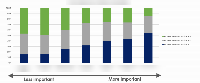
Alterantivey, create a table that shows the row or column percents to show the distribution across the board. I like to use conditional formatting in excel to vusually represent the weights for ease of understanding.
!

And for next time: try other question options to show prioritization data.
https://www.surveyanalytics.com/max-diff/
https://en.wikipedia.org/wiki/Conjoint_analysis
https://www.criticaltosuccess.com/how-to-create-a-static-four-quadrant-matrix-model-in-an-excel-chart/

I have this problem a lot. Rank order looks on paper like it is going to yield the insights you want, but in my experience it is really hard to communicatre to stakeholders.
I have done it in two differnt ways in the past. 1- present stacked bar charts that show how often a category was placed in the 1st, 2nd, or 3rd category. But what I DON'T Like is that this masks the overall n count. So I usually combine it with a starter question that is like "select what matters" THEN "rank order".
!
Alterantivey, create a table that shows the row or column percents to show the distribution across the board. I like to use conditional formatting in excel to vusually represent the weights for ease of understanding.
!
And for next time: try other question options to show prioritization data.
https://www.surveyanalytics.com/max-diff/
https://en.wikipedia.org/wiki/Conjoint_analysis
https://www.criticaltosuccess.com/how-to-create-a-static-four-quadrant-matrix-model-in-an-excel-chart/
I don’t really understand what I’m looking at or how to get to this point. Does anyone understand how she got here or how to use this data? I feel so frustrated that such a simply named question yields such useless and confusing results. I don’t want to have to interview people again.
Ok I put what I ended up doing here:
Leave a Reply
Enter your username or e-mail address. We'll send you an e-mail with instructions to reset your password.