Our current practice is to present results in either a Word or Excel document (usually with several tabs). Results come from either SPSS or Business Objects Web Intelligence (your basic reporting tool, for charts, Pivot tables, etc.).
I'm really liking what I see in Stats iQ, but I'm not seeing how to "package things up" ...
What is the best practice for Qualtrics? I am going through all the Stats iQ training modules/videos, and one of my main questions is how is this "packaged up" to present to the user? Or can we skip the Word/Excel model altogether and provide results to the user online via a dashboard or something like that?
We have user users and then we'll eventually have actual researchers who know what they are doing and want to use the tool as they see fit. I'm thinking about regular users, and the goal is to make a nice presentation, either in Excel or online.

How best to present / distribute results to users?

Userlevel 3
 +8
+8

Userlevel 7
 +56
+56
Hi, @WilliamPeckUSNA -- that's a good question and the answer really depends on who your audiences is. The Vocalize dashboard is very useful for presenting insights in-the-moment and interacting with data.
For example, to show how NPS changes for one segment versus another. Depending on how comfortable your audience is with manipulating data, you could also send it to them as a self-service tool. The "Report" function in Stats IQ is also useful, as the charts are high-impact but not interactive.
For example, to show how NPS changes for one segment versus another. Depending on how comfortable your audience is with manipulating data, you could also send it to them as a self-service tool. The "Report" function in Stats IQ is also useful, as the charts are high-impact but not interactive.
Userlevel 3
+8
AdamK12 - thanks!
- What is Vocalize Dashboard?
- I don't see "Reports" function in Stats iQ, is this different than the the basic "Reports" function?
I did find a Basecamp course for "Communicating Your Findings Effectively" so I will look at that as well.
I'm two days into a deep dive on Stats iQ, I'm sure I'll be posting more ... but thx!
Userlevel 7
+56
Hi, @WilliamPeckUSNA -- it is the "Reports" tab which is one of the basic functions -- next to "Data and Analysis". Whether you have Vocalize depends on your level of access, but the Reports function works well also. The Basecamps are good as well. You can also find some good articles about data visualization just with a Google search. Are you coming to X4 next month?
Userlevel 3
+8
AdamK12, thanks again ... I'll look into all of this.
Unfortunately no on X4 ...
Unfortunately no on X4 ...
Userlevel 7
+56
One more thing @WilliamPeckUSNA -- check your permissions under your account because you may need whoever is the admin for your account to grant you Stats IQ permissions -- otherwise you may not see them on your dashboard. I just learned this this morning when I found some users that didn't have them by default...
Userlevel 3
+8
Fantastic, and good point. Thanks for the followup. I'm sure I'll be back ... ")
Hi William!
Just a thought - what about moving what is created in Excel to a PowerPoint slide deck? My team and I use Excel to create charts and then drop them in PowerPoint for a smoother presentation. I like your idea of a dashboard though!
Just a thought - what about moving what is created in Excel to a PowerPoint slide deck? My team and I use Excel to create charts and then drop them in PowerPoint for a smoother presentation. I like your idea of a dashboard though!
Userlevel 3
+8
Hannahkeith - that's a good idea, but I'm really looking to avoid jiggling things back and forth. My vision (which I didn't articulate) is to do the survey analysis in Stats iQ and then somehow let the user look at it, dashboard or something.
I haven't gotten to the point of doing a full analysis in Stats iQ, but I did stay at a Holiday Inn Express!!! I liked what I saw and overall am just looking to be as efficient as possible and let the computer do the work ...
Thx!
I haven't gotten to the point of doing a full analysis in Stats iQ, but I did stay at a Holiday Inn Express!!! I liked what I saw and overall am just looking to be as efficient as possible and let the computer do the work ...
Thx!
Userlevel 7
+56
@WilliamPeckUSNA @hannahkeith Also don't give short shrift to the "reports" function in the data & analysis tab -- it's not as interactive as the dashboard (Vocalize) function but still very useful for sharing information.
I also share your concern with sharing data across channels. It's considerable work to re-engineer and rework data to appear in a PowerPoint chart and the Qualtrics data are best viewed within the Qualtrics applications -- otherwise font size is too small to read which will be the first thing your audience will mention when you try to walk through a chart during a presentation.
But let's keep the conversation going -- this is a good one!
@WilliamPeckUSNA @AdamK12 Adam, you make such a great point about the font/formatting issues that comes with using PowerPoint. I spend more time than I'd like to reformatting my data to make it pleasing to the eye.
I'm still a pretty new Qualtrics user so I am currently working on learning the 'Reports' function further so that I can be more efficient with my time and am not switching back and forth between programs.
I don't have the Vocalize (dashboard) feature so unfortunately I don't have any insight when it comes to that!
Userlevel 7
+56
Thanks @hannahkeith ! Vocalize is useful for walking colleagues through the results -- but it's a more limited access feature so I'm finding the report function is even better for sharing data.
It's also worth noting that you can connect your Qualtrics data to another data visualization tool like Tableau, or data environments like Google BigQuery, or even port your data to analyze in R, SPSS, SAS, SQL, etc...
It's also worth noting that you can connect your Qualtrics data to another data visualization tool like Tableau, or data environments like Google BigQuery, or even port your data to analyze in R, SPSS, SAS, SQL, etc...
Userlevel 3
+8
@hannahkeith @AdamK12 Business Objects (Web Intelligence) is my tool of choice. I'd like to do as much as possible in Qualtrics.
Userlevel 3
+8
Ok, this is what I'm looking for! just providing for reference, I will post specific questions later. It looks a dashboard to me! (And it looks like "tiles" kinda-sorta, and like the "canvas" I mentioned.)
And again, my perfect case scenario is users log on and see this, rather then sending out a spreadsheet (and certainly not a .pdf ...)
!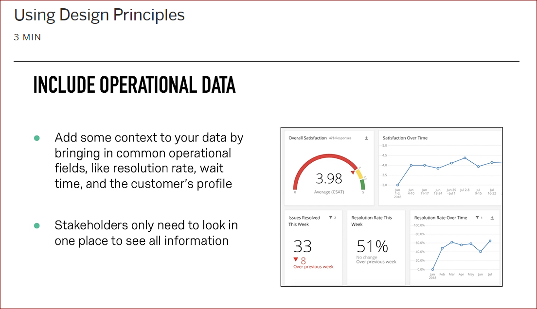
from Basecamp training, "Using Design Principles" (4th module), @ 2:40.
And again, my perfect case scenario is users log on and see this, rather then sending out a spreadsheet (and certainly not a .pdf ...)
!
from Basecamp training, "Using Design Principles" (4th module), @ 2:40.
Leave a Reply
Enter your username or e-mail address. We'll send you an e-mail with instructions to reset your password.