I have the slider the way I want it to look in the survey builder area (see below)....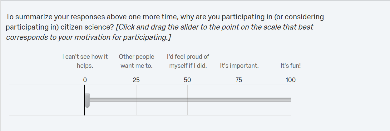 However, in the preview, the spacing is inconsistent for the slider labels. The mobile version looks slightly better (and I'm not sure if it can be improved, since the labels are so long they will necessarily be scrunched up) but the desktop version looks very sloppy. Any suggestions for how to fix this?
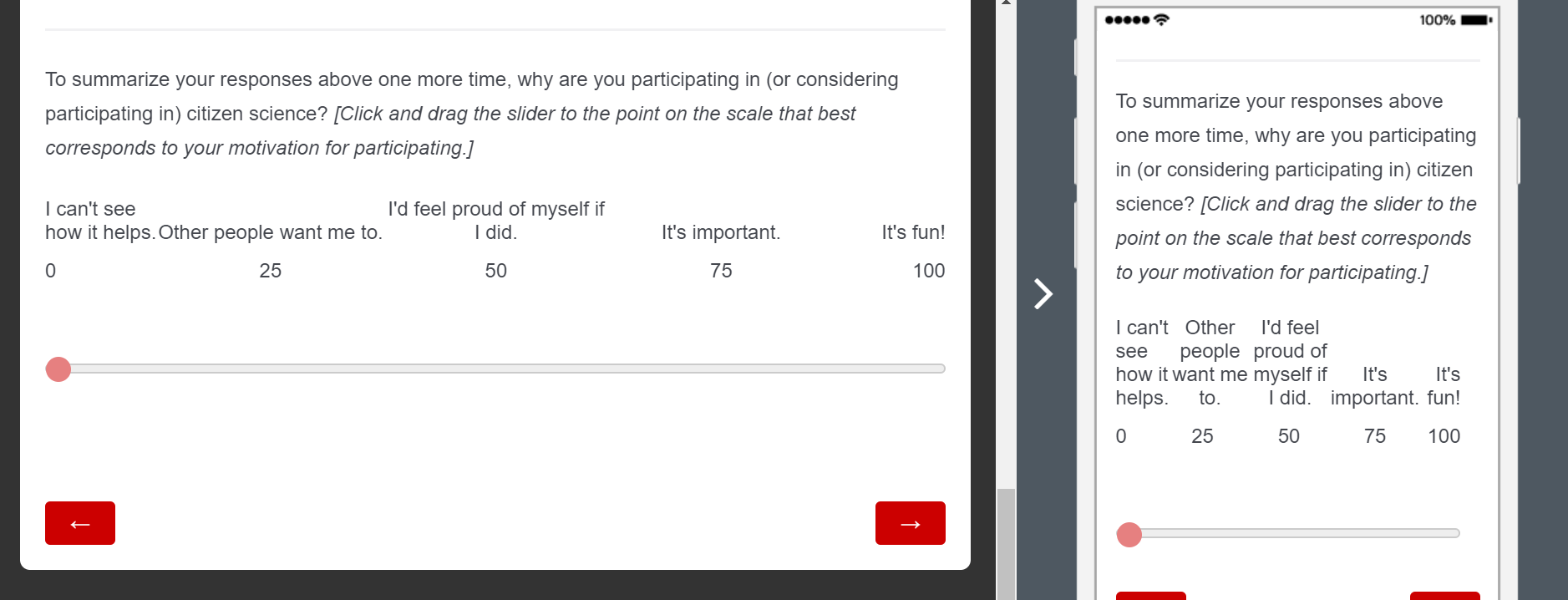 Thanks so much!
Bradley
Best answer by rondev
View original