How do i change the appearance of a simple table in the mobile version? | XM Community
Solved

How do i change the appearance of a simple table in the mobile version?


Hi there!
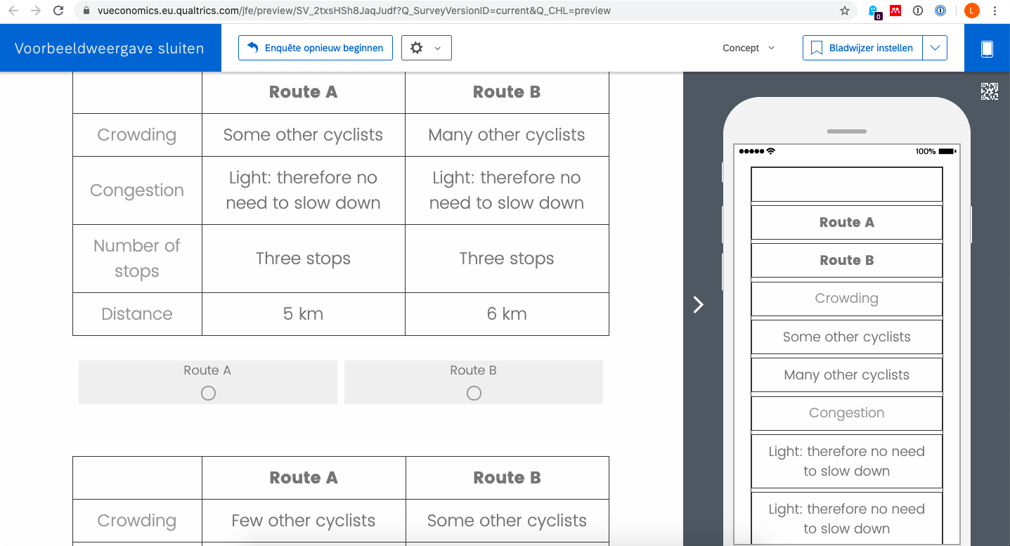
I am currently making a stated preference survey in Qualtrics. I am using regular multiple choice questions and changing the question text to a simple table form (see picture attached). The problem however with this is that once I preview my survey and check the mobile version of it all cells of the table are presented below each other (see other picture) instead of having the full size table.
I know people are having the same issues when they use a 'matrix' type question and there is a simple way of clicking the 'mobile friendly' option on the right side.. but unfortunately nothing like this exists for the multiple choice question.
Therefore my question is: is there a way to change the preview of this table in the mobile version? Or otherwise: is there a way I can switch off this particular mobile version so people simply get the normal web version on their screen when accessing it on their phone.
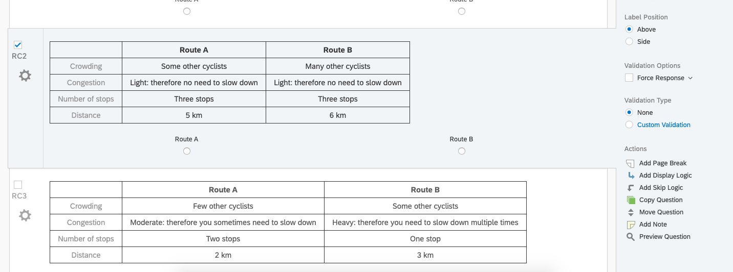
Screenshot 2020-05-08 at 18.44.34.pngScreenshot 2020-05-08 at 18.58.50.png

icon

Best answer by TomG 8 May 2020, 20:32

View original

6 replies

Userlevel 7
Badge +27

Post your table (question text) html.


 Route ARoute B
CrowdingFew other cyclistsMany other cyclists
CongestionModerate: therefore you sometimes need to slow downHeavy: therefore you need to slow down multiple times
Number of stopsOne stopTwo stops
Distance6 km3 km

Userlevel 7
Badge +27

Adding the following to your question text will prevent each cell of the table from breaking in mobile view. You'll still have a number of other issues to deal with to make it respondent friendly.

Thank you so much for your clear and fast reply! What other issues do you suggest I would also deal with to make it respondent friendly?

Userlevel 7
Badge +27

Thank you so much for your clear and fast reply! What other issues do you suggest I would also deal with to make it respondent friendly?

There are a number of things you could do...it depends on how user friendly you want to make it and your skill level with CSS and JS.
As of now, they are going to have to scroll right to see Route B. The easiest thing to do is add some HTML/CSS to force or suggest they rotate their screen to landscape.
Other things you could do is size the table columns based on % width and adjust the font size on Mobile. With JS, you could move the choice labels into table cells so the choices are in their respective columns.

https://www.qualtrics.com/community/discussion/comment/25082#Comment_25082I have the same issue. May I ask you to tell more details about where to add these codes into the html? I tried several ways but nothing change in the mobile preview.

Leave a Reply