-

Qualtrics Platform -

Customer Journey Optimizer -

XM Discover -

Qualtrics Social Connect
Data Table Visualization
About Data Tables
The Data Table visualization allows you to view basic information about a selected metric for a given data source. By default, it displays the name of each answer option and the metric for each option. For example, if you set the metric to Choice Count, the number of respondents who selected each choice will appear to the right of each choice.

Customization
For basic visualization instructions and customization, visit the Visualizations Overview support page. Continue reading for visualization-specific customization.
Column Values
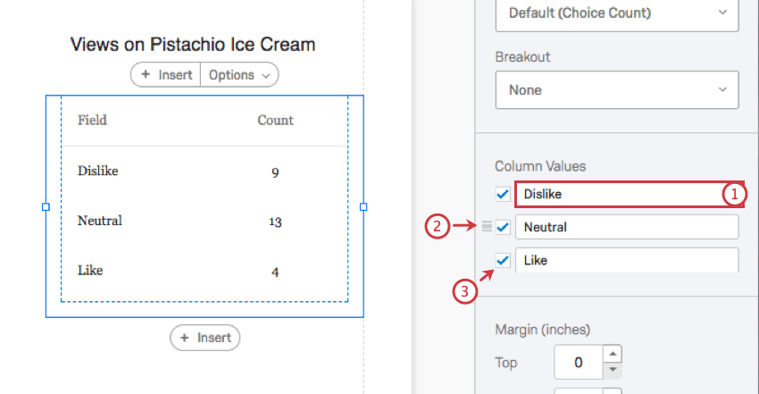
- Type in the field to rename the value. This does not affect the question as it appears in the survey, just the visualization.
- Click and drag to change the order of the options.
- Deselect to hide the option from the visualization.
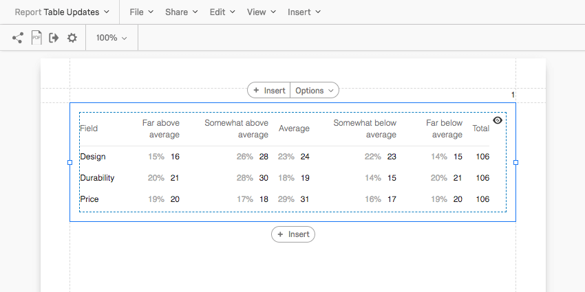
Table Totals, Show Percentages, & Total Counts
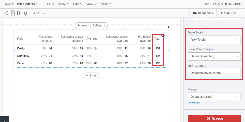
Table Totals allow you to calculate and display the total sum of each row or column in a Data Table visualization.
- Show Totals: Decide between totals being displayed for rows or columns.
- Show Percentages: Decide if you would like to display percentages next to each value in a data table.
- Total Counts: This option is useful if you are reporting on a multiple select-style question, where respondents can choose multiple answers.
- Choice Totals: Base data on the number of choices. This can add up to more than the number of respondents because respondents can choose multiple answers for one question.
- Respondent Totals: Base data on the number of respondents. This will only ever add up to the number of respondents who answered the question. If the respondent skipped a question, then this number may be less than the number of completed responses you’ve received.
Styles
Select the Styles tab to modify table header and body fonts.
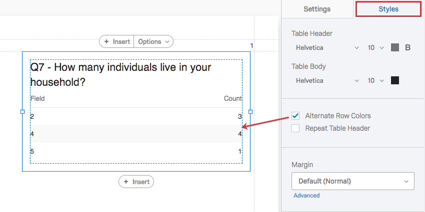
Select Alternate Row Colors to shade every other row and make them easier to read.
Selecting Repeat Table Header will make sure that the header row (not the title) will repeat as the table gets much larger and has many rows.
Use Margin to adjust the table’s margins.
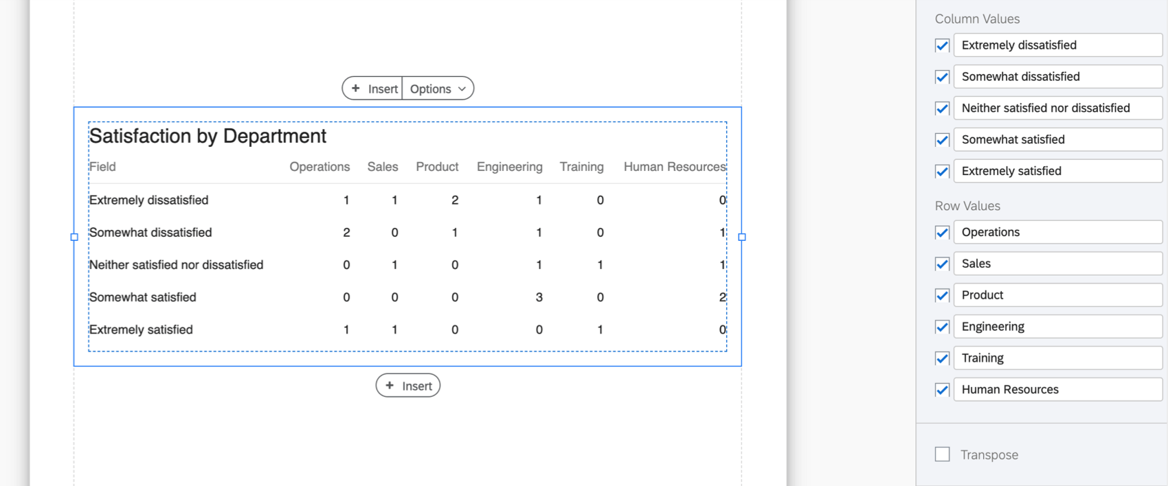
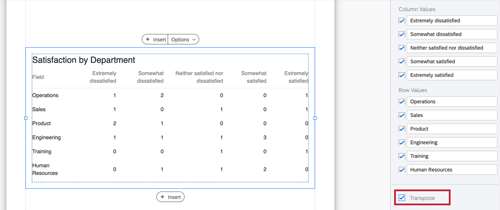
Transpose table
You can switch which data appears along the table’s column headers and which data appears along the rows. To do this, select Transpose.
Here’s a picture of a table with a breakout applied:
Here’s a picture of the same table transposed:
Incompatible Fields
Data Table visualizations are compatible with almost every kind of variable in Qualtrics because they can display both discrete data (for example, a finite, five point scale) and continuous data (for example, a question where respondents type in their age). This includes most question types, survey metadata, embedded data, and custom variables, such as Formulas or Bucketed variables.
Below are the few variables Data Table visualizations are not compatible with:
- Text Entry question (without numeric content validation)
- Form field question (without numeric content validation)
- Signature question
- Filter Only Embedded Data
- Text Embedded Data
- Text manual variables
In general, Data Table visualizations are incompatible with open text content that does not come in numeric format.
Types of Reports
This visualization can be used in a few different types of report: