-

Qualtrics Platform -

Customer Journey Optimizer -

XM Discover -

Qualtrics Social Connect
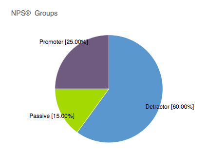
Pie Chart Visualization
About Pie Charts
Pie Charts are visualizations that you can customize in the Reports section. The whole “pie” is the total number choices selected, and the “slices” are proportionate to the number of times each choice was selected.
Customization
For basic visualization instructions and customization, visit the Visualizations Overview support page. Continue reading for visualization-specific customization.
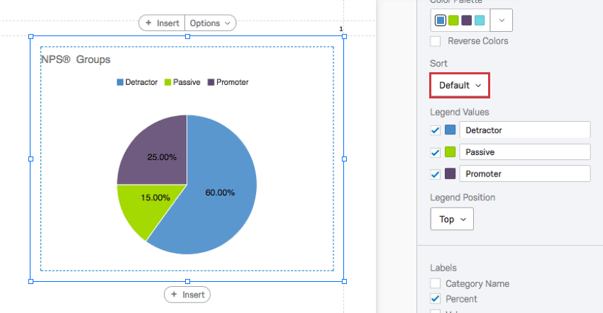
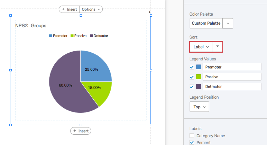
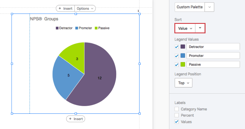
Sort
By default, your choices appear in the chart in the order they appear in the question. However, you can change this with the sort function.
- Default: Sort choices by the order they appear in the survey.
- Label: Sort choices by the original, unedited order of the labels.
- Value: Sort choices by the associated values. Sort by the most to least chosen option, or the reverse.
- Custom: Since you can drag and reorder the legend values, you can reorder values as you please and then reverse this order.
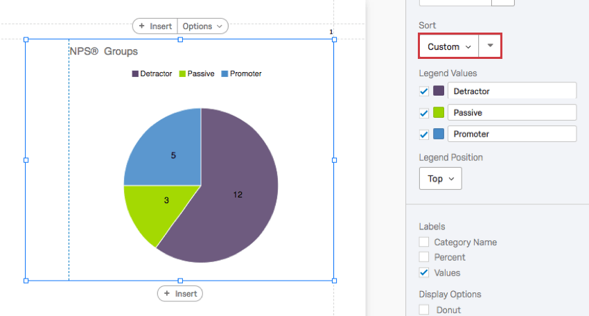
Reordering the values and then clicking the arrow will automatically change your sort settings to Custom.
Labels
The labels can be located on the Pie Chart instead of inside the legend, or both at the same time. You can add information to the labels that you can’t to the legend.
- Category Name: When selected, this displays the names of the categories on the Pie Chart.
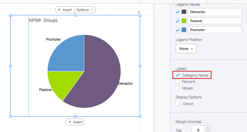 Qtip: If you select this option, you will likely want to change the Legend Position to No, as displayed in the screenshot. Otherwise the categories will be explained twice.
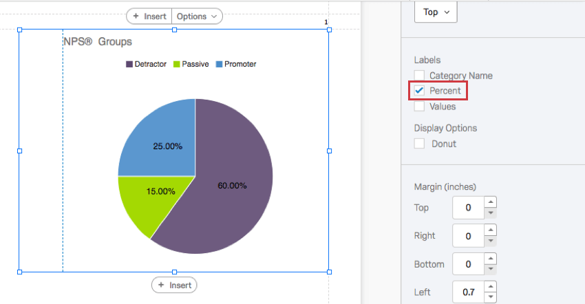
 - Percent: The percentage of times that choice was selected. For single-answer questions, this will be the percentage of respondents who made each selection. For multi-answer questions, the number of times each choice was selected will add up to more than the number of respondents because each respondent will select more than one answer.
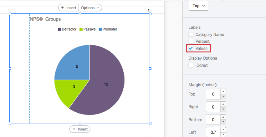
- Values: The number of times each choice was selected. For multi-answer questions, the number of times each choice was selected will add up to more than the number of respondents because each respondent will select more than one answer.
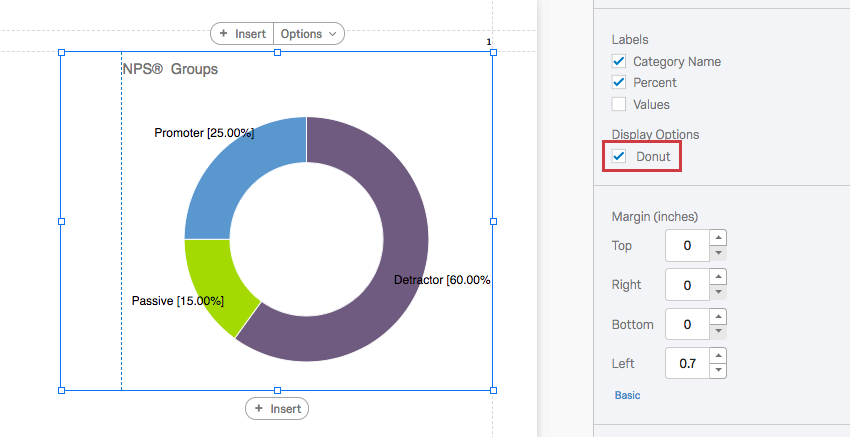
Donut
When you select this option, the center of the circle will be hollowed out like a donut.
Incompatible Fields
Pie Charts are compatible with most scaled and discrete data, such as any question with a multiple choice option. They work best with variables that have a finite number of choices, such as questions that can have single-answer multiple choice formats.
The following are fields Pie Charts are not compatible with:
- Text Entry question
- Form field question
- Open text fields on other questions, such as Text Entry Matrix Tables, text entry columns on Side by Sides, and “Other” text boxes
- Heat Maps with no regions defined
- Signature question
- Slider
- Constant Sum
- Filter Only Embedded Data
- Text Embedded Data
- Number Set Embedded Data
- Text manual variables
- Numeric manual variables
- Formulas
- Survey metadata Duration
- Survey metadata Progress
In general, open text and continuous numeric data do not work well with Pie Charts. Pie Charts are better at showing percentages of a whole, and so are not as useful for statistical data like averages.
Types of Reports
This visualization can be used in a few different types of report: