-

Qualtrics Platform -

Customer Journey Optimizer -

XM Discover -

Qualtrics Social Connect
Question List Widget (EX)
About Question List Widgets
Question List widgets highlight your key drivers, along with highest and lowest scoring items. You can use the question list to show your users what drivers to focus on for impact, to show where they have declined since last year, or to warn that they are performing below the rest of the organization.
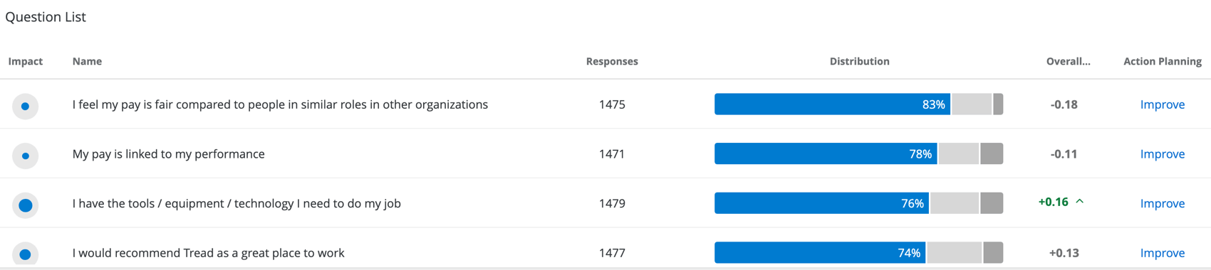
The Distribution column of this widget is calculated based off of the Scale settings. Each color of the scale indicates a different level of favorability, with the percentage on the far-left in blue indicating the percentage of participants who gave the item a high favorability rating.
Selecting Items to Display
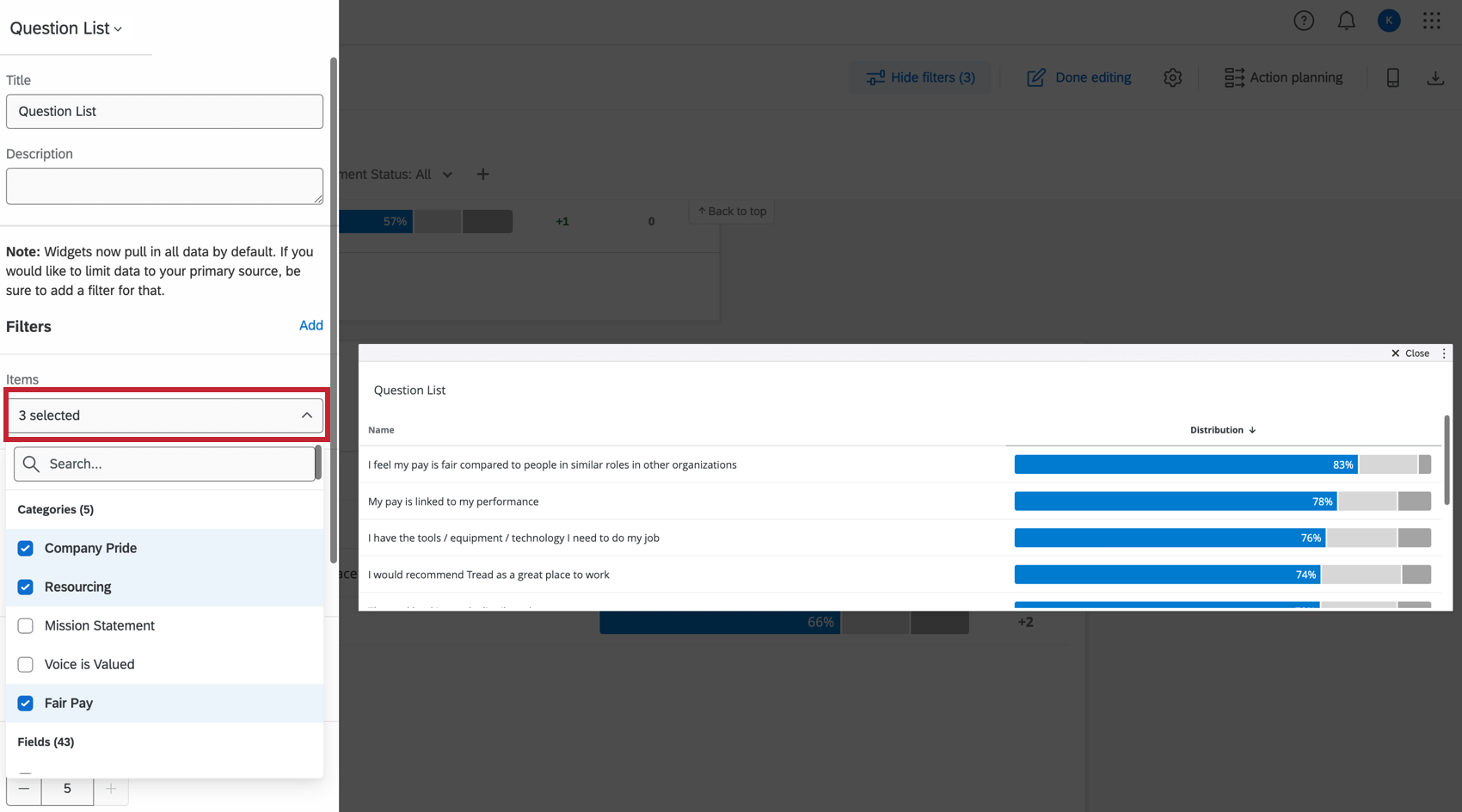
In the Items section, select the fields you’d like to display in the table. You may choose multiple.
All items must be the Number Set field type.
Sorting
These options determine how your selected items are sorted in the widget. Sorting is incredibly important in a Question List widget, as it can determine how you frame the data in the widget.
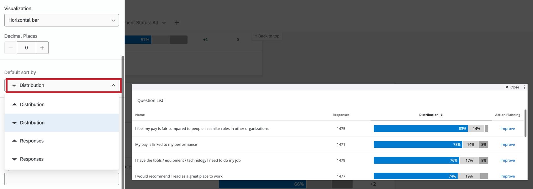
- Default Sort By Column: Select the value that the order of items in the table should be based off. Regardless of the columns displayed, you can sort by distribution, mean, or the number of responses given.
Example: We often recommend sorting by Impact, since this sorts your rows by r value. Sorting by Distribution sorts by engagement score/favorability, which is determined by Scale settings.
High/Low Options
The Question List widget also helps you visualize highest and lowest scoring items. The more items you load into your widget, the better the widget can assess the items your team excels in, and the items they need to work on.
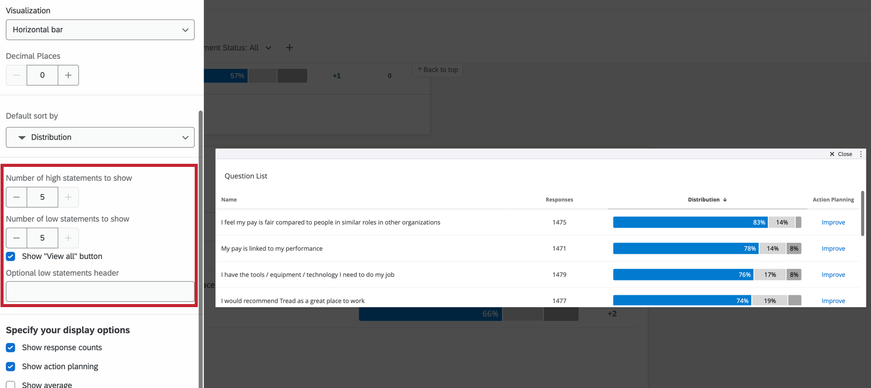
- # of High Statements to Show: Determine the number of high statements to display.
- # of Low Statements to Show: Determine the number of low statements to display.
- Show “View All” Button: When deselected, this option removes the View All button in between the high and low statements. It will not Remove the View Items with too few responses button.
- Optional low statements header: Add a header for your low statements. If you have few items loaded and are not using the high/low function, you don’t need a header. If you have many items loaded and are splitting the items by high or low, you should add a header for clarity.
Impact
Impact is the r-value, which measures the correlation coefficient between each item in the table and a chosen outcome metric. Impact calculates the score for the category first, and then a correlation calculation is performed against that score using the standard Pearson Correlation.
- Select Show Impact column.
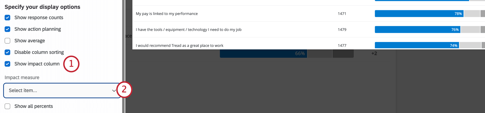
- Select an Impact Measure. This is a measure you think will be impacted by how people scored on the items in the table.
Qtip: Impact follows a standard statistical approach called pairwise deletion, where missing data points are excluded from the calculation. If a respondent skips the question used as the Impact Measure, or any of the items in the table, their response won’t be included in the correlation calculation for the question(s) they skipped.
- In the impact column, the circles will get larger as the r value approaches 1.
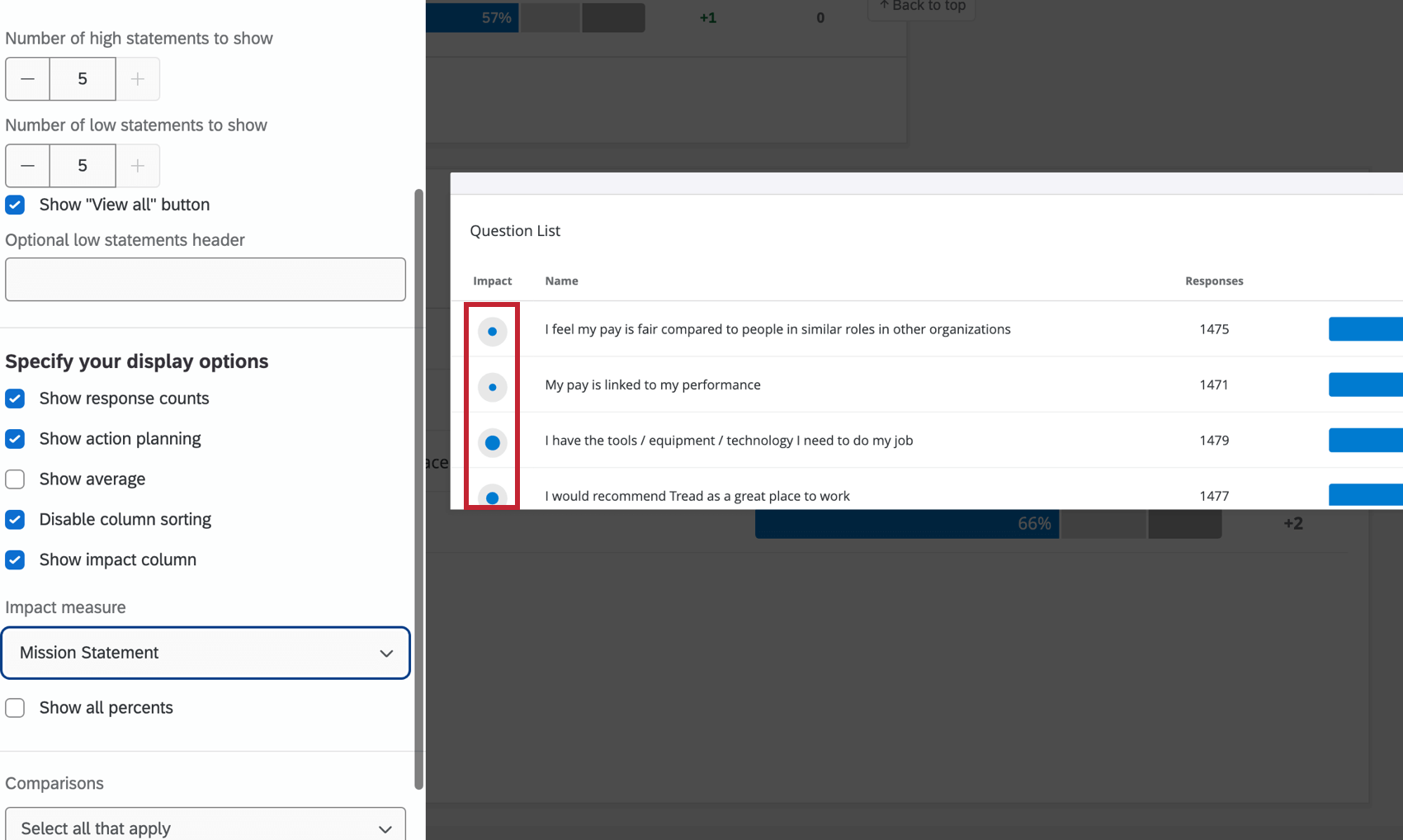
- Highlight a circle to see the exact r value.
Sorting is done based on the absolute value of the correlation. For example, a strong negative correlation is still a strong correlation and thus a strong driver of your engagement outcome.
Qtip: You cannot sort by impact until you set an Impact column.
Additional Display Options
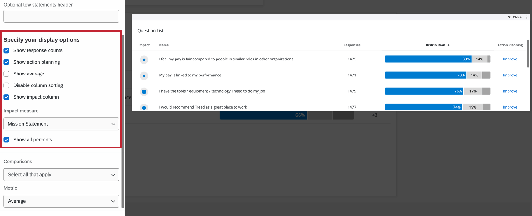
- Show Response Counts: Show the number of responses for each statement.
- Show Action Planning: Will display an Action Planning column where users can click Improve to add an action plan. To edit these action plans, they will need to use the Action Planning Editor widget.
- Show Average: Show the average rating provided for each item displayed.
- Disable Column Sorting: Disables the ability for dashboard viewers to click column headers and sort the widget data in a different order. This keeps users from reframing how you want the data displayed.
- Show All Percents: Display the percent of respondents who fell into each engagement category.
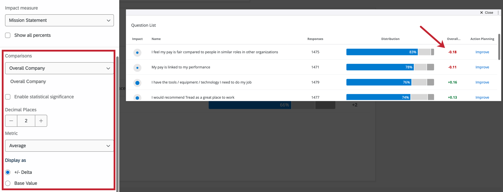
Comparisons
You can add both benchmarks and comparisons as comparison data in your Question List widget.
 In order to add a comparison to the widget, you will have to ensure that you have at least one benchmark added in your Benchmark Editor or at least one comparison added in your Comparisons section of your dashboard Settings.Note than you can add multiple comparisons, if you would like.
Metric
The metric is another field that determines how the numbers along the x-axis are calculated. You can either present results based on engagement or average.
- Favorability: Base your data on favorability. This is calculated as an engagement score, the percentage of participants who rated favorably on the set scale. For more on setting favorability scales, see Scales.
- Average: Base your data on the average value. In a Heat Map, that means you see the average of everyone’s score in a group. You cannot set your metric to average until Show Average is enabled in your widget’s display options.
Qtip: Depending on the number of scale points, it may be difficult to get a large range for average. Consider adjusting your value ranges to include decimals.
Display As
Once your comparison is added and you’ve decided on the metric, you can display the comparison data as +/- Delta Base Value (displays the difference between your survey data and your comparison data) or as the Base Value (displays the actual value of your comparison data).
Significance Testing
When displaying comparisons or benchmarks on your widgets, you’ll see a lot of changes from one group to another. But are these changes to be expected, or are they representative of something deeper? How can you decide what changes demand your attention? Thankfully, you can flag whether a difference is statistically significant.
Enabling Significance Testing
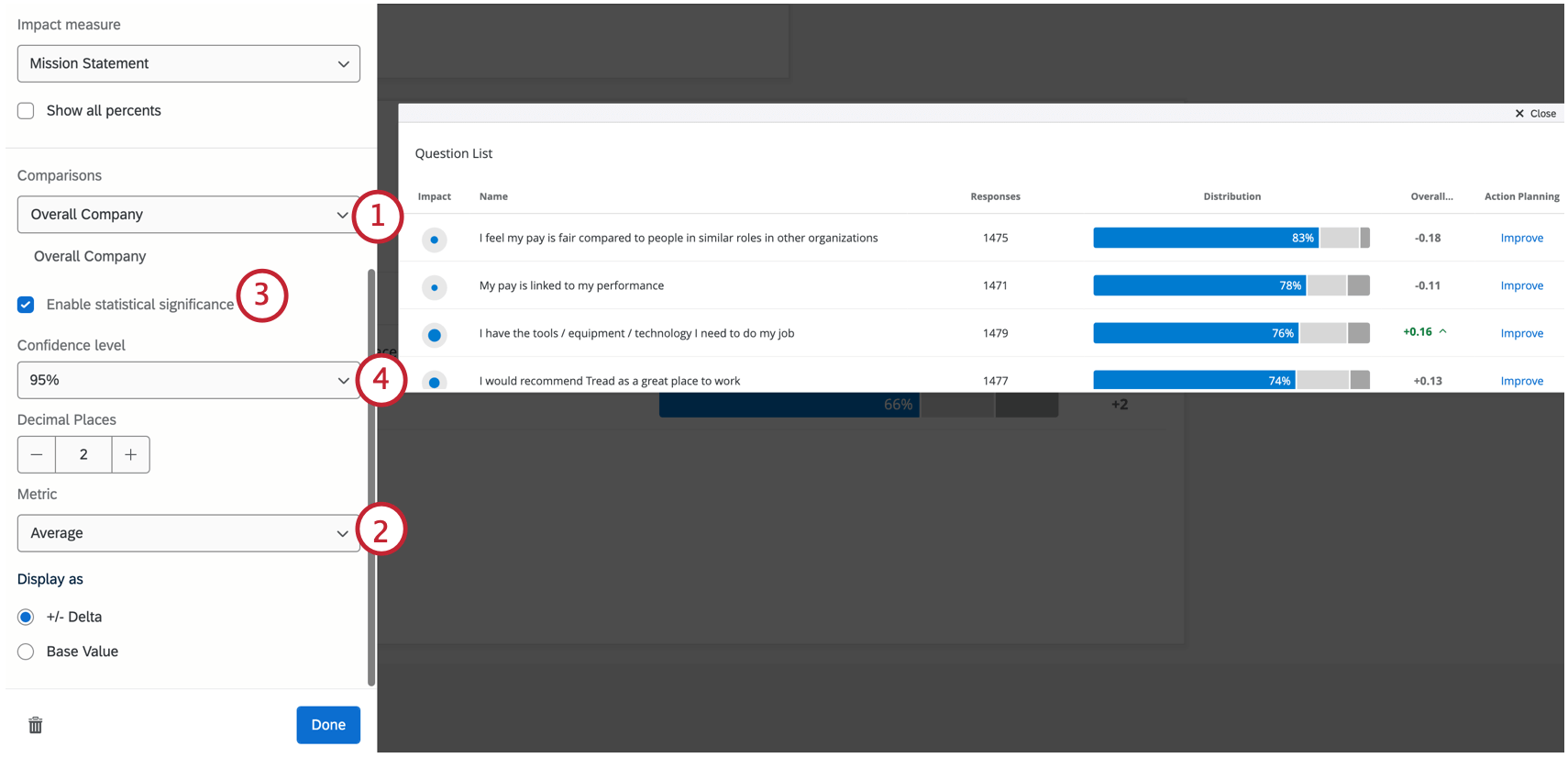
- Add a comparison or benchmark to your widget.
Qtip: To use significance testing, you must make sure your comparison is set to display number values as +/- Delta.
- Choose your display Metric. You can choose either Average or Favorability.
Qtip: Don’t see the option to select a metric? Make sure Show Average is first enabled in your widget’s Display Options. If the Metric dropdown is not visible, then the display metric is Favorability.
- Select Enable Significance Testing.
- Select your Confidence Interval.
Types of Significance Tests
The type of significance testing that is being performed varies based on your chosen metric and whether you have added a benchmark or a comparison.
| Favorability | Average | |
| Comparisons | A 2 proportion z-test in 2 tails. Here, we are comparing proportions of favorability for two populations.
Qtip: For statistical tests that are set up with comparisons, the test will be performed with the comparison as it is configured, and will not attempt to remove any overlap between the samples being compared. For example, if your comparison is a subgroup vs. the company overall, the company overall includes the subgroup as well.
|
An independent samples t-test. Here, we are comparing two different distributions of scores: the current project’s survey results against the comparisons’ survey results.
Qtip: For statistical tests that are set up with comparisons, the test will be performed with the comparison as it is configured, and will not attempt to remove any overlap between the samples being compared. For example, if your comparison is a subgroup vs. the company overall, the company overall includes the subgroup as well.
|
| Benchmark | One sample test of binomial proportions. Here, we are comparing expected proportion (a benchmark) to the experimental proportion of the binomial question: is this favorable or unfavorable. | One sample t-test. Here, we are comparing the benchmark mean (which is a single value) to the current survey’s results, which is a distribution of values. |
The sample size for categories is the average number of responses across the items in the category.
Understanding Significance in a Widget
The Confidence Interval indicates how confident you would like to be that the results generated through the analysis match the general population. Higher confidence levels raise the threshold for a difference to be considered statistically significant, meaning only the clearest differences will be marked as such.
Once you have enabled significance testing, only the changes that are significant will appear in color, with arrows to indicate the direction of the change. Insignificant changes will be in gray.
Visualizations
You have three options for formatting data in a Question List widget.
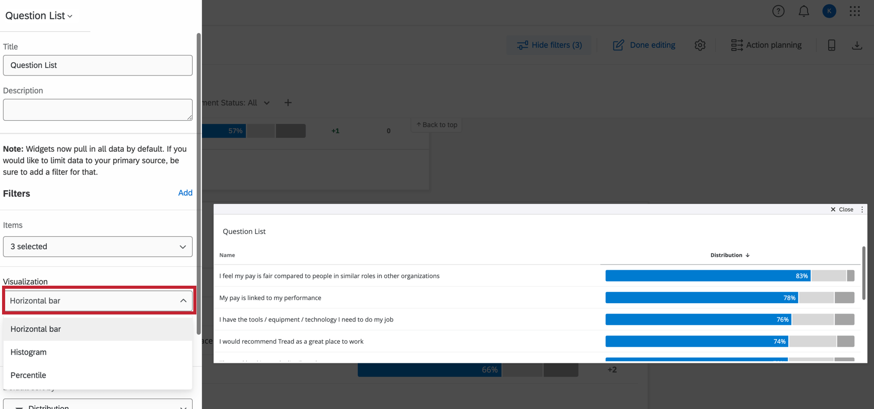
- Horizontal bar: The default and highly recommended visualization, which displays the frequency data as the percent of total. (Seen in the screenshot above.)
- Histogram: Displays the frequency count of the data.
- Percentile: Will only work if you have percentile benchmarks set up. Regular benchmarks will not work with this visualization. This visualization is not recommended for the average user.
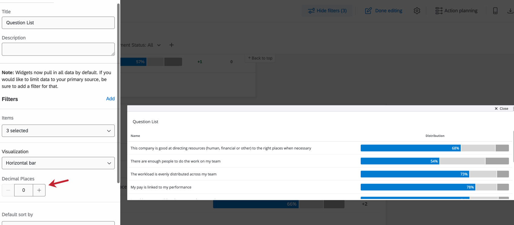
DECIMALS
Indicate to which decimal point you would like to display data by clicking the plus ( + ) or minus ( – ) in the Decimal Places section.