-

Qualtrics Platform -

Customer Journey Optimizer -

XM Discover -

Qualtrics Social Connect
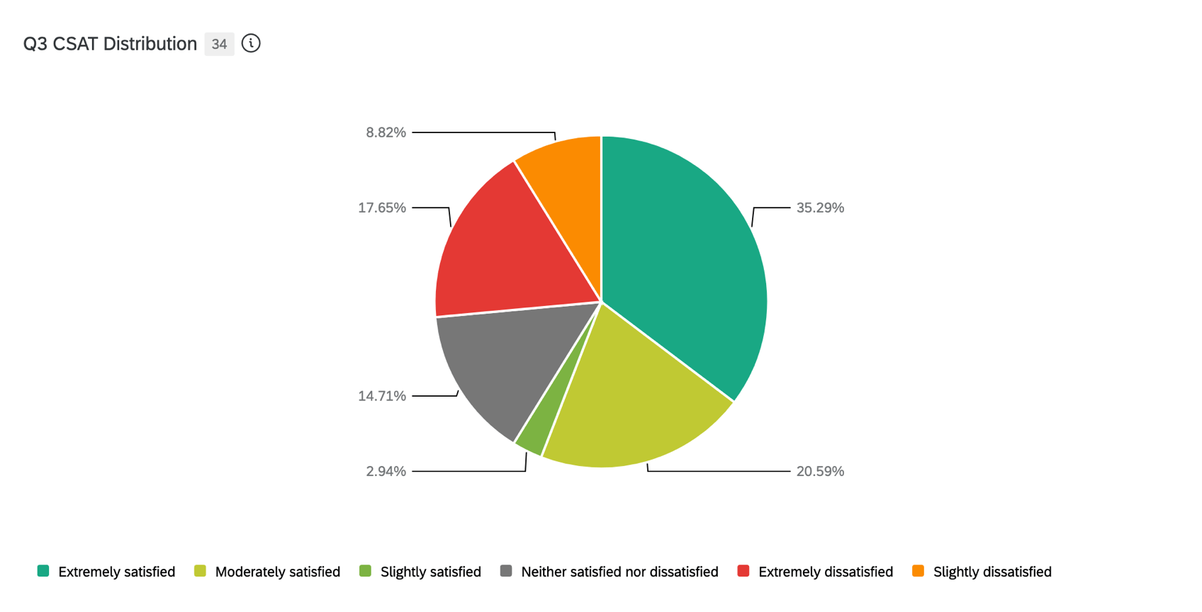
Donut / Pie Chart Widget
About Donut / Pie Chart Widgets
The donut / pie chart widget displays data as sections of a circular graph. The size of each section is determined by the value of the metric (count, sum, etc.) for the data value that the section represents.
Types of Dashboards
This widget can be used in a few different types of dashboard. This includes:
Field Type Compatibility
The Sum metric is only compatible with categories (EX) and fields with the following field types (CX|EX):
- Number Set
- Numeric Value
Only fields with the following types will be available when selecting the Dimension field for the pie chart:
- Text Set
- Multi-Answer Text Set
- Date
- Number Set
If using a pie chart in a CX dashboard, you can also use the following field types:
If using a pie chart in an EX dashboard, you can use a category for the pie chart’s dimension only if the metric is set to Count. If the metric is set to a different type, then you cannot select a category for the pie chart’s dimension.
Setting Up a Donut / Pie Chart
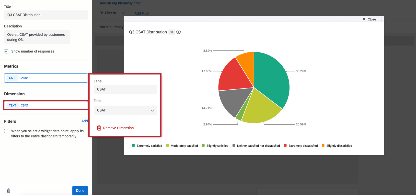
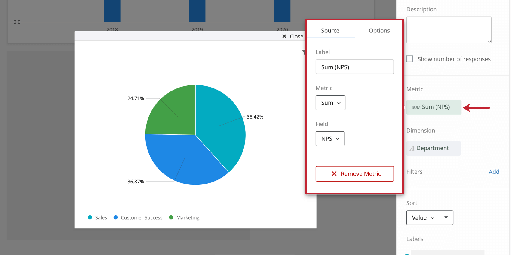
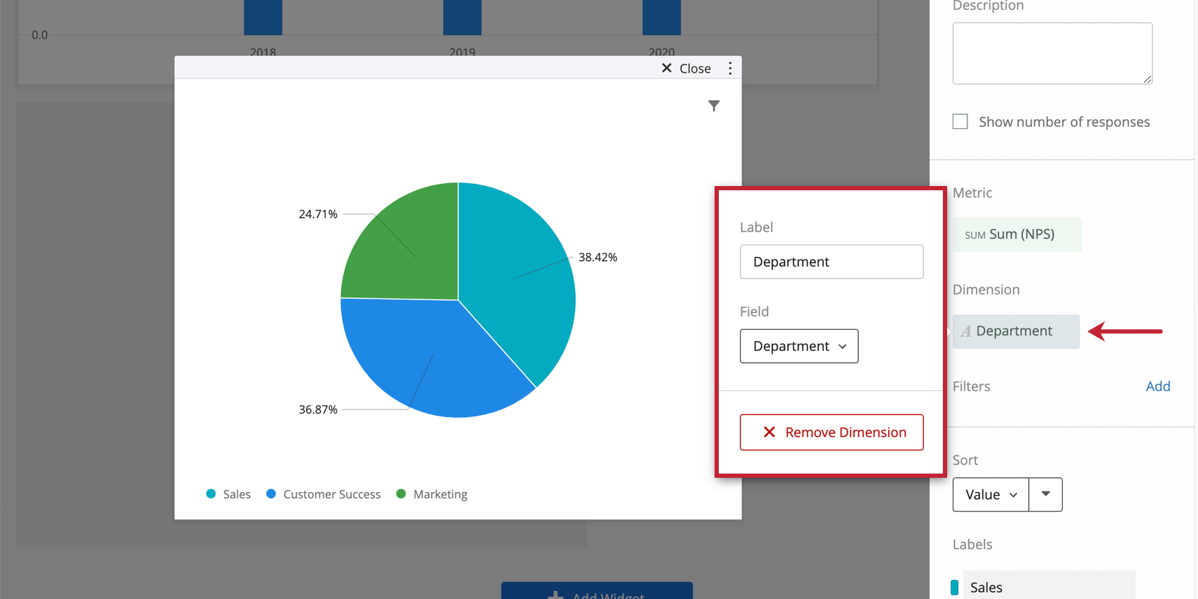
To set up your pie chart widget, you will need to specify a metric (the value you would like displayed) and a dimension (how you want your metric broken out).
When selecting your Metric, you will need to give your metric a Label (i.e., a name) and choose the metric itself. If you choose sum, you will need to specify the field that the metric will be calculated off of. You can also select Options to specify whether or not you would like your metric in a number, percent, or currency format as well as the number of decimal places displayed.
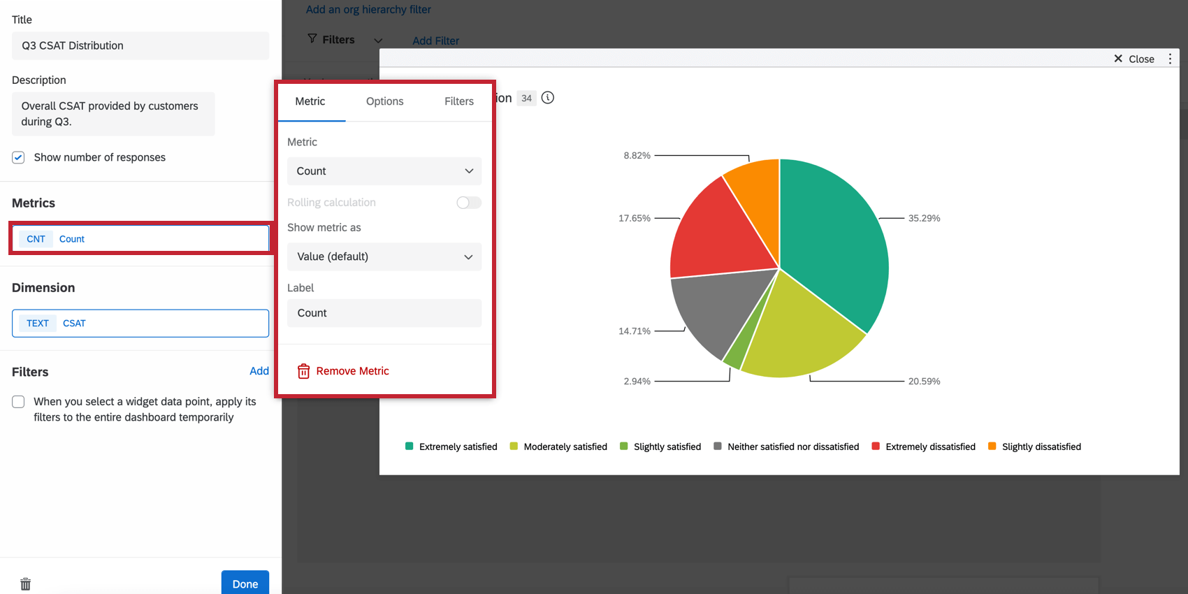
- Count: Display response counts from the selected fields (i.e., number of respondents choosing a value in a five-point scale)
- Average: Exhibit the average value for a selected field.
- Minimum: Show the minimum value of a selected field.
- Maximum: Present the maximum value for a selected field.
- Sum: Pull in the sum of all values for a selected field.
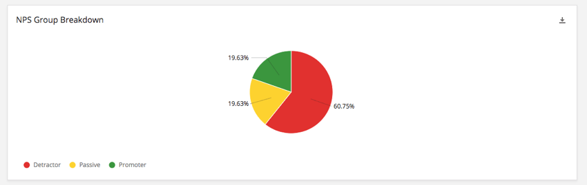
- Net Promoter Score: Identify the Detractors, Passives, and Promoters from NPS questions.
- Correlation: Input Pearson’s r value for the correlation between two fields.
- Top Box / Bottom Box: Display the percentage of responses that fall into a specified range of values.
- Benchmarks: Any benchmarks you’ve created.
- Custom Metrics: CX dashboards only. Include any custom metrics you have created. For more information, visit the page on Custom Metrics.
When selecting your Dimension, you will have to choose the field you would like your metric broken out by.
You can add a filter to your widget for a more granular look at the data in your chart. Click Add and then decide which metrics to include or exclude.
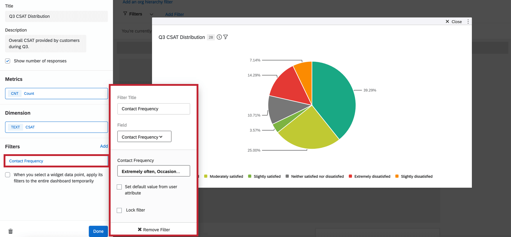
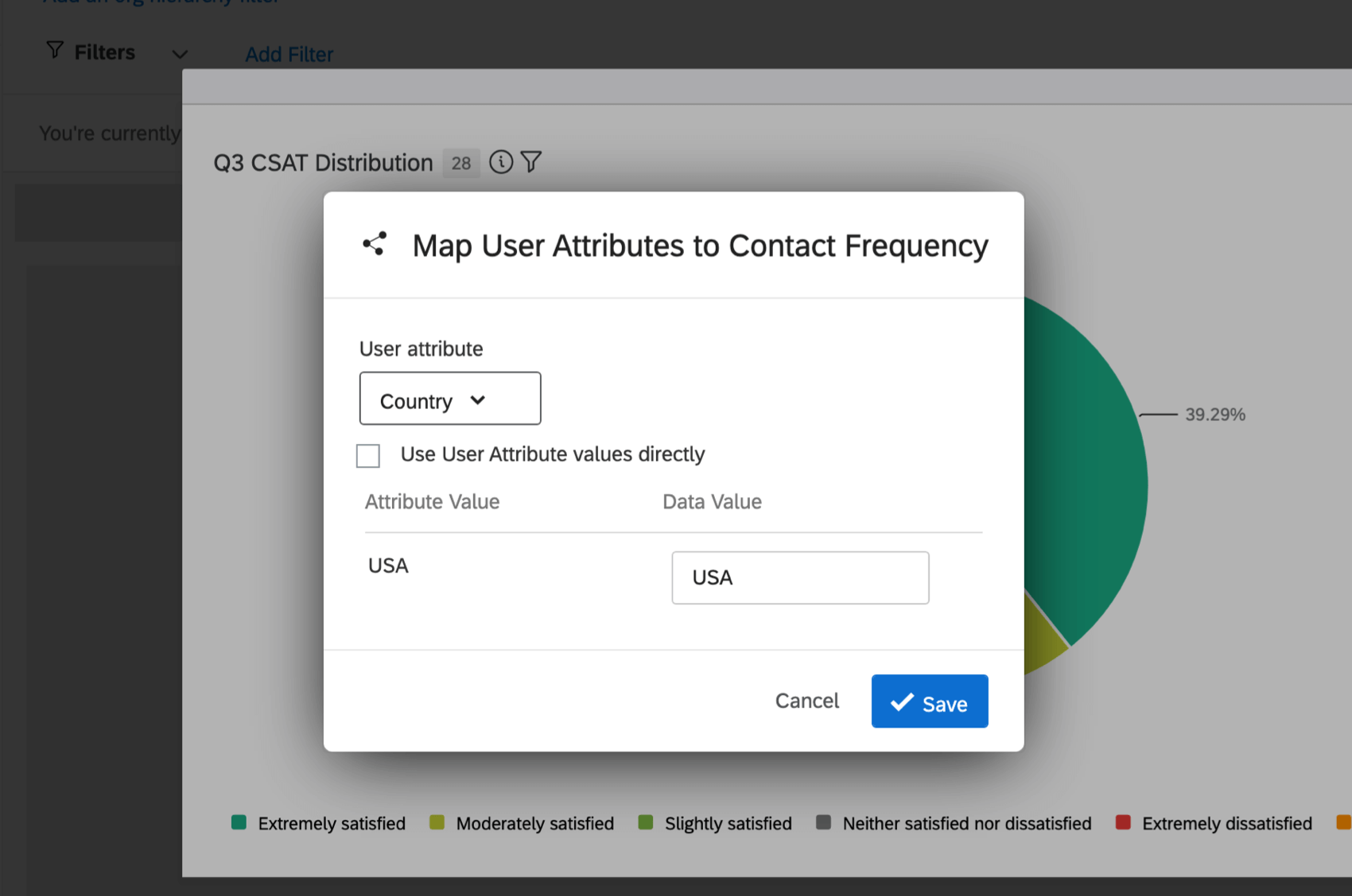
- Set default value from user attribute: You can make the default metrics users see vary based on user attribute. Users will still be able to select different filters, but what they see will depend on the value attributed to their attribute. To use the user attributes exactly as they’re saved, click Use User Attribute values directly.
- Limit default value: Once a user attribute is set, you can also limit the default value by role, if desired. After clicking this value, select a role from the dropdown.
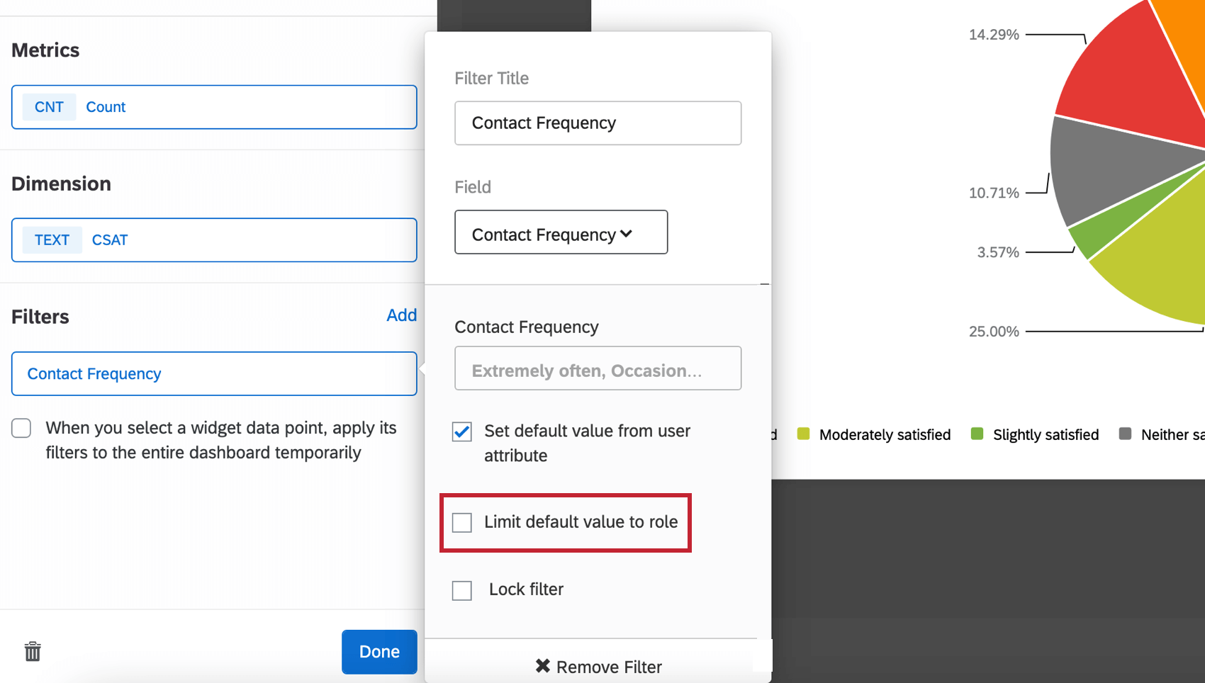 Qtip: When you choose to “Limit default value to role,” you are determining a single role whose default metrics will be limited by the members’ user attribute. This means that members of the role will see what you set as their user attributes by default, whereas everyone outside the role will just see all the metrics by default.
 - Lock filter: Selecting this option prevents dashboard users from modifying this filter.
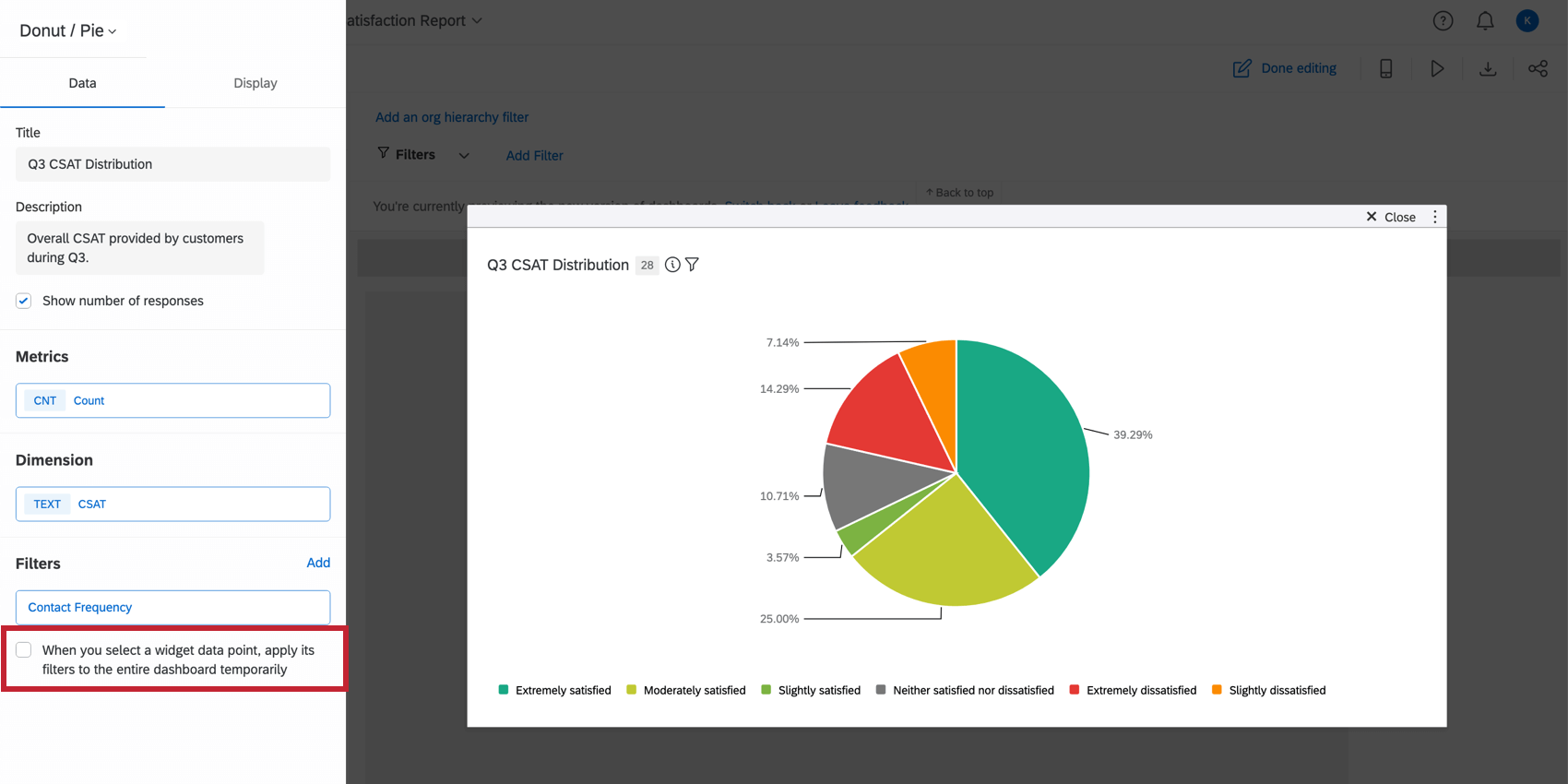
- Selecting When you select a widget data point, apply its filters to the entire dashboard temporarily will apply a filter to the entire dashboard after clicking a datapoint in the pie chart.
Display Options
The Dimension options allow you to customize the order and color of the dimension you have chosen.
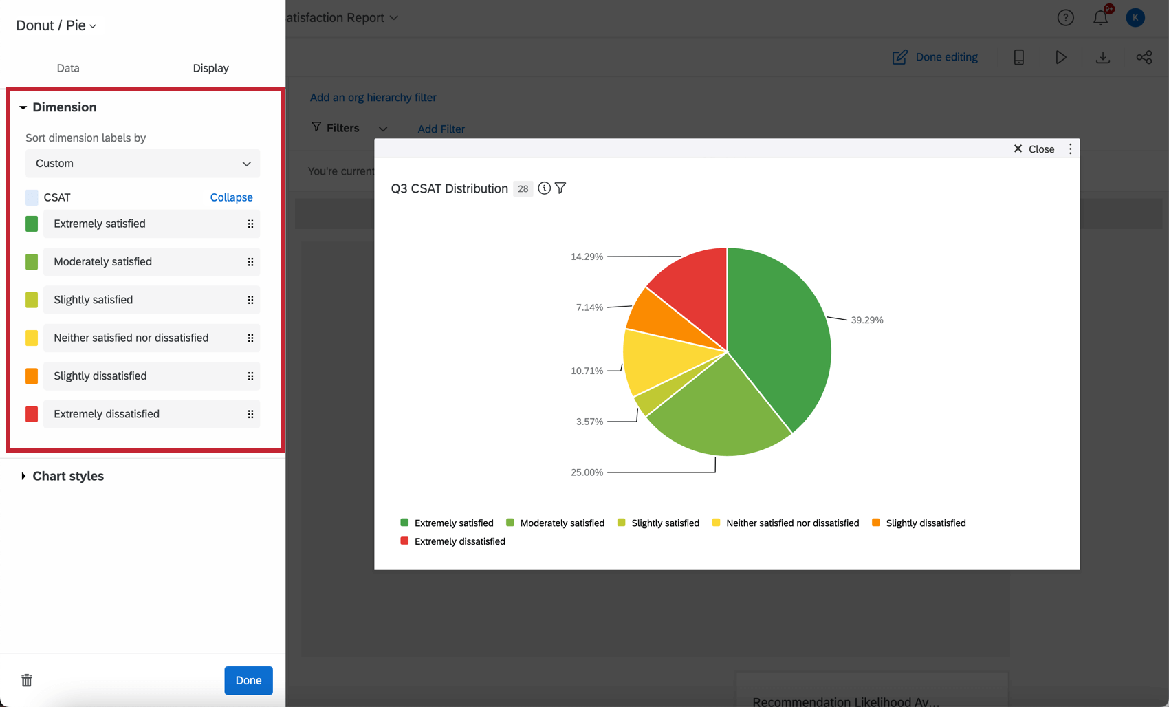
- Sort dimension labels by: Change the order of your data by selecting a sort option from the dropdown choices. If you choose Custom, you will be able to drag and drop the values into whatever order you would like. To rename your chart values, click on the name and type what you would like to see.
- Data colors: Change the colors of your data by clicking the colored box to the left of each value label. If you would like all the values to be the same color, click the box to the left of the dimension title and the color will be applied to every value in your graph.
The Chart styles options allow you to customize the information displayed on the widget.
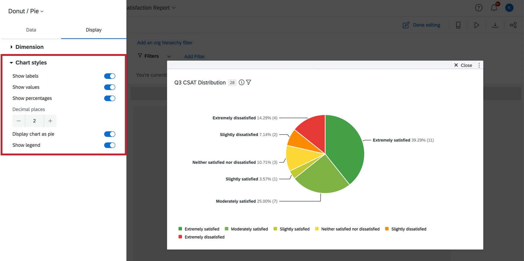
- Show labels: Displays the label of each dimension alongside the value.
- Show values: Displays the value of the metric for each dimension.
- Show percentages: Displays the percentage of the metric for each dimension.
- Decimal places: Displays the percentage of the metric to the decimal place provided.
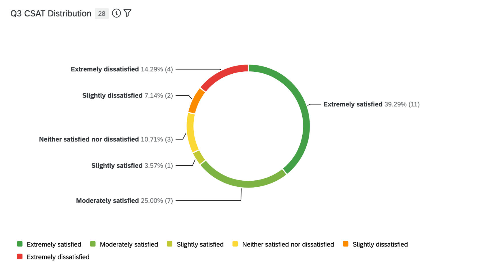
- Display chart as pie: Displays the chart as a pie instead of a donut. With this option disabled, the wedges of the chart will not be filled to the center.
- Show legend: Displays the dimension labels along the bottom of the chart.
Legacy Pie Widget
As of July 2023, you cannot create new legacy pie widgets. However, any existing pie widgets you have on your dashboard still exist. Legacy pie widgets are very similar to the new and improved donut / pie widget, with a few less features. Here is a guide to help you edit any legacy pie widgets you may still have.
Field Type Compatibility
The pie chart widget Sum metric is only compatible with categories (EX) and fields with the following field types (CX|EX):
- Number Set
- Numeric Value
Only fields with the following types will be available when selecting the Dimension field for the pie chart:
- Text Set
- Multi-Answer Text Set
- Date
- Number Set
CX Dashboards Only
If using a pie chart in a CX dashboard, you can also use the following field types:
EX Dashboards Only
If using a pie chart in an EX dashboard, you can use a category for the pie chart’s dimension only if the metric is set to Count. If the metric is set to a different type, then you cannot select a category for the pie chart’s dimension.
Widget Customization
For basic widget instructions and customization, visit the Building Widgets support page. Continue reading for pie chart-specific customization.
Basic Setup
To set up your pie chart widget, you will need to specify a metric (the value you would like displayed) and a dimension (how you want your metric broken out).
When selecting your Metric, you will need to give your metric a Label (i.e., a name) and choose the metric itself. If you choose sum, you will need to specify the field that the metric will be calculated off of. You can also select Options to specify whether or not you would like your metric in a number, percent, or currency format as well as the number of decimal places displayed.
Your available metrics include:
- Count: Display response counts from the selected fields (i.e., number of respondents choosing a value in a five-point scale)
- Average: Exhibit the average value for a selected field.
- Minimum: Show the minimum value of a selected field.
- Maximum: Present the maximum value for a selected field.
- Sum: Pull in the sum of all values for a selected field.
- Net Promoter Score: Identify the Detractors, Passives, and Promoters from NPS questions.
- Correlation: Input Pearson’s r value for the correlation between two fields.
- Top Box / Bottom Box: Display the percentage of responses that fall into a specified range of values.
- Benchmarks: Any benchmarks you’ve created.
- Custom Metrics: CX dashboards only. Include any custom metrics you have created. For more information, visit the page on Custom Metrics.
When selecting your Dimension, you will have to choose the field you would like your metric broken out by.
Section Customization
You can change how your pie sections are organized by using the Sort options. You can choose default, value, label, or custom. If you choose Custom, you will be able to drag and drop the labels below the Sort section into whatever order you would like.
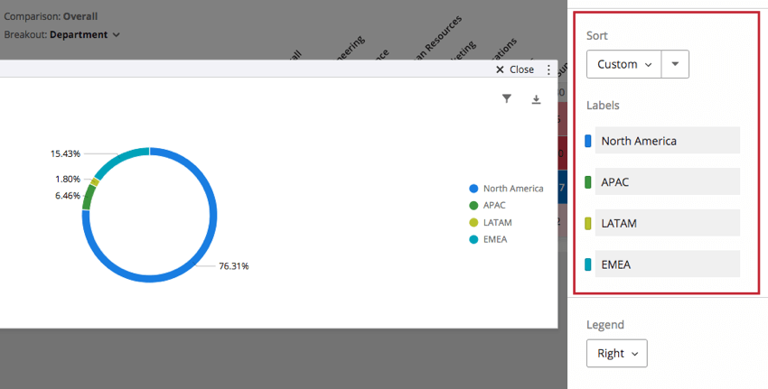
To rename your labels, simply click on the label name under Labels and type whatever name you would like. To change the color of a label, select the color swatch to the left of the label.
Display Options
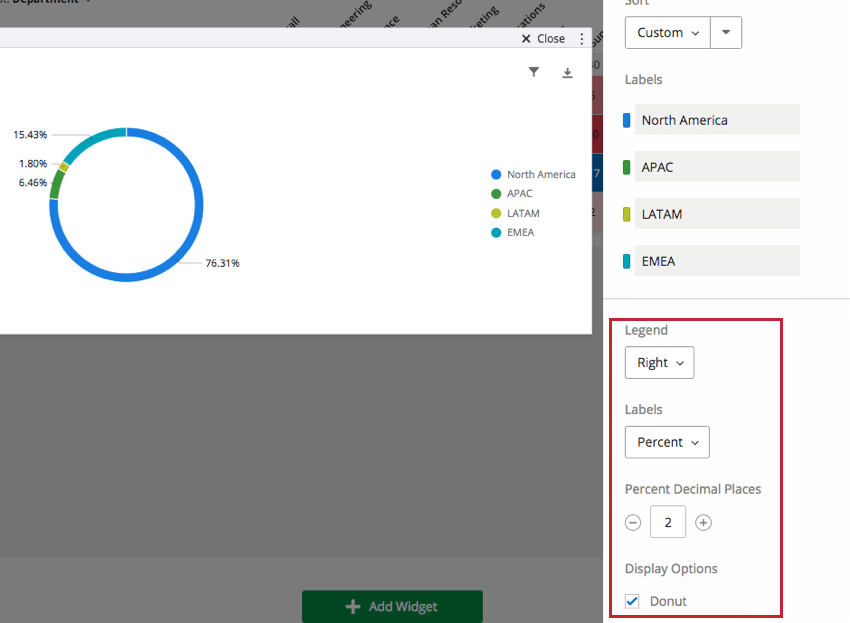
You can specify the location of your Legend to be in the top, right, or bottom. Select Off to not display the legend.
You can also choose a combination of the following options for your labels:
- Label: Displays your dimension on the chart itself, not just in the legend.
- Percent: Displays the percentage of the pie section.
- Value: Displays the metric value of the pie section.
Determine the number of decimal places in percents (not values) using the Percent Decimal Places option.
The pie chart widget can be displayed as either a filled circle or as a donut with the center part empty. To switch from a full circle to donut, select the checkbox next to Donut under Display Options.