-

Qualtrics Platform -

Customer Journey Optimizer -

XM Discover -

Qualtrics Social Connect
Breakdown Bar (Results)

About Breakdown Bars
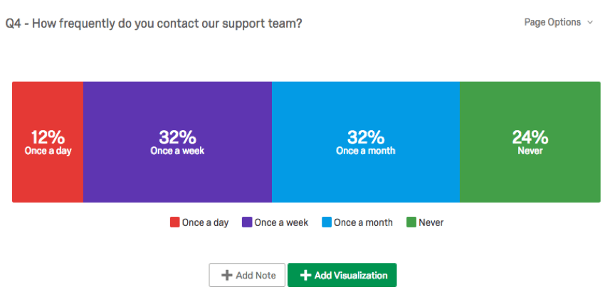
Breakdown Bars allow you to look at how your answer choices or field values for a given data source compare to each other as components of a whole. The possible answer choices are each represented as a segment of the bar, taking up space proportional to how many respondents selected or were assigned the value. This makes them great for displaying percentage data, much like the Pie Chart.
Customization Options
For general settings, see the Visualizations Overview support page. Read on for settings specific to the Breakdown Bar.
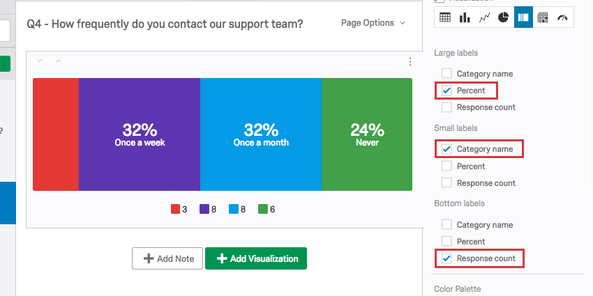
Labels
You have three size options for labels: large, small, and bottom. Large labels are always placed above small labels directly on the segment of the bar. Bottom labels are moved to the legend.
The information you can include in your labels is as follows:
- Category name: The answer choice text or field value name.
- Percent: The percentage of respondents who selected or were assigned the value.
- Response count: The number of respondents who selected or were assigned the value.
In the example above, the category names are written as large labels, the percentage of respondents who fit each category are written as small labels, and the number of respondents who belong to each category have been allocated to the legend.
You are allowed to include the same information in each area, so be sure when adjusting these settings that you deselect settings you don’t want to include anymore.
Legend Values
You have a variety of options concerning the category names (or “legend values”), including the following:
- Change the legend value text by clicking directly into the text box for the name and entering the new name.
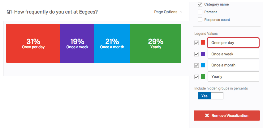
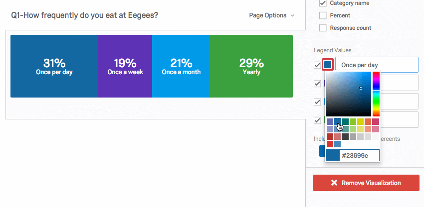
- Adjust the color of the option by clicking directly on the color box to the left of the value and selecting a new color.
- Change the order the values appear in the visualization by clicking to the left of a value and dragging it to its desired position.
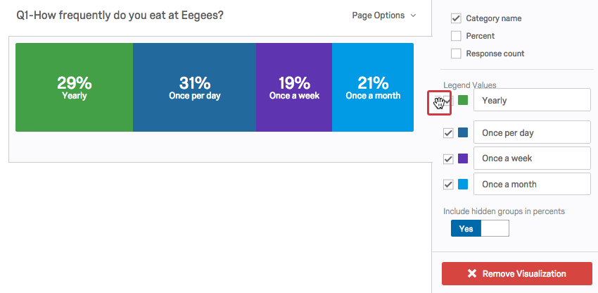
- Hide values from the visualization by deselecting the checkbox to the left of the value.
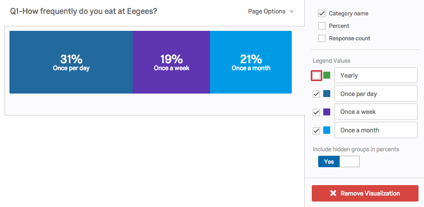

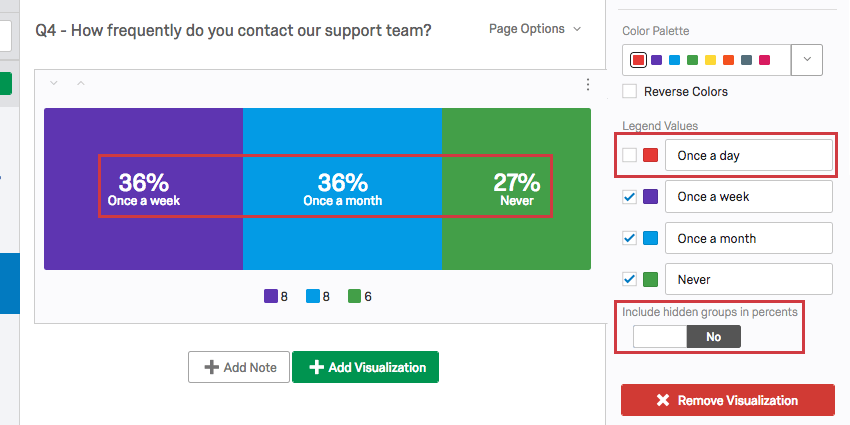
Hidden groups
By default, when you hide values from your Breakdown Bar, those values still contribute to the percentages displayed for each option remaining in the visualization.
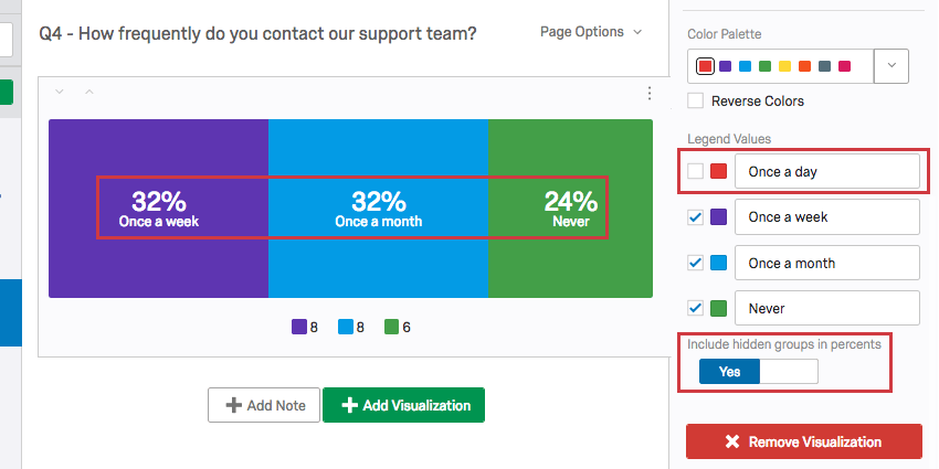
You can choose exclude these hidden values by switching the Include hidden groups in percents option to No.
Incompatible Fields
Breakdown Bars are compatible with most scaled and discrete data, such as any question with a multiple choice option. It is easier to list the fields they are not compatible with, which includes:
- Text Entry question
- Form field question
- Open text fields on other questions, such as Text Entry Matrix Tables, text entry columns on Side by Sides, and “Other” text boxes
- Slider
- Constant Sum
- Constant Sum Matrix Table
- Signature question
- File Upload question
- Timing questions
- Highlight questions
- Heat Maps with no regions specified
- Filter Only Embedded Data
- Text Embedded Data
- Number Set Embedded Data
- Manual Text variables
- Numeric manual variables
- Formulas
- Survey Metadata Duration (how long it took for respondents to take the survey)
- Survey Metadata Progress (how far respondents got in the survey before the response was recorded)
In general, open text and continuous numeric data do not work well with Breakdown Bars. Breakdown Bars are better at showing percentages of a whole, and so are not as useful for statistical data like averages.