-

Qualtrics Platform -

Customer Journey Optimizer -

XM Discover -

Qualtrics Social Connect
Mobile Survey Optimization
About Mobile Survey Optimization
As mobile usage becomes more and more common, it’s important to format and optimize your survey’s mobile experience. This page outlines best practices for mobile optimization, options for previewing and adjusting mobile formatting, and more.
Though all Qualtrics question types are compatible with a variety of mobile devices (including iOS, Android, and Windows Phone systems), there are 4 question types that deserve special attention:
Along with the mobile settings for these 4 question types, there are 3 other mobile features that this page addresses:
- Mobile Preview
- Mobile Compatibility Advisor
- Mobile Themes
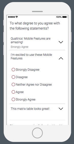
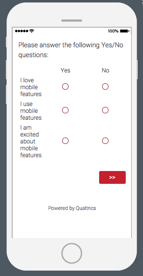
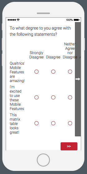
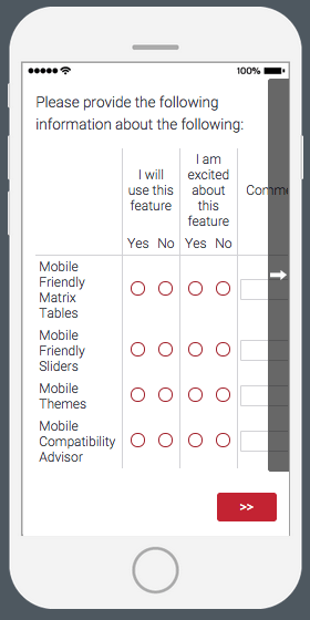
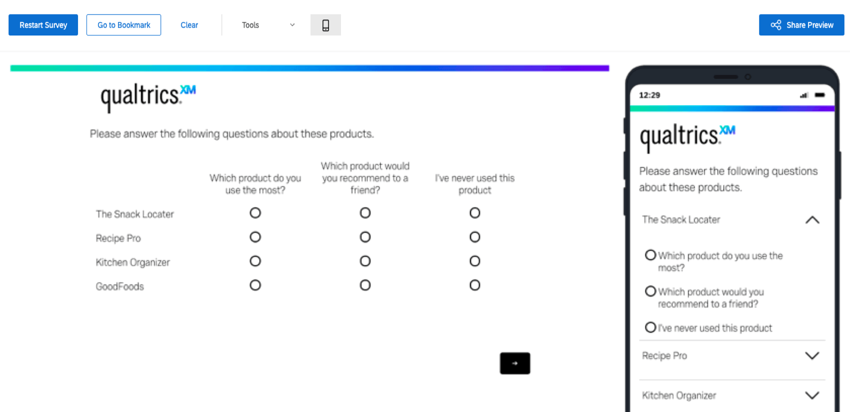
Matrix Table
The matrix table question type has 3 viewable formats for mobile devices: accordion, normal, and scrollable.
Accordion Format
The accordion format for matrix tables is turned on by enabling the Mobile friendly setting in the question editing pane.
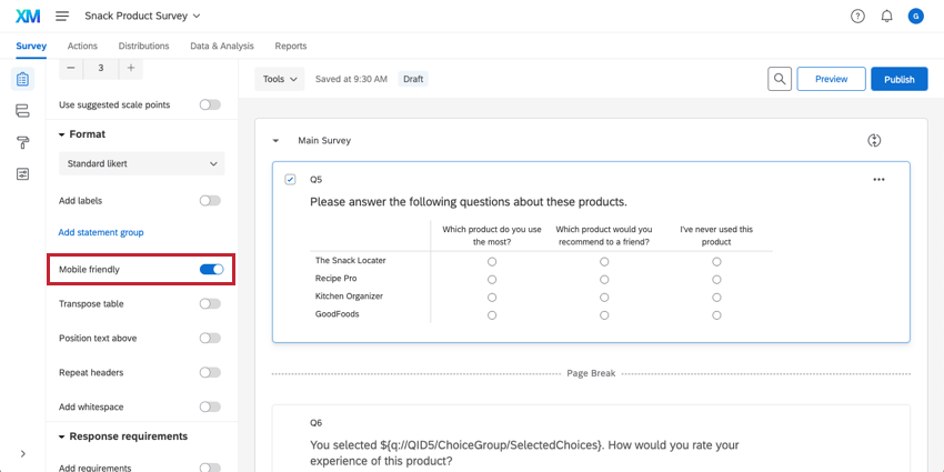
When this box is checked, the matrix table will display in the accordion format on mobile devices if the table is too large to fit on the screen. If the table is small, the question will display in normal format.
We recommend enabling the Mobile friendly setting for all matrix table questions.
Normal Format
The normal format for matrix tables is enabled when the mobile screen is wide enough to fit all of the scale points without scrolling.
Scrollable Format
To see the scrollable view of the matrix table scale points, leave the Mobile friendly setting unchecked in the question editing pane. With this setting turned off, any part of the question that extends beyond the width of the mobile screen will require scrolling to view. We do not recommend using scrollable format.
Multiple Choice
The multiple choice question type has 2 viewable formats for mobile devices: vertical lists and column lists.
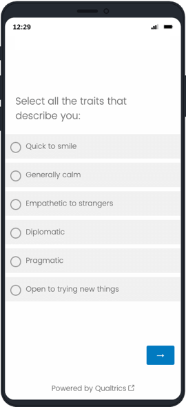
Vertical List Format
You can use the vertical list format for your multiple choice question by choosing to use the List format and setting the alignment to Vertical.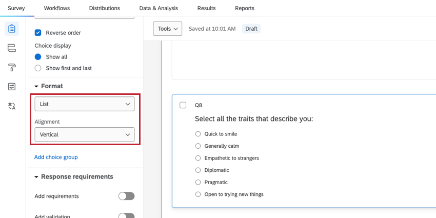
When using the vertical list format, answer choices will be shown to respondents in a top-to-bottom list.
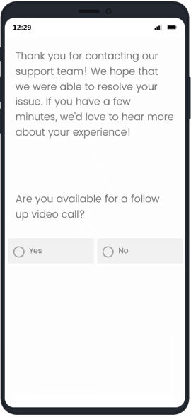
Column List Format
You can use the column list format for your multiple choice question by choosing to use the List format and setting the alignment to Column.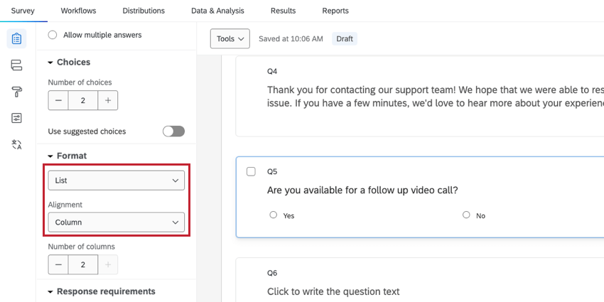
When using the column list format, answer choices will be sorted into column groups. You can choose how many columns to include for your question.
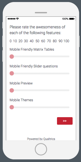
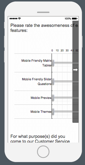
Slider
The Slider question type has 2 viewable formats for mobile devices: condensed and scrollable.
Condensed Format
The condensed format is turned on by enabling the Mobile friendly setting on the question editing pane. When this box is checked, the slider will be fitted to display on the screen so that respondents don’t have to scroll to see the whole scale.
We recommend using the Mobile friendly setting for all slider questions.
Scrollable Format
To see the scrollable view of the slider scales, leave the Mobile friendly setting unchecked in the question editing pane. With this setting turned off, any part of the question that extends beyond the width of the mobile screen will require scrolling to view. Because this format can be challenging to work with on a mobile device, we do not recommend it.
Side by Side
The side by side question type currently has only one viewable format for mobile devices: scrollable format.
The scrollable format is the default view for side by side questions. With the scrollable format, any part of the question that extends beyond the width of the mobile screen will require scrolling to view. If the scrollable format does not work for your mobile survey, we recommend using multiple matrix table questions in place of a side by side.
Mobile Preview
With the mobile preview feature, you can check your survey’s mobile experience as you create it. The preview shows you the survey’s appearance on a desktop and on a mobile device.
Additionally, you can collapse the mobile preview pane to show only the desktop view. A QR code™ is also provided in the top left Tools menu that can be scanned to preview the survey directly on your mobile device without having to email yourself the survey link. Click the QR code to zoom in and enlarge the survey for easy scanning.
Mobile Compatibility Advisor
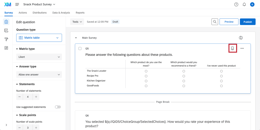
The mobile compatibility advisor saves you time by automatically tracking potential mobile issues, so you won’t have to constantly preview your survey to catch them all.
When a question merits a mobile preview, the mobile compatibility advisor puts a mini mobile device icon to the left of your question (see image below). If you click on the icon, it will explain why the question may need attention. You can then preview the survey to see the question’s actual behavior and make the necessary adjustments.
There are 2 mobile compatibility icons, orange and red. The orange icon indicates a possible issue with taking the survey on mobile devices. The red icon indicates a compatibility issue with the Offline App.
Mobile Specific Content
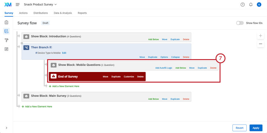
Because of the nature of mobile devices, you may want to create a different survey experience for your mobile respondents by showing different questions or end of survey messages. You can do this in the survey flow with branch logic based on a mobile device type so that only mobile devices will experience that content.
To deliver mobile specific content
- Navigate to the Survey tab and open the Survey flow.
- Click Add Below or Add a New Element Here.
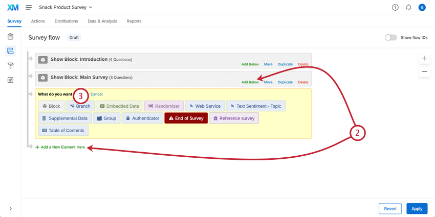
- Select Branch.
- Click Add a Condition.
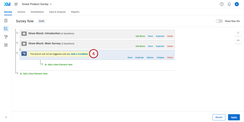
- Ensure that Device Type is set to Mobile in the branch condition.
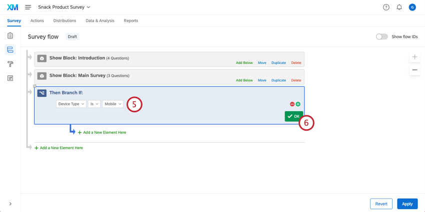
- Click OK.
- Add blocks, end of survey elements, and other survey flow elements that will make up your mobile specific content within the branch. Be sure to place the branch in the appropriate place for the mobile experience to display.
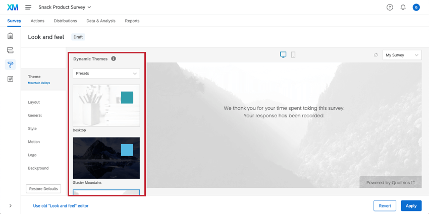
Mobile Themes
The mobile compatibility features addressed on this page may not be compatible with older survey themes. If you are using one of Qualtrics’ older themes, we recommend switching to one of our newer themes for an optimal mobile experience.
To make this change, access your Look and feel options and select a theme from 2014 or later from the themes options in the top-left.
Purchased Themes
All Qualtrics themes will adjust automatically for mobile environments. However, if your organization has custom themes as part of your license from Qualtrics, they may not be optimized for the best mobile experience (e.g., no scrolling). We recommend upgrading your custom theme to a newer, optimized dynamic theme. Request this free upgrade on our Theme Design page.
Mobile Optimization Best Practices
Surveys are now more likely than ever to be taken on a mobile device. Make sure your survey follows these best practices to increase your survey’s mobile experience and response rate:
- Minimize the need to scroll. This means breaking up large questions into more manageable sizes and adding enough page breaks.
- Limit the number of open response type questions in your survey (answering open text questions is even less fun on a small mobile device).
- Cut down on image use, particularly large images. Mobile devices may not be able to display the entire image.
- Test your survey! Put yourself in your respondents’ shoes and ask whether you would want to take your own survey.
QR Code is a registered trademark of DENSO WAVE INCORPORATED.