-

Qualtrics Platform -

Customer Journey Optimizer -

XM Discover -

Qualtrics Social Connect
Spotlight Insights (CX)
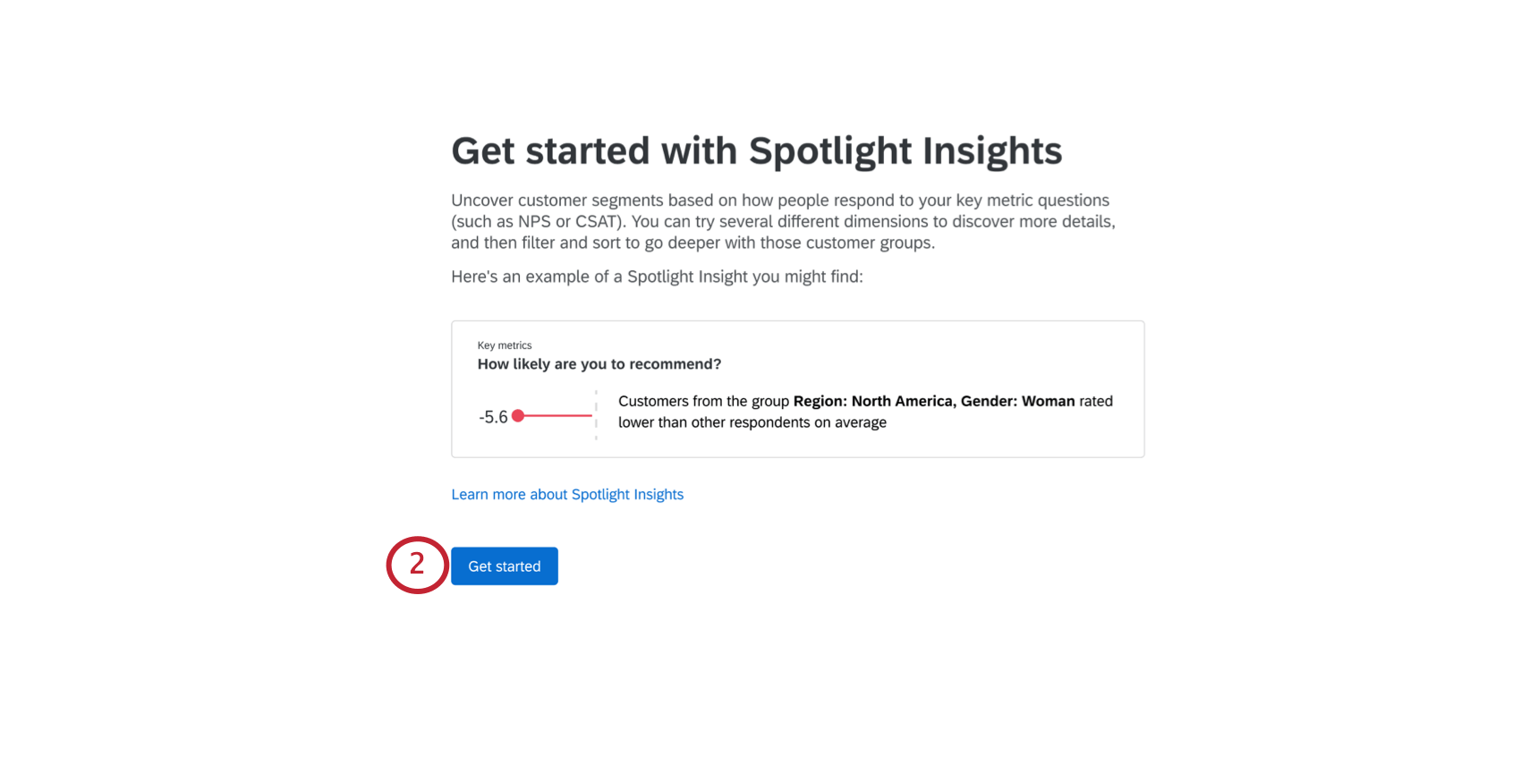
About Spotlight Insights
After collecting all your data, it can sometimes be overwhelming to determine where your company should focus its efforts. With spotlight insights, you can uncover how customer segments are responding to key metric questions. Simply choose what metrics and demographic breakouts you want to run, and Qualtrics will provide you a straightforward report highlighting key experience gaps.
Setting Up Insights
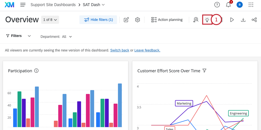
- In your dashboard, click Insights.
- Click Get Started.
- Choose outcome metrics you want to analyze. Fields should be mapped as number sets with recodes.
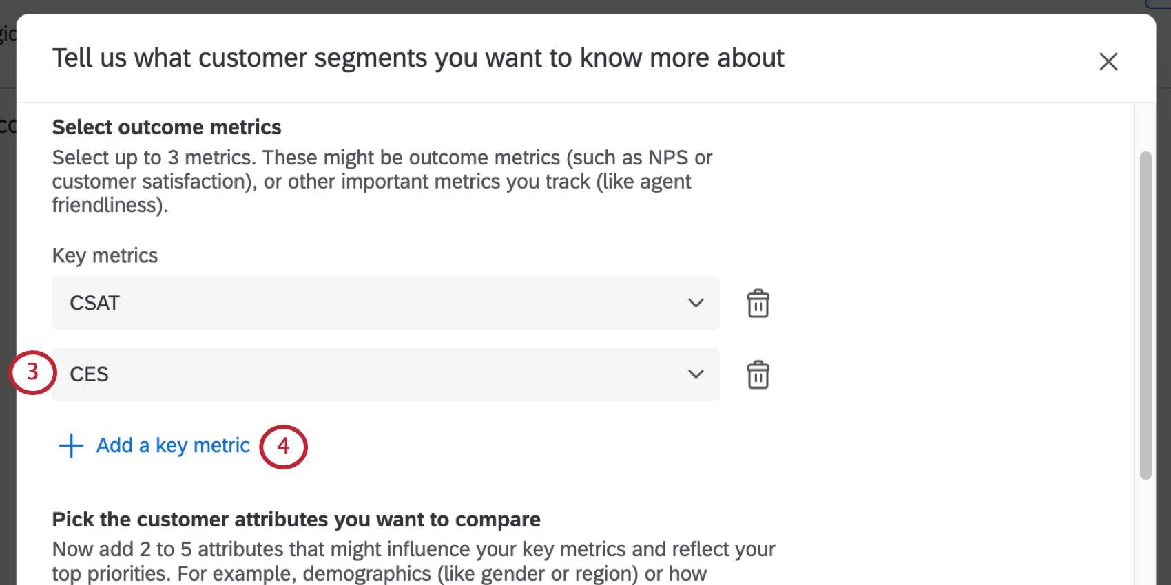 Qtip: Right now, you cannot use custom metrics as outcome metrics.Example: These might be outcome metrics (such as NPS or Customer Satisfaction), or other important metrics you track (such as Agent Friendliness).
 - If desired, click Add a key metric to add additional metrics to your comparison. You may add up to 3 metrics.
- Clicking Add a customer attribute lets you pick 2 to 5 attributes that might influence your key metrics and reflect your top priorities. These attributes should be either text set or text value types.
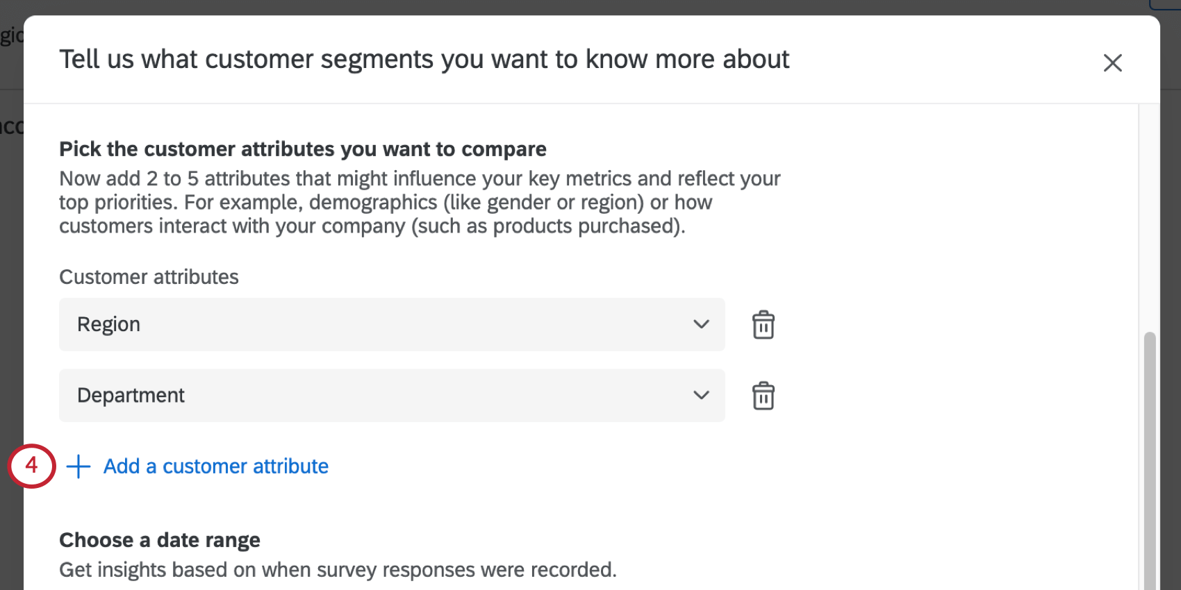 Qtip: It’s best to stick to attributes with a finite number of unique values. For example, there are so many postal codes you may not have enough responses per value to see meaningful results if you chose this field. Fields with 2000 unique values or more cannot be selected.Example: These could be customer attributes such as demographics (e.g. Gender, Region, Age Group), firmographics (e.g., Company size, Industry), or how how customers interacted with your company (e.g. Products purchased, Customer tenure, Number of support interactions).
 - Choose a date range. This will determine the data included in the insights. You can choose from several preset date ranges or set a custom date range.
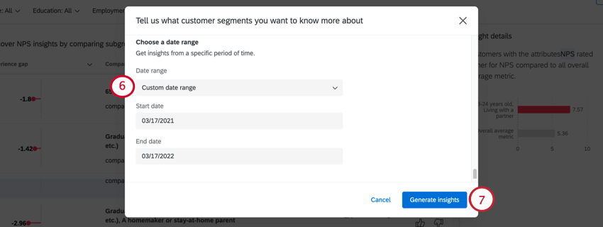 Example: You’d like to see the impact of past product purchases on customer satisfaction for the last 90 days.Qtip: The date used here is based on the recorded date field. This cannot be changed to another date field.
 - Click Generate insights when finished.
Qtip: Your insights may take up to 30 minutes to calculate. Feel free to exit this page while we analyze your data – we’ll send you a notification when it’s ready!
If you need to edit these settings, simply click Edit in the top-right and make any desired changes. Please note that if you edit these settings, you will need to wait while we generate your new insights. There is only one set of insights per dashboard, so if you edit this content, it will be replaced for all dashboard users.
Navigating Insights
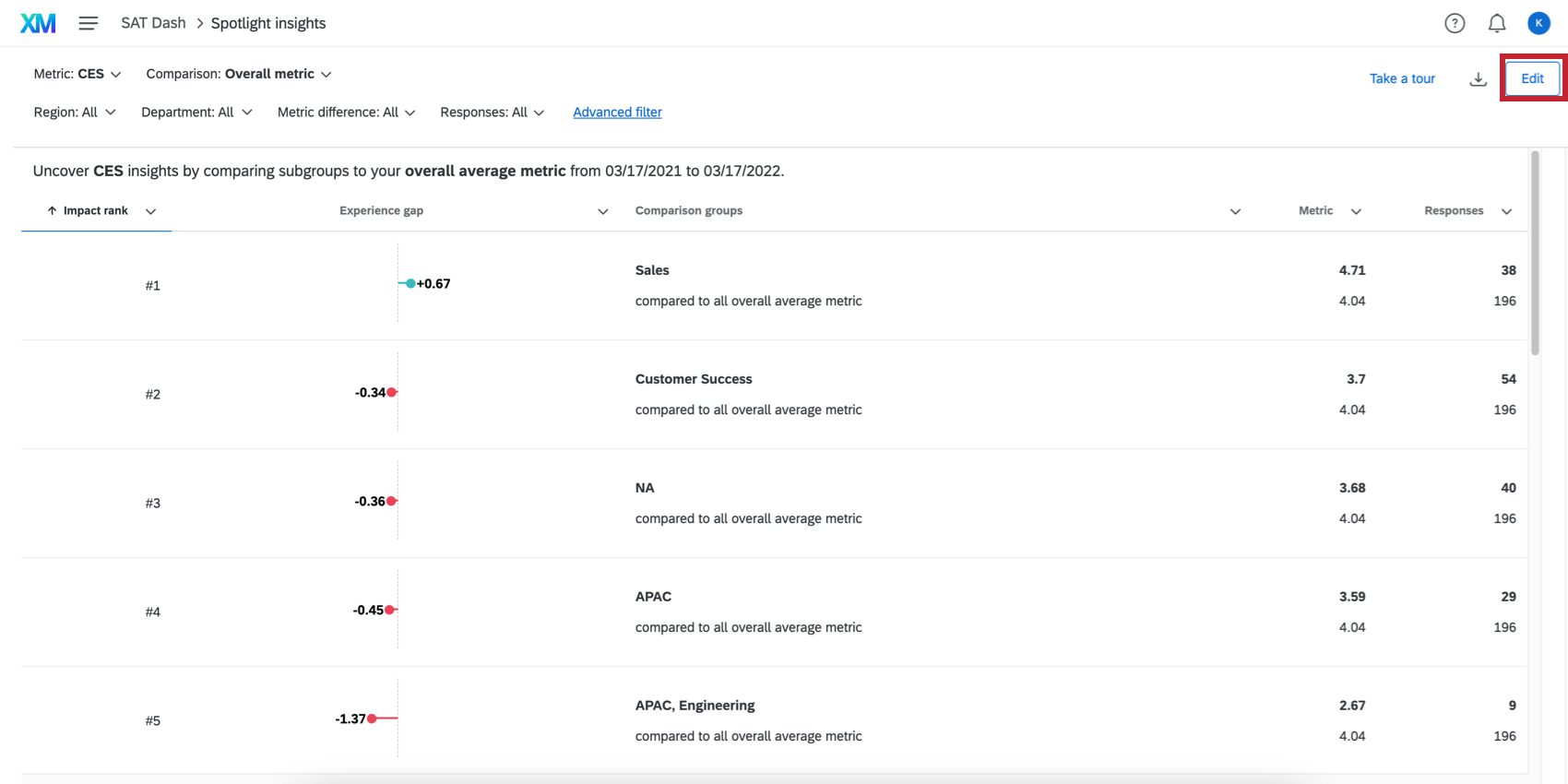
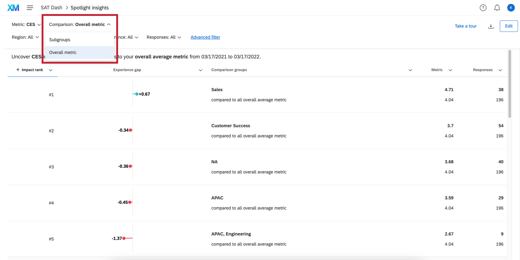
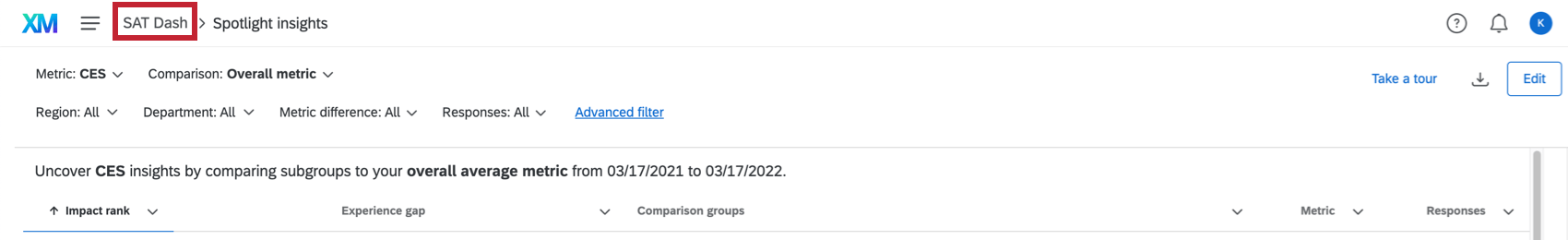
Once your insights have been generated, you can select which insights you want to view by using the Comparison dropdown at the top of the page.
To change what metric or priority you are analyzing for, use the Metric dropdown at the top of the page.
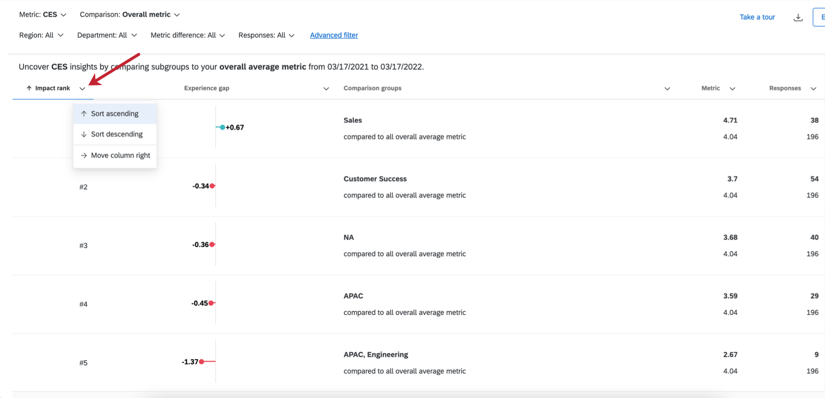
In order to help you focus on the areas most promising of improvement, Qualtrics orders the insights list based on impact rank. This rank is the calculation of the number of survey respondents affected and the width of the experience gap. Therefore, large experience gaps that affect a large number of respondents will be displayed higher in the list than small experience gaps that affect only a small number of respondents. You can still use the page filters and sorting to view the insights in a different way.
To return to your dashboard, click the dashboard name in the navigation bar.
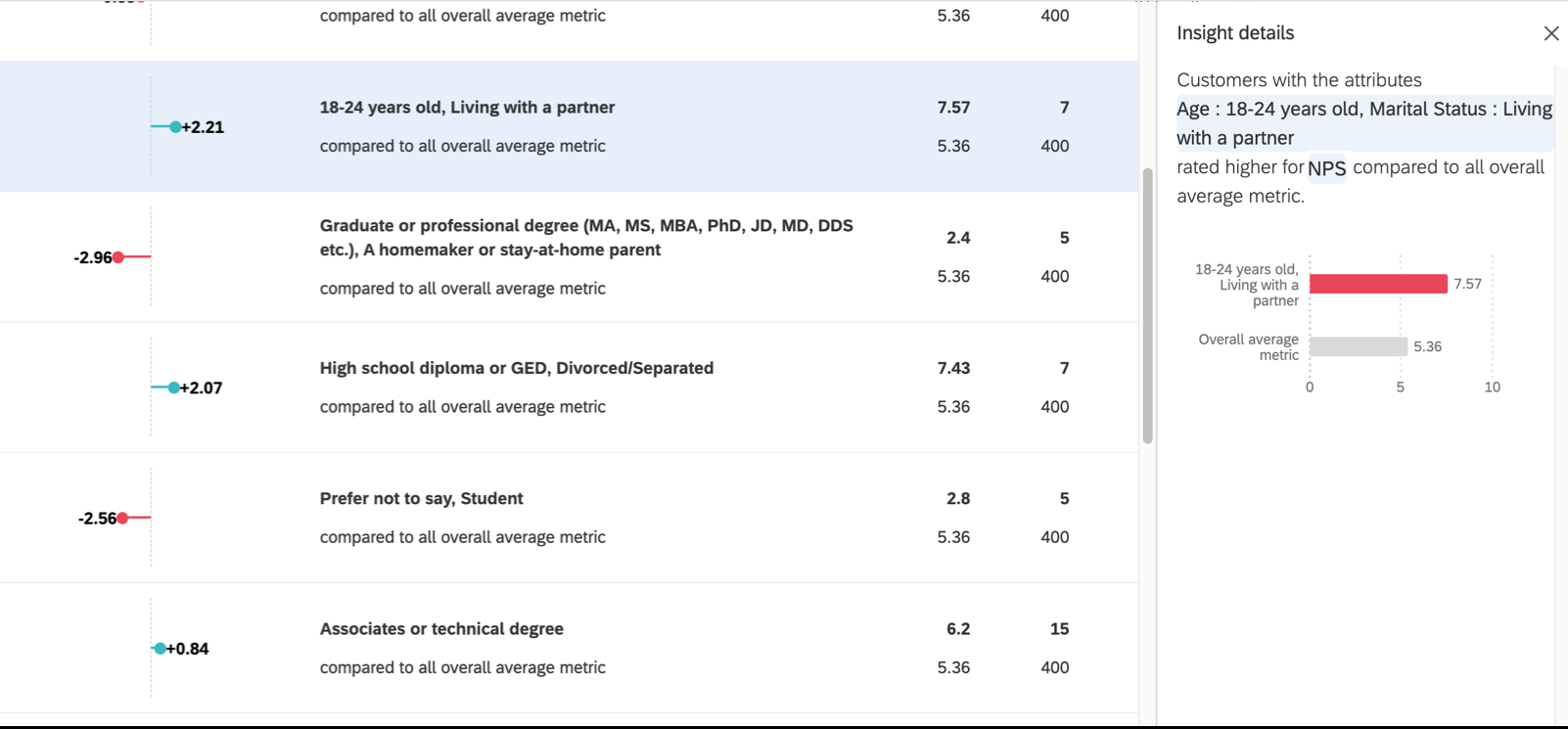
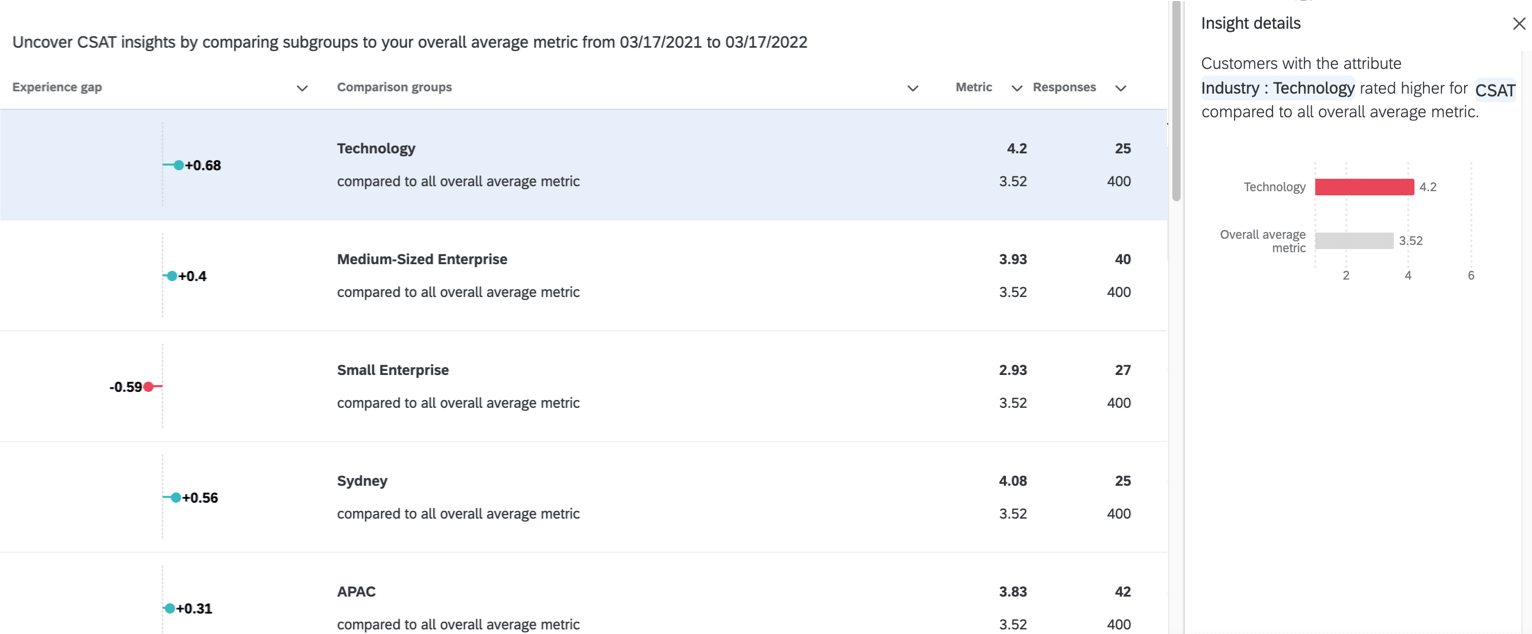
Insight Details
When you click on an insight, additional details will open in a pane to the right. The details pane will explain the insight in simple language with a chart.
Subgroup Comparison
The Subgroups comparison contains demographic groups that we noticed showed a statistically significant difference from other groups we collected data from.
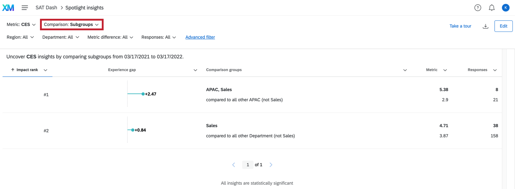
In the insight, you have the following attributes:
- Experience gap: The difference between the subgroup’s score and the comparison group’s score. The raw scores for each can be found in the Metric column.
- Comparison groups: The subgroup that is being analyzed and the group that the subgroup is being compared against. Note that the subgroup is excluded from the comparison group.
Example: For example, let’s say our customers are from three possible regions: North America, EMEA, and APAC. If my subgroup is North America, then the comparison group is EMEA and APAC. Your comparison group will indicate which demographic is excluded.
- Metric: The subgroup’s score for the selected metric. The comparison group’s score is found below this number
- Responses The number of responses in the subgroup. The number of responses in the comparison group is found below this number.
Overall Metric Comparison
The Overall Metric comparison displays which subgroups have a statistically significant score compared to your key metric data as a whole. It’s important to note that the subgroup is compared against overall data, which includes the subgroup.
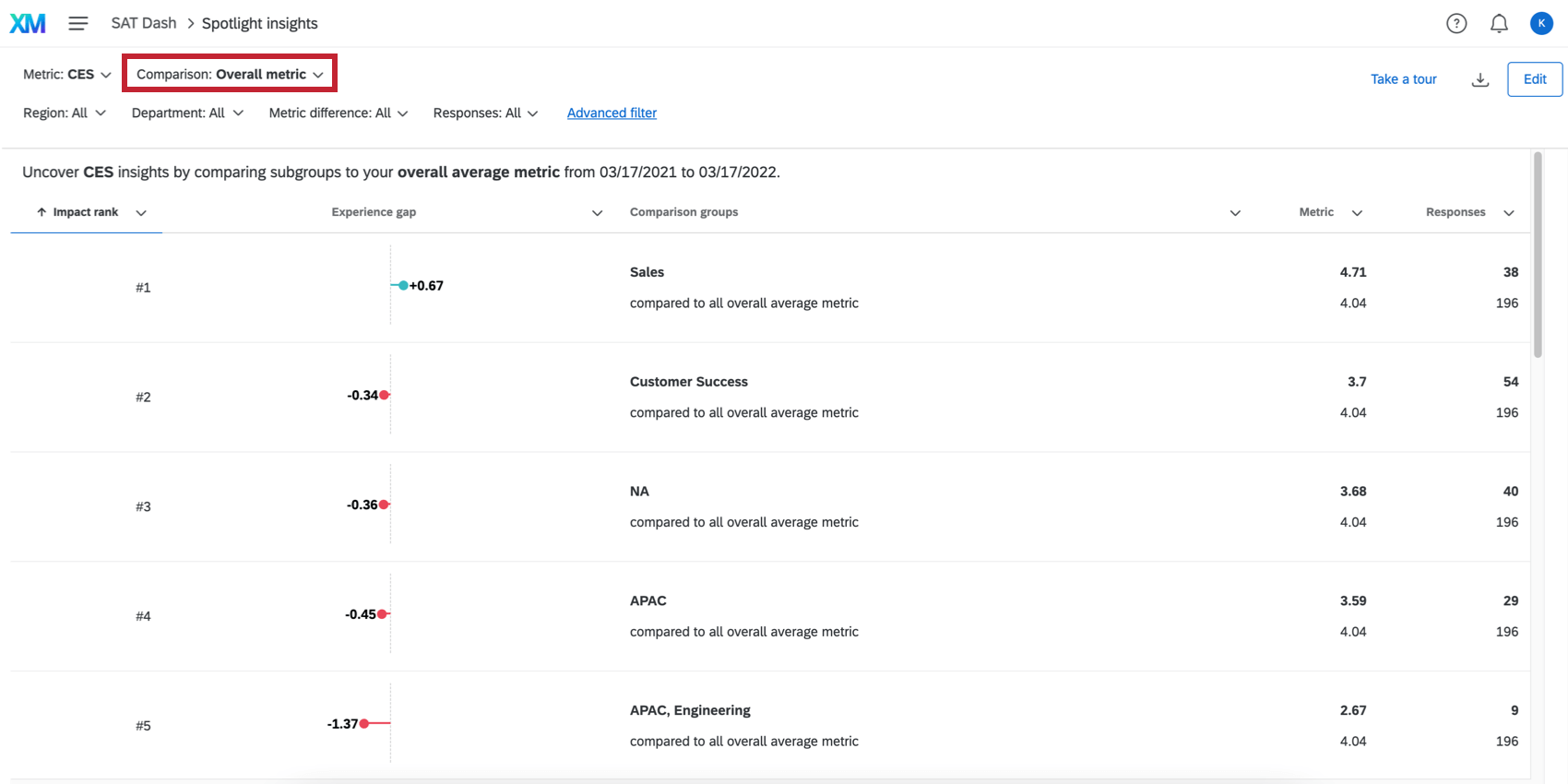
In the insight, you can find the following attributes:
- Experience gap: The difference between the subgroup’s score and the comparison group’s score. The raw scores for each can be found in the Metric column.
- Comparison groups: The subgroup that is being analyzed and the group that the subgroup is being compared against (i.e., the entire company).
Example: For example, let’s say our customers are from three possible regions: North America, EMEA, and APAC. If my subgroup is North America, then then the comparison group is North America, EMEA, and APAC (i.e., all possible regions).
- Metric: The subgroup’s score for the selected metric. The comparison group’s score is found below this number
- Responses The number of responses in the subgroup. The number of responses in the comparison group is found below this number.
Filtering Insights
This functionality is the same in CX Dashboard insights as it is in EX project dashboards.
See Filtering Insights for more information.
Sorting Insights
To sort your insights, click the header of the attribute you want to sort by. An arrow will appear next to the attribute indicating if it’s sorted in ascending or descending order.