-

Qualtrics Platform -

Customer Journey Optimizer -

XM Discover -

Qualtrics Social Connect
Pivot Table Widget (CX)
About Pivot Table Widgets
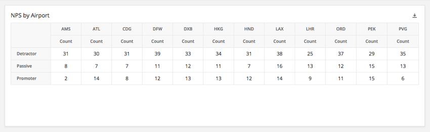
The pivot table widget allows you to create a crosstab between multiple fields. Each cell displays the chosen metric value that corresponds with both the row and column value for that cell. For example, you may wish to display the number of respondents from a given airport that fall into each of the three NPS categories.
Field Type Compatibility
The pivot table widget is compatible with the following field types:
- Number Set
- Text Set
- Multi-Answer Text Set
- Drill Down
- Generic Group
- Measure Group
Only fields with the above type will be available when selecting the rows and columns for the pivot table.
Widget Customization
For basic widget instructions and customization, visit the Building Widgets support page. Continue reading for pivot table-specific customization.
Formatting Rules
Adding formatting rules to your metric allows you to specify how values in a certain range are formatted on the pivot table – for example, bolding results or changing their color once they fit within a certain numeric range. This is useful if you would like to be able to easily differentiate cells on the table based on their value. To access formatting rules:
- Click the desired metric.
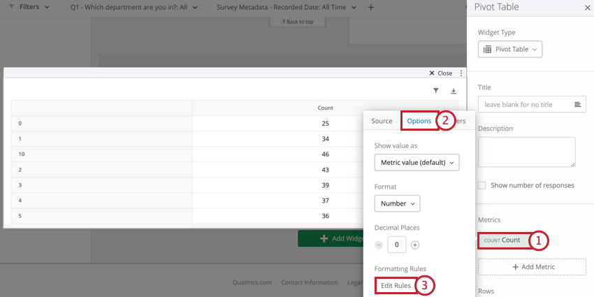
- Select the Options tab at the top of the metric window.
- Click Edit Rules under Formatting Rules.
- Click Add Rule to add a new formatting rule.
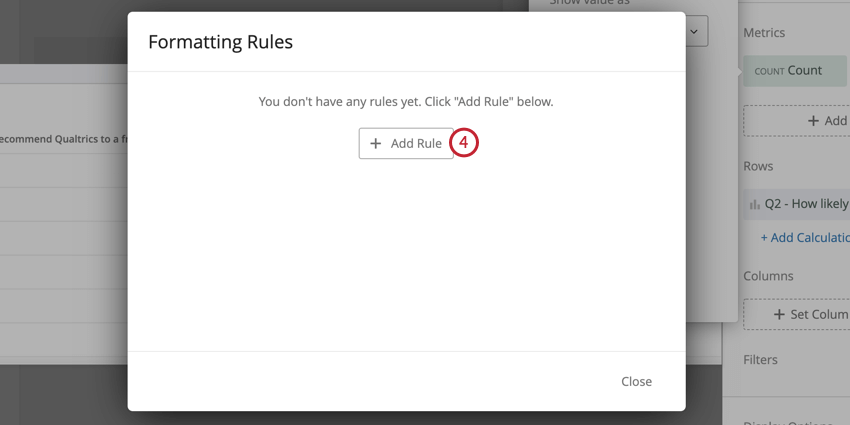
- Configure your rule. Use the A button to specify the formatting you’d like to apply. Select a condition from the dropdown and enter a numeric value in the entry box.
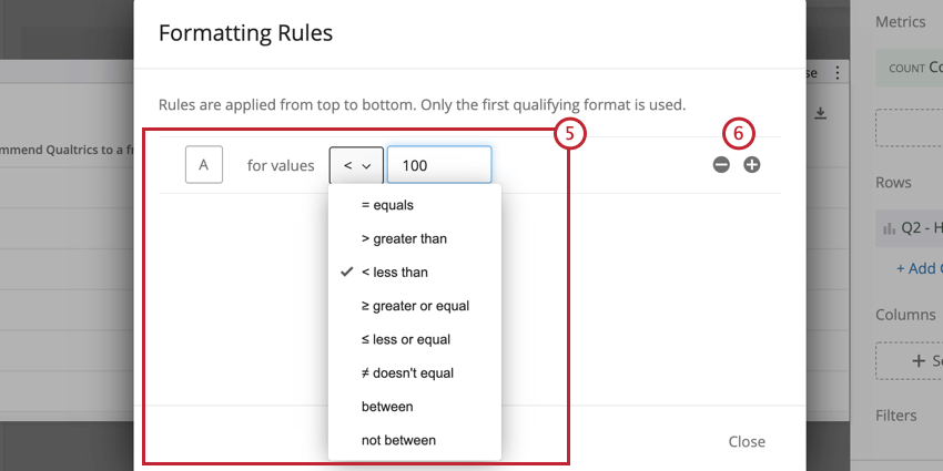
- Use the + sign to add additional formatting rules and the – sign to delete rules.
Display Options
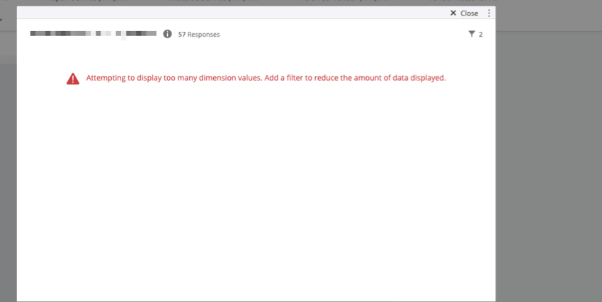
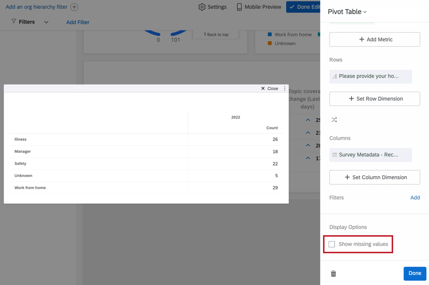
If your pivot table contains rows of data that have no corresponding values in the selected columns, you can hide these rows by leaving Show missing values unchecked. This option is useful if you want to consolidate your pivot table and omit rows with no corresponding data.
Significance Testing in Pivot Tables
You can enable significance testing in a pivot table when you use the top box/bottom box metric and a single value on the x-axis. Once you have these, follow the steps below to enable significance testing.
- Click on the Top Box/Bottom Box metric and select Options.
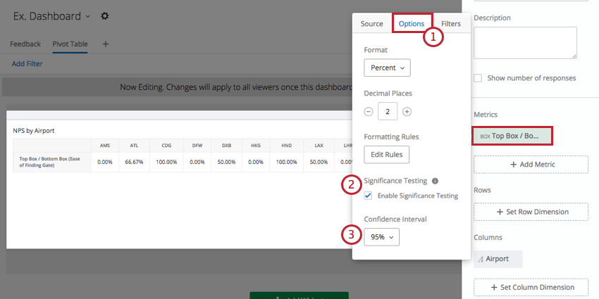
- Select the checkbox next to Enable Significance Testing.
- Click on the dropdown menu and select your Confidence Interval.
The confidence interval indicates how confident you would like to be that the results generated through the analysis match the general population.
Once you have enabled significance testing, you might notice red and green arrows in your pivot table.
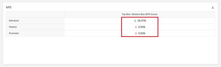
The arrows are determined by the adjusted residual of each cell. Pivot tables show up to three arrows, depending on the p-value calculated from the adjusted residual. A different number of arrows will be shown depending on the degree of significance of the result. Specifically, one arrow is shown if the p-value is less than alpha (?) where ? = (1 – Confidence Interval), two arrows if the p-value is less than ?/5, and three arrows if the p-value is less than ?/50.
For example, if your confidence level was set to 95%:
p-value <= .05: one arrow
p-value <= .01: two arrows
p-value <= .001: three arrows