-

Qualtrics Platform -

Customer Journey Optimizer -

XM Discover -

Qualtrics Social Connect
Responsive Dialog Creative
About Responsive Dialog Creatives
The responsive dialog is a creative type available for Website / App Insights projects. This creative type enables you to make accessibility compliant creatives that are responsive to different device sizes.
The responsive dialog creative provides accessibility features out of the box, without the need for additional JavaScript based updates that were required in the past.
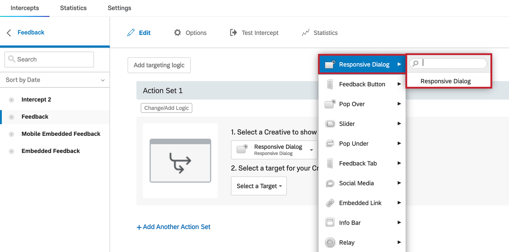
Once you have access to this feature, the Responsive dialog is available alongside other creatives.
Once you create your responsive dialog, there are six areas that you can customize before setting up your intercept: Size & Style, Message, Buttons, Logos & Images, Animation, and Translations.
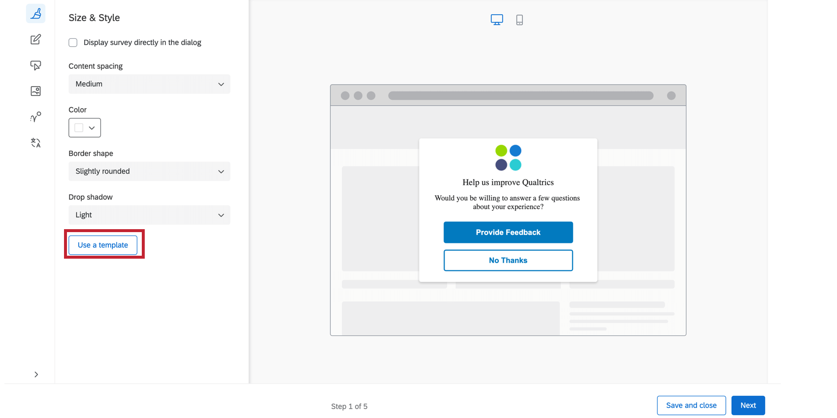
Size & Style
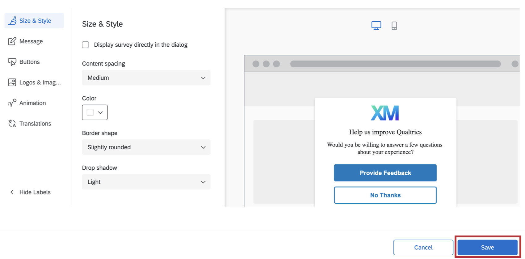
In the Size & Style section, you can customize the overall look and feel of the creative as follows:
Standard Size & Style Options
These are the options that appear if you do not use an embedded target, and leave Display survey directly in the dialog deselected.
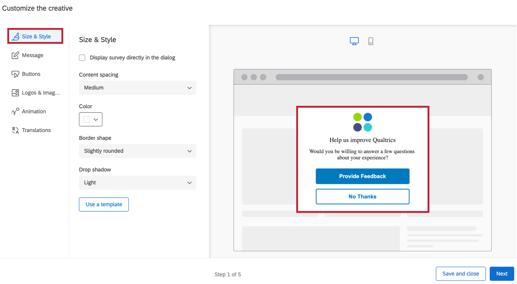
- Content spacing: Configure the density of the text on your creative. You can choose either Compact, Medium or Spacious.
- Color: Configure the background color of the creative by choosing from the color picker palette.
- Border shape: Configure the border radius of your creative. This determines how rounded the corners are. You can choose from None, Slightly Rounded, Moderately Rounded, Very Rounded.
- Drop shadow: Configure the drop shadow surrounding your creative. You can choose from None, Light, Medium, Heavy.
Display Survey Directly in Dialog
When you select Display survey directly in dialog, the survey will be embedded on the creative, instead of linked with a button. To test the full and accurate experience of the survey in the creative, use the bookmarklet. See Test Intercepts for more.
Selecting this option removes the Message and Buttons tabs because you will no longer have a message or buttons on the Responsive Dialog, aside from what is already set in your target survey. Selecting this option also means you have different Size & Style settings:
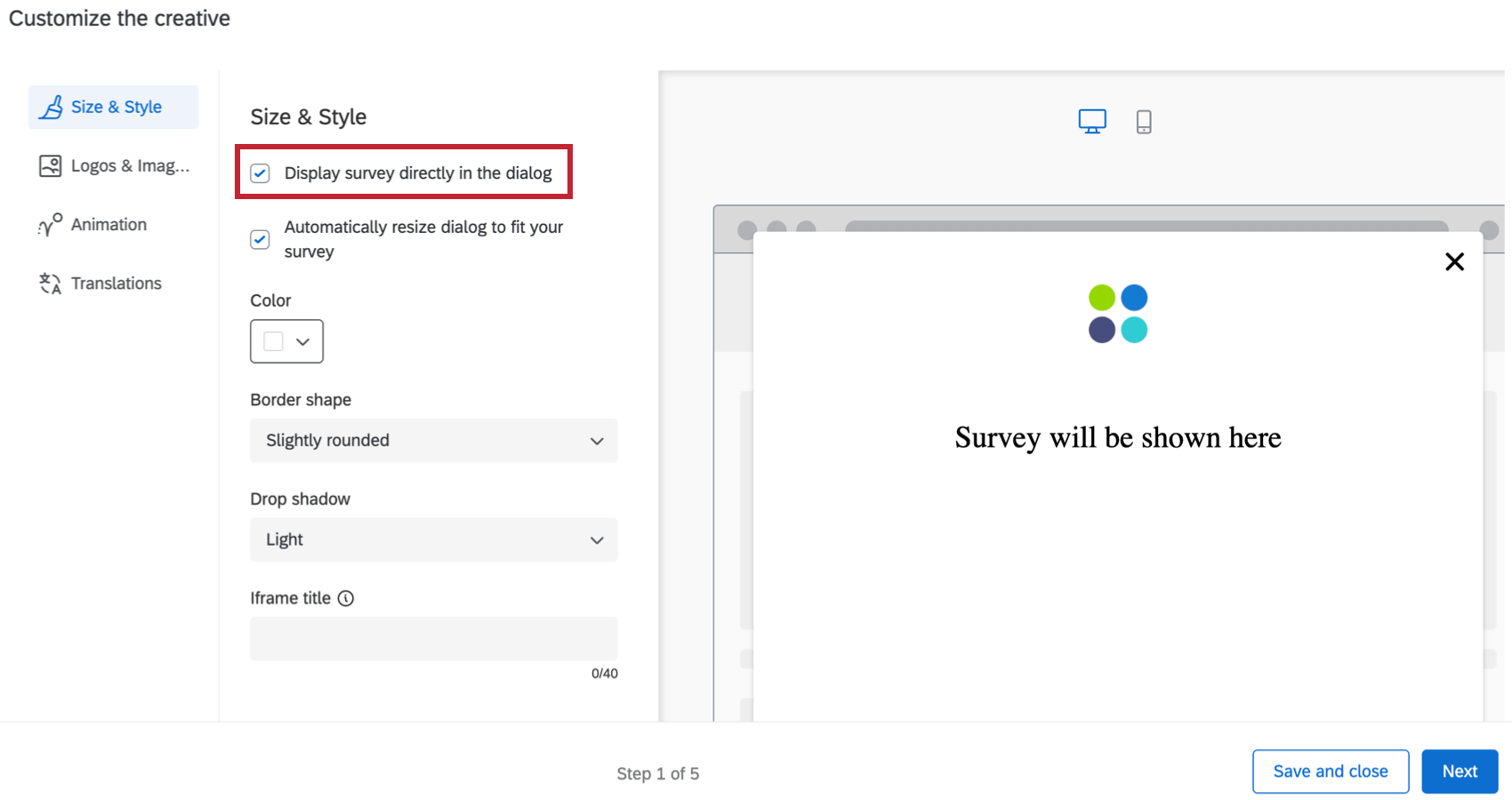
- Automatically resize dialog to fit your survey: Automatically resize the responsive dialog to fit the survey you are displaying in the dialog. The window will automatically resize according to the length of the first page of your survey.
Qtip: If you’d like to make the responsive dialog creative automatically scale to a larger size, add additional questions to your first page of the survey or add additional spacing to your survey. To make the responsive dialog smaller, move questions to other following pages, add page breaks, or decrease the spacing within your survey.
- Color: Configure the background color of the creative by choosing from the color picker palette.
- Border shape: Configure the border radius of your creative. This determines how rounded the corners are. You can choose from None, Slightly Rounded, Moderately Rounded, Very Rounded.
- Drop shadow: Configure the drop shadow surrounding your creative. You can choose from None, Light, Medium, Heavy.
- Accessibility
- Iframe title: This text will be read by a screenreader when the visitor navigates to the embedded window.
USE A TEMPLATE
If you would like to import a survey theme into the creative’s style settings, click Use a template.
Themes are created by the Brand Administrator for the use of users in their brand. Select a brand from the dropdown menu, then click Import. If you would like to add a theme to this list, reach out to your Brand Administrator for more information.
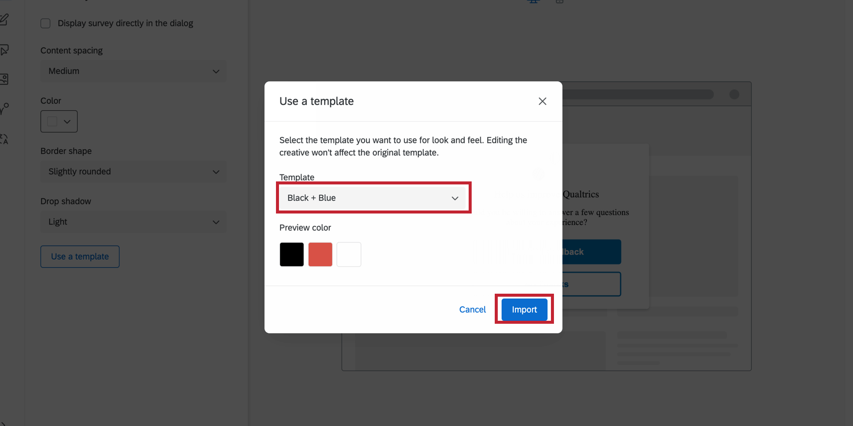
Importing a theme template will adjust the following settings for the creative:
- Primary Color
- Secondary Color
- Background Color
- Question Text Size
- Answer Text Size
- Question Spacing
- Foreground Contrast
- Logo
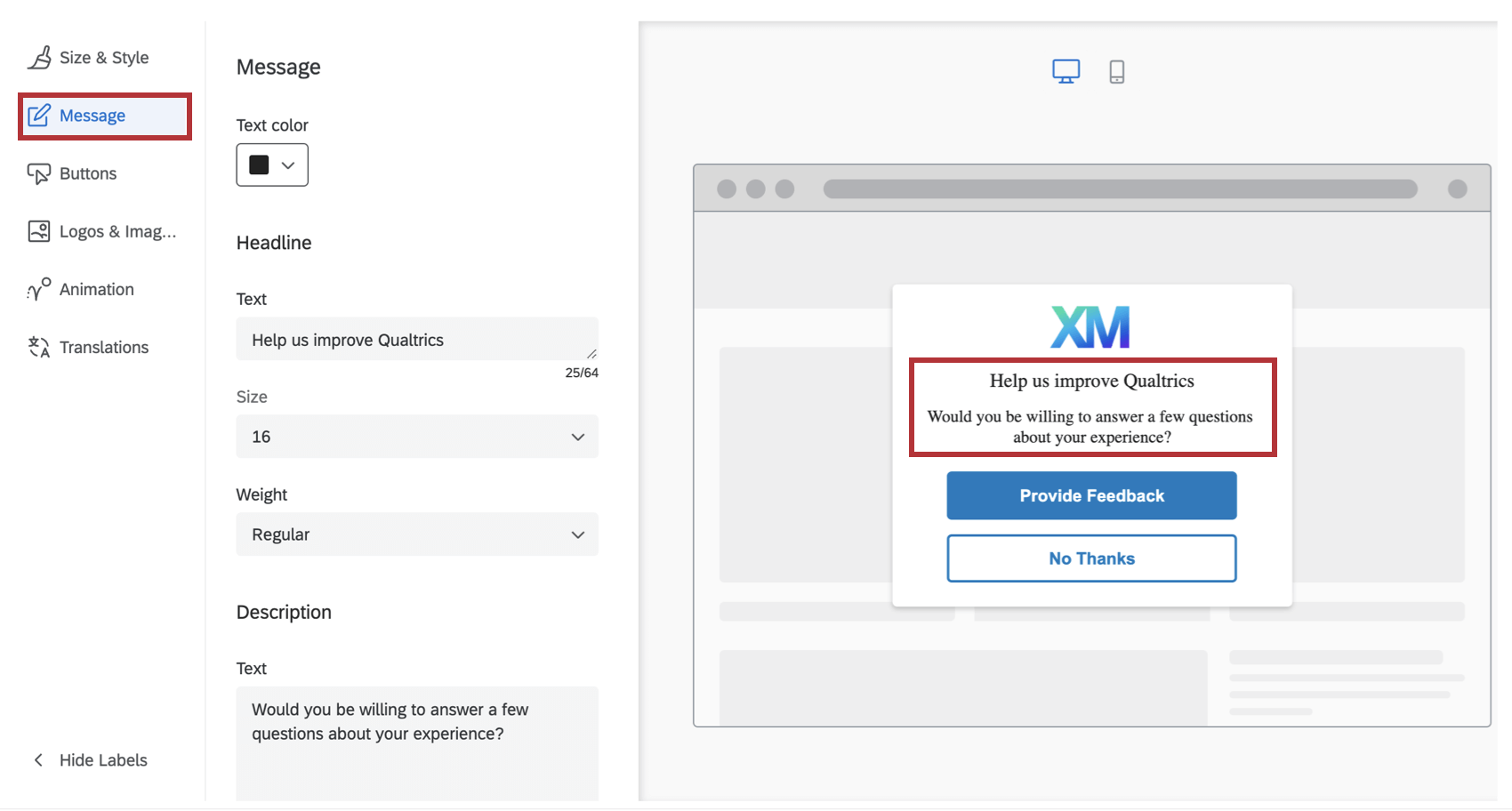
Message
In the Message section, you can the configure the Headline and Description that shows up on your creative. The headline should generally be a short phrase that captures the visitor’s attention, while the description gives more detail as to why the creative has appeared to them.
The font will be adopted from the website that displays the creative. For both the Headline and Description, you can customize the actual text, font size, and font weight.
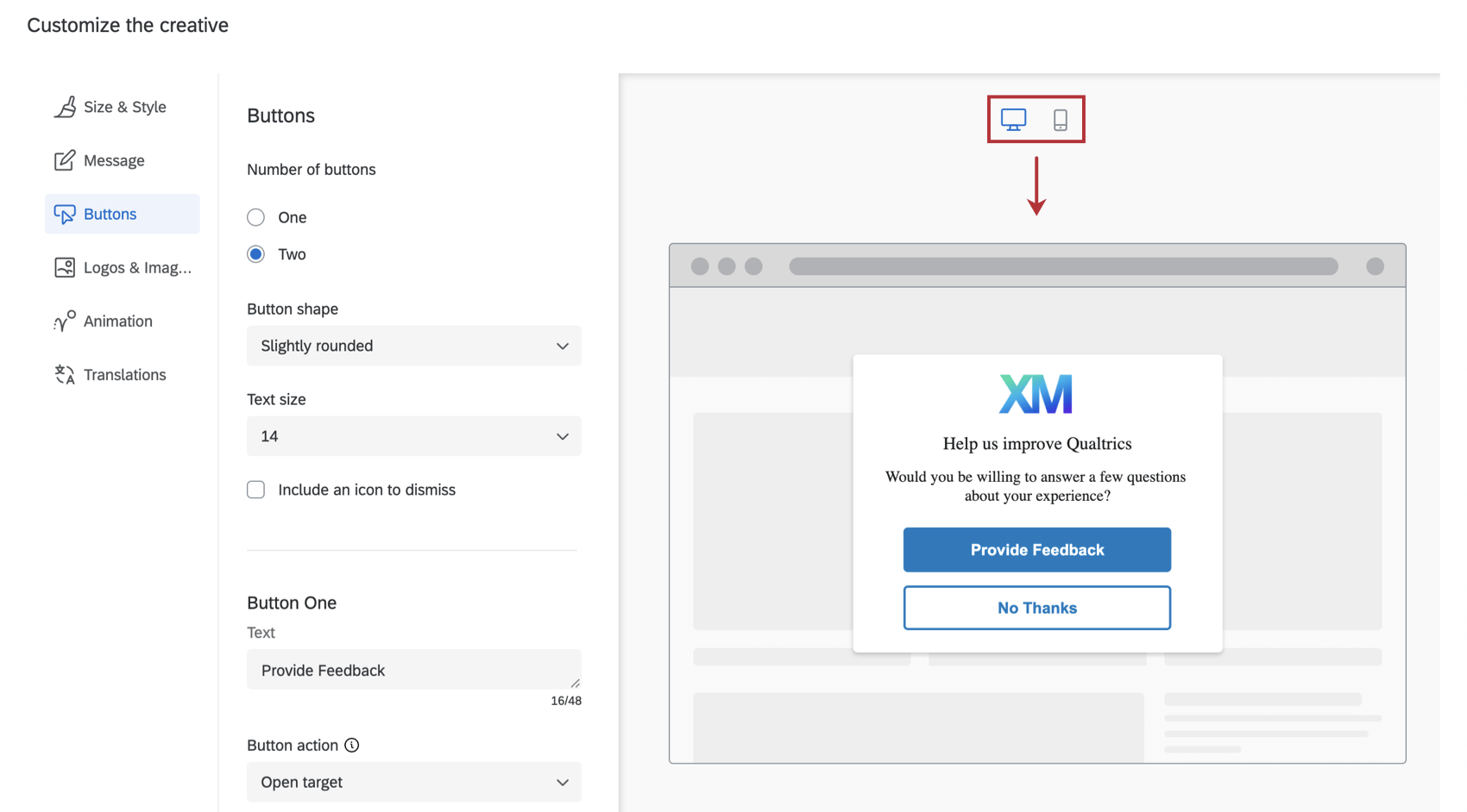
Buttons
In the Buttons section, you can configure options specific to the number, appearance, and target for each button.
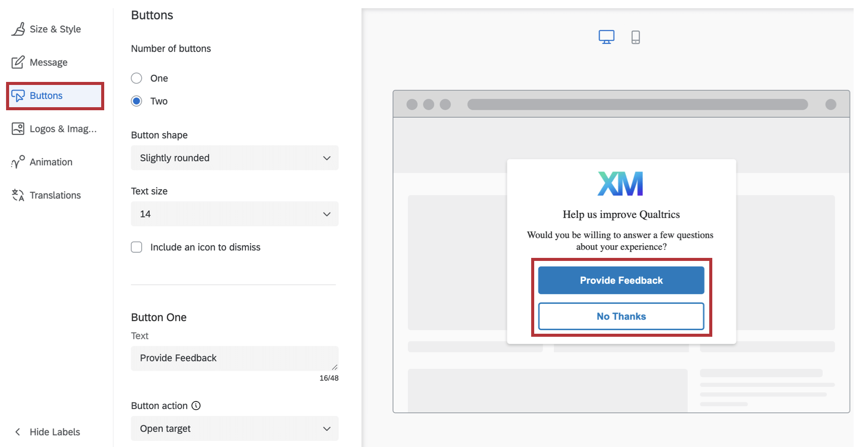
- Start by choosing the number of buttons you want on your creative.
- Specify the Button Shape for each button by choosing from None, Slightly Rounded, Moderately Rounded or Completely Rounded.
- Specify the Text Size.
- For each button:
- Specify your Text This is what the button says.
- Choose the Button Action to either Open Target or Dismiss Intercept. Open Target indicates that this button will open the target that you specify in your intercept criteria. Dismiss Intercept will simply close the intercept.
- Choose your Label Color, Background Color and Border Color using the color picker palette.
- Designate an ARIA label. By default, screen readers will read the text that you specify for the button label. However, in some cases, you may want the screen reader to read additional context, such as, “Click on this button to open up a new survey window.” In this case, you can specify the ARIA label for the button controls.
Logos & Images
In the Logos & Images section, you can specify 1 or more images/logos to include on your creative.
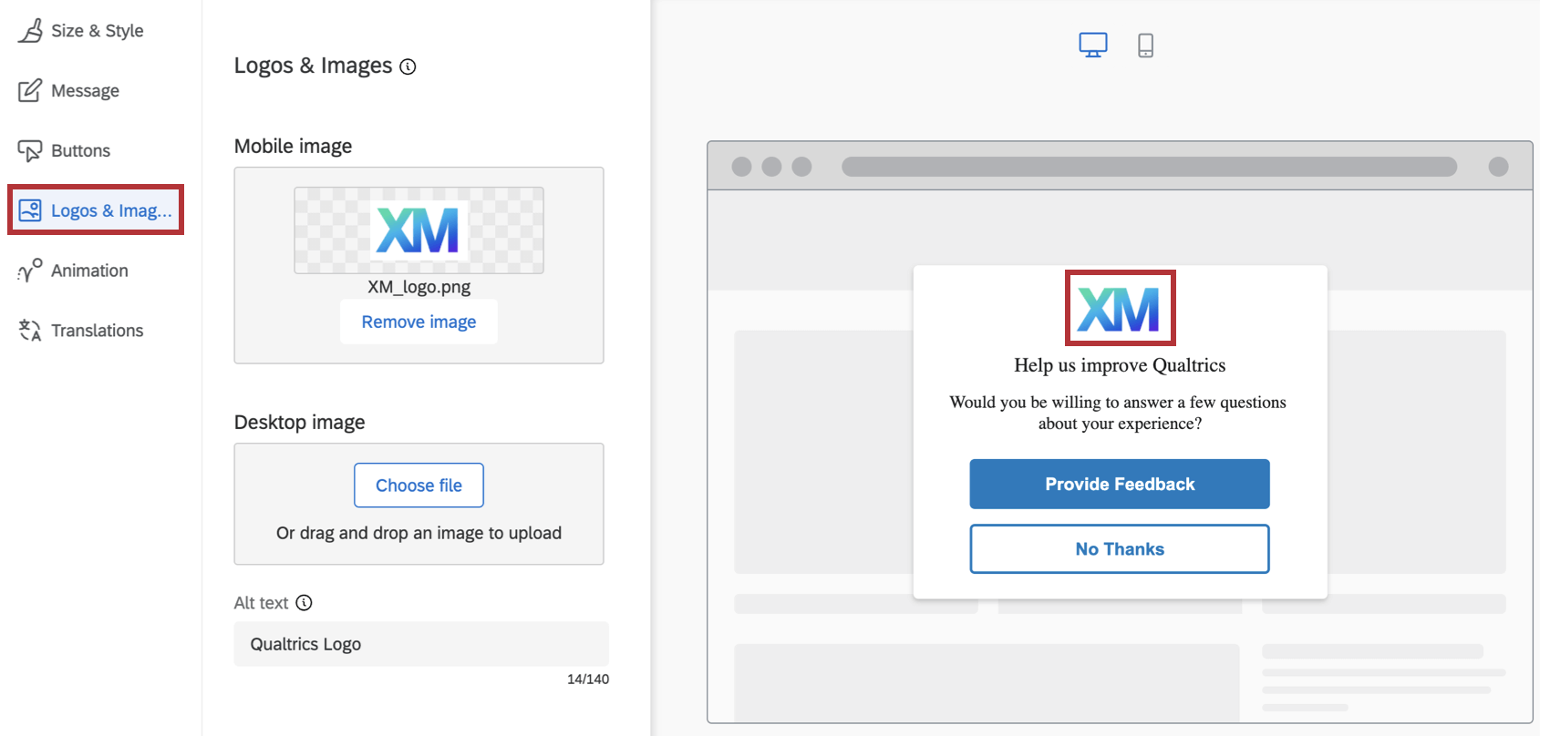
You can choose to upload a separate image for Mobile or Desktop, so that different images will be displayed depending on whether the creative is seen on a Mobile or Desktop browser. You can also upload the same image but with different resolutions to optimizing the display on either type of device browsers.
To make the image accessibility compliant, you also have the ability to specify the Alt Text to go with the images. (Alt Text is a feature that allows screen readers to describe an image to visually impaired users.)
Animation
In the Animation section you can choose the type of animation (Fade or Slide In) you want for your creative as it appears on the screen.
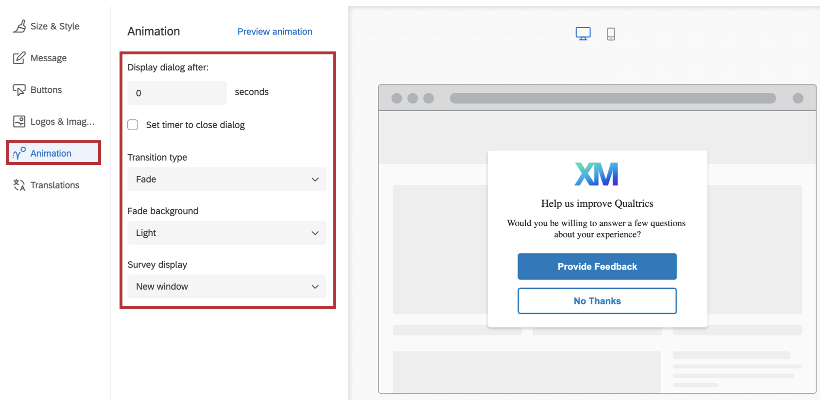
- Display dialog after: The number of seconds after the user meets the intercept conditions (e.g., clicks into the app) that this dialog appears.
- Set timer to close dialog: Determine how long after the dialog appears that it should close itself. Deselect this option to force the user to close the dialog to remove it from the screen.
- Transition Type: Choose whether the creative fades or slides onto the screen when it appears. If you choose Slide In animation, then you can also select the final position of the creative on the screen (Top Left, Top Right, Bottom Left, Bottom Right).
Qtip: Using the Slide In transition type makes this creative behave like a Slider Creative.
- Fade Background: The color of the device’s screen behind the creative (None, Light, Medium or Dark).
- Survey display: Where the survey will be displayed (New window, Embedded window, Current window, PopUnder window, or New tab).
As needed, you can preview your animation settings on this screen as well, by clicking on Preview Animation.
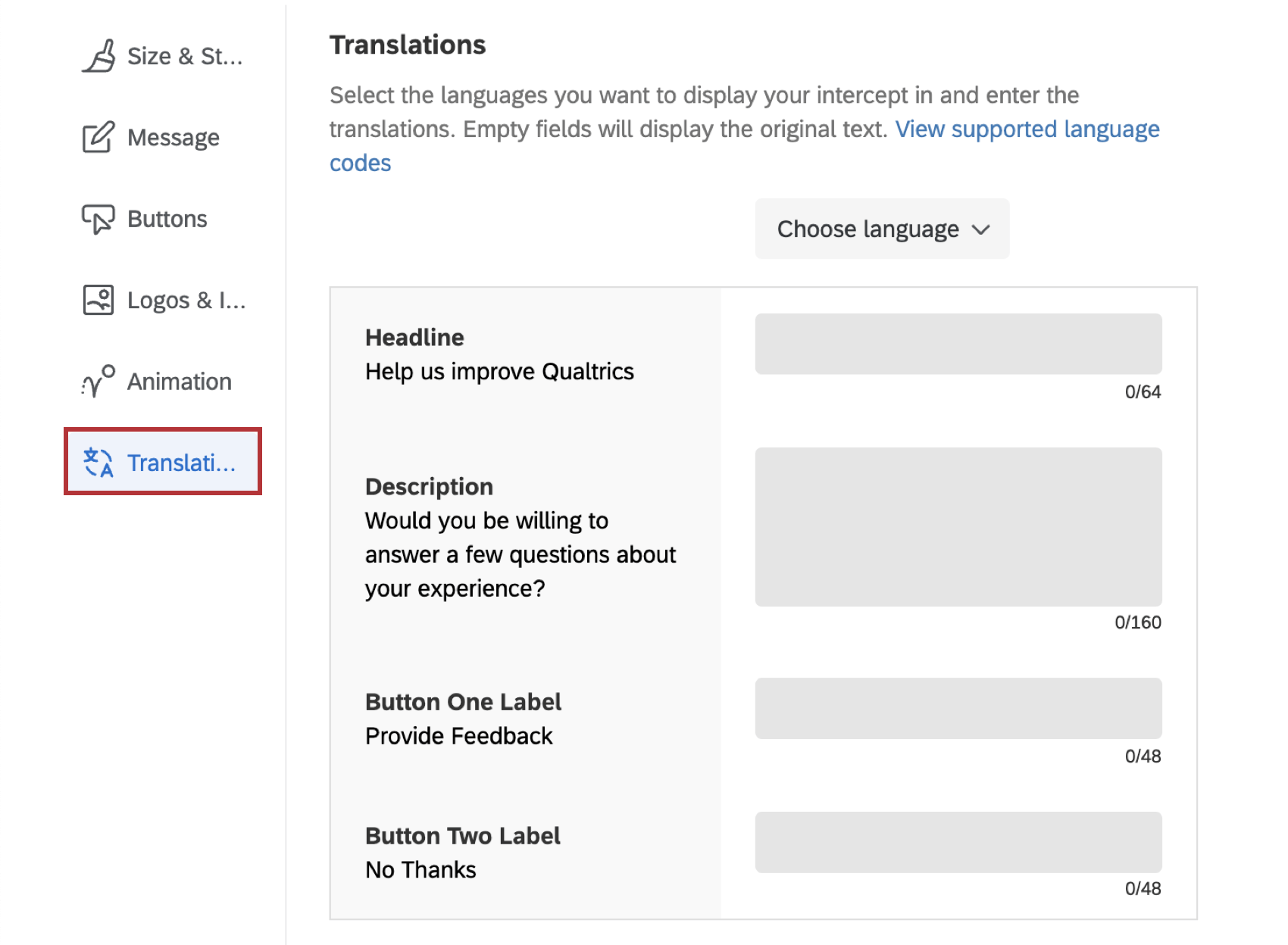
Translations
You can add translations for all the text in your responsive dialog. See the Translating Feedback Buttons & Responsive Dialogs page for step-by-step instructions.
Previewing the Responsive Dialog Creative
As you configure the responsive dialog creative, you can preview how the creative will look on different screen sizes (e.g., desktop, mobile and tablet).
Saving and Publishing the Responsive Dialog Creative
As you add changes to the responsive dialog creative, please be sure to periodically save your work by clicking on the Save button on the bottom-right hand corner, just above the preview area.
Configuring Intercepts
Responsive dialog creatives can can be used with standard intercepts. Just make sure that when you set the intercept’s Creative, you select the responsive dialog creative under the Responsive Dialog section.