
Response Rate Line Chart Widget (EX)
What's on this page
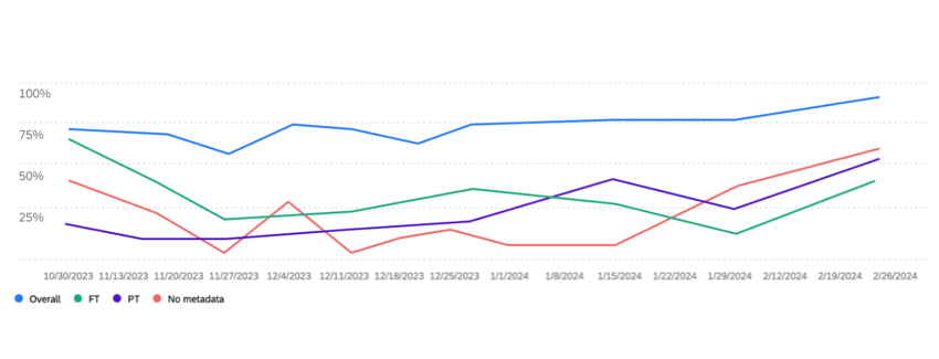
About the Response Rate Line Chart Widget
The response rate line chart widget displays the percentage of participants who responded to the pulse survey over time. You can add breakouts to this widget to see how response rates change for different employee groups, such as department, gender, location, or any other metadata you have included in your participant list.
Qtip: This widget type is only available for pulse projects. See the Widget Types and Project Compatibility table for more information.
Field Type Compatibility
Response rate line chart widgets are compatible with the following field types:
- Text Set
- Multi-Answer Text Set
Response rate line chart widgets can use participant metadata fields mapped as either a “Text Set” or “Multi-Answer Text Set.” The widget can only be filtered by metadata fields mapped as “Multi-Answer Text Set,” by org hierarchy filters, or by the “project start date” field.
Widget Customization
For basic widget instructions and customization, visit the Widgets Overview support page. Continue reading for widget-specific customization.
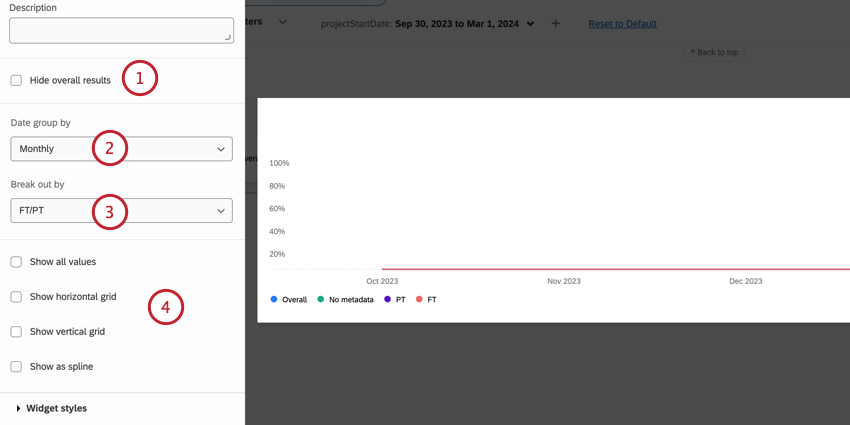
The response rate line chart widget requires a few selections before it is fully set up:
Qtip: This date is based on the pulse survey’s start date, not when the participant submitted their response.
- Show all values: Displays the exact value of each data point directly on the widget.
- Show horizontal grid: Add horizontal grid lines.
- Show vertical grid: Add vertical grid lines.
- Show as spline: Use curved lines instead of straight ones.
That's great! Thank you for your feedback!
Thank you for your feedback!