
Comparison Widget (EX)
What's on this page
About Comparison Widgets
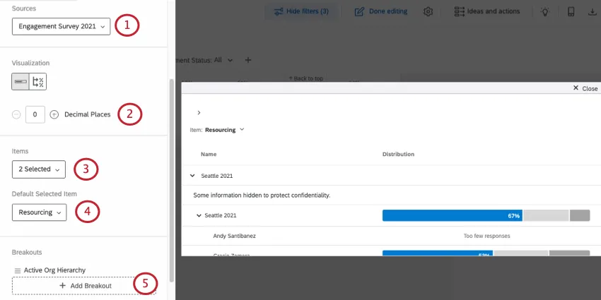
The Comparison widget allows users to compare across demographic or hierarchy fields. With this widget, users determine questions or categories to be broken out by a hierarchy or participant metadata. Dashboard viewers are then allowed to switch between selected questions and categories. This is useful if you want to compare units of the company on their engagement scores, or if you want to see a breakout of the ratings given by different units of the company.
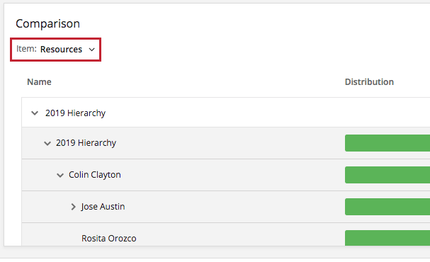
Rather than being based off of average or overall score, the Distribution column of a Comparison widget is calculated based off of the Scale settings. Each color of the scale indicates a different level of favorability, with the percentage on the far left in green indicating the percentage of participants who gave the item a high favorability rating.
Qtip: Unsure which Employee Experience projects have this widget? See our Widget Types and Project Compatibility table.
Attention: The hierarchy options are only available in Engagement projects, because those are the only projects compatible with hierarchies.
Attention: The Comparison widget has nothing to do with the comparisons that can be added to other widgets.
Field Type Compatibility
The Comparison widget has two different fields you can fill out, and each is compatible with different field types.
Items can be either categories, or questions saved as Number Set.
Break out by can be questions or metadata saved asText Set, Multi-Answer Text Set, or Number Set.
Widget Customization
For basic widget instructions and customization, visit the Widgets Overview support page. Continue reading for widget-specific customization.
The Comparison widget provides you with a number of unique customization options:
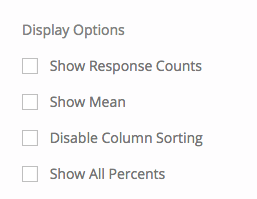
Display Options
- Show Response Counts: Show the number of responses for each level of the breakout.
- Show Mean: Show the mean rating provided for each level of the breakout.
- Disable Column Sorting: Disable the ability for dashboard viewers to click column headers and sort the widget data in a different order.
- Show All Percents: When selected, this option allows you to not just show the percentage of the positively engaged group, but the neutral and negative groups.
Percentiles
The comparison widget also has a mode where it can display percentiles. Percentiles are a means of displaying performance by comparing a score against 100 ranks, with 100 being the highest possible rank.

In order to use the percentile version of a comparison widget, you need to create a custom percentile benchmark where scores are presented as averages. Other types of percentile benchmarks are not compatible with the widget.
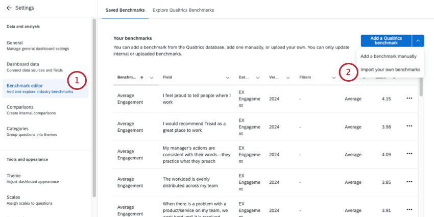
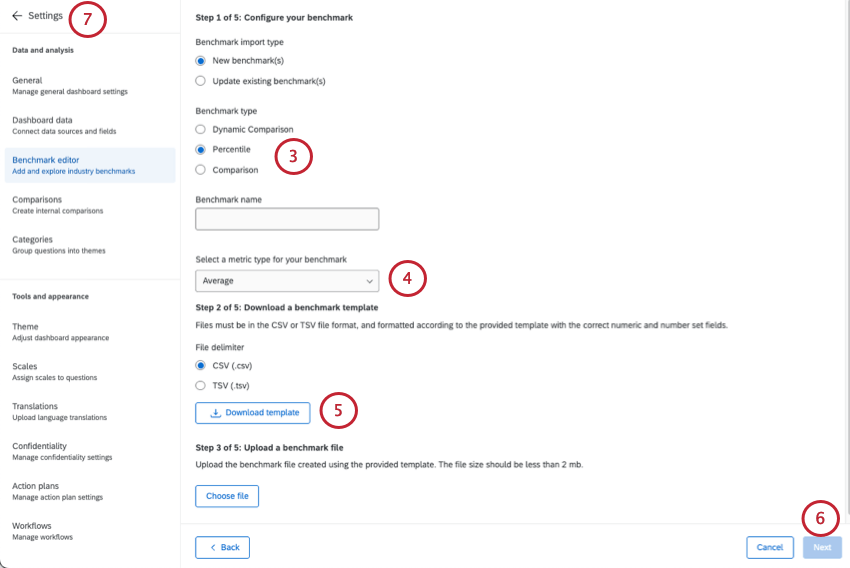
Qtip: Remember: you don’t need to create a benchmark for every question, and thus can delete entire columns. However, once you decide to make a benchmark for a question, you must include an average score every percentile, from 1-100, filling out every row.
Qtip: For more on uploading benchmarks, see Benchmark Editor (EX).
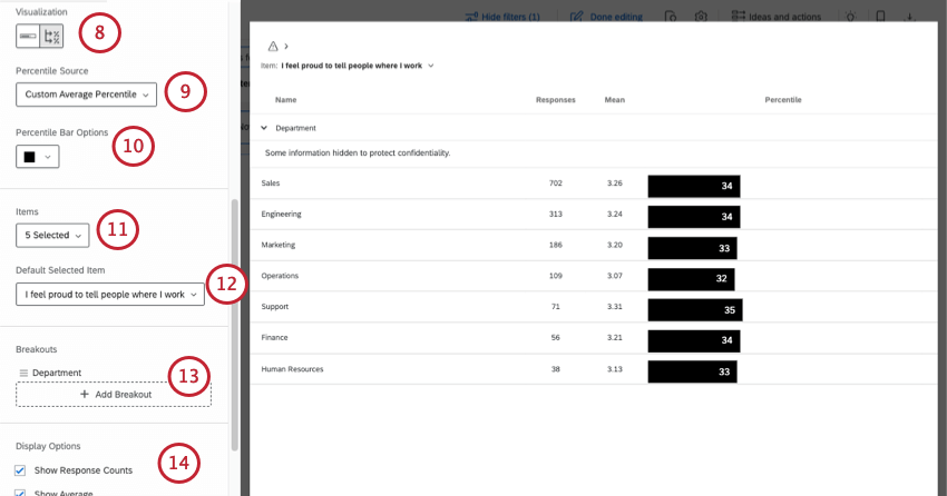
Qtip: Select the same questions you created benchmarks for.
Attention: Although they appear in the list, this widget is not compatible with categories, even if all items within have percentiles defined. This is due to the fact percentiles can vary between items in the category.
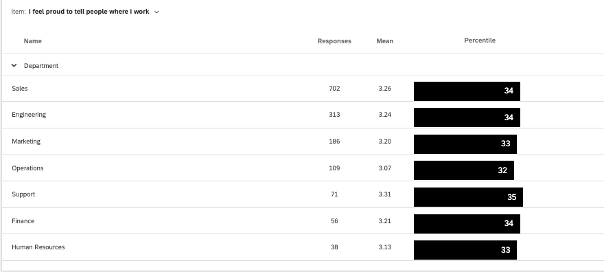
Example: In these screenshots, we’ve broken out performance by department. Once the widget is complete, we’ll see the percentile each department’s average score falls into.
FAQs
Why is there only one source listed on my widget in my EX dashboard?
Why is there only one source listed on my widget in my EX dashboard?
How is Distribution calculated on my Question List / Comparison / Engagement Summary widget in my EX dashboard?
How is Distribution calculated on my Question List / Comparison / Engagement Summary widget in my EX dashboard?
Once you've decided which parts of each scale indicate high favorability, neutrality, and low favorability, the widget calculates the percentage of respondents who indicated each.
That's great! Thank you for your feedback!
Thank you for your feedback!