
Comparisons (EX)
What's on this page
Qtip: This page describes functionality available to Engagement, Lifecycle, Pulse, and Ad Hoc Employee Research projects. For more details on each, see Types of Employee Experience Projects.
About Comparisons
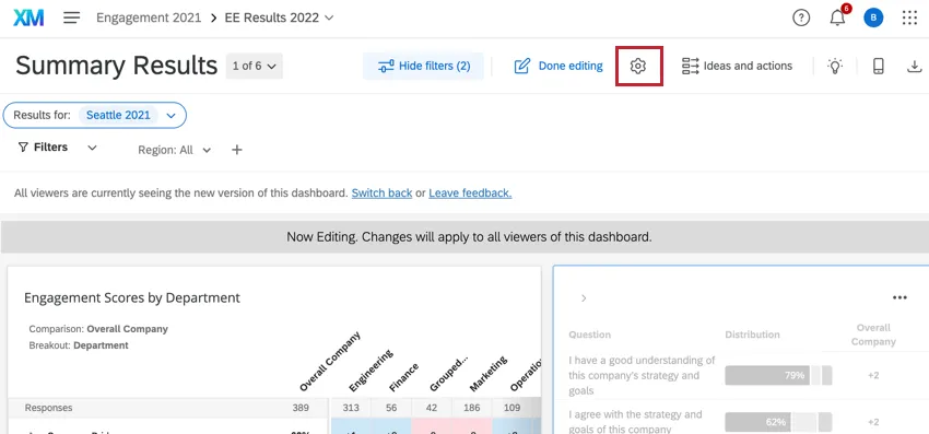
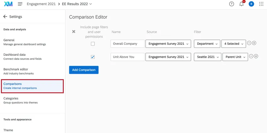
Have you ever wanted to include comparisons in your dashboard? For example, maybe you’d like to show the difference in scores from last year’s engagement survey to this year’s, or maybe you want to compare every department to the company baseline. You can set up the basis for these comparisons by going to the Settings and selecting the Comparisons section on the left.
Metadata Filters
You have the option to set filters when defining your comparisons. You can filter any Multi-Answer Text Set fields mapped into your project.
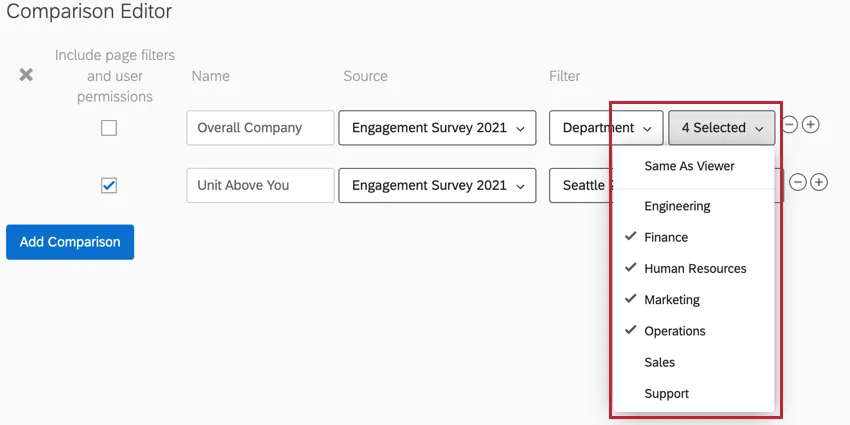
You can filter by Multi-Answer Text Sets. You can choose an exact value (e.g., Australia, Mexico, USA) or determine that the value should be “same as viewer.”
The “same as viewer” option means the value will match with the metadata value of the dashboard viewer on the selected source. So if someone from the US office looks at the dashboard, they’ll only see US data; an employee from Australia will only see the Australian office’s data.
Qtip: When using the “same as viewer” filter, you must select a specific source from the Source dropdown. This filter is not compatible when “All” is selected.
Attention: Metadata fields used in comparison filters must be mapped in the selected source, otherwise you may experience issues with your widget.
Org Hierarchy Filters
You have the option to set org hierarchy filters when defining your comparisons.
Once you’ve selected a hierarchy, you will be able to choose between Current Unit, Parent Unit, or Grandparent Unit.
Qtip: When filtering a comparison by an org hierarchy, note that if you are referencing a separate data source, you should consider how the hierarchies are mapped and what org hierarchy permissions are in place. For example, if you see no data for an org hierarchy comparison on a historical source, double-check that the unit is mapped correctly across sources and that the user has permission to view the unit based on those mappings.
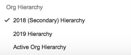
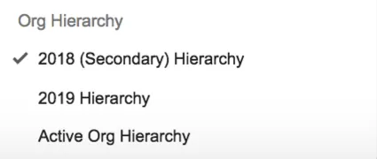
Active Org Hierarchy
If you’re not interested in isolating the comparison data to one hierarchy, you can select Active Org Hierarchy. This filters the comparison by whichever hierarchy filter the dashboard user looking at the data has selected.
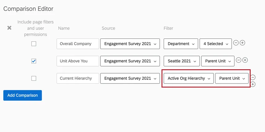
In Active Org Hierarchies, comparisons will be based on the hierarchy unit selected in the Org Hierarchy filter.
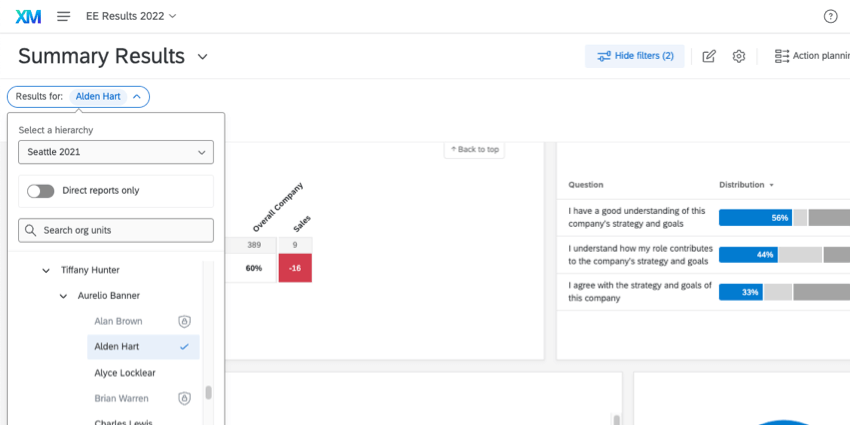
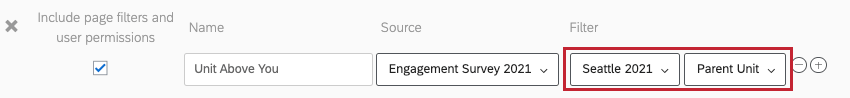
- Current Unit: Selecting “Current Unit” will show dashboard users the data of the exact unit they click. Example: In the image above, Alden Hart’s unit is selected.

- Parent Unit: This is the unit above the selected unit. Parent unit is useful if some of your company’s units are very small – the chance of anonymity decreases the fewer results that appear on the dashboard. Parent unit is also a useful option if you want a larger unit of people to work towards a common goal – for example, you’re not worried about engagement for just Web Design or the Email Marketing teams, but the whole of Digital Marketing. Example: In the image above, if Alden Hart is selected, then we’d see data for Aurelio Banner, since his unit is just above Alden’s.
- Grandparent Unit: This is the unit 2 units above the dashboard user (i.e. the unit above the parent unit). Grandparent unit is useful if some of your company’s units are very small or if you want larger groups of employees working towards a common goal. For example, using grandparent unit will show engagement across all of your Marketing teams. Example: In the image above, if Alden Hart is selected, then we’d see data for Tiffany Hunter, since she is 2 units above Alden.
Selecting a Specific Org Hierarchy
Any hierarchies you’ve added to your project will be listed as options. You can select a specific hierarchy if this basis of comparison is only supposed to be defined for one hierarchy and no other. For example, if you want to compare 2019’s hierarchy to all other years, you’ll want to set the filter to the 2019 hierarchy’s data, only.
Qtip: If you’re comparing different hierarchies, don’t forget to map the hierarchies so the dashboard knows what units to compare.

Example: Let’s say Barnaby belongs to the Web Design team of the Digital Marketing Department. The current unit would be Web Design.
Example: To use the same example, Barnaby’s parent unit would be all of Digital Marketing.
Example: Using the above example, Barnaby’s grandparent unit would be all of Marketing.
Creating & Managing Comparisons
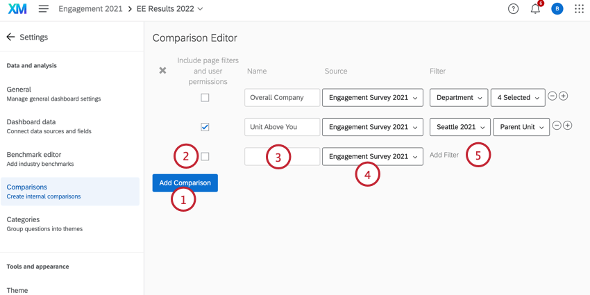
Qtip: If you have a dashboard filter applied on the same field as a comparison filter, the dashboard filter on that field is ignored. Only page filters that are not on the same field as a comparison filter are applied, even when “Include Page Filters” is checked.
Qtip: Another project cannot be added as a source until you have mapped it to the dashboard’s primary survey. For more information on this, see our Dashboard Data page.
Qtip: If a source is unmapped in the data mapper comparisons which use that source will need to be reconfigured.
Qtip: Click the gray X to the far left of a comparison to remove it.
Widget Compatibility
The following widgets can display comparison data:
- Heat Map Widget
- Demographic Breakout Widget
- Question List Widget
- Scorecard Widget
- Bubble Chart Widget
- Engagement Summary Widget
- Focus Areas Widget
- Engagement Headlines Widget
Comparison data is displayed as the difference between the primary source and the comparison. It often appears in a delta format, with a plus (+) or minus (–) and color coding to indicate in which direction this difference is, or in base value format, where the exact value of the comparison is displayed. The widgets will only show color if deltas are used.
Attention: The delta for comparisons is calculated using the data raw values. Because of this, you may see values that look like they do not completely match due to your widget’s rounding settings. For example, let’s say your widget is set to round numbers to the nearest whole number. If field A has a score of 38.5 and field B has a score of 35.4, then they will display as 39 and 35 respectively in your widget. However, the comparison between them will be displayed as 3 since 38.5-35.4=3.1 which rounds to 3.
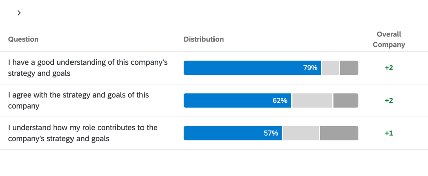
In the image below, the data displayed in the Distribution column shows the score for different questions for a specific department which is determined by a dashboard page filter. The Overall Company column displays the score for the department relative to the company’s overall score. In this example, the department scored higher than the company average for these questions.

Qtip: The comparison widget is unrelated to the comparisons you create in the dashboard settings.
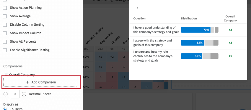
Adding Comparisons to Widgets
FAQs
I have some comparisons displayed on my EX dashboard, but they aren’t matching the historical data like I would expect. How do I fix this?
I have some comparisons displayed on my EX dashboard, but they aren’t matching the historical data like I would expect. How do I fix this?
Next, check to make sure the comparison is correctly set up in the Settings tab of your new dashboard. Check the Comparisons section to confirm that the source of the survey is your historical project. If you have a filter in place on your comparison, be sure to check that as well.
Lastly, if you are comparing org hierarchies, make sure that your hierarchies are mapped. If they haven't been mapped, map your hierarchies. Then, Update All Responses With Current Metadata in both the historical and current project after mapping the hierarchies.
I have a comparison set on my EX dashboard that shows the overall organization results, but it appears to be different from when I’m at the top of my hierarchy. How is this happening?
I have a comparison set on my EX dashboard that shows the overall organization results, but it appears to be different from when I’m at the top of my hierarchy. How is this happening?
What should I do if a filter in my comparison is invalid?
What should I do if a filter in my comparison is invalid?
That's great! Thank you for your feedback!
Thank you for your feedback!