
Using Outliers (Studio)
What's on this page
About Using Outliers
Outliers are root cause exploration tools that quickly identify which words are unique or unusual about any given data point.
How Outliers Work
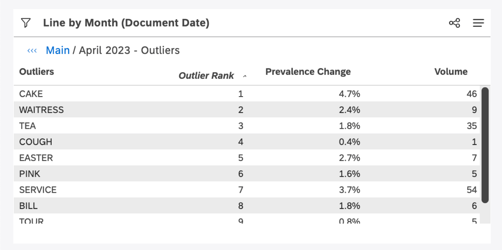
Outliers compare the prevalence of a word, associated word, or hashtag within a selected data point to the prevalence in the widget as a whole, and then rank these words by the biggest disparities. Words that are much rarer or much more popular than expected are ranked the highest.
Outliers show you words, associated words, and hashtags that meet one of the following criteria:
- They occur unusually often for the selected data point, as opposed to the rest of the dataset.
- They occur unusually infrequently for the selected data point, as opposed to the rest of the dataset. Qtip: In other words, outliers may actually have very low individual volumes, because those terms have unusually low volumes for the data point compared to other data points.

Outliers provide an alternative to finding the “top 10 words” for any data point in Studio, which can be useful on its own. However, the “top 10 words” are often the top 10 values for all data points, and do not necessarily differentiate what’s happening behind a particular data point you’re interested in.
Prevalence Change Metric
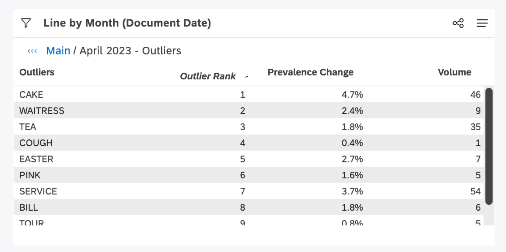
Prevalence change indicates how much more or less common an outlier is to the item you drilled on, compared to the widget’s data as a whole.
When you drill to an outlier, XM Discover evaluates interactions for the drilled item (we refer to this as the “foreground”) and compares those to the widget’s interactions as a whole (we refer to this as the “background”). It then presents the values that have the highest disparity in prevalence—that is, the values that are most unusual in prevalence rate. The Prevalence Change metric shows you exactly what that disparity is to give you a better sense of just how extreme and outlier may be.
Prevalence Change is calculated using the following formula:
Prevalence Change = percent prevalence foreground – percent prevalence background
Note that this may be a negative value if a word is unusually uncommon in the drilled group compared to the background.
Example: We drill on New York City in a widget showing data for North America. A top outlier may be the word “broadway,” because in North America this word is relatively uncommon, perhaps with a prevalence of 0.5% of interactions mentioning “broadway.” However, in New York City’s interactions, this term occurs 11% of the time. In this case, Prevalence Change would be 10.5% (11% – 0.5%).
When to Use Outliers
Here’s when using outliers can be beneficial:
- Investigating unusual data points (like a spike or dip on a trend graph, a huge area on a pie or heatmap, or a concerning color on a word cloud) to uncover what’s driving them.
- Using drivers. Drivers do not return words, associated words, or hashtags as indicators of an outcome. With outliers, you select a data point and derive correlations.
- Hunting for trending terms to discover potential new topics.
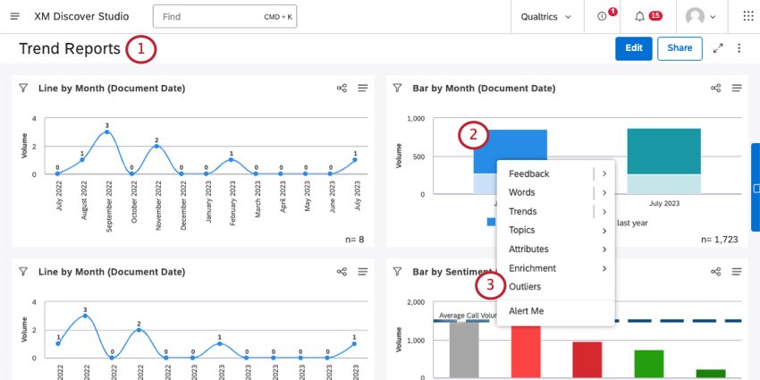
How to View Outliers
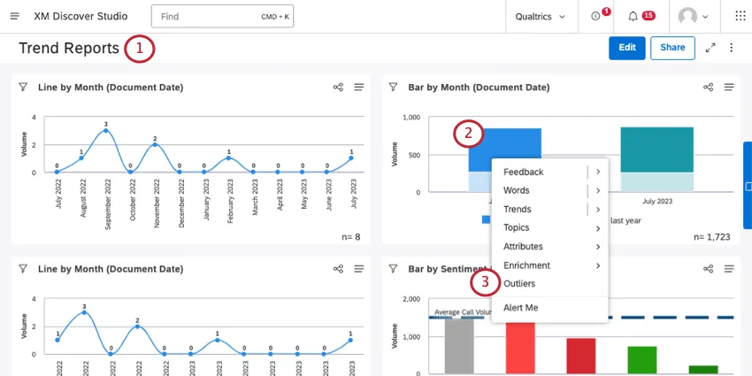
Qtip: Outliers are only available in View mode.
A table will be generated that shows words, associated words, and hashtags associated with the data point. These are all sorted by rank, with the highest disparity in prevalence at the top.
That's great! Thank you for your feedback!
Thank you for your feedback!