
Stack Size (Studio)
What's on this page
About Stack Size
This page describes how we determine the size of each segment in a stacked widget.
Qtip: Stacking can only be used in line and in bar widgets.
How Stacking Works
When stacking items, we determine their combined size based on the parent calculation value (the “Group By” option), and then break that calculation down based on the returned segments’ proportions to each other. This means that the combined volume of individual segments will not always correspond to the total volume of the stack. Let’s demonstrate this with an example.
The stacked bar widget below is configured to return top 3 topics per city.
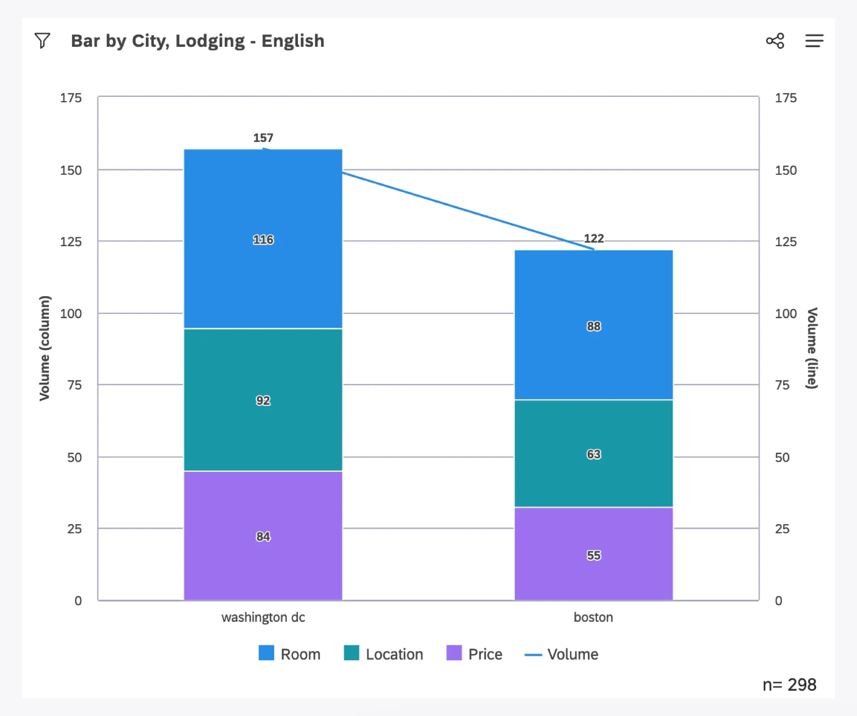
- Columns represent cities (Washington, D.C., Boston) and stacked segments represent topics in the Lodging model (Room, Location, Price).
- The overall height of a column is determined by the total volume of records for a city. Boton has a volume of 122.
- In Boston, the Room topic was mentioned in 88 records, Location in 63, and Price in 55. Their stacked segments are shown proportionally to each other within the overall height of Boston.
Understanding Why Numbers Don’t Seem to Add Up
If you look at the overall volume for each topic within Boston vs. the total volume given for Boston, you may notice a discrepancy: 88 + 63 + 55 = 206. But the total given for Boston records is 122. We deliberately show the stacked segments proportional to each other within the overall height of Boston. There are a few reasons we display stacked bar charts this way:
- Natural Language Processing (NLP)-based segments are not mutually exclusive. One record may mention multiple topics, which means a single record can be counted toward multiple topics. Consequently, there may be more topics mentioned than there are records. The result is that the sum of topic volumes may exceed the overall record count for Boston. Because showing the overall height of a column by the sum of individual topic volumescan over-represent the parent’s volume, we use Boston’s true volume.
- Only the top 3 topics are being displayed in this example, as opposed to all possible topics, which means the topics may not add up. This is particularly noticeable in a case where there are 1 or fewer topics mentioned in any document. This scenario happens frequently as a side effect of stacking by non-NLP groupings, such as attributes or satisfaction metric bands. However, for large quantities of documents there may be dozens, if not hundreds, of topics mentioned, and attempting to stack the full extent of topics may cause the most relevant topics to be drowned out. Thus, to adjust for the subset of topics, we show the displayed groups proportionally to each other.
Qtip: If you need the sum of the topic volumes to match the parent group’s volume, especially when displayed as percentages, best practice is to display all of the topics or values in your grouping settings.
Stacking on a Secondary Axis
By selecting Stacked in the Secondary Axis configuration, the bubbles will be stacked the same way as on the Primary Axis.
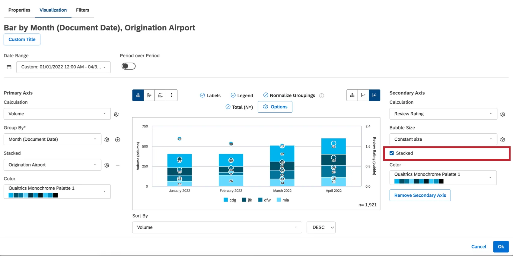
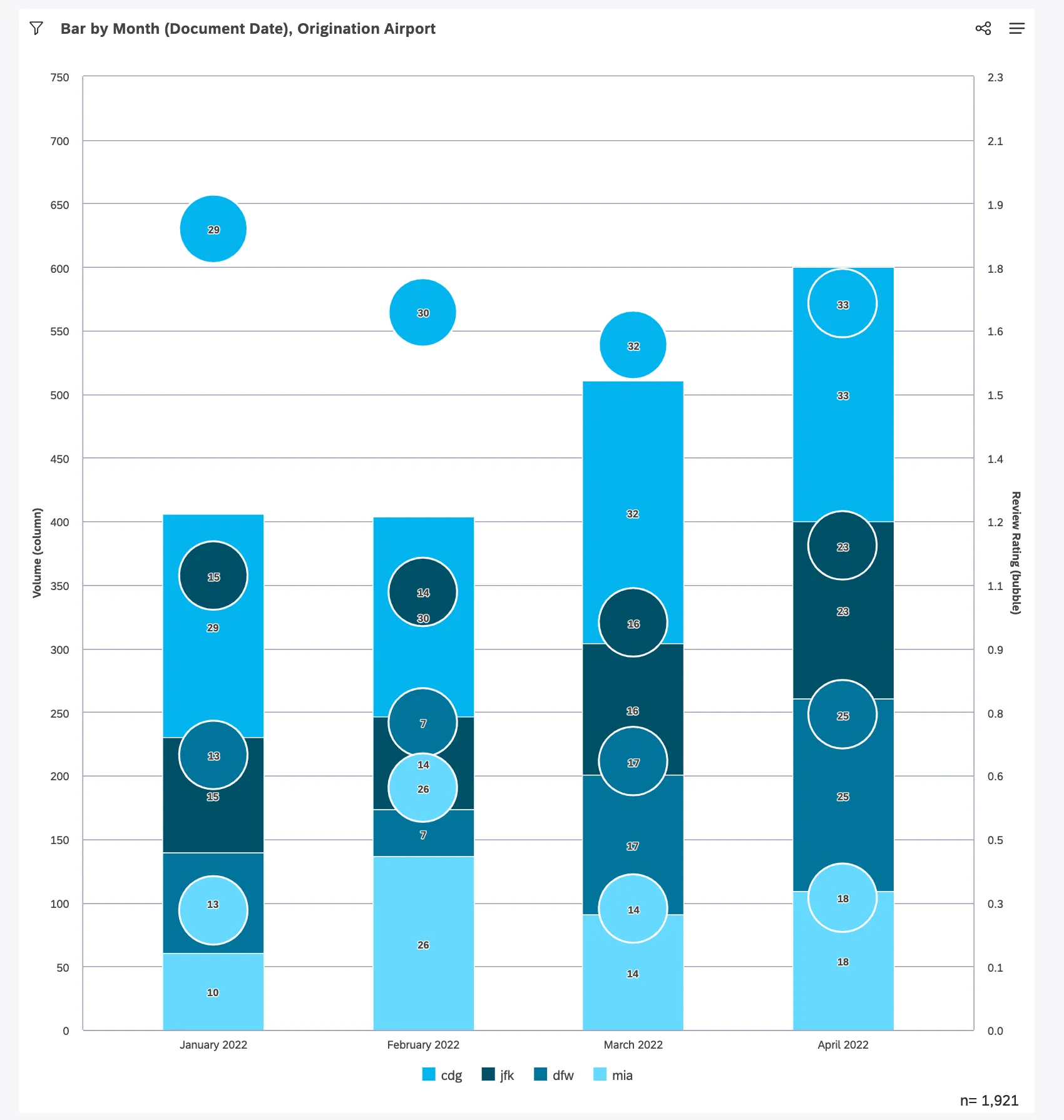
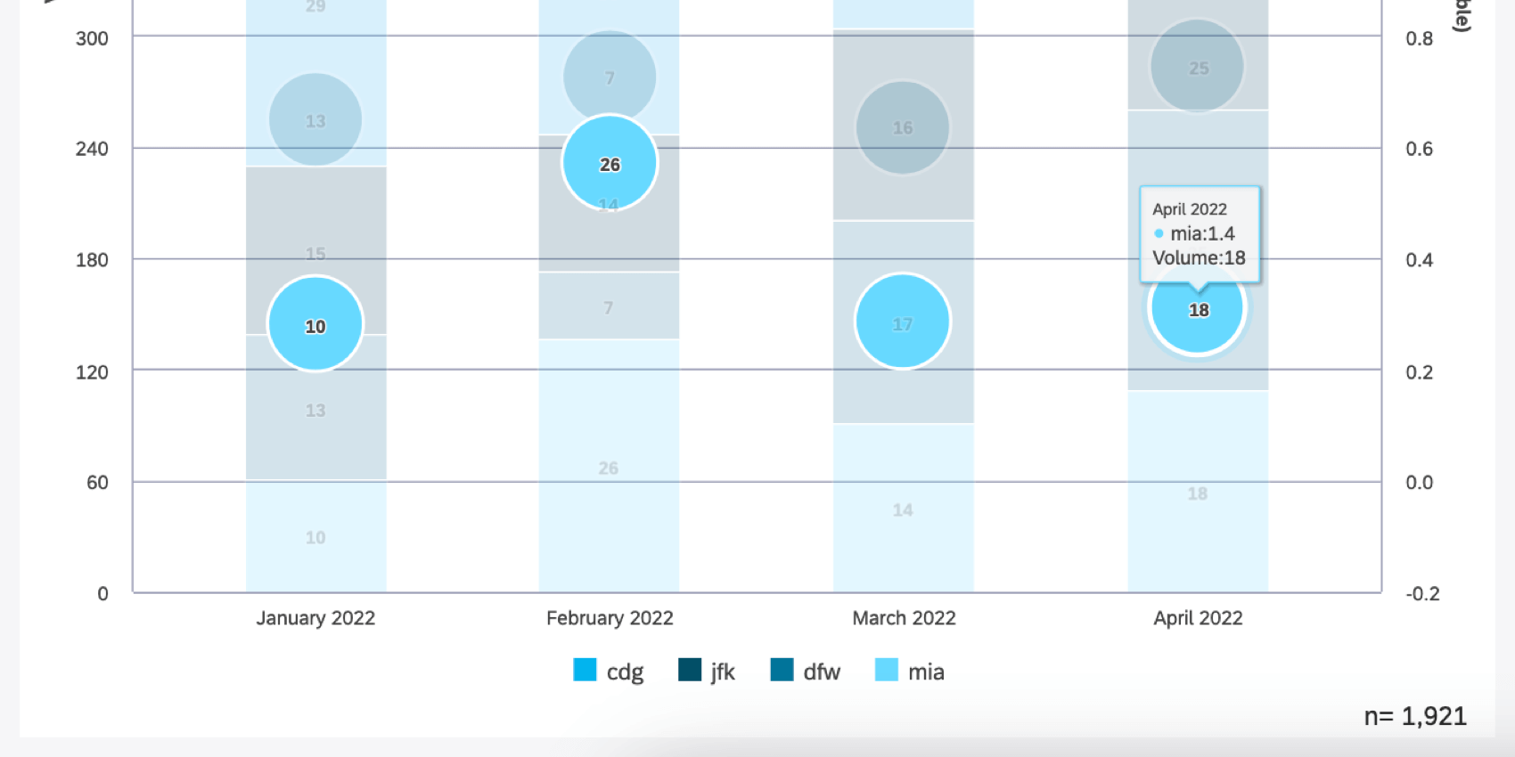
The following stacked bar widget is configured to return the top 4 Origination Airports by Volume per Month, with the secondary axis showing the stacked Review Rating of Airport per Month.
Here’s how stacking works in this example:
- Columns represent Month (Document Date), and stacked segments represent the Origination Airport (e.g., CDG, JFK).
- Bubbles represent Review Rating and are stacked. Each bubble represents the respective rating of the stacked Origination Airport codes shown in the columns on the primary axis.
- Labels have been turned on and display the primary axis calculation (Volume) for both the bars and the bubbles. The bubbles display the Volume labels for the respective topic stacked segment that they represent.
- It’s important to remember that the bubbles are not simply displaying the respective Review Rating for each stacked segment. The bubbles are stacked as well, meaning their values are added together. This causes the secondary axis range to display values that may be larger than what is expected from the individual values themselves.
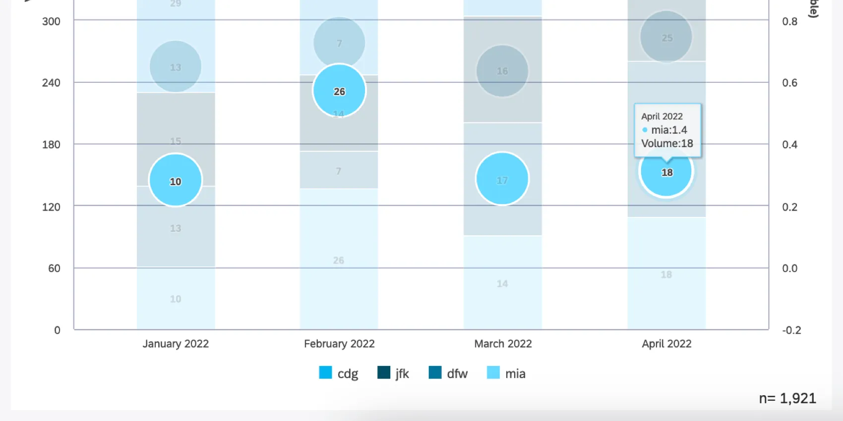
- Below, you can see the tooltip for MIA Airport for April 2022. We can see that the volume of MIA mentions in April was 18 with an average Review Rating of 1.4. However, if you look at the position of the MIA bubble on the secondary (right-hand) axis, you can see that it’s aligned with a Review Rating of roughly 0.36, because the vertical position for stacked bubbles is determined by the Review Rating multiplied by the proportion of the corresponding stacked segments on the primary axis. The position of each bubble is calculated proportionally in this way and then “stacked” together.
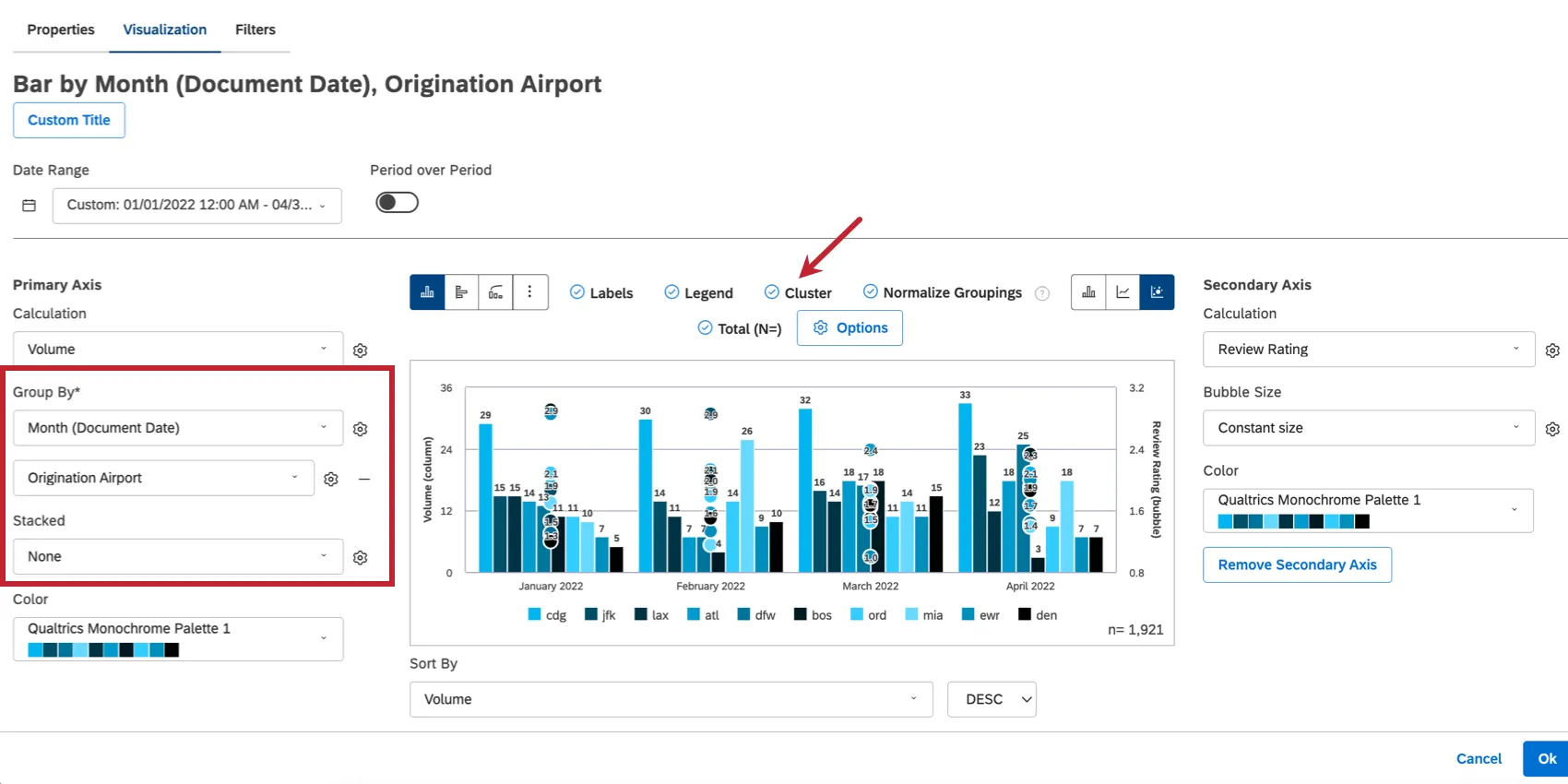
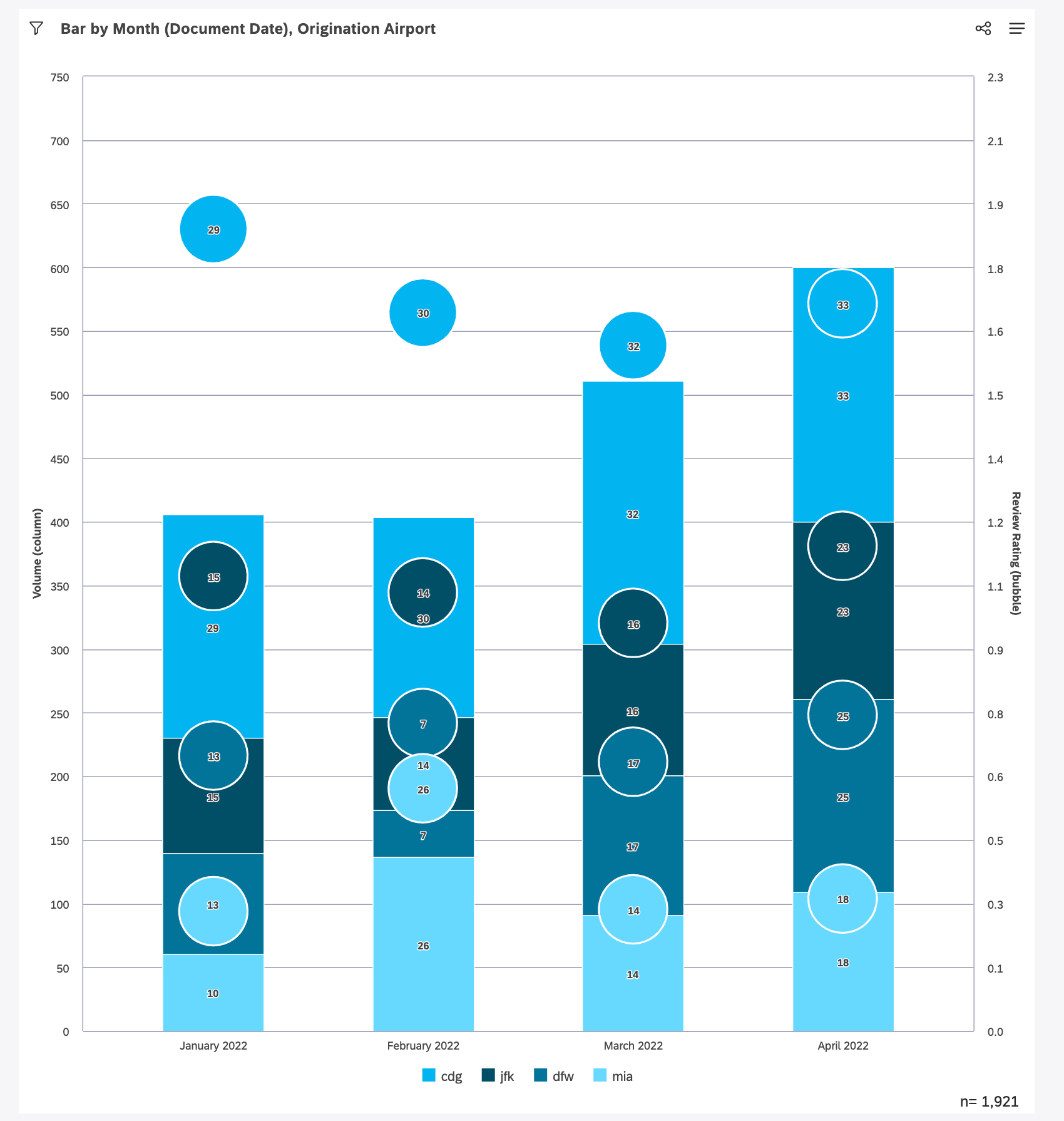
Qtip: If you need to display bubbles on the secondary axis that are vertically aligned, but not calculated proportionally, try the Cluster option. To do this, you need to remove your stacking and add the stacking attribute as a secondary grouping instead. Then select Cluster at the top.


Stacking Best Practices
- When using a metric with a diverging scale (like sentiment, effort, or NPS), we do not recommend stacking, since there is no “total” value that the segments can stack up to. Metrics like a 5-point rating or CSAT work better for this type of visualization.
- It is always best to keep the majority of information shown in a widget on the primary axis, especially when stacking.
- To display the individual values of a metric on the primary axis, try using either:
- A clustered bar chart with a line on the secondary axis.

- A clustered bar chart with bubbles on the secondary axis.
- A clustered bar chart with a line on the secondary axis.

That's great! Thank you for your feedback!
Thank you for your feedback!