
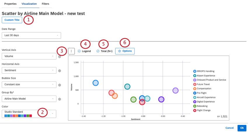
Scatter Widget (Studio)
What's on this page
About the Scatter Widget
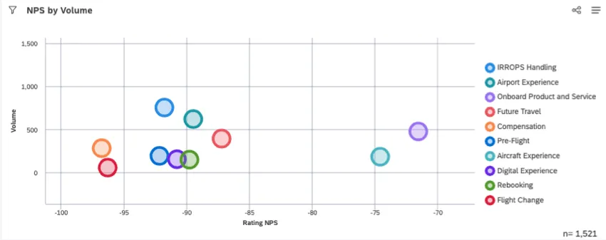
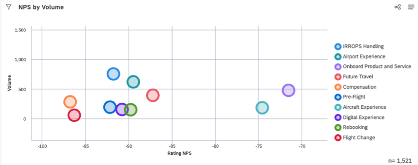
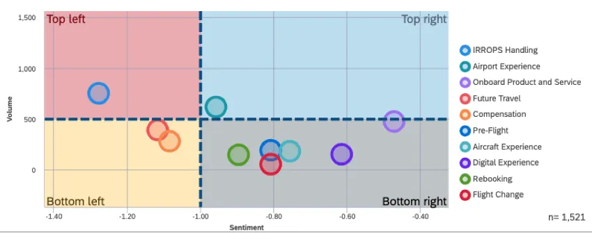
The scatter widget displays data points as bubbles along a horizontal and vertical axis. This kind of graph is also commonly called a “scatter plot.”
Setting Up a Scatter Widget
In this section, we’ll discuss the most important steps you need to complete in order to create a scatter widget. Later, we’ll discuss other ways to customize the widget that are optional.
Qtip: If your dashboard doesn’t have default properties set, you’ll need to tell the widget what data to include. Follow these steps to add a content provider, account, project, and owner to your widget.
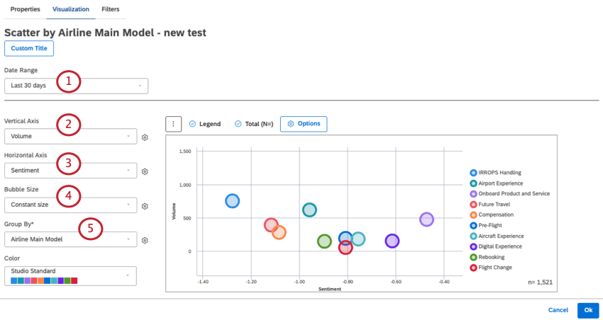
Qtip: Unless you set your widget to ignore the dashboard date range, the dashboard date range completely replaces the date range defined here.
Qtip: For all the calculations available, see Calculations (Studio).
Qtip: Calculations are grayed out when they’re either empty or contain only a single value under the current widget and / or dashboard filters you have applied. This can help you focus on more meaningful metrics. You can still select grayed out calculations if you want to.
- Standard: Select from one of these options:
- Volume: Bubble size should be based on the number of related feedback documents.
- Sentiment: Bubble size should be based on the average sentiment of sentences from related feedback.
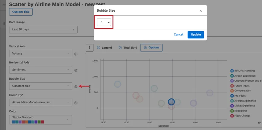
- Constant size: Make all bubbles the same size. Qtip: If you select this option, you can change the default bubble size by clicking the gear and selecting a number from 10 (largest size) to 1 (smallest size). The default size is 5.

- Effort: Bubble size should be based on the average effort score of sentences from related feedback.
- Metrics: Base bubble size on top box, bottom box, satisfaction, filtered, or custom math metrics.
- Attributes: Base bubble size on a selected attribute.
- Scorecards: Base bubble size on performance on intelligent scoring categories. Qtip: To further format your selected calculation, click the gear. See Widget Calculation Settings for more details on each option.
Qtip: To compare different topics in a category model on NPS vs. volume, I set my Group By to the category model those topics belong to.
Qtip: To customize these groups, see Grouping Settings.
Customizing a Scatter Widget
In this section, we’ll discuss some optional ways to further customize a scatter widget.
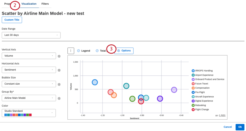
Visualization Tab
These are settings that can be adjusted in the Visualization tab.
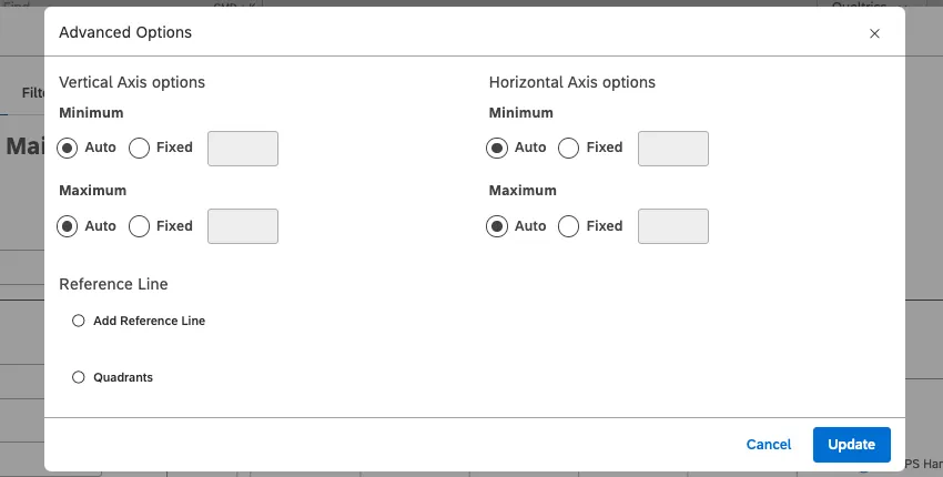
- Vertical and Horizontal Axis Options: For each axis, you can define the lower (Minimum) and upper (Maximum) limits using the following settings:
- Auto: Set the limits automatically, based on the report data.
- Fixed: Specify the limit manually.
- Reference Line: See Adding Reference Lines to Widgets.
- Quadrants: See the section below.
Filters Tab
See Filtering Widgets.
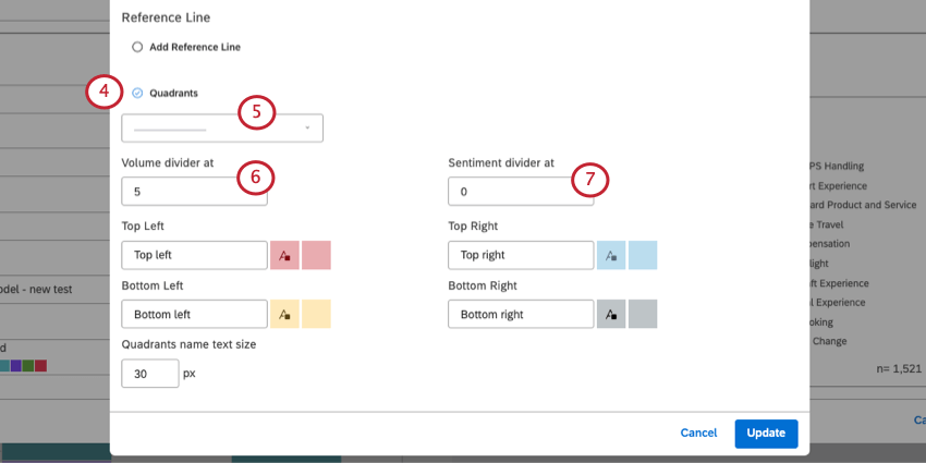
Defining Report Quadrants
You can visually break the scatter plot’s canvas into 4 quadrants to make it clear which areas need attention. These quadrants can even be highlighted with different colors.
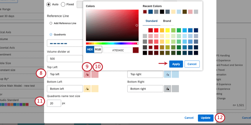
Qtip: When you open the color palette, you must select Apply when you’re done, or your changes won’t be saved.
That's great! Thank you for your feedback!
Thank you for your feedback!