
CrossXM Analytics
What's on this page
About CrossXM Analytics
The CrossXM Analytics project type enables you to combine your EX + CX data into one dataset, allowing you to analyze your experience data for key drivers that impact your organization. Research performed by the XM Institute clearly shows that there is a correlation between EX and CX. Organizations with a robust EX program deliver a better CX when interacting with customers. The insights you gain from CrossXM Analytics can inform investments in the employee experience which will drive improvements in the customer experience, ultimately impacting your key business metrics.
Qtip: This feature is similar to Employee Journey Analytics in its setup and analyses. This page often links out to the Employee Journey Analytics pages for basic functionality. This page will cover the differences you’ll encounter when setting up a CrossXM Analytics project.
Creating a CrossXM Analytics Project
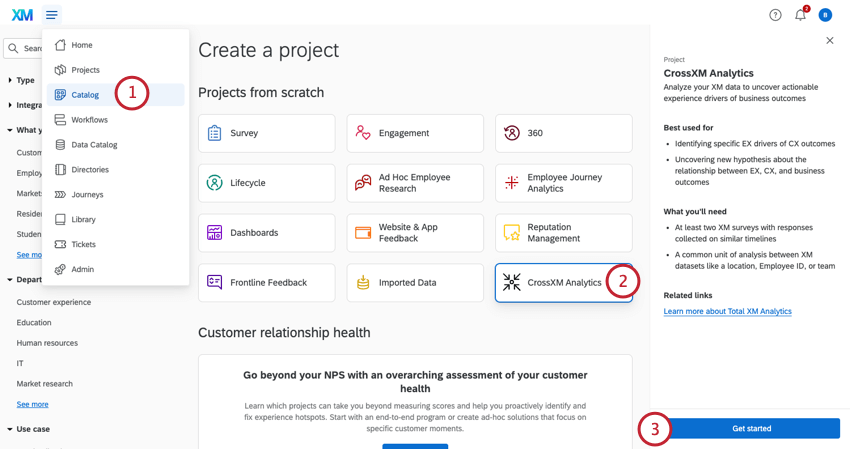
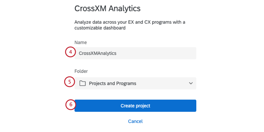
Setting Up a Cross XM Project
Once your project is created, perform the following to set up your project:
Qtip: Depending on your license setup, you may need to import your CX data into Qualtrics to use in your analysis. You can import your data and save it in an imported data project.
Attention: There is a limit of 10 data sources within a CrossXM project.
- CrossXM projects give you the ability to aggregate rows in your dataset. See Aggregating Data Model Rows for more information.
Attention: Text analysis is not available in CrossXM Analytics projects. Instead, perform text analysis in the projects you’d like to use in your data model.
Aggregating Data Model Rows
Qtip: Aggregating rows is critical for analyzing CX + EX data together. You will only be able to use fields that you’ve aggregated when you analyze your CrossXM results.
The Aggregate Rows option allows you to create variables so you can perform your analysis on the unit level relevant for your organization. For example you may be a location based business collecting experience data from customers visiting your stores and want to analyze that against the experience data from the employees working at those stores. The common unit of analysis could be the store itself, so the EX and CX datasets must be aggregated up to the level of each store.
Next to the data source you’d like to aggregate, click the plus sign ( + ).
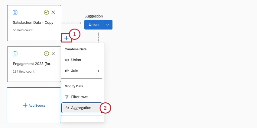
Choose Aggregation.
If desired, rename the Output. This name is for your own organizational purposes.
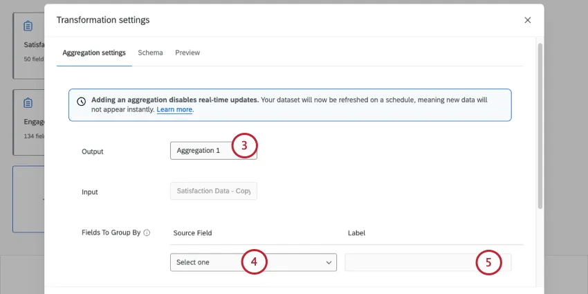
In the Fields To Group By section, choose the source field from your survey that you’d like to group by.
Example: If you want to analyze your EX data by city, you’d select the city metadata field here.
If desired, change the Label for your field. This label determines the data’s name that will be displayed in your data and dashboard.
If you want to group by multiple fields, click Add field to the group.
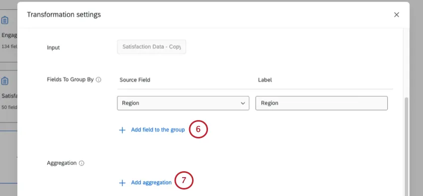
Click Add aggregation.
Choose your Aggregation Type. This determines how data is aggregated. Your options include:
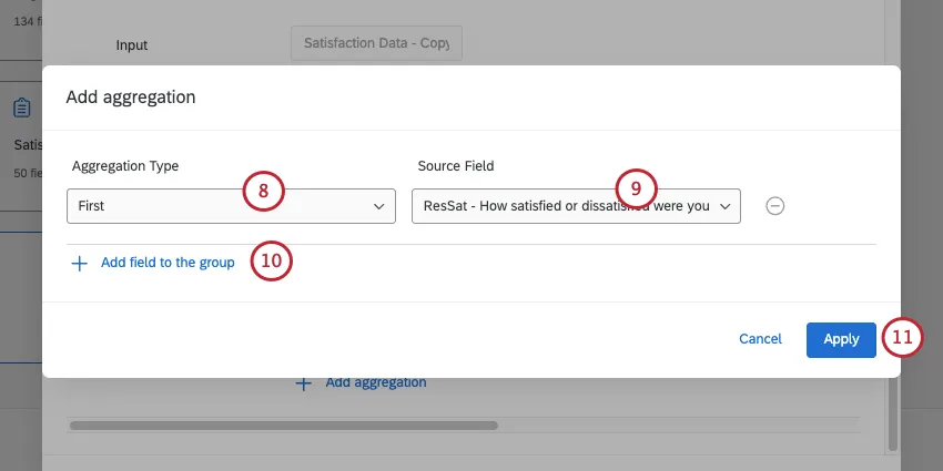
- First: Selects the first response as the output of the variable. This aggregation type is typically used when the value should be the same for every response. For example, if you are grouping by City but all locations are in the same State, you can include your State field here to bring that field into your analysis.
- Sum: Outputs the total value of all responses included at the unit of analysis. This aggregation type is generally used to calculate an operational variable at the unit of analysis. For example, you can use sum to calculate the total number of visits your store had.
- Count: Outputs the number of responses included for each variable at the unit of analysis. This aggregation type is used to calculate the number of responses.
- Top-Bottom Box: Outputs the percent of responses that meet your top box range. When aggregating by top-bottom box, you can determine the box range. This aggregation type is typically used to show favorability (e.g., a 4 or a 5 on a 1-5 scale is considered “favorable”).
- NPS: Outputs the NPS score for the selected field. Note that to use this aggregation type, the source must be a NPS question.
- Mean: Outputs the average of all responses. For example, you want to calculate the mean score for the question in your CX survey “how well does our product meet your needs?”
Choose your Source Field(s). This is the field that will be used in the aggregation calculation.
Qtip: You can select multiple source fields to aggregate.
If desired, click Add field to the group to add more fields. You will only be able to use fields that you’ve added when you analyze your CrossXM results.
When finished adding fields, click Apply.
Repeat the above steps for your additional data sources.
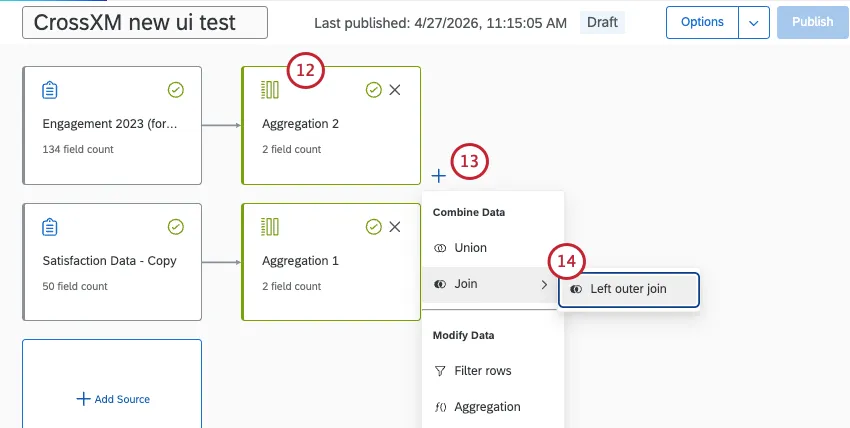
Next to the newly added aggregation, click the plus sign ( + ).
Add a Left outer join.
For source 2 (also called the secondary table, or right input), choose the other aggregation you created.
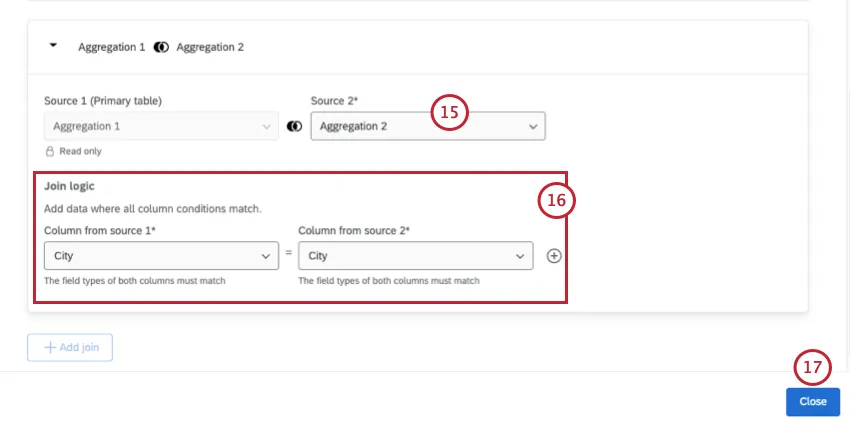
For the Join logic, choose the field from both aggregations that match with each other.
Example: Since we’re performing an analysis at the city level, we’re joining by the city field.
Click Close.
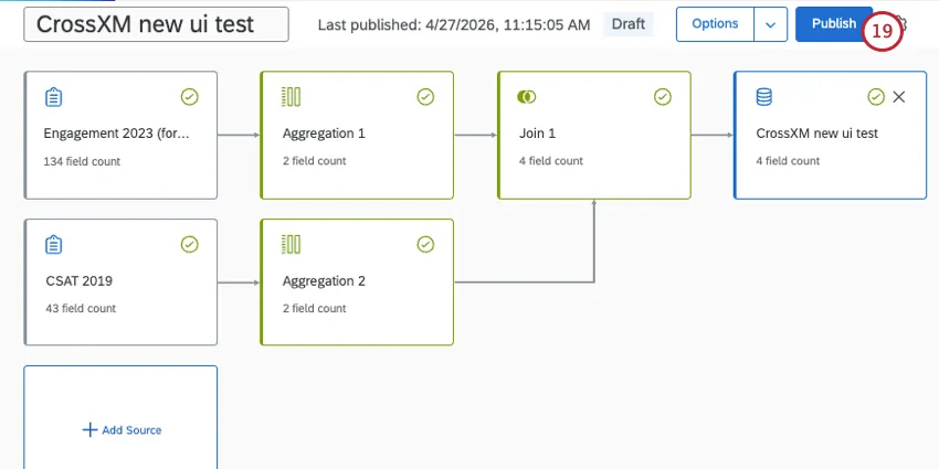
Next to your newly added join, add an Output dataset.
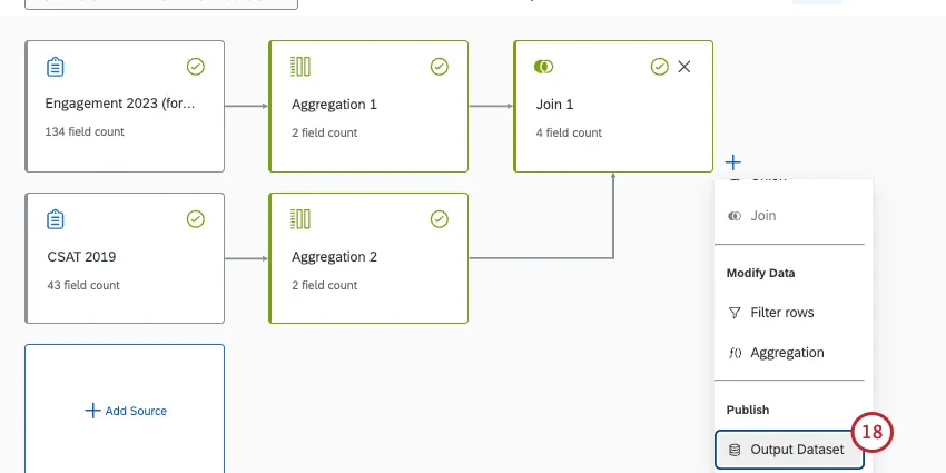
Publish your dataset.
Available EX and CX Sources
CrossXM Analytics allows you to combine CX and EX data in one project. In this section, we’ll list the types of projects and other data sources that you can add to your data model.
Qtip: For instructions on adding sources and building your data model, see Creating a Data Model (EX).
- Survey projects
- Imported data projects
- The surveys (but not the dashboards) of:
- Reputation management

Qtip: Conjoint and Maxdiff-specific data may not behave as intended.
Sources Incompatible with CrossXM Analytics
The following is a list of data sources you cannot use in your CrossXM Analytics data model:
- Any datasets built in other dashboards, whether CX or EX
- XM Directory data
- Location directories
- Employee directories
CrossXM Analytics Dashboards and XM Quadrant Widgets
This section covers how to use the CrossXM Analytics dashboard and the XM quadrant widget. The XM quadrant widget is only available in CrossXM Analytics projects. See Creating a Dashboard for more information on how to create your CrossXM dashboard.
Qtip: We recommend creating your dashboard after you’ve finalized your data model since your fields will be automatically mapped for you. You cannot edit your dashboard’s dataset from the dashboard itself. Make changes to your dataset in the Data Model tab instead.
CrossXM Dashboards Limitations
CrossXM dashboards share the same set of features as EX dashboards, with some notable exceptions. The following are not available in CrossXM dashboards:
- Comparisons
- Scales and widgets that use scales
- Action planning
- Benchmark editor
- Dashboard roles and sharing
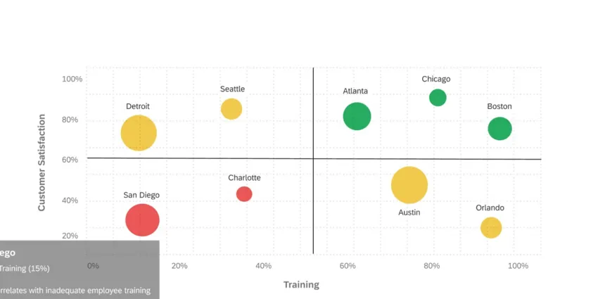
XM Quadrant Widgets
The XM quadrant widget is only available in CrossXM dashboards. This widget can display EX, CX and operational data all in one visual. A common approach for using the XM quadrant widget is to set up the X-axis as the EX variable of interest, the Y-axis as the CX outcome measure, and the bubble sizes as an operational metric or as the number of responses.
For basic widget instructions and customization, visit the Widgets Overview support page. Continue reading for widget-specific customization.
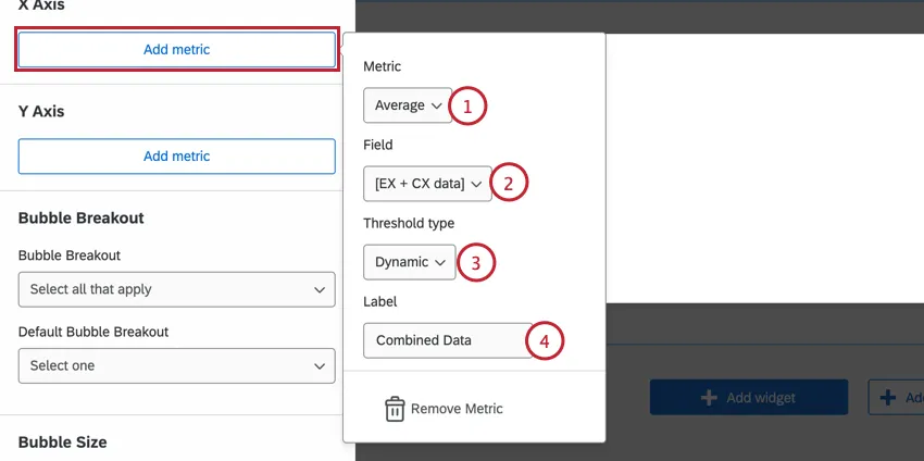
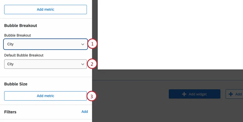
To set the widget axises, click Add metric. Then configure the following:
To configure the widget’s bubbles, configure the following:
Archived Projects
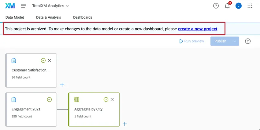
Attention: Projects created before November 6, 2024 use the old data model and have been placed in an Archived state. You cannot edit, publish, or refresh the data model in archived projects. Previously published data, dashboards, participants, and Stats iQ will continue to be available and operational, however dashboard creation and copying is disabled in archived projects. Archived projects cannot be copied; create a new project instead.
That's great! Thank you for your feedback!
Thank you for your feedback!