
Table Widget (Studio)
What's on this page
About the Table Widget
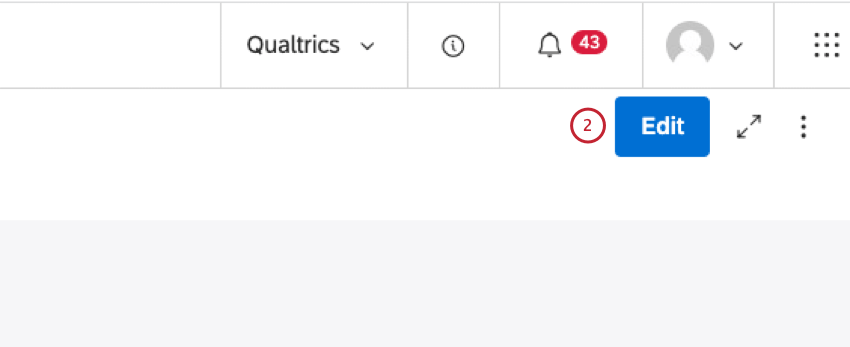
Qtip: To modify dashboard widgets, a user must have an Edit Dashboard permission and be granted Can Edit permission for the specific dashboard. For information about widget permissions, see Editing Widget Properties.
Attention: To ensure optimal Studio performance there is a limit on the number of widgets that can be added to each dashboard. For more information, see Maximum Widgets per Dashboard.
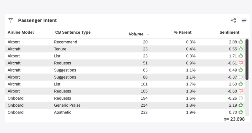
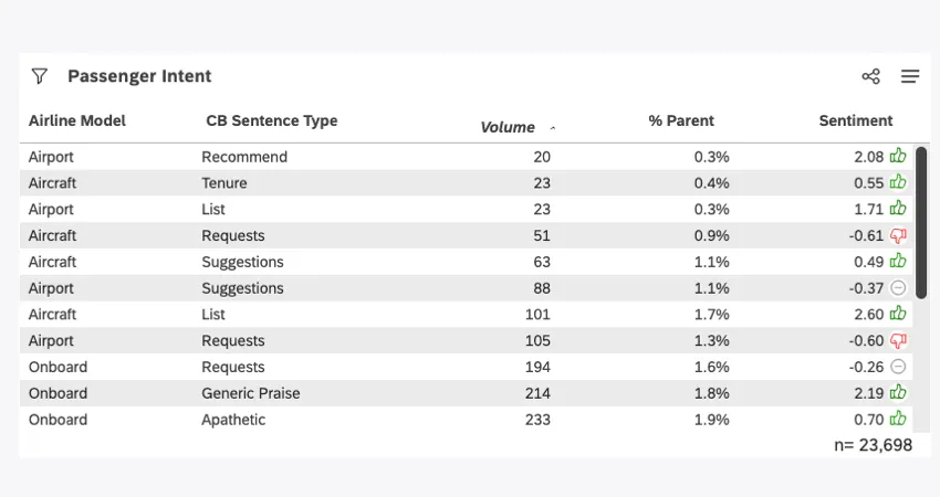
The table widget is a Studio report visualization that displays multiple metrics (up to 10 standard and additional metrics per report) aggregated by groupings of up to 5 attributes. It can help you understand which business segments are driving the performance of your business. It also makes dashboard maintenance easier by letting you consolidate up to 10 single metric widget into a single widget.
For information about editing widget properties and more, see Widgets (XM Discover).
Adding a Table Widget
Qtip: Click Ok at the bottom-right of each of the Properties, Visualization and Filters tabs to apply the settings in each of these tabs, and then click Save at the top of the dashboard.
For information about adding the widget to your dashboard, see Adding a Widget. This section will focus on setting up the table widget after it’s been added to your dashboard.
Properties Tab
You can edit table widget properties such as the content provider, account, project, and alt text in the Properties tab.
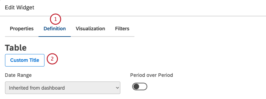
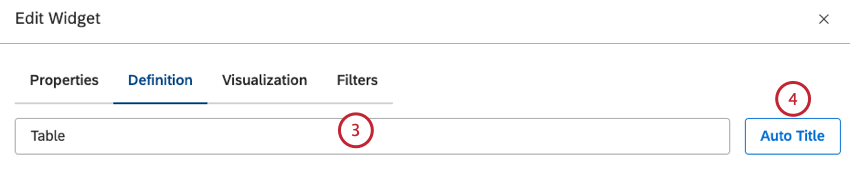
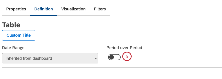
Definition Tab
You can set your widget’s title and customize the data in your widget via the Definition tab.
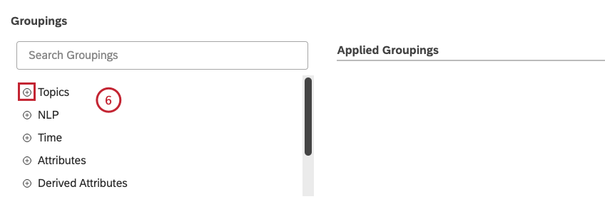
- Topics
- NLP
- Time
- Attributes
- Derived Attributes
- Metrics
- Organization Hierarchy
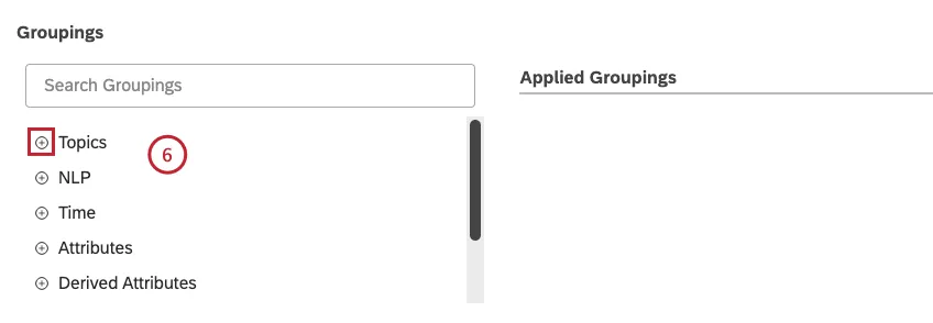
Click the plus ( + ) icon to view all the available options.
Qtip: You can take a satisfaction score and see a grouping of promoter, detractor, and neutral instead of adding it as an additional metric. Attributes selected for groupings cannot be selected for calculations and vice versa.
Qtip: Grouping options that are not likely to be useful are grayed out for your convenience. A grouping is grayed out when it is either empty or contains only a single value under the current filters (both widget-level and dashboard-level). This should help you to focus your reports on the more meaningful data groupings without having to resort to the trial and error method. You can select grayed out groupings if you need to.
Qtip: For an overview of available calculations, see Calculations (Studio).
Qtip: Selecting more than one metric will give you a visual equivalent of an Attribute Set report from Designer. This report allows visualizing survey scores and ratings information without having to do category modeling or set up. It can be used as a starting point for further analysis of underperforming or overperforming scores.
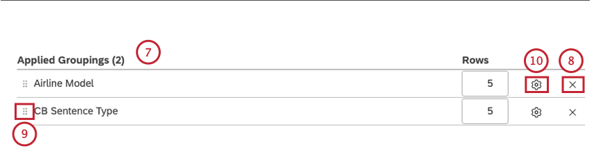
Qtip: The report will show data for all permutations of the selected options in the order you define. Each individual attribute may display up to 1000 values in each permutation, although it’s best practice to select less than 200 values.
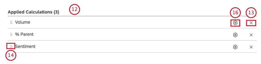
Qtip: The grouping in the top row in the Applied Groupingssection corresponds to the first column item in the final table.
Qtip: The Timegrouping is always added to the top row in the Applied Groupings section.
- Standard
- Metrics
- Attributes
- Scorecards
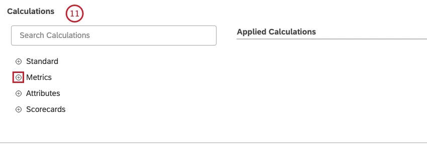
Click the plus ( + ) icon to view all the available options. Qtip: For an overview of available calculations, see Calculations (Studio).
Qtip: Calculation options that are not likely to be useful are grayed out for your convenience. A calculation is grayed out when it is either empty or contains only a single value under the current filters (both widget-level and dashboard-level). This should help you to focus your reports on the more meaningful metrics without having to apply the trial and error method. You can select grayed out calculations if you need to.
Visualization Tab
You can define report settings in the Visualization tab.
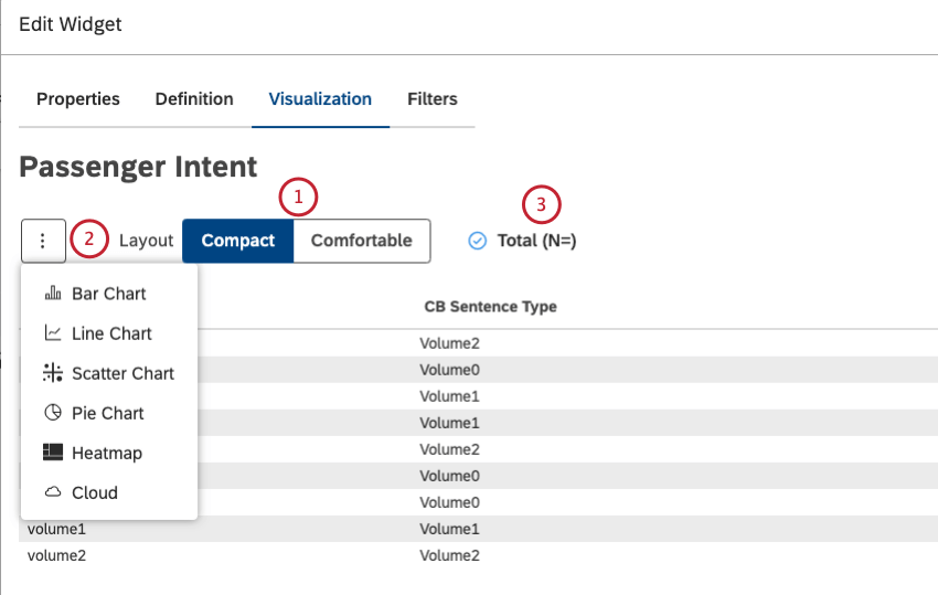
Qtip: The compact layout offers tighter padding and allows you to see as much as possible in one display.
Qtip: To set the default dashboard-wide value for new widgets, use the n= setting in dashboard properties.
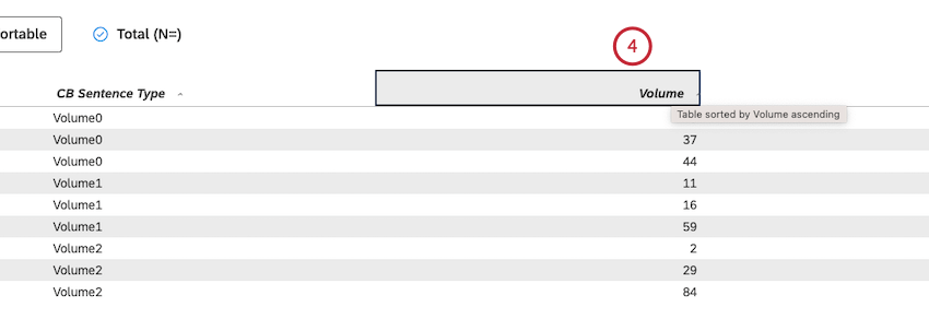
Qtip: Hold Shift while clicking multiple column headers to enable multi-column sorting (on a per-column basis starting with the leftmost column). Empty values appear at the bottom of the widget.
Filters Tab
In the Filters tab, you can further narrow down report data. For information on widget filters properties, see Applying Filters to a Widget.
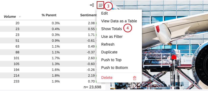
Show or Hide Totals by Default
You can display an additional total row for the first attribute in each widget. By default the total row is hidden.
Period Over Period Reporting
Period over period reporting allows you to compare data between 2 time periods. For more information, see Period Over Period Reporting (Studio).
Widget Calculation Settings
You can report on a number of calculations in your data, including volume, metrics and attributes, and more. For more information, see Calculations (Studio).
That's great! Thank you for your feedback!
Thank you for your feedback!