
Grouping Settings (Studio)
What's on this page
About Grouping Settings
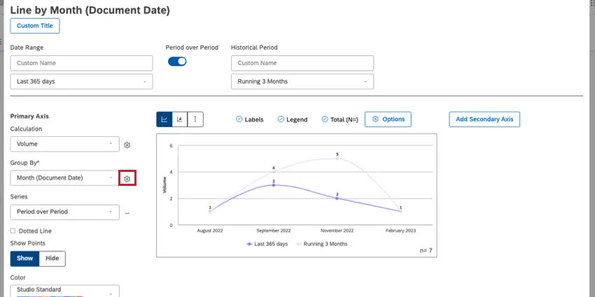
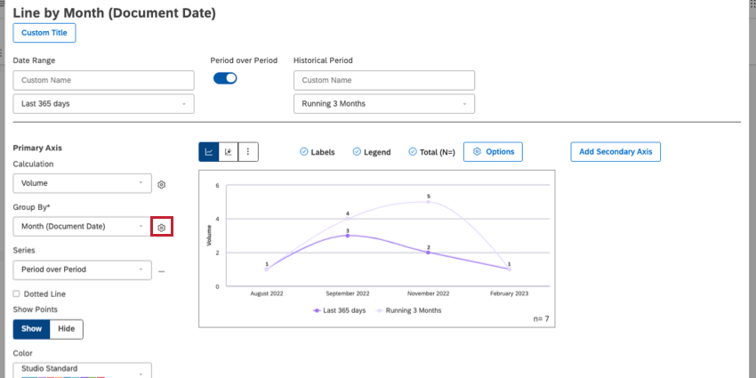
When customizing certain widgets, such as line and bar charts, you can group your data in order to break out different results and calculations by categories of interest. Next to the Group By field is a gear where you can find additional settings for grouping data.
Qtip: Depending on the format of the data you use to group your widget, you may not see all of the settings listed on this page.
Displaying Only Top or Bottom Groups
The settings described in this section let you display a selection of groupings based on how highly or lowly they perform on a metric of your choice.
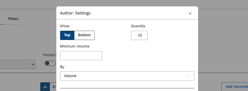
Example: You’re displaying the customer-facing agents with the top 10 highest sentiment scores.
- Show: Select which groupings should be included into the report.
- Top: Display the top results. How many top results are displayed is defined by the Quantity
- Bottom: Display the lowest results. How many bottom results are displayed is defined by the Quantity Qtip: Showing bottom results by Volume may produce highly approximate or no results.

- Quantity: Select how many top or bottom results to display in the widget (from 1 to 1000 for selector widgets and 1 to 1000 for all other widgets).
- Minimum Volume: This setting appears for most groupings. Set the number of documents for the minimum volume threshold that is relevant to your analysis. Groupings with volume below the threshold will not be included in the report.
- Minimum Sentence Count: This setting appears when you group by topic. Set the number of sentences for the minimum volume threshold that is relevant to your analysis. Groupings with a count of sentences below the threshold will not be included in the report.
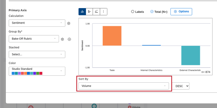
- By: Select the metric that groupings should be sorted by when they’re included in the report. Example: If you set Show to Top, Quantity to 10, and By to Volume, the report will display top 10 groupings by volume.

Qtip: The By field determines how data is ranked and included in the widget, but not how it is sorted in the widget. You can choose the widget sorting using the Sort By dropdown.

Limiting Groups by Organization Hierarchy

This setting only appears when grouping data by an organization hierarchy.
- Personalization Type: Select the type of organization reporting you want to use:
- Peer: Show data for the current user’s peers, or hierarchy nodes that share the immediate parent with the user’s organization level. See Peer and Parent Reporting for details.
- Parent: Show data for the current user’s parents, or hierarchy nodes that start at the user’s organization level and go all the way to the root node level. See Peer and Parent Reporting for details.
- Inherited: Disable peer and parent reporting and use the organization hierarchy as a filter (the same way it works for other non-personalized widgets).
Limiting the Groups Displayed
This is a list of more settings that limit which groups are displayed in the widget.
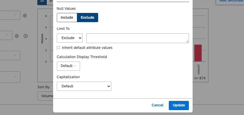
- Null Values: Decide whether or not to include or exclude null values from your groups. Null values are records with no data.
- Include
- Exclude Qtip: Displaying null values is useful for reporting on something that did not happen. For example, a bar chart may show the volume of responses that were Yes and No. To show a third bar with the volume of empty values, or non-respondents, set this option to Include.
- Limit To: Exclude or include specific groupings in your widget. Select either Exclude or Include from the dropdown, then type the name of a grouping and select it from the automatically generated list. Example: If you group feedback by sentiment, you can exclude neutral feedback, choosing to only focus on positive and negative feedback.
- Inherit default attribute values: This setting appears when you are grouping data by NLP (natural language processing) and text attributes. When enabled, this setting changes your Limit To selections to the project defaults. This is convenient when you need to synchronize attribute selections between widgets in a project.
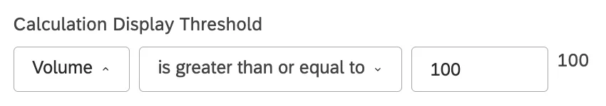
- Calculation Display Threshold: Limit the data displayed in the widget based on the selected calculation. The following options are available:
- Default: Do not limit the data included in the widget.
- Selected calculation: Set a threshold for data to be displayed in the widget. You can use these operators:
- is between: Define the minimum and maximum value.
- is greater than or equal to: Define the minimum value.
- is less than or equal to: Define the maximum value.
- is not between: Define a range of values to exclude from the results.
- Qtip: A preview of the threshold will be shown on the right.
Example: Your selected calculation is volume. You use the Calculation Display Threshold to only show groups with 100 responses or more in your widget.

Customizing Category Model Groupings

This is a list of settings you can use to limit the groups that are displayed in the widget when you’re using category models / topics as groupings.
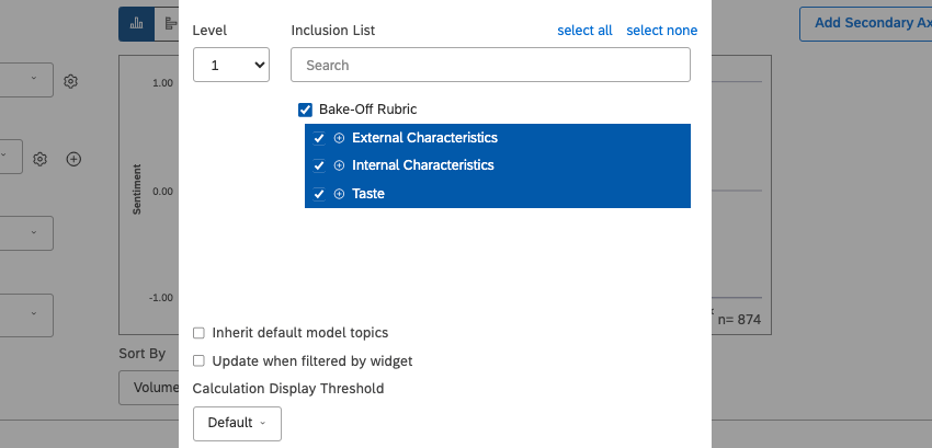
- Level: This setting appears when grouping by topics. Select the category tree level to report on, or switch to topic leaves (any category that does not have a subcategory) by selecting Leaf from the dropdown.
- Inclusion List: This setting appears when grouping by topics. Manually select topics to group data by and choose whether to include new topics in the report or not. See Using the Inclusion List for details. Qtip: If you limit groups to top and bottom groups, the inclusion list still applies. For example, if you select 20 topics in the inclusion list and choose to show the top 10 by volume, the report will be limited to top 10 topics by volume out of the 20 you selected.
- Inherit default model topics: This setting appears when grouping by topics. Enabling this option connects your widget’s Inclusion List to project defaults. This is convenient when you need to synchronize topic selections between widgets in a project.
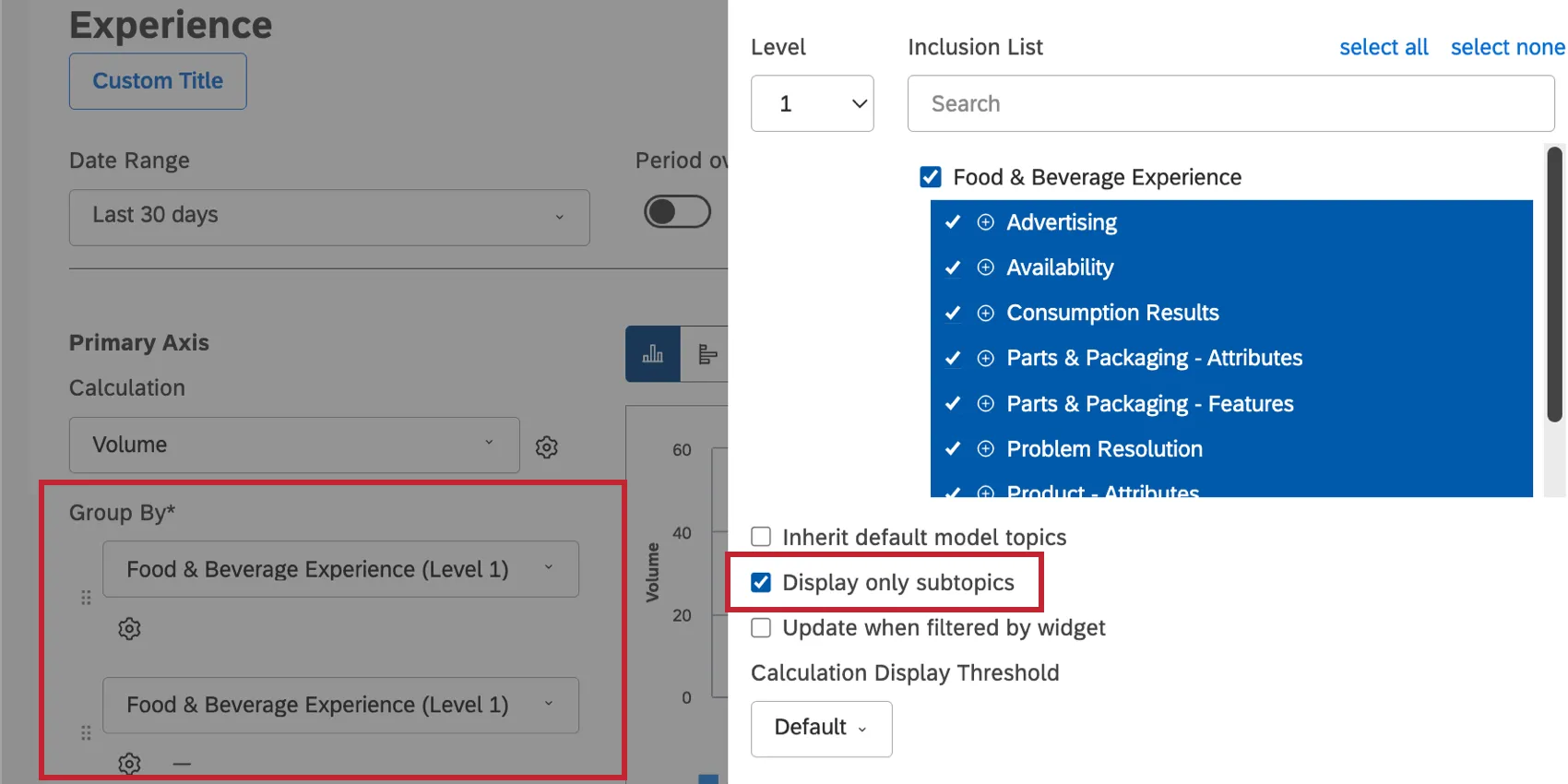
- Display only subtopics: This setting appears when using more than 1 multi-level grouping with the same category model. This option lets you choose how to group data when reporting on different levels of the same category model.
- off: For any topic from the first grouping, show any subtopic in the second grouping. Use this option to see a topic co-occurrence report.
- on: For any topic from the first grouping, show only its subtopics in the second grouping. Use this option if you want to honor the category model’s topic/subtopic organization in your report.
- Update when filtered by widget: This setting appears when grouping data by topics. This setting lets you choose whether a parent widget topic selection should be applied to this widget as a regular topic filter or as a drilldown to subtopics selected by the inclusion list.
- off: When this setting is turned off, a topic selected in a parent widget will be applied to this widget as a filter. Use this mode when you want to analyze the co-occurrences between topics selected in parent widgets and topics in this widget.
- on: When this setting is turned on, this widget will be limited to subtopics of a topic selected in a parent widget. Use this mode when you only want to see subtopics of a selected topic. This is similar to drilling to children, but done using 2 widgets instead of one. Qtip: This setting only works when parent and child widgets use the same category model.
Formatting Displayed Groups
This is a series of assorted settings that affect how you format the groups you choose to include in your widget. This includes capitalization of group names, functionality of links, stacking, and how empty time periods are handled.
- Capitalization: This setting appears when you are grouping data by text, such as topics and text attributes. You can choose how to capitalize group names:
- Default: Display group names as they were written by default.
- lowercase: Display group names in only lowercase letters.
- UPPERCASE: Display group names in only uppercase letters.
- Sentence case: Capitalize the first letter of the first word only.
- First Letter Of Every Word: Capitalize the first letter of every word. Note that letters following a hyphen or an underscore are capitalized as well (for example, Wind-Powered, April_Surveys).
- Empty Periods: This setting only appears when a widget is grouped by a time attribute. Empty periods are periods of time where no data was collected. You can decide how you want to display data from empty periods in your widgets. See Handling Empty Periods for more details.
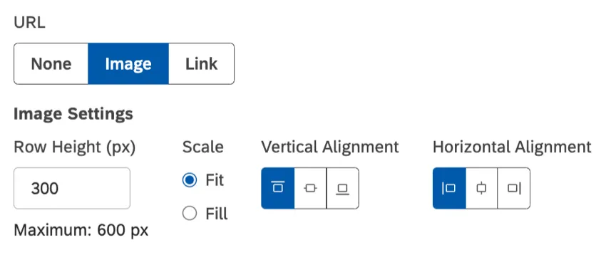
- URL: This setting appears when you are grouping data by text attributes in the table widget and table-style feedback widget. This setting lets you render URLs in an attribute as images or clickable links.
- None: Display attribute values as plain text.
- Image: Display attribute values as images. See Adding Dynamic Images for details.
- Link: Display attribute values as clickable links. Qtip: To support case-sensitive URLs, make sure they are formatted as a case-sensitive text attribute in Designer.
- Stack Type: This setting appears when groups are stacked in a bar widget or displayed as a Series in a line widget. Select one of the following stack types:
- None (Line widget only): Disable stacking.
- Stacked: Use regular stacking (based on the selected calculation).
- 100%: Use 100% stacking (based on percentage).
Including and Excluding Topics
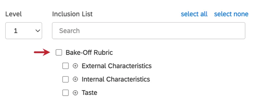
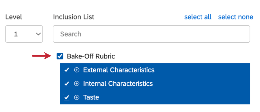
When grouping data by topics, you can use the Inclusion List feature in grouping settings to control which of the model’s topics are included in your widget.
You can choose to exclude specific topics from your widget or to include specific topics.
Example: When Level is set to 1, the report will only display the first level categories of the selected model. If you set Level to 2, the report will display the children of first level categories. The number of available levels depends on the model you use.
- Include new (default): Usually represented by a checkmark. Include all topics below this one, even new ones that may be added later. If selected on the topmost parent topic, this is the same as clicking select all.

- Include selected: Usually represented by a minus sign ( – ). Only include selected topics and ignore the new incoming topics. This mode is also enabled automatically if you remove at least 1 topic or subtopic.
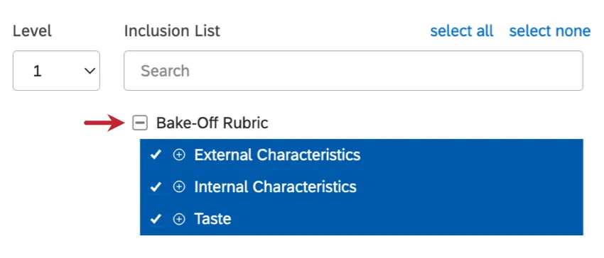 Qtip: Even if you select all of the top-level topics, setting the root node to the include selected is not the same as setting it to include new. Setting a parent topic to include selected will ignore any topics that may be added later.Qtip: The appearance of the include selected check box may vary depending on your browser and operating system.
 - Exclude all: Usually represented by an empty checkbox. Clear all topic selections. If you deselect the topmost parent topic, this is the same as clicking select none.


Qtip: If you only want to include a few subtopics in your widget, you can exclude all first to clear all of your selections, then select the subtopics you want to use.
Displaying Images in Tables
You can display URLs as images in a table widget or table-style feedback widget. Showcase product catalogs, visualize rating and reviews, and make your operational dashboards more visually appealing.
Prerequisites
To display attribute values as images, they must satisfy these requirements:
- Images must be hosted externally and be publicly accessible.
- The following image formats are supported: JPG, GIF, PNG, SVG.
- To support case-sensitive URLs, provide them via a case-sensitive text attribute in Designer.
Image Settings
- Row Height (px): Row height in pixels. The width will automatically adjust accordingly to prevent the image from being stretched or distorted.
- Scale: Select how the image should fit into the table’s cell dimensions. Your options are:
- Fit: Make the whole image visible inside a cell. If the image proportions are not the same as the cell, there will be some empty space on the sides or top and bottom.
- Fill: Make the whole cell covered by the image. If the image proportions are not the same as the cell, some parts of the image will be cropped.
- Vertical Alignment: Select how the image should be aligned vertically inside the cell (top, middle, bottom). Qtip: Tip: If your images are cropped vertically, you can use vertical alignment to choose which part of the image should be visible in a cell.
- Horizontal Alignment: Select how the image should be aligned horizontally inside the cell (left, center, right). Qtip: If your images are cropped horizontally, you can use horizontal alignment to choose which part of the image should be visible in a cell.
Best Practices
Below are some recommendations on how to add dynamic images to your data:
- Ideally, image URLs should be provided as part of feedback records’ metadata. This means the links should be stored in a structured text attribute. This option allows you to use case-sensitive URLs by setting the attribute to be case-sensitive in Designer.
- You can add image URLs using a dimensional lookup in Designer. Note that this option does not support case-sensitive URLs.
- You can also add image URLs using a category-derived attribute in Designer. Note that this may affect the widget’s loading times and accuracy.
FAQs
What is a category model? What is a topic?
What is a category model? What is a topic?
Since category models are how XM Discover analyzes topics, you will see “category model” and “topic” used interchangeably throughout the platform.
That's great! Thank you for your feedback!
Thank you for your feedback!