
Map Widget (CX)
What's on this page
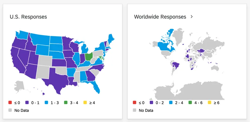
About Map Widgets
The map widget can take location data and create a map of data collected across the United States of America, countries of the world, or even more precise locations, like latitude and longitude coordinates. Users can then drag the map, zoom in and out, and highlight places to see more data.
Qtip: The map widget is powered by Mapbox.
Attention: The map widget cannot be exported. It is also not mobile dashboard compatible.
Attention: Maps widgets in your brand can only be loaded 20,000 times a month altogether. As you get closer to this limit, a warning will appear on the widget, and you will have to click the widget to load its data. To reduce loads, we recommend putting the map widget on lesser-used dashboards, and not on the main dashboard page. If you have a business case to exceed this limit, reach out to your Technical Success Manager to explore a custom solution.
Supported Types of Dashboards
This widget can be used in a few different types of dashboard. This includes:
Setting Up Location Fields
Before your location data will work with a map widget, it has to be set to the correct field type, and the individual locations have to be formatted a specific way.
Compatible Field Types
The location field of a map widget supports 2 field types:
- Text set
- Multi-answer text set
The information stored in your location field needs to be formatted a certain way depending on the type of location data you want to display in the widget.
Formatting Values
Qtip: If your location values aren’t coded in these formats in the survey, try recoding the dashboard fields.
Attention: If you use country name or state name for the values, your widget will not display correctly if your data has different values for the same location. Different values all need to be recoded to be the same. For example, if your data has both the values “Turkey” and “Türkiye”, your widget will not work.
- United States: State name or abbreviation.
Countries: Either country name, or ISO ALPHA-2 or ISO ALPHA-3 codes found here. UN codes are not supported.

Qtip: For the most accurate results, we recommend using country codes instead of names.
Qtip: You may need to zoom into the widget to see smaller countries, like Singapore.
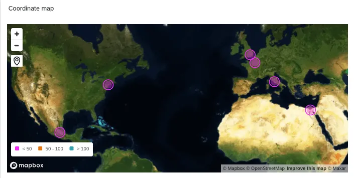
- Data point: Format values as latitude and longitude coordinates. For coordinates to work with the map widget, they must be saved in one field together, and be in one of these example formats:
- 6061° N, 122.3328° W
- 6061 N, 122.3328 W
- 6061N, 122.3328W
- 6061, -122.3328
- +47.6061, -122.3328
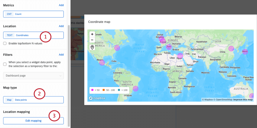
Basic Widget Setup
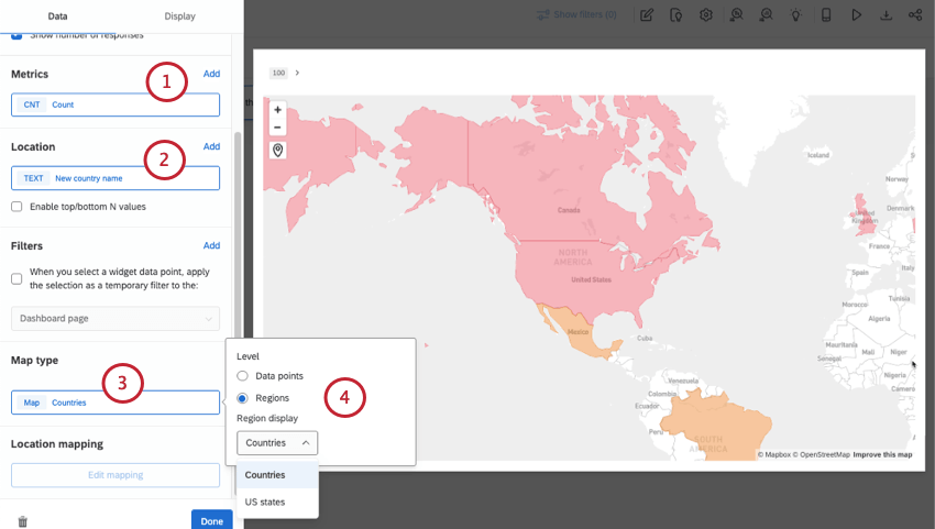
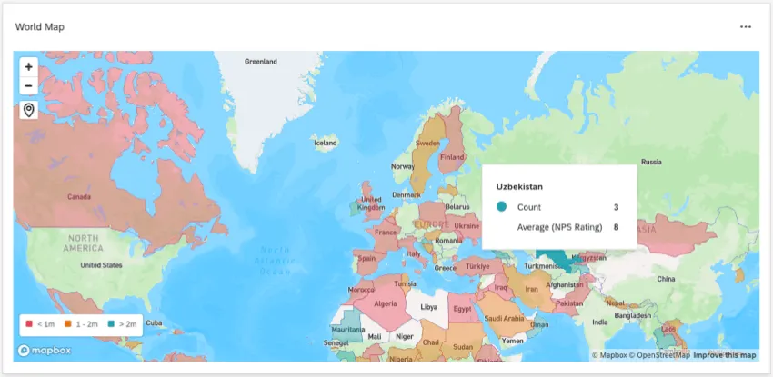
Qtip: If you add multiple metrics, you’ll see these additional metrics when you hover over a region to see the tooltip. Generally the first metric is the one that determines color, but you can adjust this in display options.
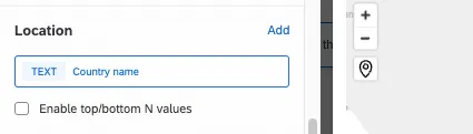
Qtip: You can only add one location field.
- Data points: This is the option you select for latitude and longitude mapping. If you’d like to show coordinate names on hover, see Mapping Location Names to Coordinates.
- Region display: Choose between countries and US states.
Qtip: Above the map is a button called Go to saved location. This will take you and dashboard viewers back to the saved location after exploring the map.
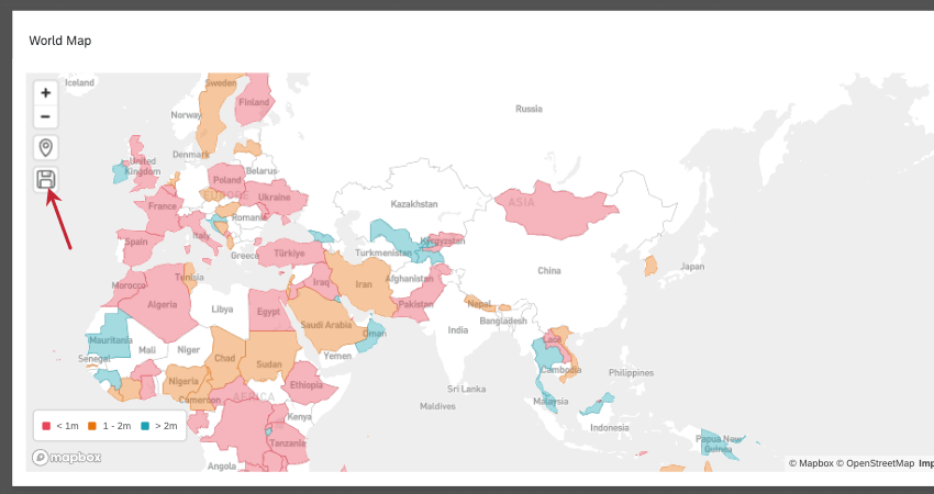
Qtip: Instead of highlighting entire regions (like most of these screenshots show), the data point map shows the exact spots where you can find your coordinates on the map, like this:
Qtip: For more on setup shared by all widget types, such as titles, containers, and resizing, see Building Widgets CX.
Display Options
The Display tab of a map widget holds important visual settings, such as map background, location labels, and color scale.
Map Styles
When you expand Map styles, these are the options available:
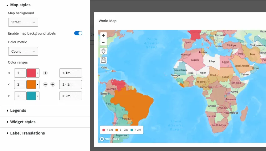
- Map background: Choose the visual style of the map. Options include:
- Basic: Choose a basic white map. This is good for a contrast against any region color you set.
- Street: See a basic blue and green map that displays streets and cities as you zoom in.
- Satellite: Show real snapshots of the Earth as you’d see it from a satellite. As you zoom in, this map shows actual street views.
- Enable map background labels: Show labels for countries, provinces, cities, and more, depending on how zoomed in you are.
- Default zoom level: Determine how zoomed in the map should be by default.
- Color metric: If you added multiple metrics, determine which one gets a scale that determines color changes for regions or data points.
- Color ranges: Set the numeric range for your metric, add milestones, and even customize the labels that appear in the widget legend.
Legends
The legend will show your color metric and its corresponding scale.
- Show legends: Select this option to display a legend on the widget to explain what the colors over regions means. Deselect this option to hide the legend.
- Legend placement: Decide where on the widget to display the legend.
Widget Styles
Widget styles are a setting all widgets have where you determine things like containers and borders. See more on widget styles under Editing Widgets.
Mapping Location Names to Coordinates
Whether you have coordinate data or location names to start with, you can add more context to your location data.
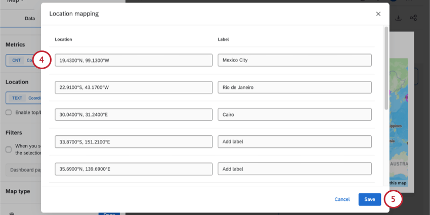
Adding names to existing coordinates
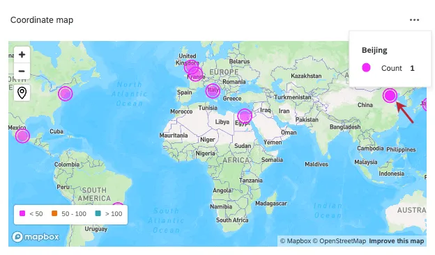
These are the steps you’ll follow if you already have coordinates, but want to give them names. These names will appear instead of the coordinates when you hover over a data point.
Qtip: In the next window, do not select Add coordinates, as you already have that data.
Adding coordinates to existing place names
On the other hand, if you have a question with a text set of place names, you can give them coordinates. For example, if you ask customers what store they shopped at, you can add coordinates to each store so each one will appear on the map.
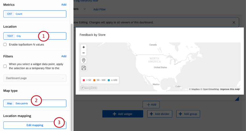
Example: In this example, we have a field that captures city name.
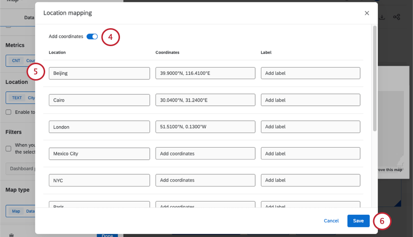
Qtip: If you want an alternate name to appear for each data point when you hover over them, you can also add a Label for each location. Labels replace what’s in the “Location” column in the map.
Limiting Views of the Map Widget
As stated in the introduction to this page, there’s a limit to the number of times map widgets can be viewed in one brand. Once you hit about 70% of this limit, the map will start to conserve the number of times it loads. Instead of loading automatically when you visit it on a dashboard, it will show a message, and you will have to click a button.
The map widget is considered viewed when the page it belongs to on a dashboard is loaded. Keeping this in mind, there are ways to keep map widget usage down:
- Put the map widget on a lesser-used dashboard.
- Don’t put the map widget on a default, main page of the dashboard.
- Limit which users can view the map widget by role. You can add permissions that restrict which pages of a dashboard a user can access. See the description on “Set page access.”
Legacy Map View Widget
Attention: Brands created after April 9, 2026 cannot create legacy map view widgets.
When you create a new widget, the legacy map view widget can be found in the Deprecated section of the menu. The legacy map view widget doesn’t support latitude and longitude, it cannot display some smaller countries (like Singapore), and it does not have the additional display options the new map widget has, like the street and satellite views.
Below, you’ll find details on editing a legacy map view widget.
Field Type Compatibility
Either the Text Set or Text Value field type can be used for the map view widget. In preparing your data for your map view widget, state fields should be coded by state name or state abbreviation (e.g., ID, UT, NM). Country fields can be formatted by country names (e.g., France, Singapore, Nigeria) or by the ISO ALPHA-2 or ISO ALPHA-3 code found here.
Qtip: Although ISO ALPHA-2 and ISO ALPHA-3 country codes will always work, not all country names do. Several countries have specific naming conventions, including:
- The United States of America must always be written as United States
- United Kingdom cannot be abbreviated as UK
- The Democratic Republic of Korea must always be written as South Korea
- The Democratic People’s Republic of Korea must always be written as North Korea
If you’re noticing certain countries not pulling through, try using the ISO ALPHA-2 or ISO ALPHA-3 code instead.
Qtip: The map view widget will only export data for countries displayed in the map view. The widget will not export smaller countries like Singapore and Hong Kong, as they cannot be seen in the map view.
Metric
Add a metric to your widget. We advise only having one. If you add multiple metrics to your widget, make sure you specify which you plan to use for the widget under the Color Metric dropdown.
You can add any metric to your map view widget, including count, average, or NPS. See the Widget Metrics page for more on configuring these settings.
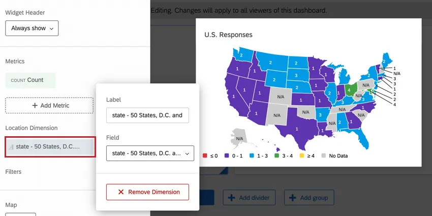
Location Dimension
Select the field where data is stored for either your state or country. Remember that the data in this field must adhere to the naming principles listed above.
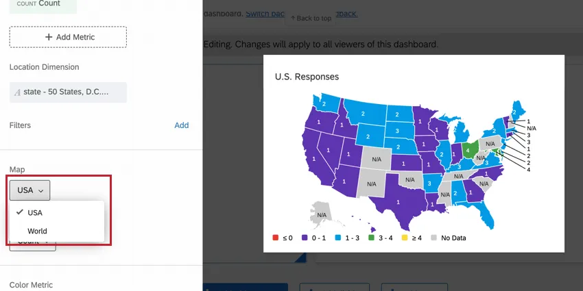
Map
Select either USA or World.
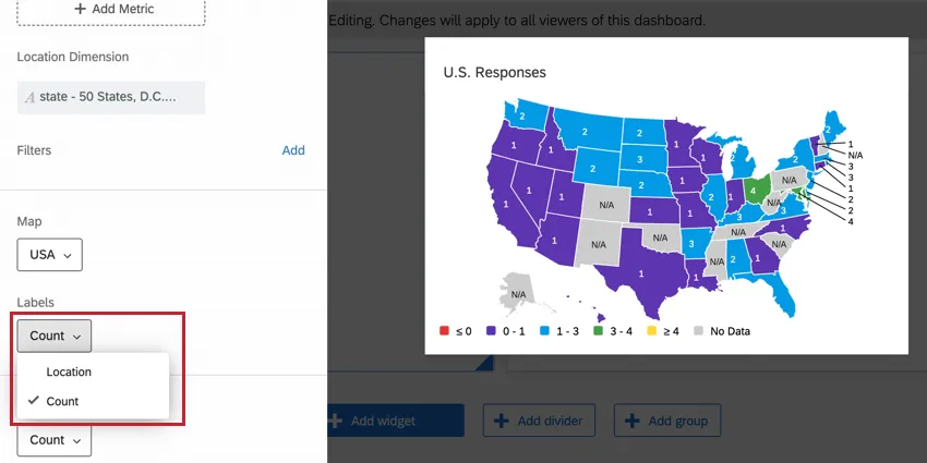
Labels
Add labels for Location, Count, or both.
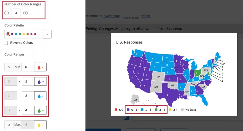
Number of Color Ranges
Set the number of ranges you want in the widget. The range determines the color of each state or country. This number does not include the minimum, maximum, or “No Data” fields.
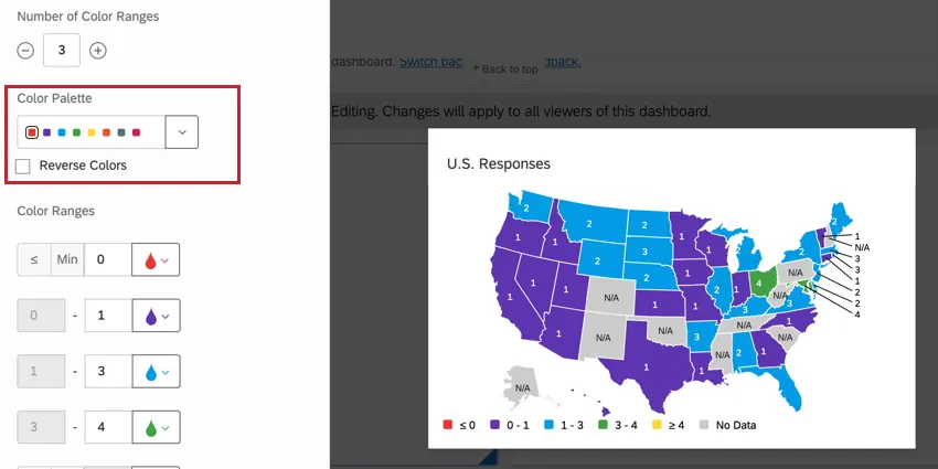
Color Palette
Select the color palette for your ranges. If you don’t want to use the entire range, click the color you’d like to use as your Start Color. If you want to reverse the order of the colors, select Reverse Colors.
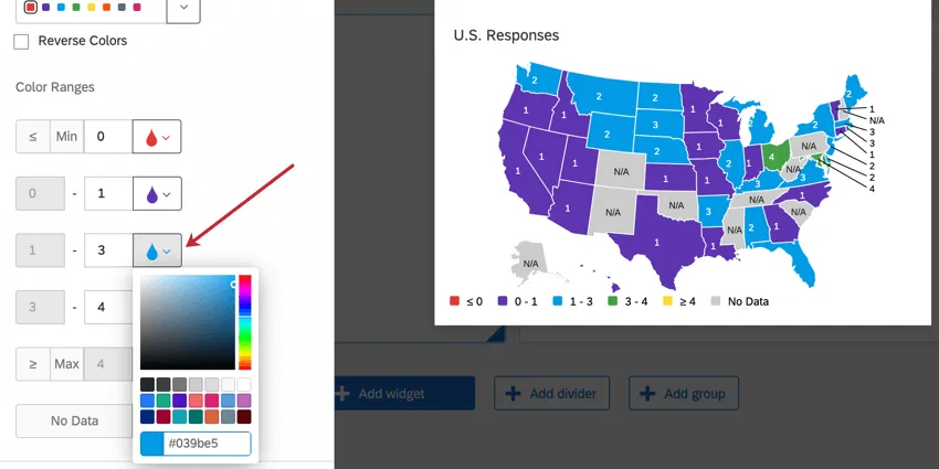
Color Ranges
Define your ranges. In any given range, the lower number will be included in the range and the upper number will be excluded. So, if a range is 10-20, 10 through 19 would be included in that group.
Qtip: If your widget’s metric is in the percentage format, then you should enter percentages for your color ranges. Percentages are entered as a decimal ( e.g., 0.2 for 20%, 0.25 for 25%, and so on).
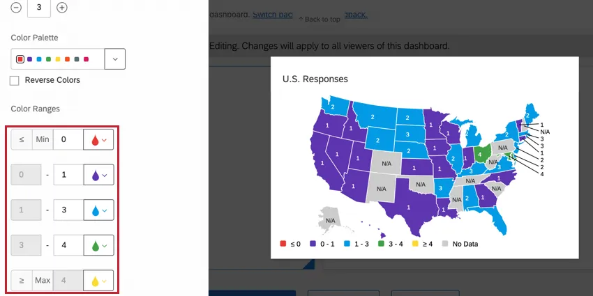
You can also specify different colors for each range in this section if you don’t want to use the color palettes.
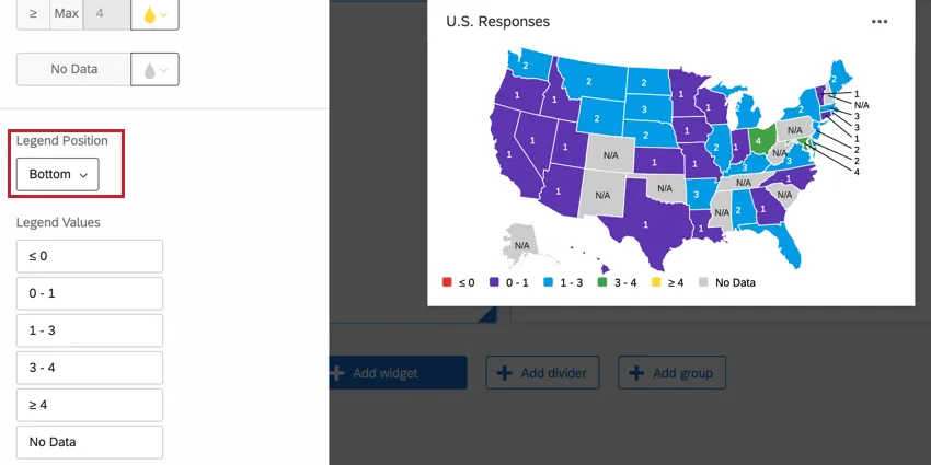
Legend Position
Decide where to place your color legend.
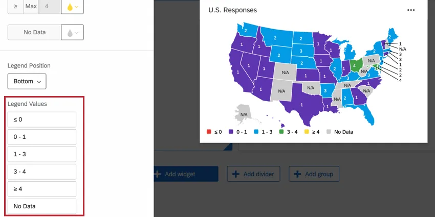
Legend Values
Change the labels for your legend values.
FAQs
I didn’t collect state or country data, but I have the location data recorded automatically as latitude and longitude. Can I use these coordinates in the CX Dashboards map widget instead?
I didn’t collect state or country data, but I have the location data recorded automatically as latitude and longitude. Can I use these coordinates in the CX Dashboards map widget instead?
Can I use the latitude and longitude survey metadata in the map widget?
Can I use the latitude and longitude survey metadata in the map widget?
Can I use a map widget with an ArcGIS map question?
Can I use a map widget with an ArcGIS map question?
That's great! Thank you for your feedback!
Thank you for your feedback!