
Pulse Dashboards Basic Overview
What's on this page
About Pulse Dashboards
Dashboards allow you to report the results of your pulse over time. You can start creating dashboards and managing who sees them after you start your program.
Everything related to your dashboards can be found under the Dashboard management tab.
There are 3 important steps to dashboard setup:
Qtip: All of your pulse survey projects will automatically be mapped to your dashboard at the time the survey starts, so you can skip straight to customizing your dashboard’s widgets and theme.
Customizing a Pulse Dashboard
A dashboard will be created for you by default after you start the program. You’ll be able to find this and any other dashboards you’ve created in the Dashboards section.
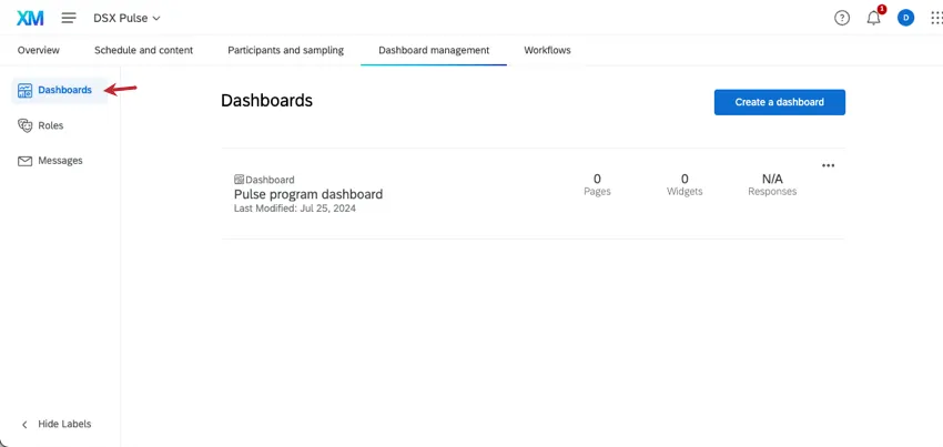
The Dashboards section allows you to create, copy, and remove dashboards. See Adding & Removing a Dashboard (EX) for more details.
To start editing your dashboard and viewing data, click the dashboard’s name.
Dashboard Editing Guides
Editing Pulse dashboards is the same as editing dashboards in other Employee Experience projects. Here are some resources to get you started:
- Reporting on Your Employee Engagement Project Results: An overview of dashboard building, from data mapping to widgets to configuring participant permissions.
Dashboard Basic Overview (EX): Introduction to key dashboard features, such as page management, how to enable exports, filtering, and more.

Qtip: If you’re using org hierarchies, make sure to add an org hierarchy filter to your dashboard.
- Widgets Basic Overview (EX): Everything you need to know about widgets, which are the charts and tables you use to visualize your data.
- Types of Employee Experience Projects: This table compares the different features each Employee Experience project has access to. If you’re ever unsure what’s included with a Pulse, check this table.
- Widget Types and Project Compatibility: This table has a list of widgets available in Pulse projects.
- Adding Additional Dashboard Sources: Your pulse program will automatically map all of your survey sources for you. However, this section also has important information on how data across different sources will appear in the same dashboard.
Qtip: The primary data source mapped in a pulse dashboard is always empty. If you set a widget to display this data source, the widget won't display any data. If this happens, select another data source instead.
- Text iQ in Dashboards: Unlike many EX Dashboards, Pulses allow you to conduct text analysis on dashboard data. See this page for how to use Text iQ in your dashboard.
- Action Planning: Now that you’ve gathered insights from your feedback, it’s time to take action. Set up company goals and create shared idea boards devoted to improving employee experience.
Attention: Pulse dashboards do not have access to report templates.
Qtip: To leave your dashboard and return to your pulse project, click the name of the pulse in the header.

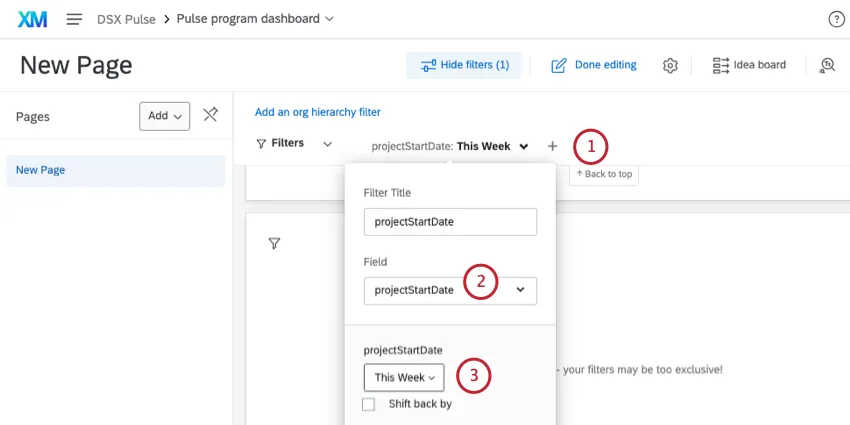
Filtering Pulse Dashboards by Project Start Date
We recommend filtering all pages of your Pulse dashboard by Project Start Date. This is a field exclusive to Pulses that records the launch date for each survey.
Example: If you launch a pulse on October 1, 2024, everyone in that pulse project will have a Project Start Date equal to October 1, 2024.
Project Start Date is an important field because it gives each participant invited to each survey the same field value; this means you can easily create filtered views for specific pulse surveys. We recommend filtering to show the last week of data, so you can see the most recent pulse data.
Showing Pulse Trend Data
Pulse dashboards can show your participants’ performance over a series of pulse surveys. But if you’re filtering your page for the last week of data, you need to find a way to show pulse performance over a longer period of time. To do this, we’ll make a line widget with a widget-level filter.
For example:
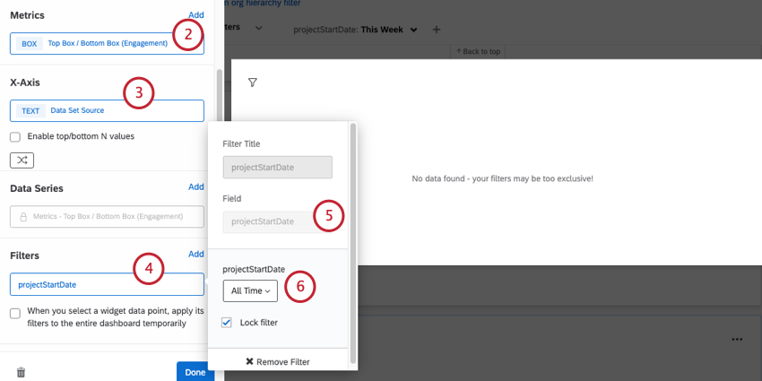
Example: In this case, we wanted to showcase high engagement scores. We created a scoring category for engagement, customized our scales for it, and on the widget, set it to Top Box, highlighting top scores.
Qtip: With this setting, no matter what the page filter is, the widget will always show trends over time.
Qtip: You can lock filters that you don’t want dashboard viewers to adjust.
Comparing Time Frames of Pulse Performance
Comparisons over time can be useful to help identify longer-term trends in how participants respond. To do this, you can create comparisons based on dates.
For example, if you want to compare this week’s pulse data to data collected a month ago:
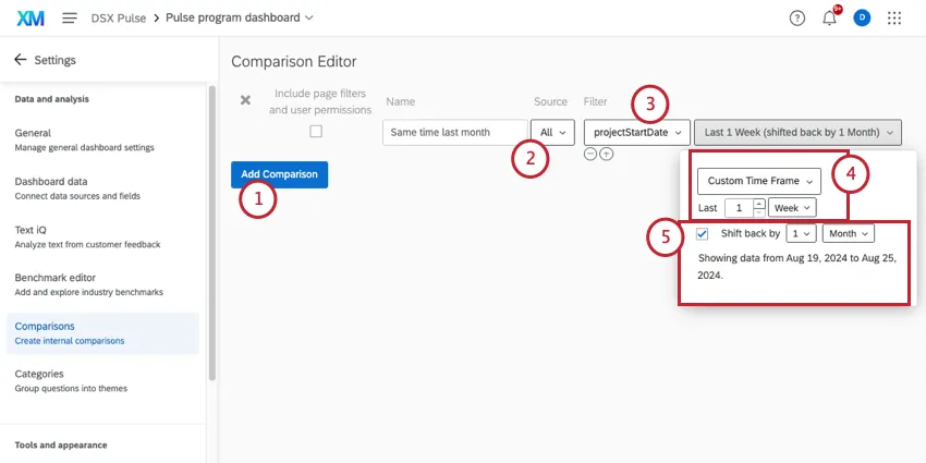
Example: In our example, we shifted back 1 month. This helps us compare current data to data collected at the same time a month ago.
Qtip: See a list of compatible widgets.
Qtip: Learn more about date filters, including shifts back.
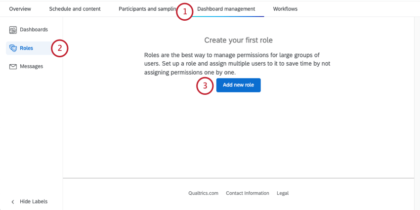
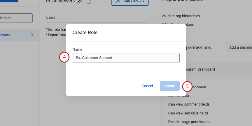
Roles
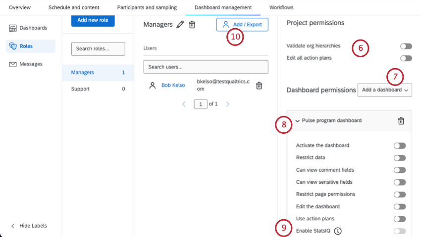
Roles let you give participants access to dashboards, and set permissions for many users at a time. You can determine which specific dashboards each participant has access to, and whether they can edit those dashboards or not. You can also use roles to restrict what fields and sensitive data users can see in the dashboard.
Roles are important when you’re using an org hierarchy in your program, because they have permissions that allow you to limit the data participants see based on their place in the org hierarchy. Roles are thus a great way to protect sensitive information.
Qtip: Participants can only view dashboards if they’re a member of a role with dashboard permissions.
Attention: This functionality is currently not available to all customers. If you’re interested in using Stats iQ in Pulse dashboards, reach out to Account Services.
For more, see the Roles (EX) support page.
Messages
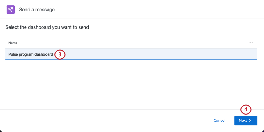
In the Messages tab, you can invite participants to view the dashboard, or you can view information about past dashboard invites you’ve sent.
Qtip: We recommend inviting participants to the dashboard after you’ve had a chance to customize your dashboard and set up roles.
Sending the first dashboard invite
Qtip: Participants can only be invited to view dashboards if they’re a member of a role that gives them dashboard access. Dashboard access is required regardless of any additional criteria you add to the invitation recipients.

- Only send to users who meet the confidentiality threshold: The confidentiality threshold is a setting on the dashboard that determines when data displays in the widgets. For example, if only one person completed the survey, you might not want your engagement scores to display data, because then you will know for sure whose it is. When selecting this option, only users who are allowed to view data that meets the confidentiality threshold will receive the invite. For more information on data restriction, see our support page on Role Permissions. Example: Your confidentiality threshold is 10. One of your managers is only allowed to see data in his own unit, but only 5 of his direct reports have responded so far. If Only send to users who meet the anonymity threshold is turned On, this manager will not receive an invite, because he will have no data to view in his dashboard.

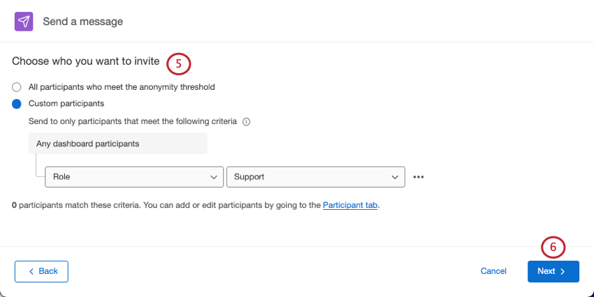
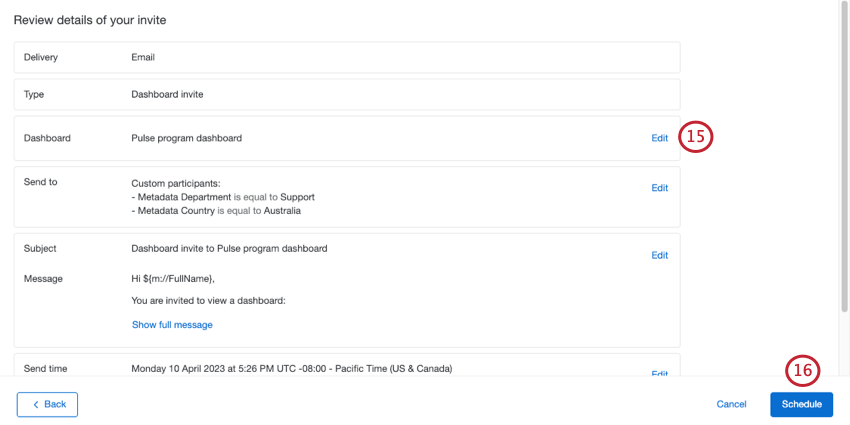
- Custom participants: Use contact info, metadata, or role to specify which participants should receive the invite. Use the dropdown to add more conditions. Participants who meet any of the criteria you set will be included in the distribution. Example: In the screenshot below, participants who are based in either Germany or Australia will be included.
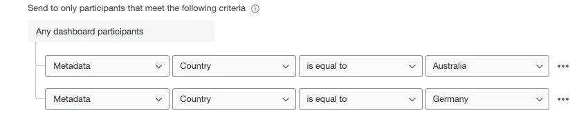 Qtip: Conditions are always joined by “any.” You cannot change it so that “all” conditions must be true.
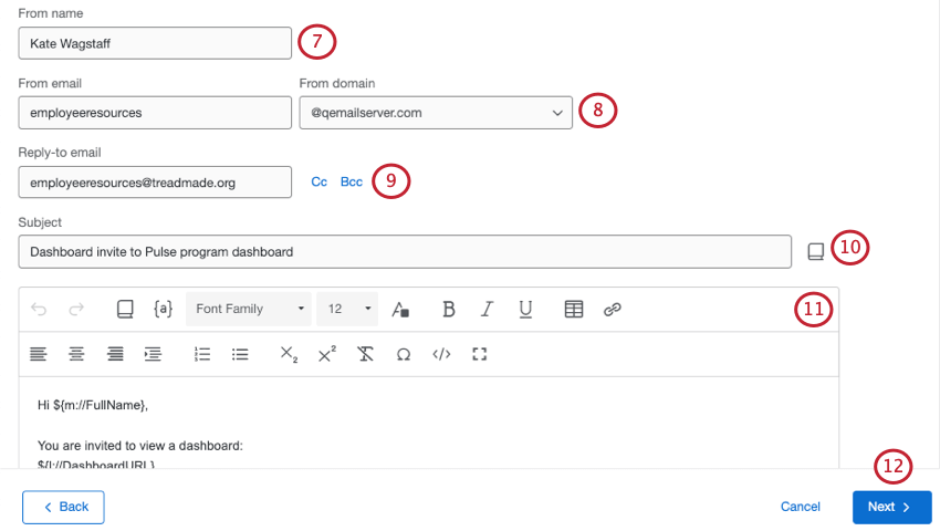
Qtip: You can use whatever name you want (e.g., MyCompany@qemailserver.com), but the domain has to be a Qualtrics-approved one. This improves your email’s legitimacy and decreases the chances it’ll bounce. If your organization has a custom email domain set up, this will also appear as an option.
Qtip: Saving a subject in your library lets you translate it more easily. See our support page on translating library messages.
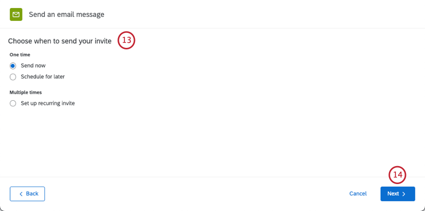
- Send now: Send the invite immediately after you finish these steps.
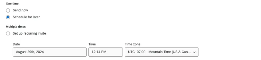
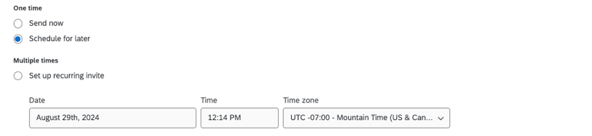
- Schedule for later: Pick a date, time, and time zone.
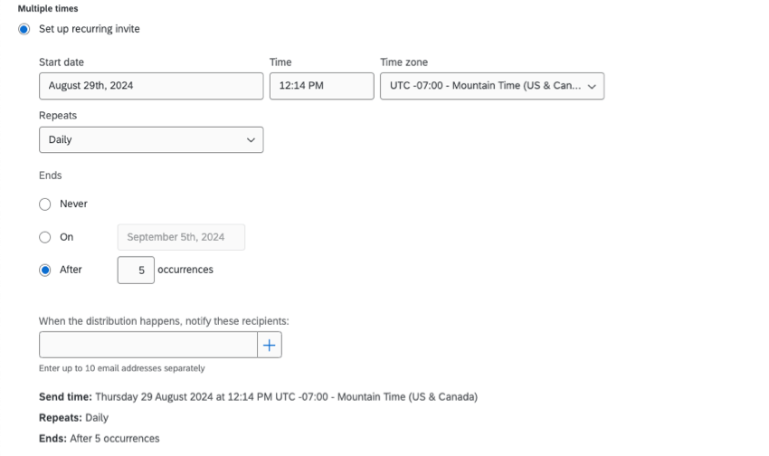
- Set up a recurring invite: Add a schedule the invite should repeat on. You can specify when the emails should stop being sent. You can also add emails of people you’d like to be notified whenever a recurring invite is sent.
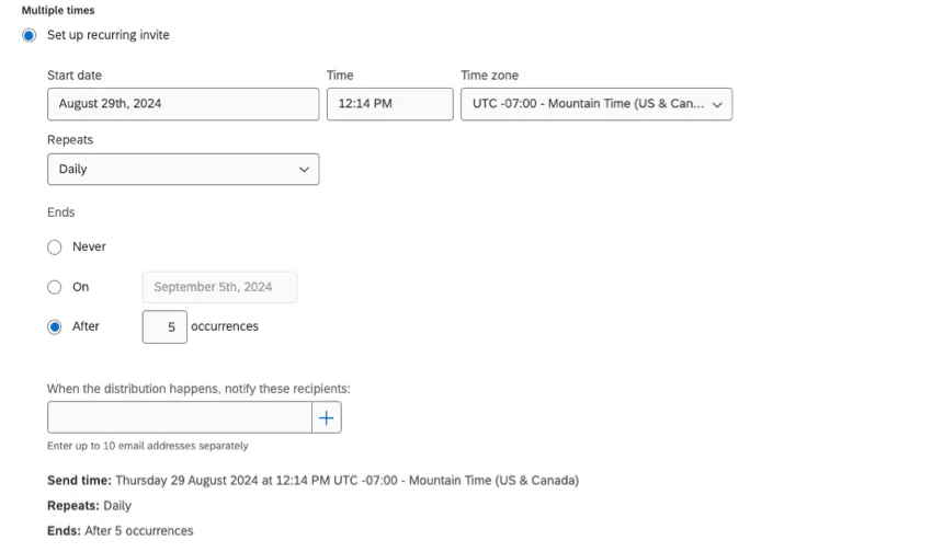 Qtip: You can use a recurring dashboard invite at the same cadence as your pulse survey, so that leaders will be reminded to log back in when the next pulse completes.
Managing Distributions
For each distribution you have sent (or have scheduled in the future), you’ll be able to see:
- The type of distribution (daily, weekly, etc.)
- The recipients
- The time the distribution was sent (or will be sent)
- The status of the distribution
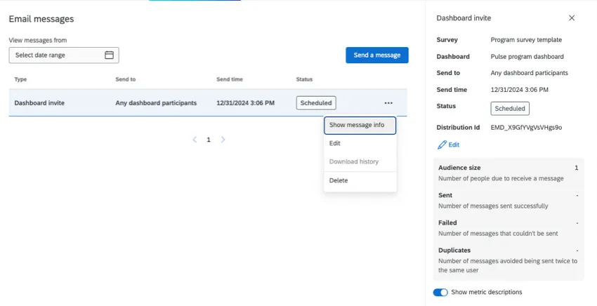
If you click on a distribution, you’ll see even more information, such as the dashboard the invitation is for, when the distribution is planned to end, the distribution ID, and a series of metrics.
- Audience size: The number of participants that the message was sent to. (For a scheduled distribution that hasn’t been sent yet, this will display the number of intended recipients.)
- Sent: The number of messages sent successfully.
- Failed: The number of messages that couldn’t be sent.
- Duplicates: The number of messages skipped to avoid being sent twice to the same user.
Qtip: Click Show metric descriptions to see metric definitions right inside the page.
If you click the dropdown next to a distribution, you can do the following:
- Show message info: Show the same panel you see to the right when you click the distribution.
- Edit: Make changes. This option is only for scheduled distributions that haven’t been sent yet.
- Review: See what message was sent, along with other distribution details. This option is only for sent distributions.
- Download history: Get a spreadsheet with a detailed distribution history. Learn more about the information included in this file in the next section.
- Delete: Delete the distribution. When you delete a sent message, it will erase the history of the distribution from your project. When you delete a scheduled distribution, it won’t send.
Distribution History
When you download the email distribution history, it contains the following columns of information on each participant.
- First Name: The participant’s first name.
- Last Name: The participant’s last name.
- Email: The participant’s email as specified in the Participants tab.
User Name: The participant’s user name as specified in the Participants tab.
Qtip: While a participant’s user name is often their email, this may not always be the case. Be sure to double check the participant’s information in the Participants tab to confirm this information.
- Status: The status column helps you monitor whether the recipient received the message. Below is a descriptive list of possible status conditions.
- Success: The email successfully left Qualtrics email servers.
- Bounced: The email did not reach the recipient’s inbox. This could be for a number of reasons: the email address doesn’t exist, the receiving server has a high security firewall, the receiving mailbox is full, the recipient server is offline, etc.
- Failed: The email failed to send. Usually, this is because the from address for the email is using an invalid email domain. To use a custom email domain in the from address, it must be configured for use in Qualtrics. See Using a Custom From Address for more information.
- Timestamp: The timestamp of when the participant’s status changed. This is displayed in ISO 8601 format in the UTC time zone.
FAQs
How can I stay up to date on new Qualtrics features?
How can I stay up to date on new Qualtrics features?
To access these release notes, you need an XM Community account. These accounts are free for any users with a Qualtrics account. This support page contains information for how to register an XM Community account.
Once you're logged into the XM Community, head over to the Weekly Product Updates Introduction Post. This post contains all the information you need to get started with subscribing to product updates!
Can I import historical pulse data into my program?
Can I import historical pulse data into my program?
- You can skip any steps involving hierarchies.
- The dashboard where you will map the historical data will be the pulse dashboard.
Can I use Text iQ with a pulse?
Can I use Text iQ with a pulse?
Do I need to map my pulse surveys to my dashboard myself?
Do I need to map my pulse surveys to my dashboard myself?
How can I see my response rates?
How can I see my response rates?
Can I use Stats iQ in a Pulse dashboard?
Can I use Stats iQ in a Pulse dashboard?
Stats iQ is only available to the user if the following is true:
- Restrict Data is disabled in the user’s role.
- Can view sensitive fields and Can view comment fields are both enabled in the user’s role.
- Enhanced Anonymity is disabled for the dashboard.
What are EX Dashboards?
What are EX Dashboards?
That's great! Thank you for your feedback!
Thank you for your feedback!