
Pie Widget (Studio)
Suite
Customer Experience
Product
Qualtrics
What's on this page
About the Pie Widget
Qtip: To modify dashboard widgets, a user must have an Edit Dashboard permission and be granted Can Edit permission for the specific dashboard. For information about widget permissions, see Editing Widget Properties.
Qtip: To ensure optimal Studio performance, there is a limit on the number of widgets that can be added to each dashboard. For more information, see Maximum Widgets per Dashboard.
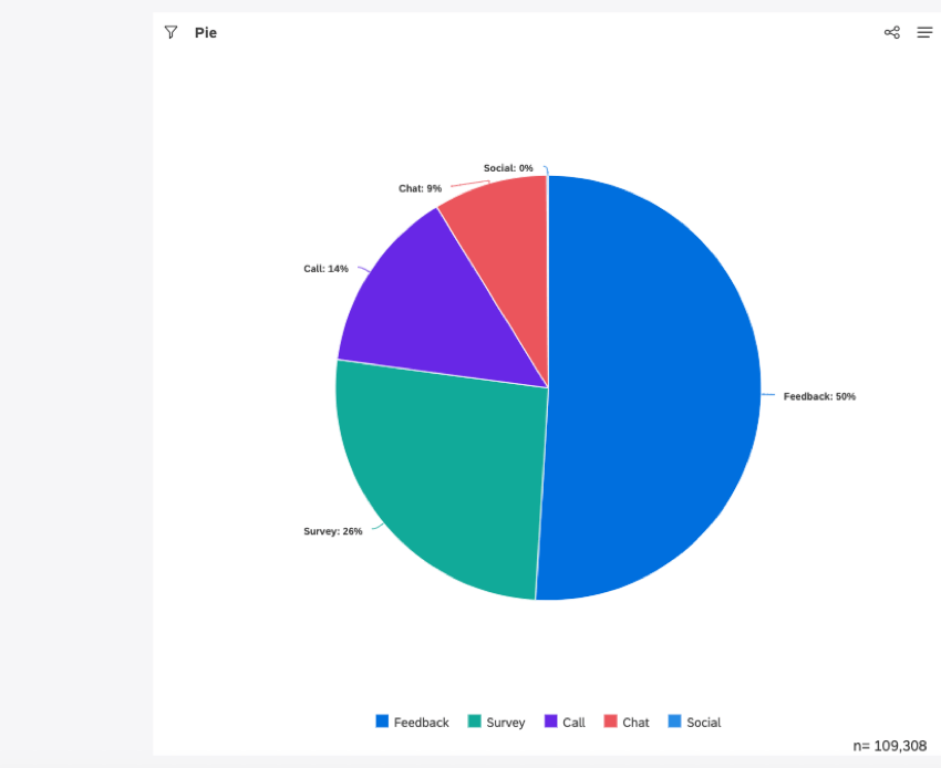
You can use the pie widget to display data as a pie chart or a donut chart. This widget provides a useful way of comparing items and visualizing their relationship to the whole, preferably for only a few categories.

For information about editing widget properties, resizing or rearranging a widget, using a widget as a filter, creating a copy of a widget, applying filters to a widget and more, see Widgets (XM Discover).
Adding a Pie Widget
Qtip: at the bottom-right of each of the Properties, Visualization and Filters tabs to apply the settings in each of these tabs, and then click Save at the top of the dashboard.
Properties Tab
You can edit widget properties in the Properties tab. For information about adding a widget, please see Adding a Widget.
Visualization Tab
You can define report settings in the Visualization tab.
Select the Visualization tab.
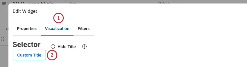
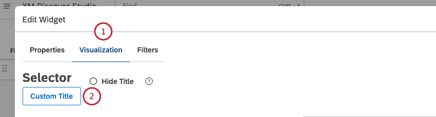
To enter your own report title, click Custom title.
Enter a custom report title into the box.
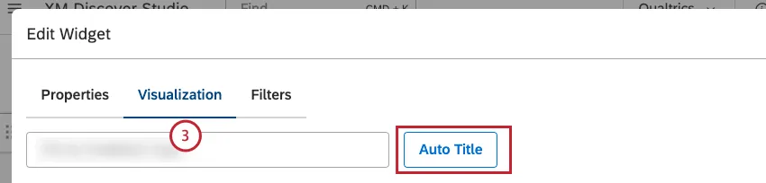
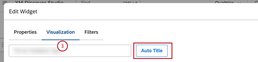
Qtip: Alternatively, click Auto Title to keep the automatically generated report title.
Select the date range for the report. For all available options, see Date Range Filters.
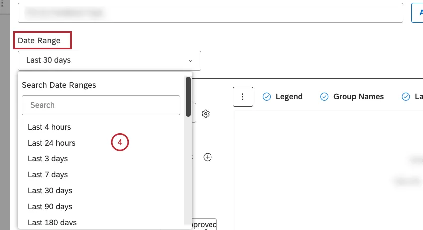
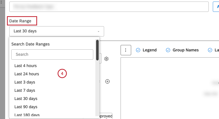
Qtip: Unless you set your widget to ignore the dashboard date range, the dashboard date range replaces the date range defined here.
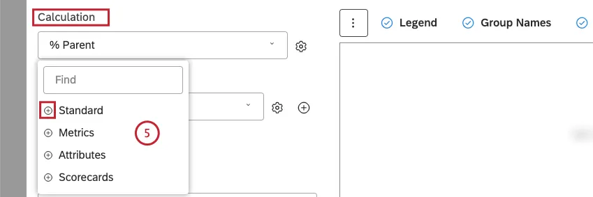
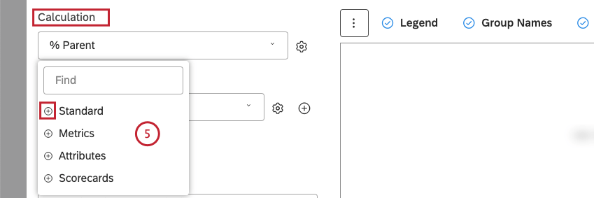
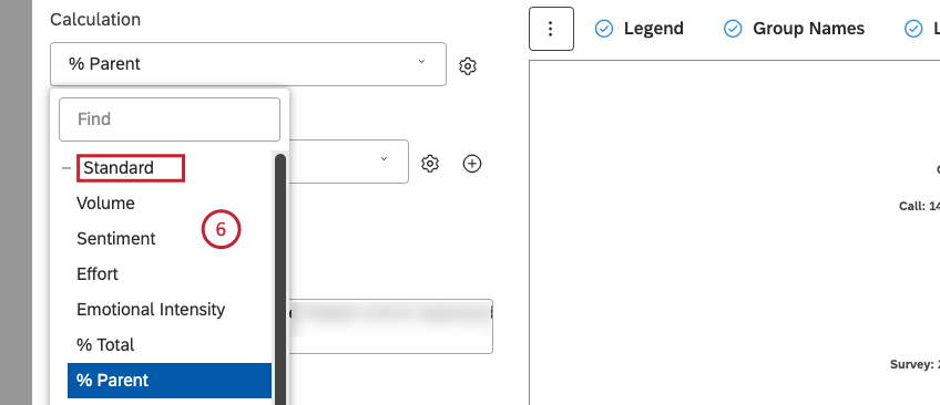
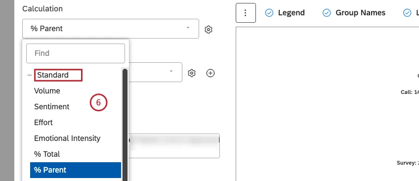
Select 1 of the following calculation options to be reflected by the size of the pie sectors or ring slices:
- Standard
- Metrics
- Attributes
- Scorecards
 Qtip: For an overview of available calculations, see Calculations (Studio).
 Qtip: Click the plus ( + ) icon to view more options.Qtip: Calculation options that are not likely to be useful are grayed out. A calculation is grayed out when it is either empty or contains only a single value under the current filters (both widget-level and dashboard-level). This should help you focus your reports on the more meaningful metrics without having to apply the trial and error method. You can select grayed out calculations if you need to.
- Volume
- Sentiment
- Effort
- Emotional Intensity
- % Total
- % Parent
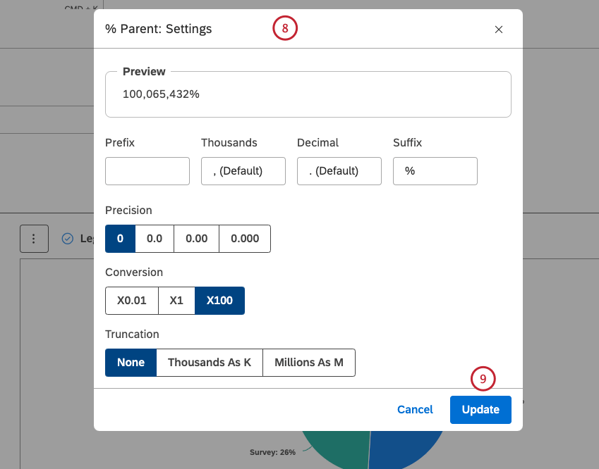
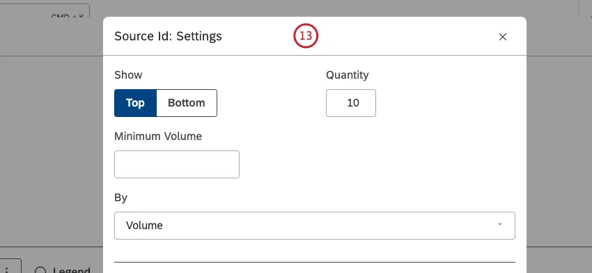
After you select a calculation, click the gear icon next to it to define additional settings.
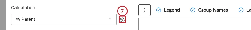
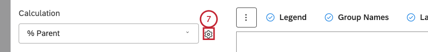
Depending on the calculation selected, you can define different settings. For information about calculation settings, see Calculations (Studio).

Qtip: You can define default settings for calculations based on specific attributes on the Projectspage.
Click Update.
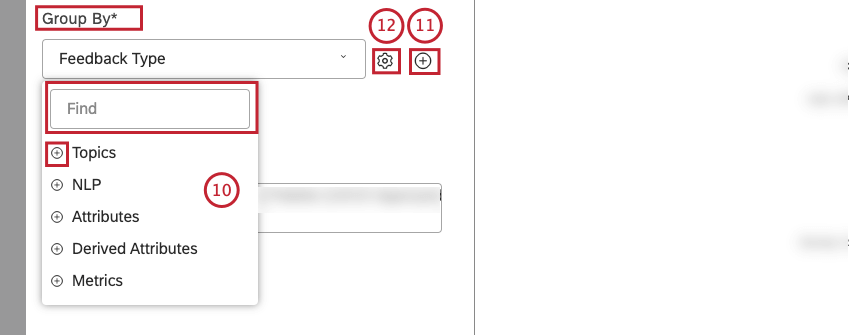
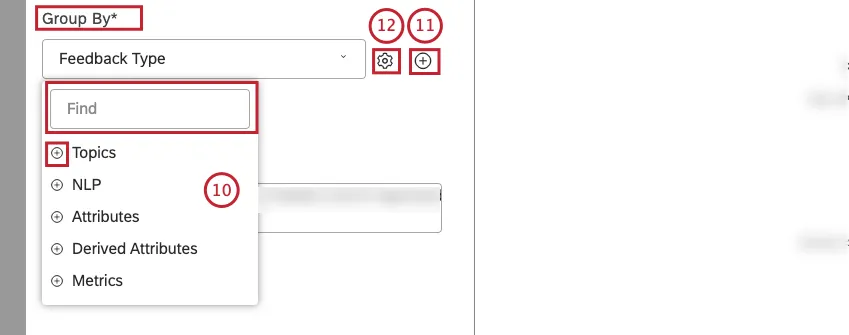
Select the option by which to group data for your report:
- Topics
- NLP
- Attributes
- Derived Attributes
- Metrics
Qtip: For an overview of available data groupings, see Grouping Data.
Qtip: Click the plus ( + ) icon to view more options.
Qtip: Use search to find options you want to group by.
Qtip: Grouping options that are not likely to be useful are grayed out. A grouping is grayed out when it is either empty or contains only a single value under the current filters (both widget-level and dashboard-level). This should help you focus your reports on the more meaningful data groupings without having to apply the trial and error method. You can select grayed out groupings if you need to.
Qtip: If primary grouping is by any NLP option, secondary grouping is not available for performance reasons.
If you wish, you can add a secondary grouping by clicking the Add ( + ) When a secondary grouping is selected, primary groupings are displayed as separate charts side by side.
Qtip: If primary grouping is by any NLP option, secondary grouping is not available for performance reasons.
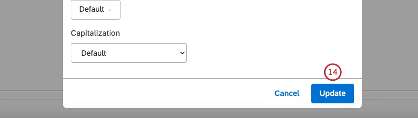
After you select a grouping option, click the gear icon next to it.
Configure the subset of data that should be included in that grouping for the report in the Settings For an overview of available grouping settings, see Grouping Settings.

Click Update.

If you wish, you can select the Donut checkbox to display data as a donut chart, with rings instead of sectors.

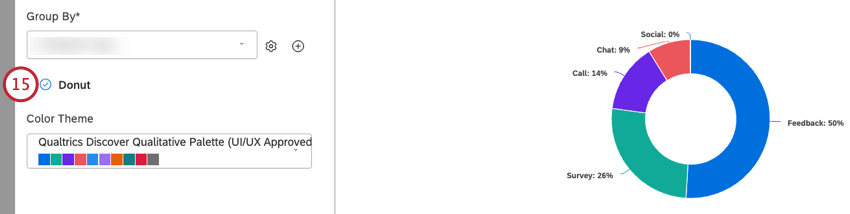
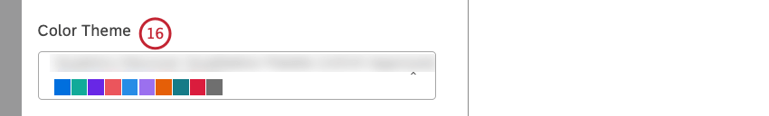
Select the color palette for the chart.

If you wish, you can click More Graphs to switch to other widget types while retaining the current report settings (where applicable).
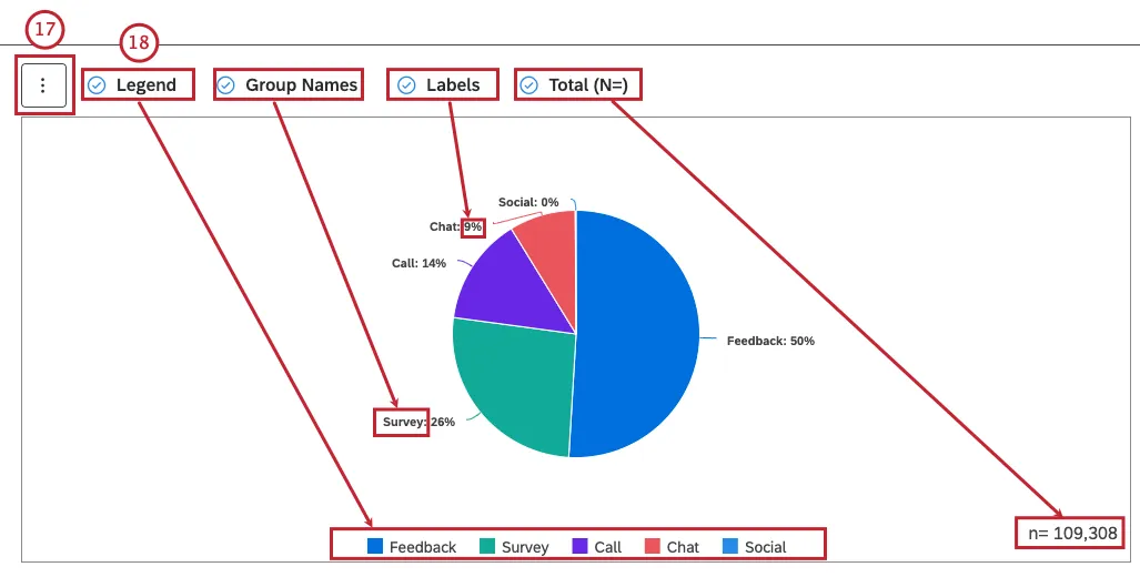

If you wish, you can select the following checkboxes:
- Legend: To show a chart legend (optional). Deselect the Legend checkbox to hide a chart legend. Qtip: Viewers can hide and show specific report items by clicking them in a legend.
- Group Names: To show primary grouping names as labels next to pie sectors. Qtip: This option is only available when the primary grouping is defined. Deselect the Group Names checkbox to hide numeric labels next to report items.
- Labels: To show exact numeric values as labels next to pie sectors (optional). Deselect the Labels checkbox to hide exact numeric labels next to pie sectors.
- Total (N=) To show the total number of documents that match report conditions and filters (optional). For more information, see Displaying Total Volume on Widgets (Studio). Deselect the Total (N=) checkbox to hide the total number of documents that match report conditions and filters. Qtip: To set the default dashboard-wide value for new widgets, use the n= setting in dashboard properties.
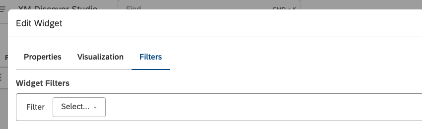
Filters Tab
In the Filters tab, you can further narrow down report data. For information on widget filters properties, please see Applying Filters to a Widget.

That's great! Thank you for your feedback!
Thank you for your feedback!