
Journey Chart Widget
What's on this page
Qtip: You are now reading about a feature that is only available on certain licenses. If you’d like to gain access to this feature, please reach out to Account Services.
About Journey Chart Widgets
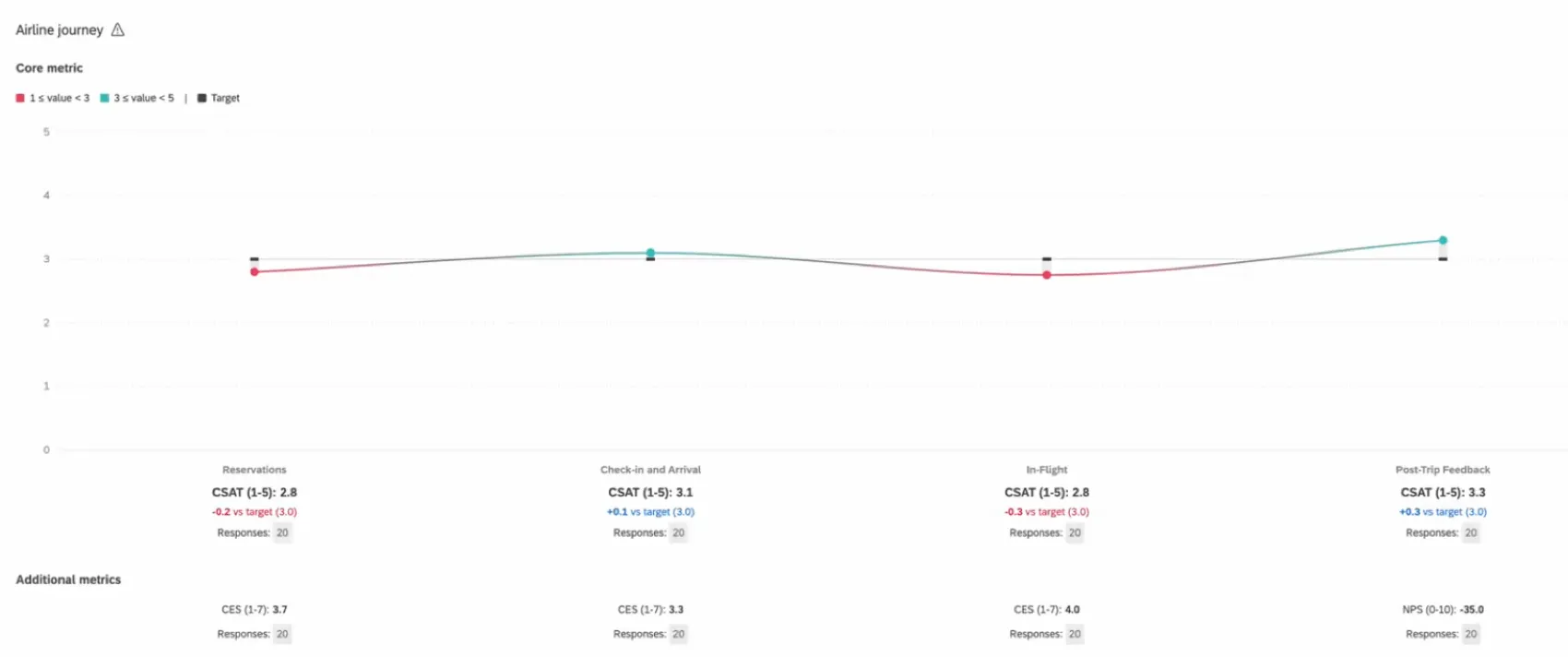
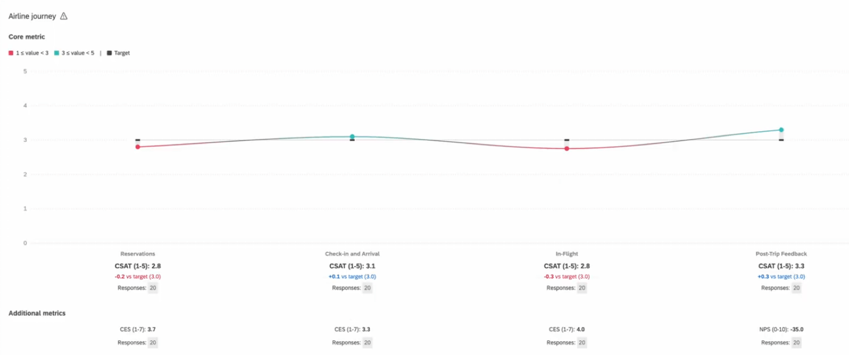
The journey chart widget displays data in a single line, where each data point represents a moment in the customer or employee journey. This widget is useful if you would like to easily visualize your respondents’ experiences across multiple touchpoints.
For information on creating a widget, see Adding Widgets.
Qtip: The screenshots on this page show CX dashboards, but this widget works the exact same in EX dashboards.
Enabling Journey Chart Widgets
Before you can use this feature, you need to make sure you do the following:
You must complete these steps before you set up your journey chart widget. Otherwise, data may not appear as intended.
Types of Dashboards
This widget can be used in a few different types of dashboard. These include:
- CX Dashboards
- Customer Experience Programs
- Employee Engagement
- Lifecycle
- Pulse
- Ad Hoc Employee Research
- Employee Journey Analytics
Field Type Compatibility
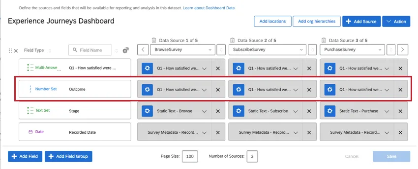
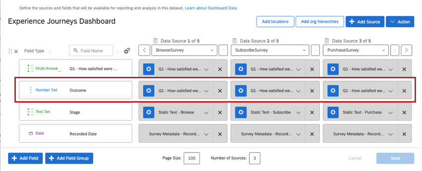
The journey chart widget requires two field types: Text Set and Number Set.
The Stage Dimension (milestone) must be set to the Text Set field type. See more on stages.
The (outcome) Metric must be configured as the Number Set field type. See more on outcome metrics.
Qtip: Before you can add these fields to your widget, you need to have completed your survey embedded data and dashboard data mapping. Depending on the type of dashboard you’re using, see the following resources:
- Journeys in Customer Experience Programs (Recommended for CX customers)
- Employee Experience Journeys (Recommended for EX customers)
Widget Setup
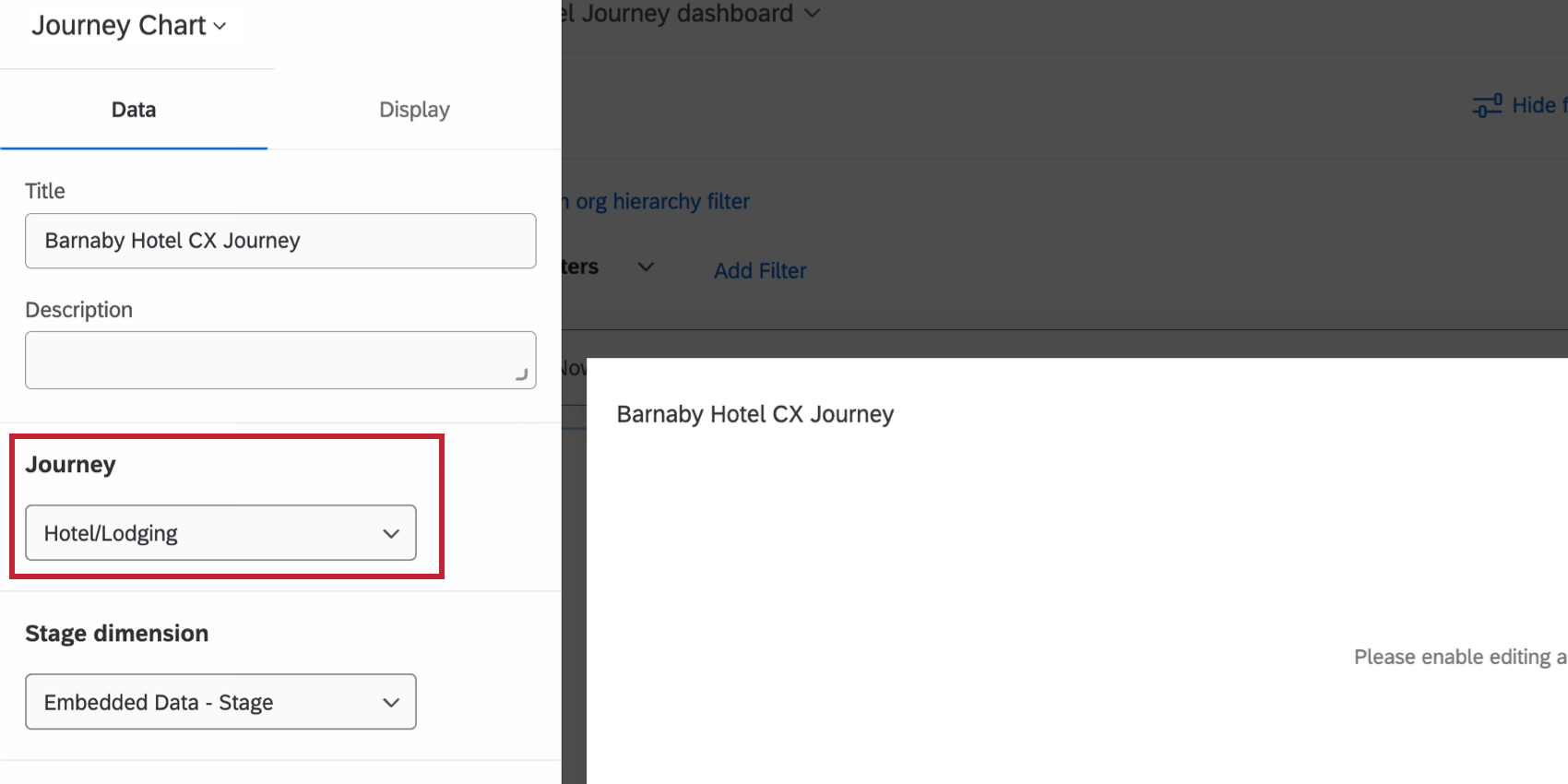
Journey

In the Journey field, you’ll have the option to select any of the journeys you’ve defined on the Journeys page or in a Customer Experience Program. This journey, as well as the journey stages you’ve set, must first be properly configured with the stages in your dashboard sources. Each journey stage will appear as a point in the line graph.
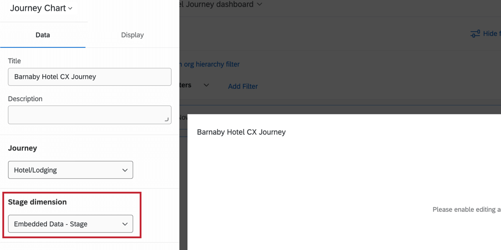
Stage Dimension
You will need to define your Stage Dimension as the stage Text Set metric you configured in your dashboard settings.

Metric
When setting up your journeys widget, you will need to define a metric for each milestone of the journey. The metric is the outcome for each stage that you want to show. Make sure before you start that the outcome metric is added to your dashboard data as a number set.
First, you’ll need to choose your metric’s format. For definitions of each, see Widget Metrics. Options include:
- Average
- Sum
- Net Promoter Score (NPS)
- Minimum
- Maximum
- Top Box / Bottom Box
You should have the same metric format for each milestone.
Once you’ve selected one of the options above, you can then choose the outcome (or metric) you defined for each milestone. The milestones shown in the widget are based on the specific journey you selected.
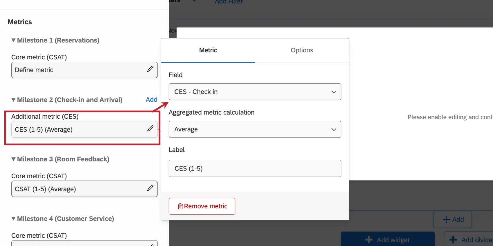
Qtip: Usually, you’ll select the same dashboard field for each milestone’s outcome metric. This is because when you map your dashboard data, you tend to match similar fields together, “merging” them on the same row, like seen below.
If you’ve separated your outcome metrics into different dashboard fields, then you will select different fields for each milestone.
Metric Options
After your metric and field have been configured, you can customize additional metric options in the Options menu, such as formatting and decimal places. See these optional settings on the Widget Metrics page.
Display Options
The Display section of the widget editor allows you to customize the visual aspects of your widget.
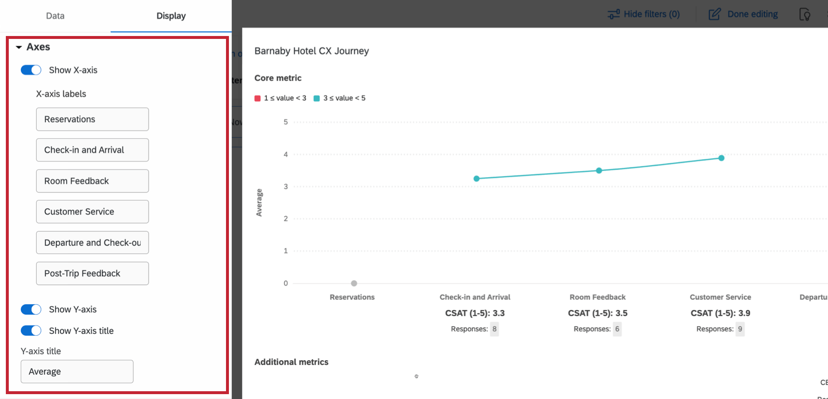
Axes
Customize your widget’s axes:
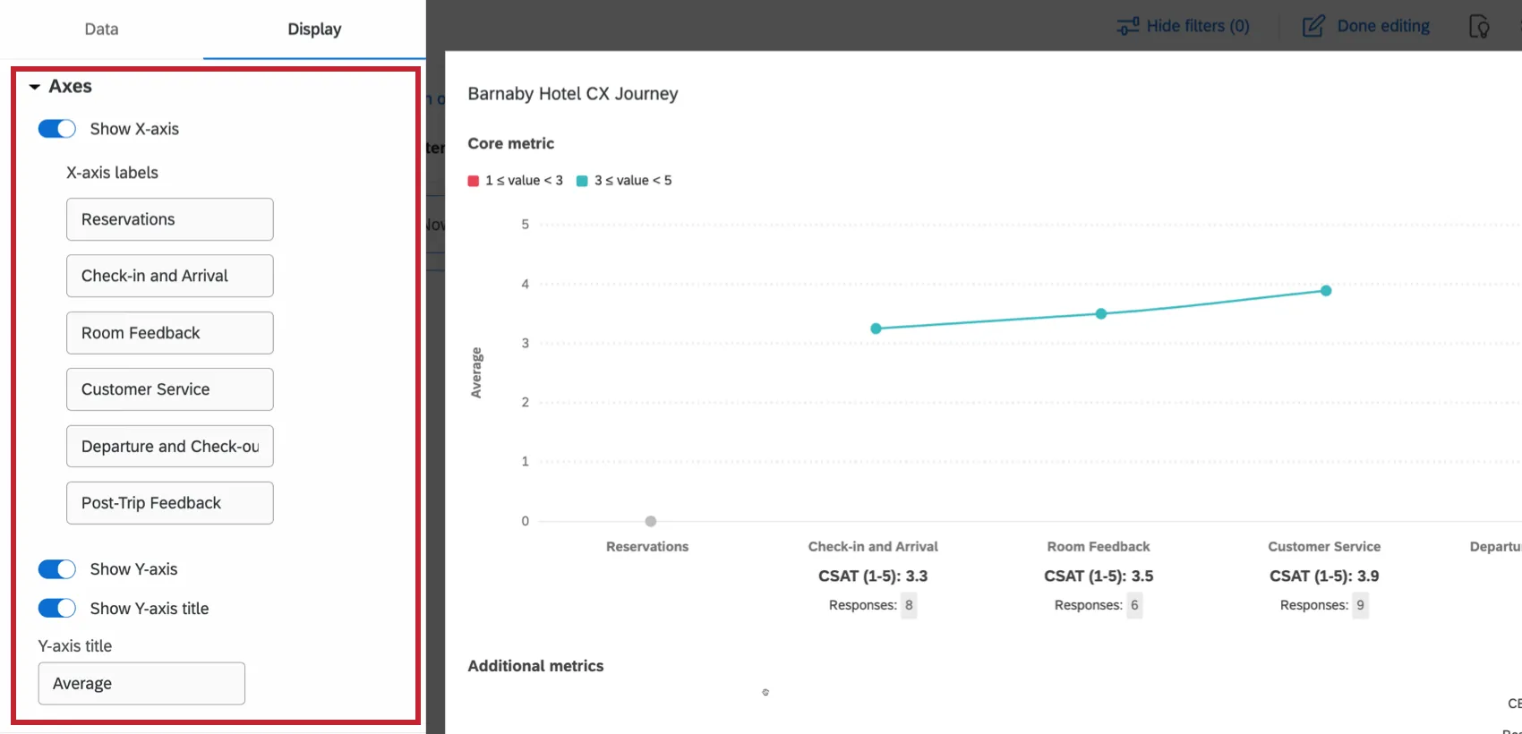
- Show X-axis: When enabled, show labels for the x-axis.
- X-axis labels: Edit the individual x-axis labels. By default, these are the milestone names.
- Show Y-axis: When enabled, show labels for the y-axis.
- Show Y-axis title: When enabled, show a title for the y-axis
- Y-axis title: Edit the displayed y-axis title. By default, this is the chosen metric calculation.
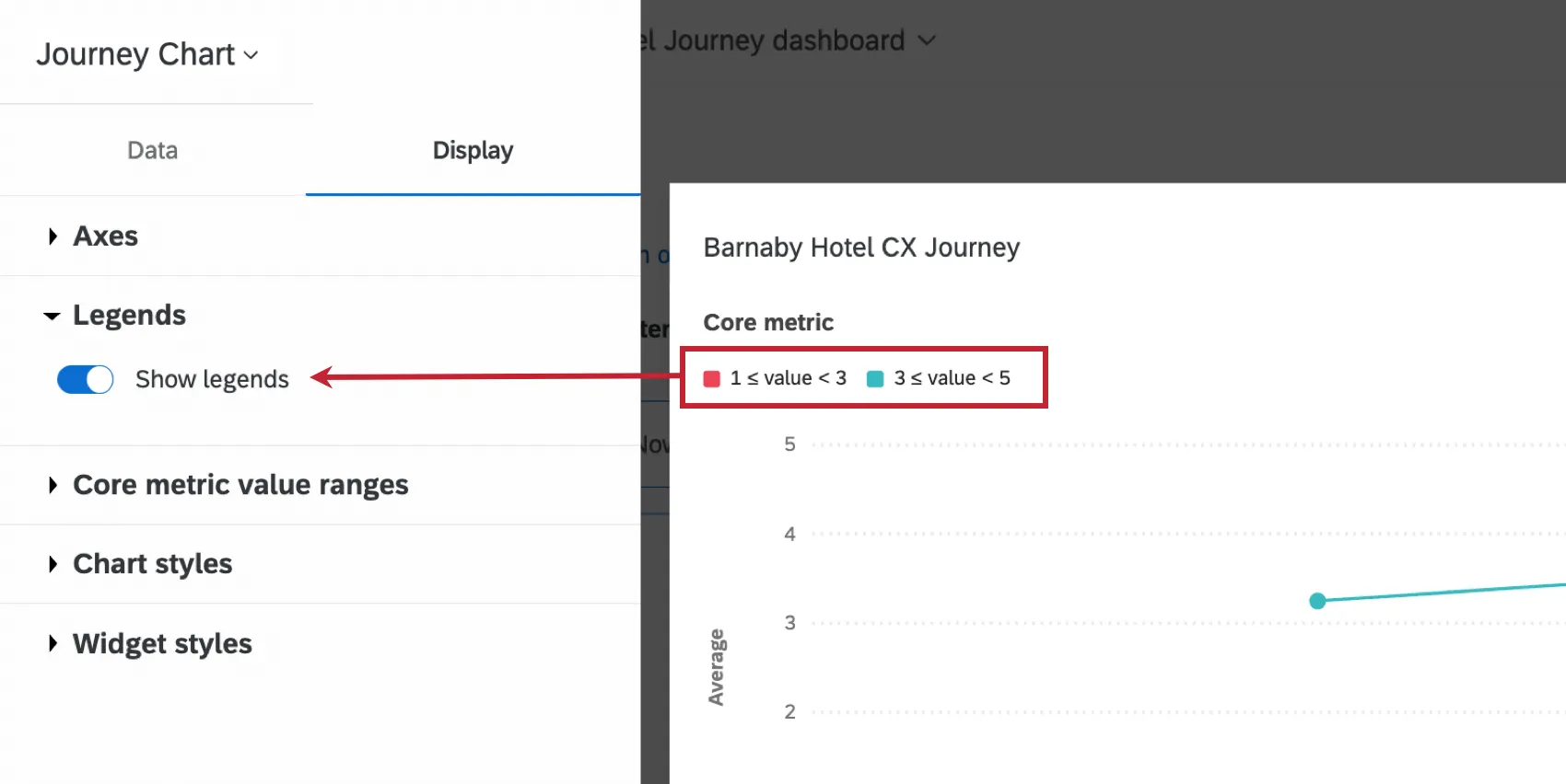
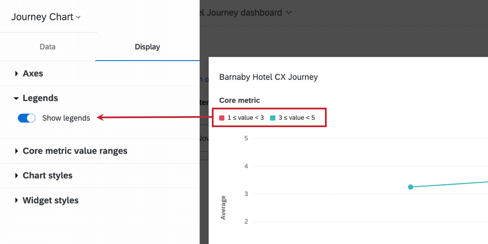
Legends
Enable Show legends if you’d like your core metric data ranges to be defined on the widget.
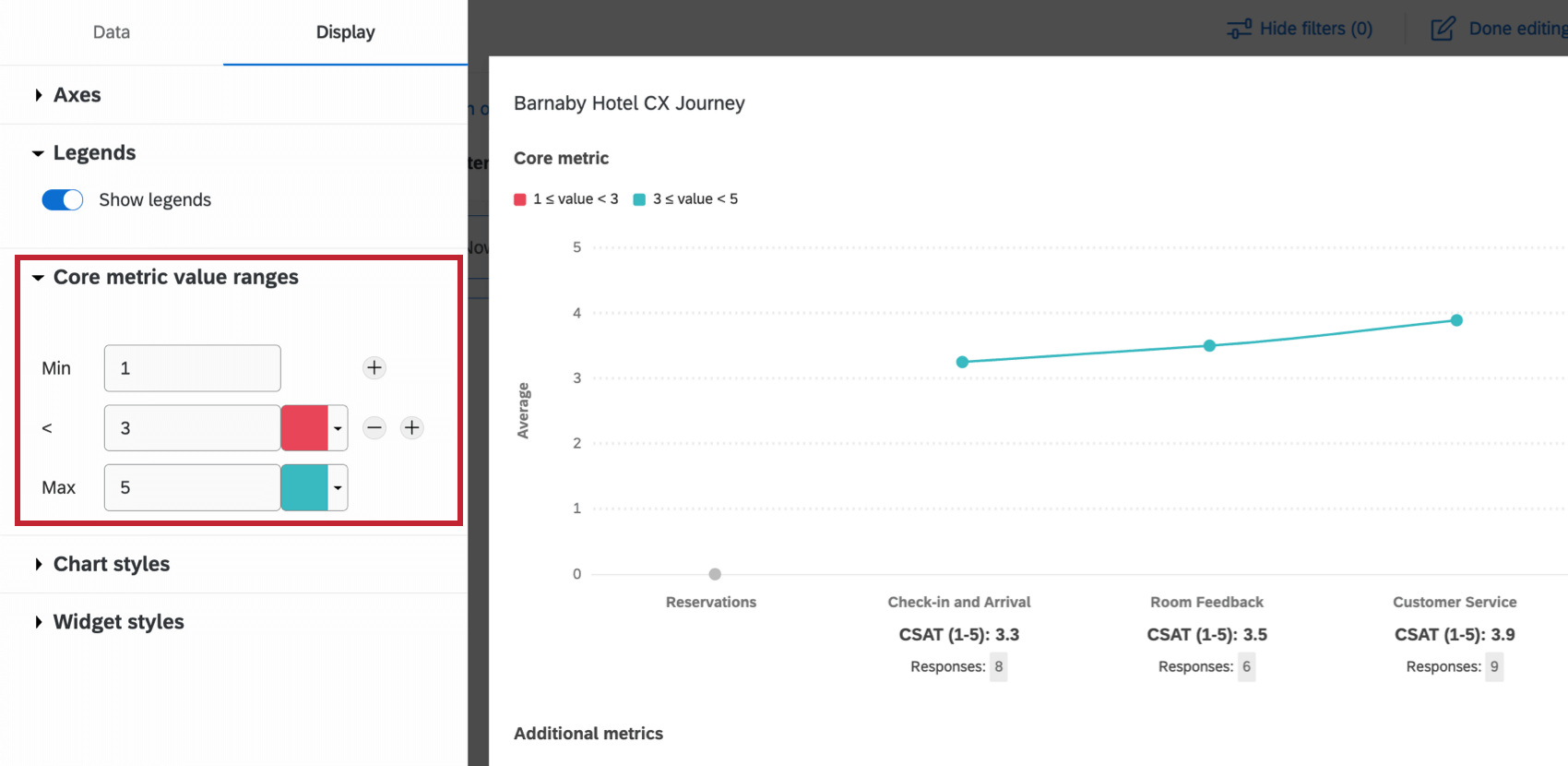
Core metric value ranges
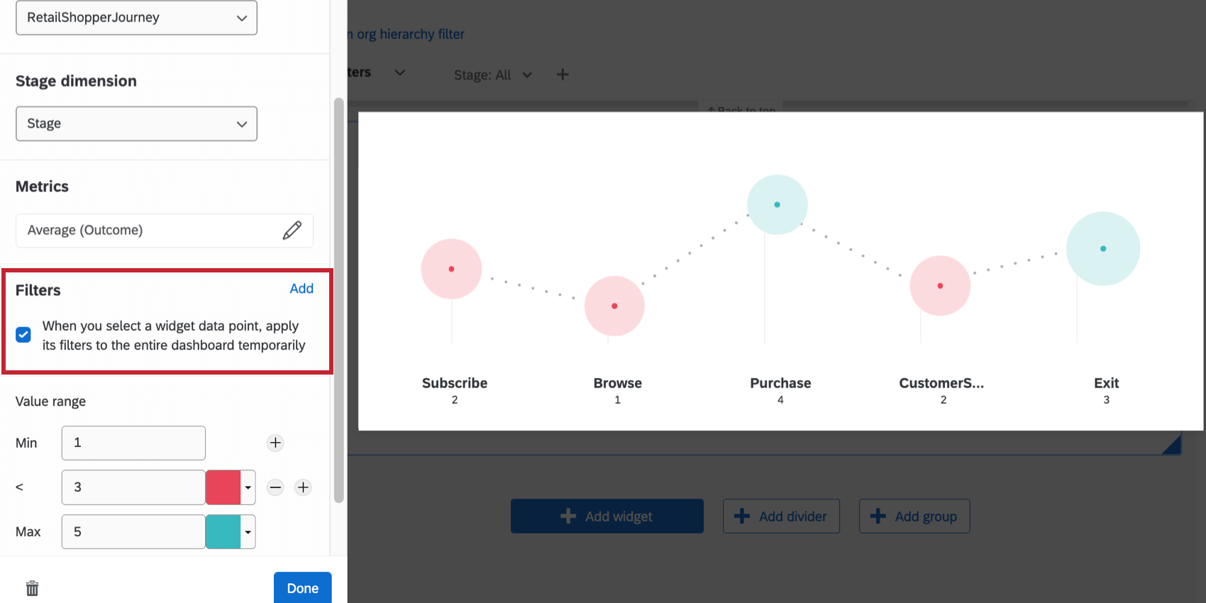
The Core metric value ranges determine the scale values associated with your journey’s core metric. Enter values in the Min and Max boxes to set the lower and upper bounds for your metric. In addition to the minimum and maximum values, you can set up to 9 intermediate values. For each value, set the color that you would like each stage to be when the metric is less than or equal to that value.
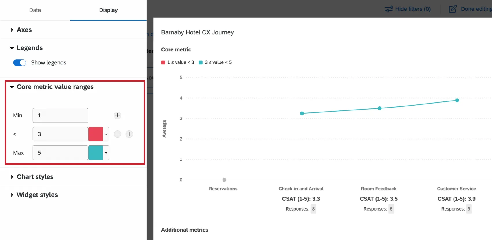
Qtip: When setting your value ranges, if you would like to indicate decimals for cutoff points, please be sure to use a dot ( . ) instead of comma ( , ) when typing your entry.
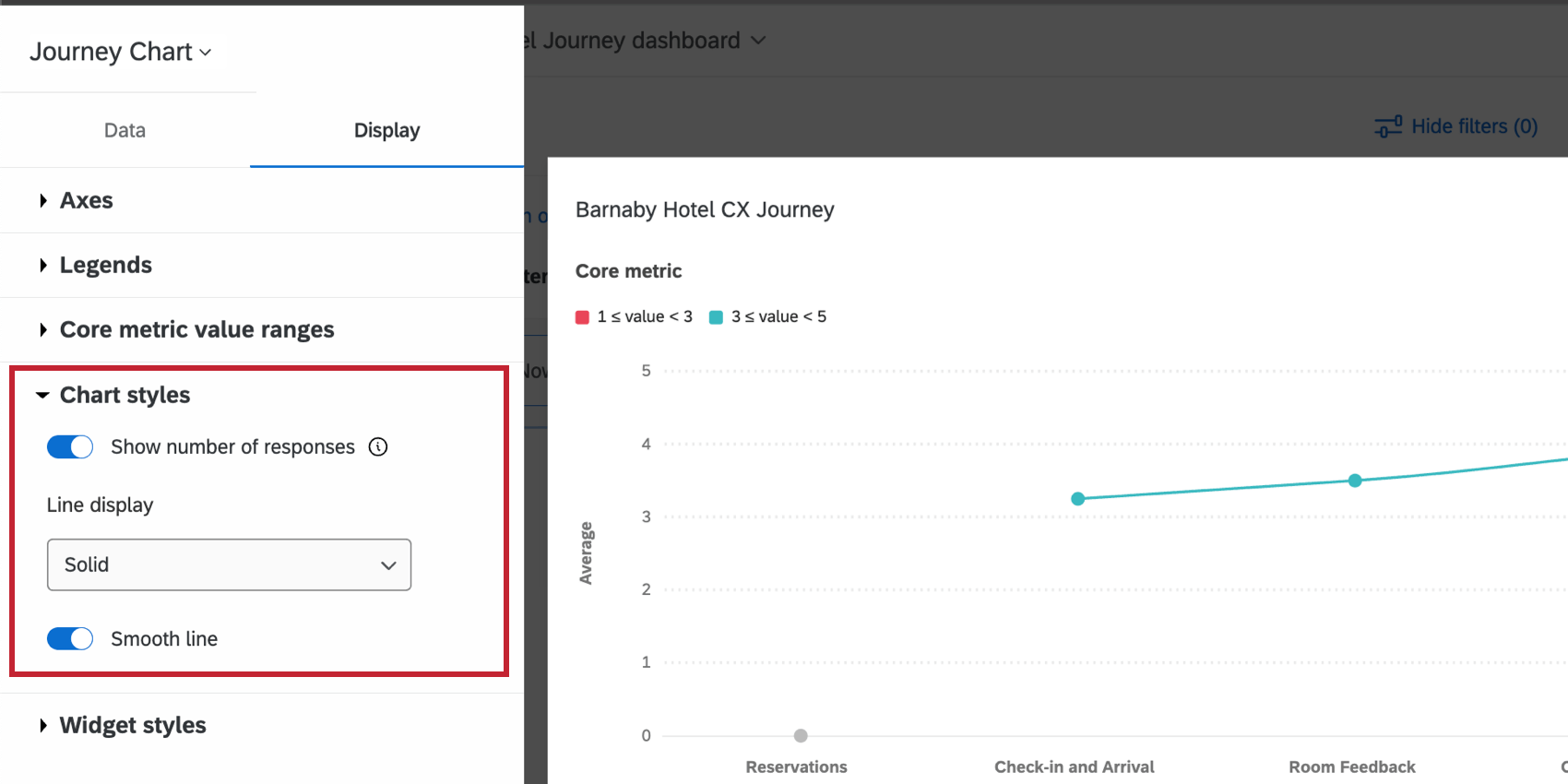
Chart styles
The Chart styles options control the following aspects of your widget:

- Show number of responses: If enabled, show the number of responses corresponding to each milestone and metric.
- Line display: Choose to display a solid line, or no line.
- Smooth line: If displaying a line, choose if you’d like the line to be smoothed.
Widget styles
Widget styles are the same regardless of widget type. For more on widget styles, see Editing Widgets.
Journey Stage Filters
Let’s say you’ve loaded your journey stage dimension and outcomes into your journey chart, and you want to be able to filter this data for easier viewing. There are two ways to accomplish this in your dashboard.

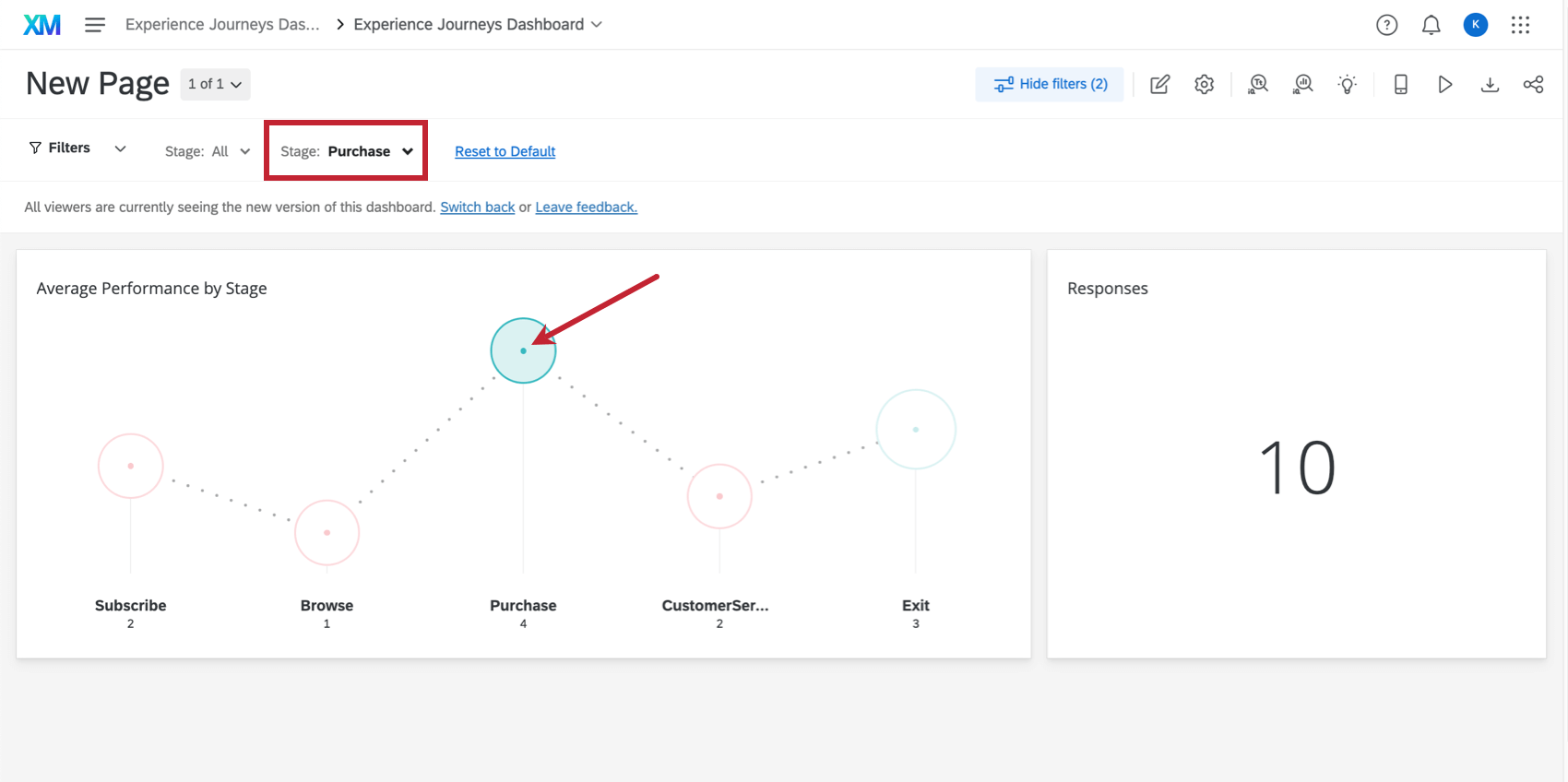
You will have the option to filter your dashboard page by clicking on the widget directly. Navigate to the Journey Chart Widget options, and select whether you would like to apply a filter to the dashboard when you click a value in the Journey Chart Widget. If you choose to add a page filter, the filter that will be created will correspond to the stage you selected. To remove the filter, simply click the selected stage again.
Example: We’ve chosen to add a page filter after clicking a value in the journey chart. If Purchase is selected on the widget, the other stages grey out, and the dashboard page is now filtered by the Purchase stage data.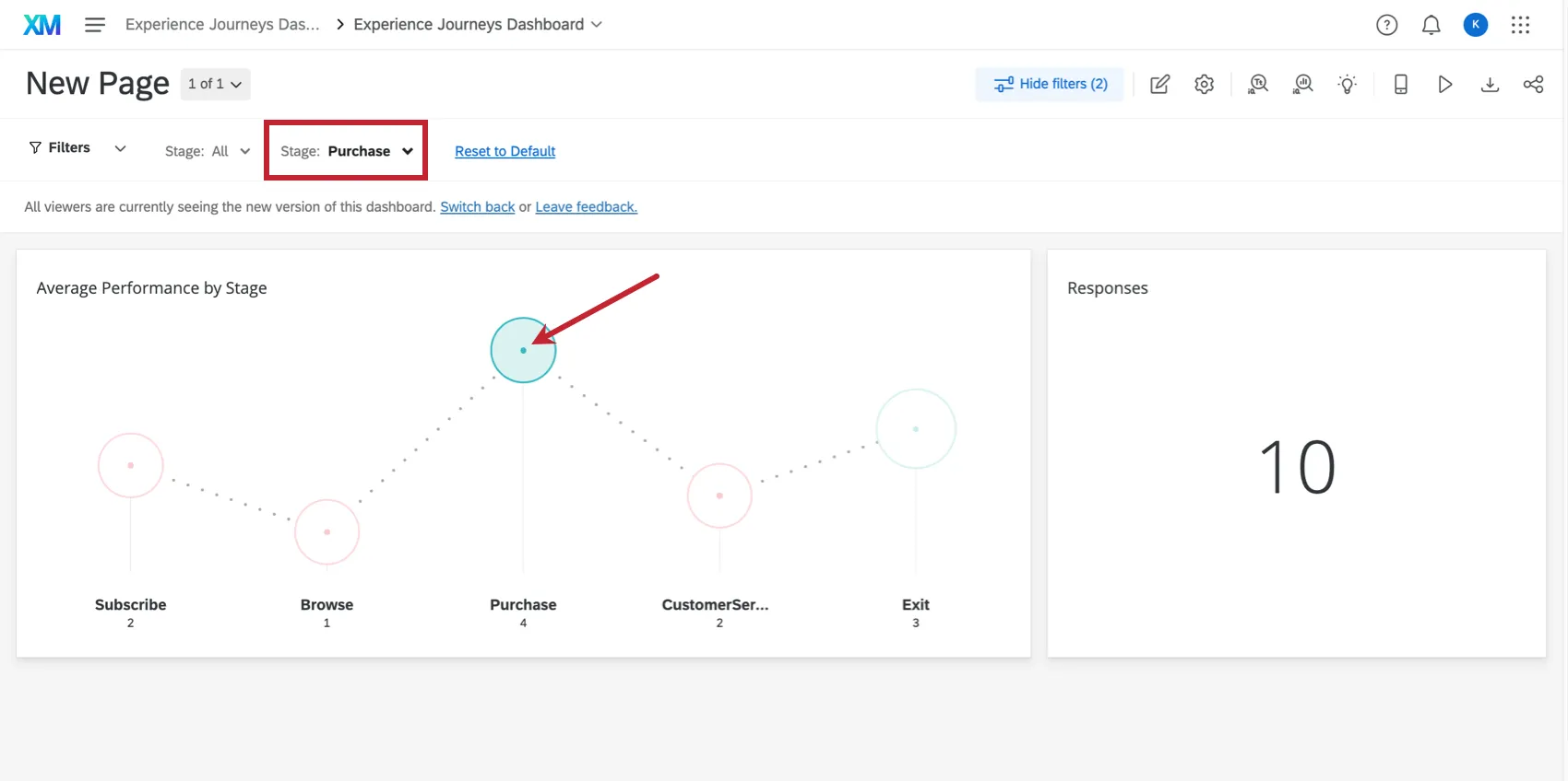
Qtip: For more information, see Adding Widget Filters.
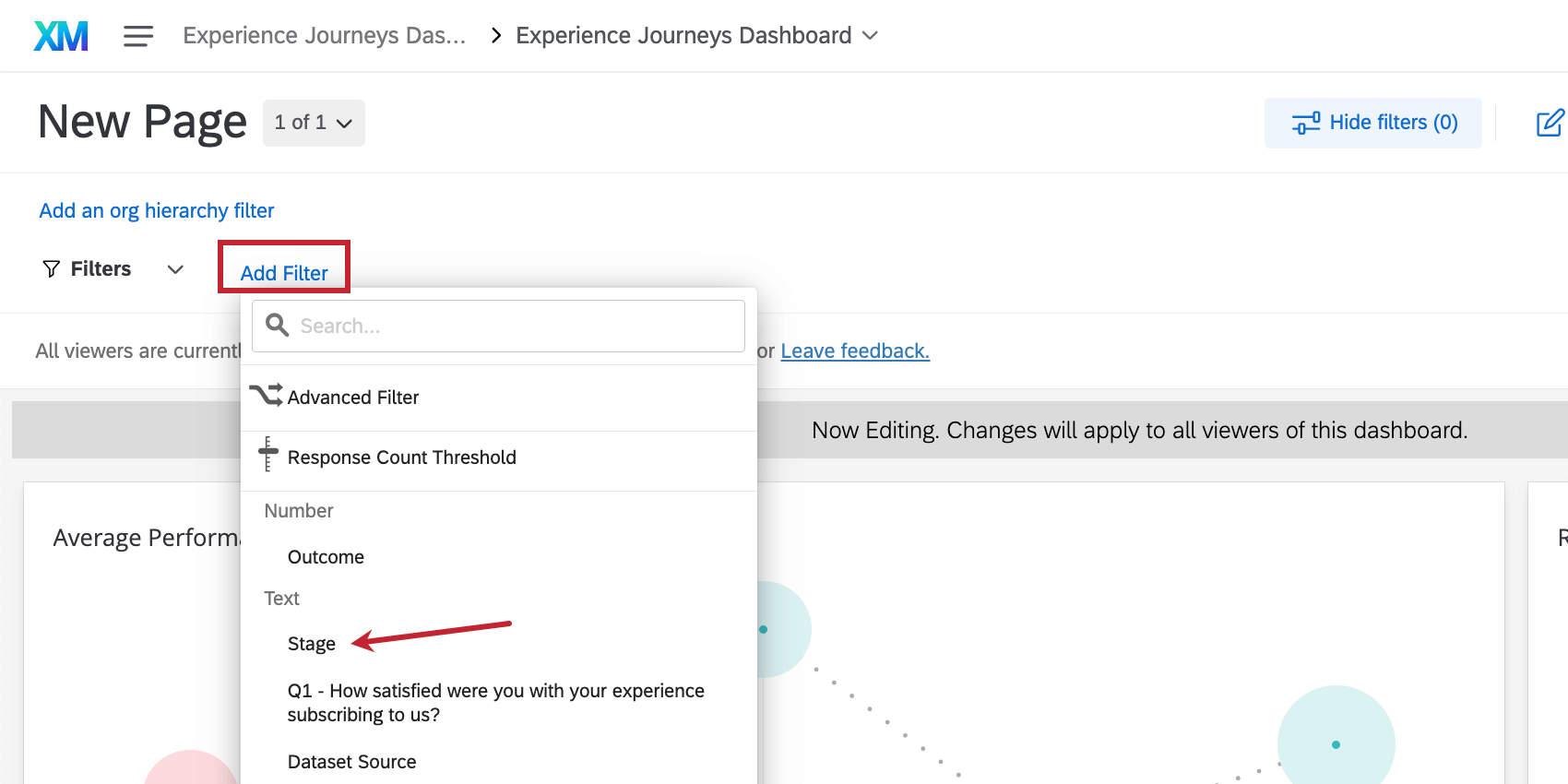
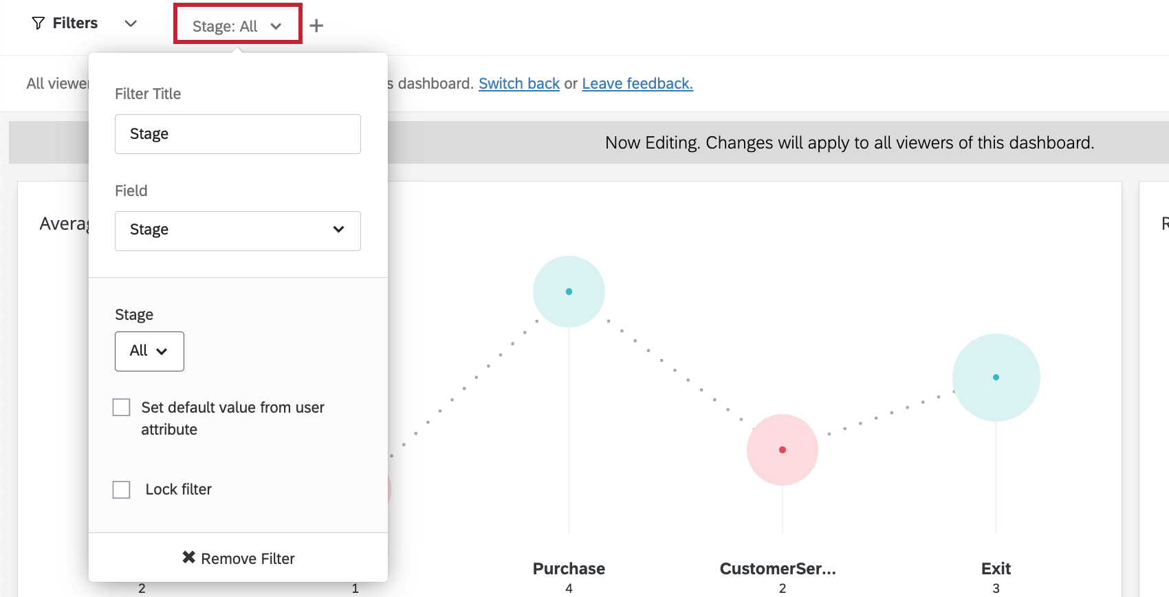
You can also filter by journey stage at the page level. When adding a page filter, select Stage.

Once you’ve selected Stage, you’ll be presented with additional options in the Stage filter dropdown. Click the option under the Stage heading, and you will have the ability to select a specific journey stage to filter by.
Qtip: For more information, see Adding Page Filters.
Troubleshooting
Below is a list of common error messages you may see in the journey chart widget and how to resolve them.
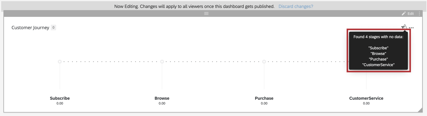
Stages Do Not Have Data
Example: If you are collecting feedback across your journey stages with a CSAT question, make sure that you’ve correctly configured this as your outcome in the dashboard data settings.
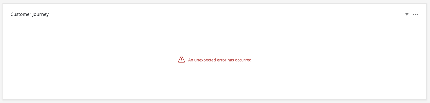
An Unexpected Error Has Occurred
FAQs
I have multiple datasets on my dashboard. Can I use this feature with all of my widgets?
I have multiple datasets on my dashboard. Can I use this feature with all of my widgets?
- Changing which dataset your widget shows: Not all widgets can have their referenced dataset switched. Some can only use the default dataset. For a compatible list, see this section.
- Showing multiple datasets in the same widget: Not all widgets can show multiple datasets’ results at the same time. For a compatible list, see this section.
That's great! Thank you for your feedback!
Thank you for your feedback!