
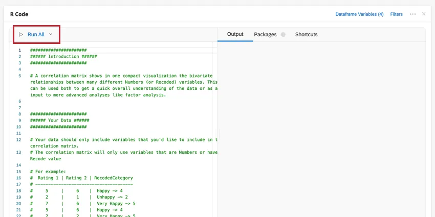
Pre-composed R Scripts
What's on this page
Attention: You are reading about a feature that not all Stats iQ users have access to. If you’re interested in this feature, contact your Account Executive to see if you qualify.
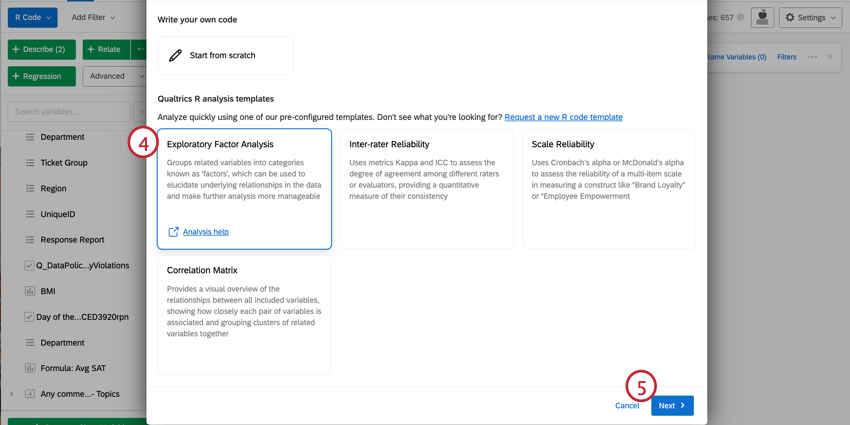
About Pre-composed R Scripts
R is a statistical programming language that is widely used for flexible and powerful analysis. When using R Coding in Stats iQ, you can select from multiple analysis scripts to make using R easier and more efficient.
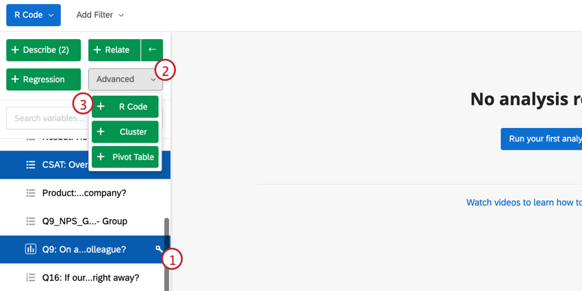
Selecting a Script for R Code
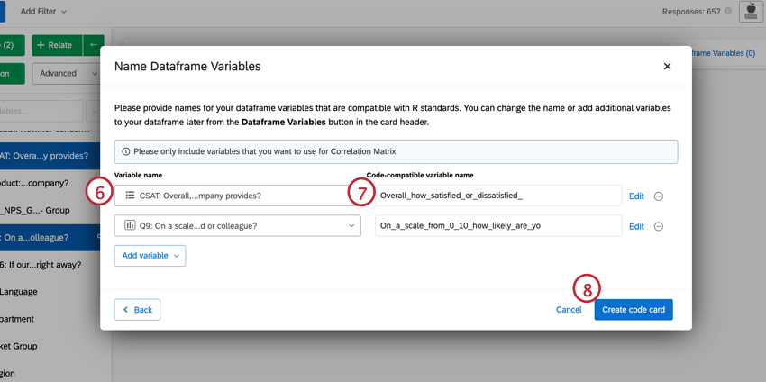
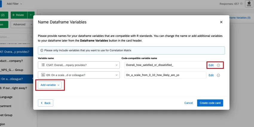
Qtip: You can make changes to the variables you have selected directly from this window. To edit the recode values, click Edit. If you want to delete the variable, click the ( – ) icon. If you want to add a new variable, click Add variable in the bottom left.

Navigating Pre-composed R Code Scripts
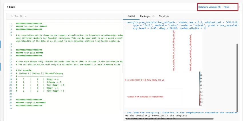
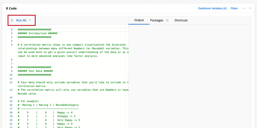
Your script will be pasted into the code section of the R Code card. This code will contain advice along with the commands for generating the analysis you have selected. To run your analysis, click Run All. The results will show in the output box on the right.
You can edit your dataframe variables or add a filter to the analysis by clicking the options at the top-right. Click the three-dot menu to add notes to your code card, copy the analysis, or open the card in full-screen.
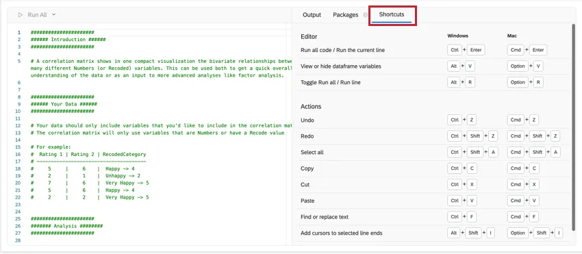
SHORTCUTS
Keyboard shortcuts can be used to more efficiently navigate the R Code card. Click Shortcuts for a list of possible actions.
PACKAGES
R coding in Stats iQ comes pre-installed with hundreds of the most popular R packages used for analysis. Click on the Packages tab in the right half of the card to see the list of available packages. For more information on using packages, see R Coding in Stats iQ.
Scale Reliability
Scale Reliability assesses the extent to which items in a multi-item scale can reliably measure a construct. In other words, if the same thing is measured using the same set of questions, will there be reliably similar results? If so, there is confidence that any changes we see in the future are due to changes in the surveyed population or interventions that have been made to improve the score.
INTERPRETING RELIABILITY MEASURES
Measures of scale reliability fall between 0 and 1 and are essentially an aggregate correlation between all of the items in the scale.
Cronbach’s alpha, a widely used reliability measure, often underestimates reliability due to certain assumptions. McDonald’s omega, a recommended alternative, avoids these flaws. We use McDonald’s omega by default, but Cronbach’s alpha is still widely accepted.
There is no single correct way to interpret the resulting number, but our preferred rule of thumb for both omega is outlined below:
| Less than 0.65 | Unacceptable |
| 0.65 | Acceptable |
| 0.8 | Very good |
If your reliable scale is unacceptable, there are a few options for remedying your dataset :
- Remove any items that are lowering the omega or alpha.
- It’s possible that there are two distinct constructs being measured. If that’s the case then separating the variables into two groups and running this analysis on each would lead to reliability scores that are higher than that of the initial analysis. You can explore this by reviewing the correlation matrix in the output or by using the Exploratory Factor Analysis script to see what groupings naturally fall out of the data.
- Ultimately, it may be necessary to modify and run the survey again. Items that have a low correlation with the others may need to be clarified or re-worked, or other items may need to be added.
Very high results (e.g., 0.95) can also indicate a problem with the scale, usually that you could still have a scale that is very reliable without having so many items. In this case, we recommend removing the least useful items from the scale and re-running the analysis.
INTERPRETING ITEM-LEVEL STATISTICS
The script first runs an overall reliability measure then runs one iteration for each variable. The goal of per-item reliability analysis is to understand which items are most useful to the construction of the scale. Stats iQ will output a table that looks similar to this:
Overall McDonald’s Omega: 0.71
| N | Mean | Item-Total Correlation | McDonald’s Omega if removed | |
| A1 | 2784 | 4.59 | 0.31 | 0.72 |
| A2 | 2773 | 4.80 | 0.56 | 0.69 |
| A3 | 2774 | 4.60 | 0.59 | 0.61 |
| … | … | … | … | … |
- The general goal is to have a higher McDonald’s Omega with a lower number of items. So if a researcher were creating a new scale, they’d likely want to remove A1, since the omega is actually higher without it.
- The rest of the items that would lower reliability if removed are up to the researcher to determine. For example, if a researcher is concerned with survey fatigue, they might allow a larger decrease in reliability when deciding to remove a variable.
- The Item-Total Correlation is the correlation between that item and the average of all the others. Low Item-Total Correlation suggests the variable is not representative enough of the underlying construct. The most common rule of thumb is to be suspicious of anything with an Item-Total Correlation of 0.3 or lower, especially if you have many items, which artificially inflates the reliability metric.
If you do choose to remove an item, you should re-run all the other statistics before deciding whether to remove another item. In Stats iQ, this means just removing the variable from the entire card–the rest will happen automatically.
INTER-ITEM CORRELATION MATRIX
The Inter-item Correlation Matrix shows the correlation between each variable in the analysis and each other variable. For example, if one variable is very highly correlated with another (e.g., 0.9), those questions may be redundant and removing them will only have a small impact on your reliability.
The Average Inter-item Correlation is the average of the numbers in the matrix. Higher numbers suggest that some items may be redundant and could be removed. Generally, variables should fall in the range of 0.2 to 0.4.
Qtip: The average inter-item correlation can provide useful information on the overall reliability scores. For example, if you’re working with a smaller number of items (e.g. 3) and have a low reliability score and a high average inter-item correlation, this could suggest it is due to a lack of items rather than a lack of correlation between them.
MORE RESOURCES
- The reliability analysis in Stats iQ is run by the compRelSem() function from the semTools R package. A variety of advanced settings are described in the documentation. It is not necessary to use or understand these settings in order to run a reliability analysis.
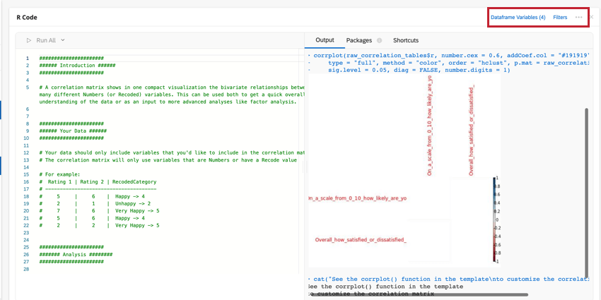
- The correlation matrix is run by the corrplot() function from the corrplot R package. A variety of advanced settings and customizations are described in the documentation and in this walk-through.
Inter-Rater Reliability
Inter-rater reliability (IRR) is used to assess the extent to which two or more raters agree in their evaluation. For example, three different coders might assess a text comment as having had positive or neutral or negative sentiment; IRR describes how much they agreed with one another.
MEASURES OF INTER-RATER RELIABILITY
IRR is assessed using slightly different metrics based on the structure of the data. For example, an analysis of two raters’ inter-reliability will use a slightly different metric from that of 3 raters’ inter-reliability.
Stats iQ will automatically select the appropriate metric for your data.
INTERPRETING RESULTS
The Kappa or ICC metric is the primary output, between 0 and 1, and it indicates how well-correlated the raters are. We suggest the below ranges for interpreting the Kappa:
| 0.75 to 1 | Excellent |
| 0.6 to 0.75 | Good |
| 0.4 to 0.6 | Fair |
| 0.4 or lower | Poor |
MORE RESOURCES
- This reliability analysis is run by the functions from the IRR R package. A variety of advanced settings are described in the documentation. It is not necessary to use or understand these settings in order to run this analysis.
Exploratory Factor Analysis
Exploratory factor analysis (EFA) is a statistical technique that helps you reduce a large number of variables into a smaller, more manageable set of summary ‘factors’. This makes them significantly easier to interpret, communicate, and run further analyses on (e.g., regression analysis). EFA typically follows this set of steps:
The result is a set of named factors and their component survey items. These factors can serve as a conceptual framework for further analyses, or can be applied back to the data.
Example: If the items “My room was clean”, “The rest of the hotel was clean”, and “My room had everything I needed” are in the same factor, you could average those items and report on the summary measure of “Room Quality”.
DIAGNOSTICS
The script first runs a series of diagnostics to ensure that the data is suitable for EFA:
- Sample size: Generally, a 10:1 ratio of responses to items is suggested. For example, if you have 10 questions you should have at least 100 respondents.
- Bartlett’s Test of Sphericity: This test evaluates whether the items are correlated enough to be usefully grouped into factors. If this fails, there are likely several items that do not correlate enough with the others. You may consider dropping items from your analysis that don’t correlate with others, or add more related items to the survey.
- Determinant: The determinant evaluates whether the items are too highly correlated to be usefully grouped into factors. If this diagnostic fails, there are likely items that are too similar to each other to separate into factors. Consider editing survey items to be more distinct.
- Kaiser-Meyer-Olkin (KMO) Measure: This measure checks if your survey items have enough in common to group them into meaningful factors. Passing this diagnostic means that the responses in your survey have a lot in common and can be grouped nicely. Otherwise, the items do not cluster into categories. If this diagnostic fails, you may want to revise your survey items to capture more similar themes and consider removing items that aren’t showing a clear relationship with others.
CHOOSING FACTORS
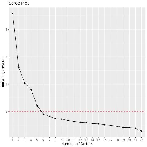
The point of EFA is to boil down many variables into a relatively small number that are useful for analysis, so you may need to run the factor analysis several times with different numbers of factors to find a grouping that works for you. The EFA script will suggest the number of factors by using their eigenvalues.
Qtip: Eigenvalues measure the extent to which a factor correlates with the original variables from which it was created by adding together the r-squared values between the factor and the variables. For example, if the r-squared between the factor and Q1 is 0.8 and that of the factor and Q2 is 0.5, the eigenvalue is 1.3. Generally, factors with an eigenvalue above 1 should be used. The EFA script uses this benchmark to suggest the number of factors.
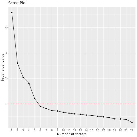
The EFA script will output a scree plot, which shows the eigenvalues of the variables in descending order. You can examine the chart to see how many factors occur before the “elbow” in the chart, after which adding more factors is less useful.
Example: In this example there’s a large drop-off after the 4th variable and then another significant drop-off after the 5th variable. By default the script will use 5 factors here, but you might want to also run it with 4 factors and compare your results.
NAMING YOUR FACTORS
After running EFA, each variable is assigned to a factor. It’s helpful to give each factor a name that gives you a shorthand for talking about them, which makes your findings more accessible. The goal here is to simplify your complex data into a few understandable themes.
Here are some guidelines for naming your factors:
- Be descriptive: Try to capture the common theme that summarizes the variables in the group.
- Keep it simple: Your factor names should be easy to understand and communicate. Avoid technical jargon or overly complex phrases.
- Consider your audience: Factor names should make sense to people who will be using your analysis. For example, “Cleanliness” would be meaningful to both hotel managers and hotel guests alike.
- Consistency: If your survey or dataset spans across different domains or subjects, make sure your factor names are consistent.
ASSOCIATED MEASURES & METRICS
The Factor Loadings Table is one of the key outputs of EFA. Factor loading for a given variable-factor pair is the correlation between that variable and factor. If a variable has a high factor loading for a certain factor, it means that question is strongly connected to that factor.
Uniqueness is the portion of the variance that is unique to the specific variable and not shared with other variables. Uniqueness values range from 0 to 1 with higher values indicating that the variable is unique and does not fit well into any of the factors. .
Generally, it’s recommended to remove variables if their factor loadings are above 0.3 or their uniqueness is above 0.7.
USING YOUR RESULTS
Factor analysis is an iterative process, so you may need to run it several times with different numbers of factors to find a grouping that works for you. For most researchers, the key takeaway is finding groupings of factors that can provide new insight into their data, but you can use these factors as new variables in subsequent analysis – like regression or cluster analysis. For example, you could create a new variable for each factor that takes the average value of all the variables that are grouped into it.
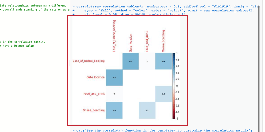
Correlation Matrix
The correlation matrix is a table that shows the correlation between each pair of variables provided. This table uses Pearson’s r by default to measure correlation, but you can change it to Spearman’s rho if you’d like.
You can edit the parameters of the corrplot() function to modify the table and make it more readable. For more information, you can view the official R walkthrough and documentation.
That's great! Thank you for your feedback!
Thank you for your feedback!