
Widgets Basic Overview (Studio)
What's on this page
About Widgets (Discover)
A widget is a block of content that can be added to a dashboard. Widgets can display graphs, tables, images, text, and videos. After you create a dashboard, you can add widgets. You can customize your widgets in many ways, resizing and moving them as needed, recoloring different elements to highlight them, using them as filters, and much more.
You can add 3 types of widgets to dashboards in Studio:
- Reporting: These widgets enable you to display reports.
- Object Overview: These widgets help you to visualize a categorization model as a hierarchy of topics, share the underlying structure of your rubrics and interpret Intelligent Scores while maintaining the guardrails for editing the rubrics.
- Content and Layout: These widgets help you customize the layout and visual content of your dashboard.
Reporting Widgets
You can add the following reporting widgets to dashboards in Studio:
Object Viewer Widgets
You can add 2 types of object view widgets to dashboards in Studio:
- Rubric
- Model
Content and Layout Widgets
You can add 5 types of content and layout widgets to dashboards in Studio:
Widget Ownership
An owner of a widget is the user who created it or to whom the widget has been transferred. Widget ownership means the following:
- Report widget always displays data to other users on behalf of its owner.
Copying a widget does not copy its ownership.

Example: If Paul copies a widget created by John, the new widget will be owned by Paul and will reflect any discrepancies between John’s and Paul’s access levels. The same applies to drilling in edit mode.
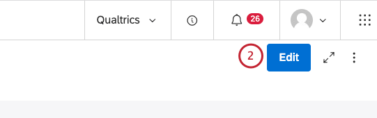
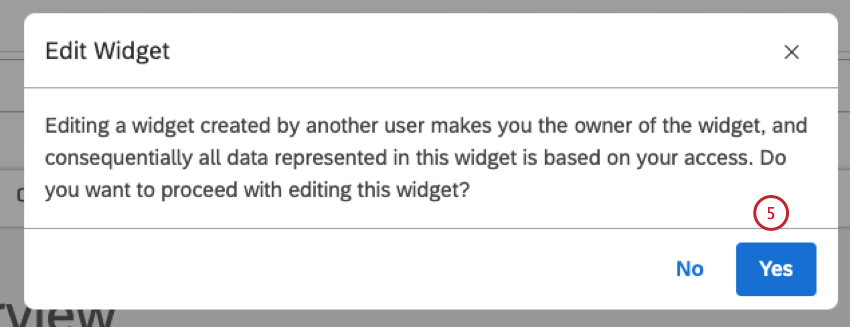
- Editing a widget created by another user makes you the owner of the widget.
Maximum Widgets Per Dashboard
There is a limit to the number of widgets you can add to a dashboard. A System Administrator can change this limit at any time. By default, these limits are:
- 25 reporting widgets of any type.
- 50 content widgets of any type (Text block, Label, Image, and Video).
Qtip: If you create a dashboard and widget limits are later changed, your dashboard can be affected. If the number of widgets in your dashboard exceeds the new limit, the data in your widgets will still display for dashboard viewers. You will be able to edit and delete widgets, but not add new widgets until you reduce the number of widgets to below the new limit.
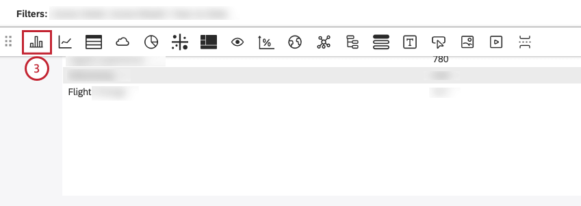
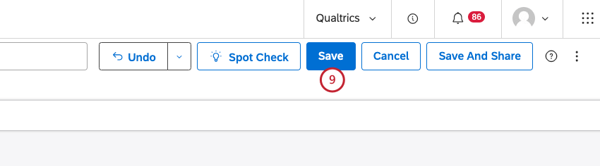
Adding a Widget

Qtip: By default, settings in the Properties tab match the defaults defined in dashboard properties.
Qtip: It isn’t possible to embed feedback widgets for Enterprise viewers.
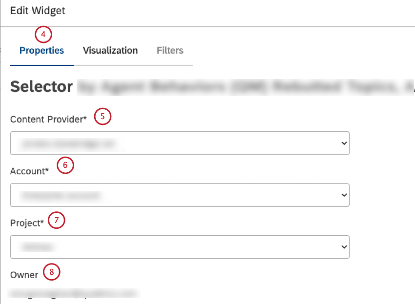
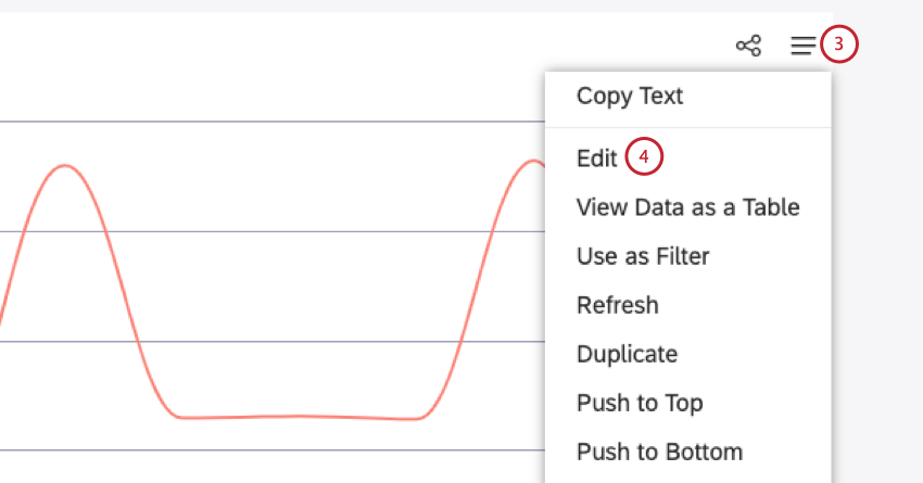
Editing Widget Properties
Qtip: To modify dashboard widgets, a user must have an Edit Dashboard permission and be granted a Can Edit permission for the specific dashboard. Editing a widget created by another user transfers the widget ownership to you. Dashboard editors can edit widgets’ properties.
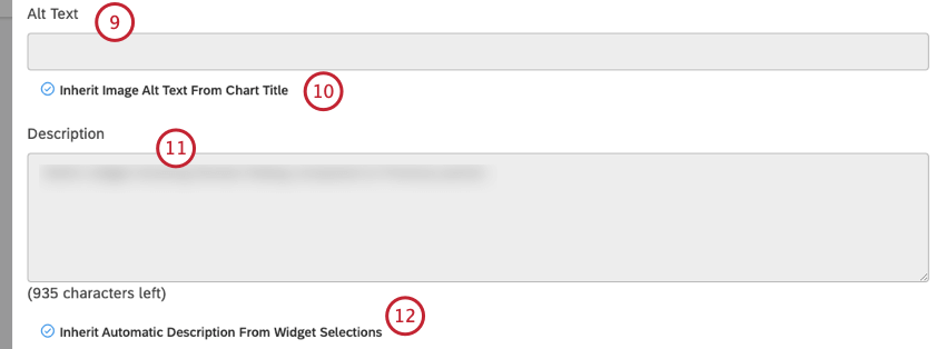
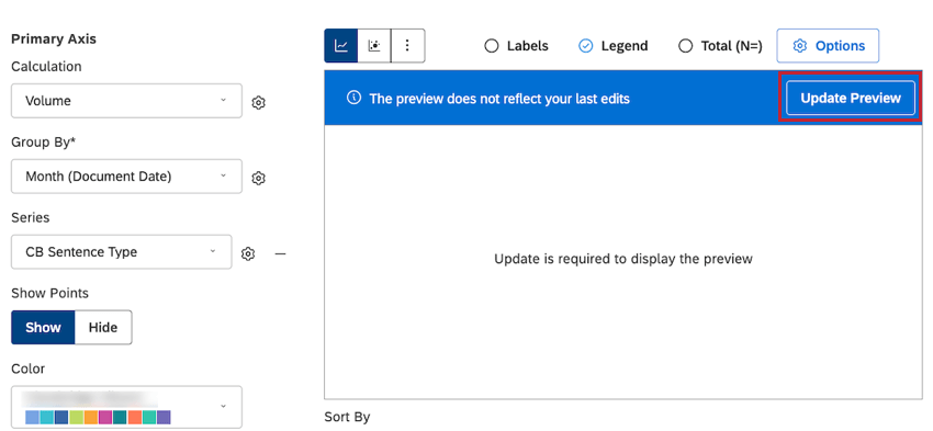
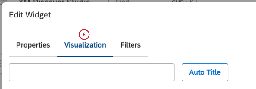
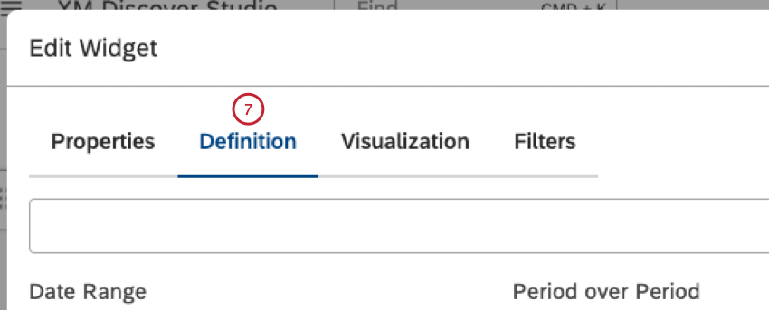
After you have added reporting widgets to a dashboard, you can modify report properties, visualization, filters, and widget type. For image, video, and text widgets it is possible to replace their content entirely.

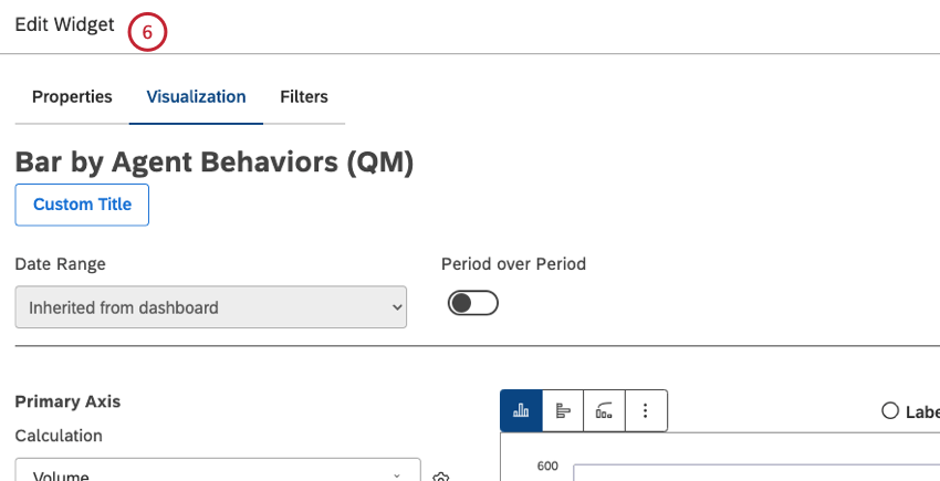
Qtip: Widget properties depend on the widget type.
- You can see all updates in preview mode, even when new data is not being used, without having to click Update Preview.
- You can preview changes without using real data and using mocked labels and values.
- You can click Update Preview and see your latest updates using new data in preview mode.
 Qtip: For more information on widget editing preview setting options, see Widget Editing Previews.

Editing a Widget Title
Attention: To edit a widget title, a user must have an Edit Dashboard permission and be allowed to edit the specific dashboard.
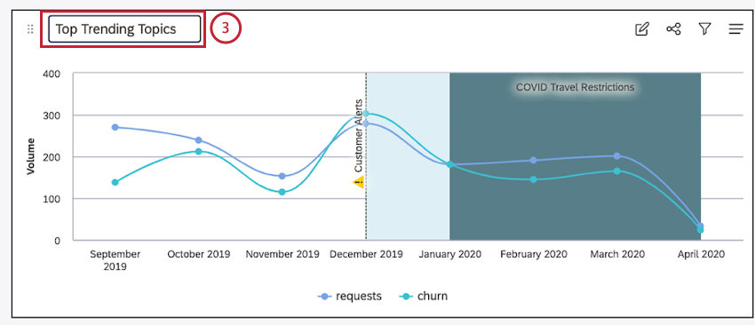

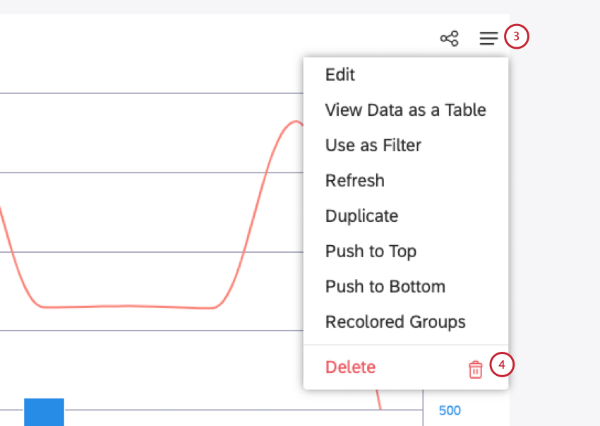
Deleting a Widget
Qtip: To modify dashboard widgets, a user must have an Edit Dashboard permission and be allowed to edit the specific dashboard.
You can delete widgets from a dashboard.
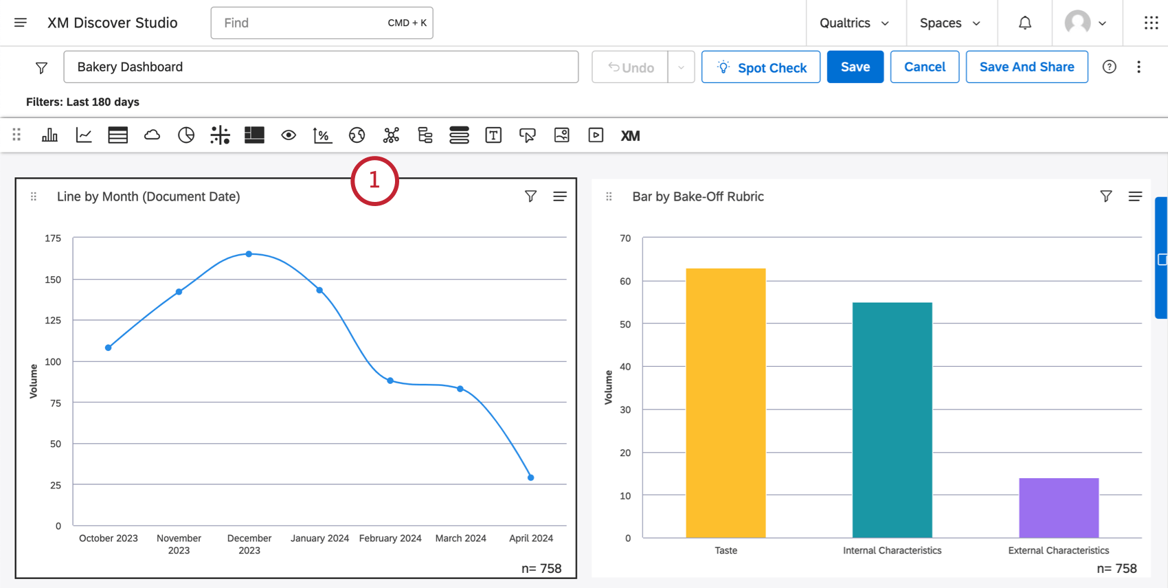
Resizing and Rearranging Widgets
Qtip: Before you start arranging widgets, make sure your dashboard is open in edit mode.
Once you have added several widgets, you can easily resize and rearrange them. You can also zoom out to have a better view of the overall dashboard layout.
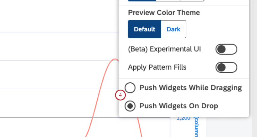
Adjust Widget Movement Options
You can choose the preferred way of moving widgets in your dashboards. Once you choose an option in any dashboard, it’s applied to all dashboards moving forward (as a user-specific preference).
Change Dashboard Zoom Level
Zooming in and out of your dashboard can give you a much fuller view of your dashboard while you make changes. While certain edits are disabled, 50% and 75% zoom states are great for moving, rearranging, and resizing widgets.
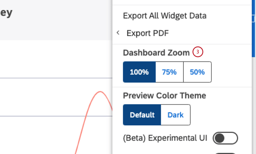
Qtip: When a dashboard is zoomed out, drilling is disabled.

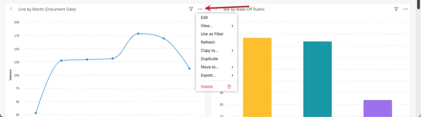
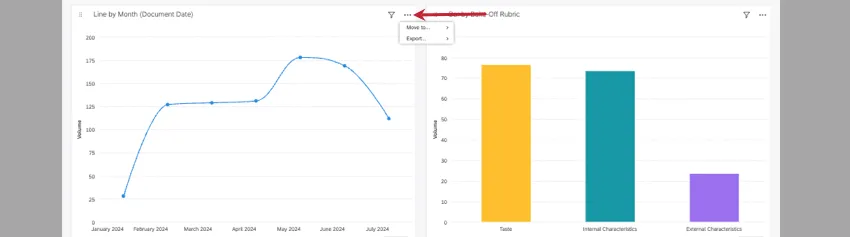
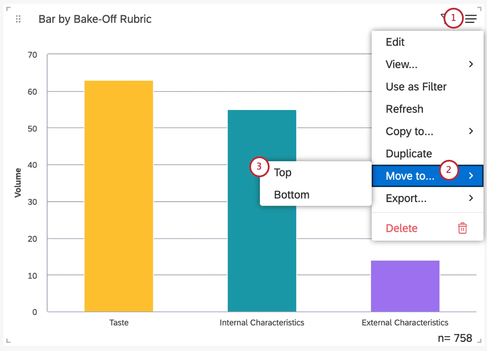
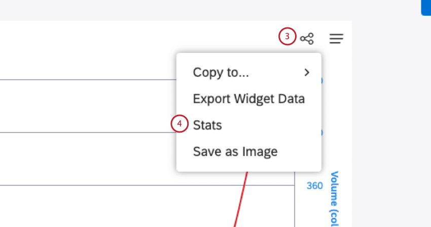
Qtip: After you change your dashboard’s zoom settings, the three dot menu, which is only accessible in edit mode, will limit your options to Move to top / bottom and Export Widget data / As image . You can resize and move your widget in a zoomed state, but you cannot edit a widget’s properties until you zoom back into 100%. The screenshots below show the same widget’s options at 100%, then at 75%.
Resize a Widget
Hover over the sides or the bottom-right corner of a widget. When the sizing arrow appears, click and drag your widget to the desired size.
Rearrange Widgets
To rearrange a single widget, click the drag icon and drag the widget to its new location.
Moving Widgets to Top or Bottom of Dashboard
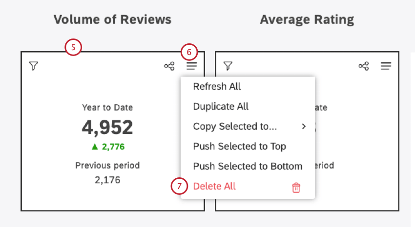
Move Multiple Widgets at Once
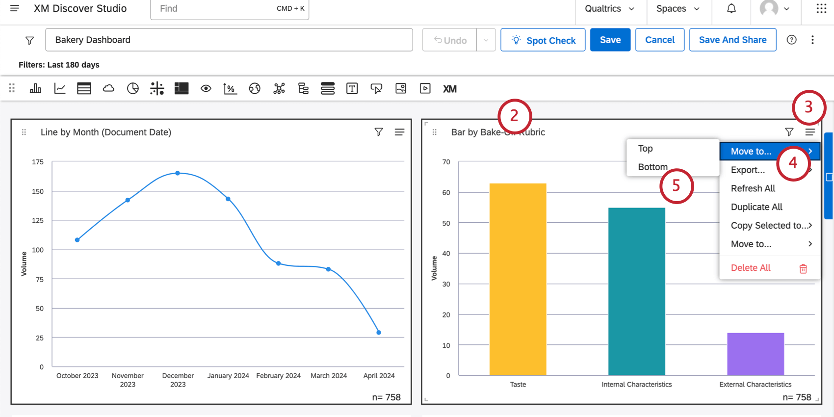
Qtip: Once you have multiple widgets selected, you can also drag the widgets wherever you want in your dashboard.
The Dashboard Grid
Dashboard elements are located on a drag-and-drop multi-column grid. A dashboard consists of 24 columns, which size depends on the size of the browser window. Row size is equal to half of current column width. The maximum length of a dashboard is 10,000 rows.
Widget Calculation Settings
Select the Use default metric formatting option to use the formatting defined in metric’s advanced options. This option is available only for Filtered or Custom Math metrics.
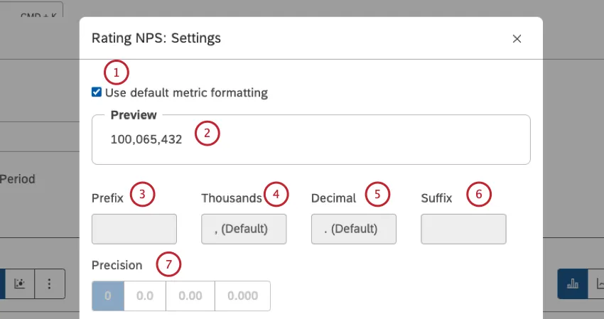
You can preview the calculator settings under Preview.
Prefix: Type up to 10 characters to be appended before the calculation.
Thousands: Specify a thousands separator. This option can be empty.
Qtip: If the Thousands box is empty, the value in the Thousands box will revert to , (Default) when you save the calculation settings.
Decimal: Specify a decimal separator. This option cannot be empty.
Suffix: Type up to 10 characters to be appended after the calculation.
Precision: Select the number of digits after the decimal point to round the number to.
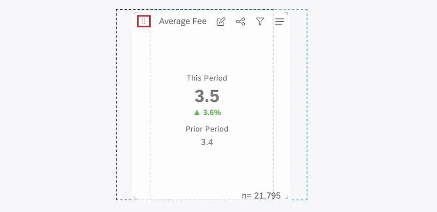
Qtip: Rounding is always performed on the original calculation value. For example, 3.46 rounded to 0.0 precision is 3.5, but when further rounded to 0 precision, it becomes 3, not 4.
Conversion: Select 1 of these options: x0.01 to divide the calculation by a 100 (in some cases this type of conversion might require adjusting the precision as well), X1 to leave the calculation as is, X100 to multiply the calculation by a 100.
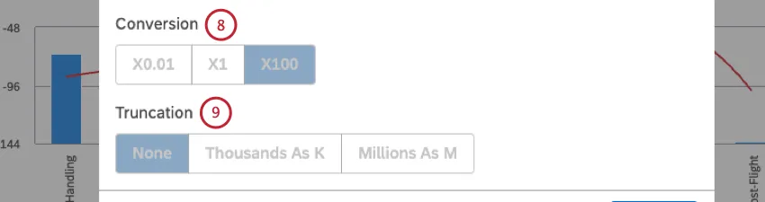
Qtip: To add a percentage sign, use the Prefix or Suffix fields.
Truncation: If you expect your report to contain large numbers, you can choose to truncate them for better readability. For example, if you select the Thousands as K option, 555,000 will be represented as 555K.
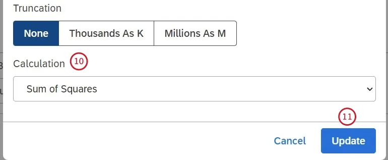
Calculation (numeric attributes only): Select 1 of the following options to choose how you want to aggregate the attribute, and click Update at the bottom-right of the calculation settings window:
- Average: Use the average of attribute values (sum divided by count).
- Count: Use the total number of records containing this attribute.
Count Distinct: Use the total number of distinct attribute values.
Qtip: If you’re interested in having “count distinct” enabled for numeric attributes, reach out to your Discover representative.
- Maximum: Use the maximum value of an attribute.
- Minimum: Use the minimum value of an attribute.
- Sum: Use the sum of attribute values.
- Standard Deviation: Use standard deviation, a statistical measure of the amount of dispersion of an attribute’s values relative to its mean. The higher the standard deviation, the farther an attribute’s values are from the mean.
- Variance: Use variance, a statistical measure of how far an attribute’s values are spread out from the mean (Standard Deviation squared).
- Sum of Squares: Use sum of squares, a statistical measure of the deviation of an attribute’s values away from the mean. The higher the sum of squares, the larger the variability within the dataset.
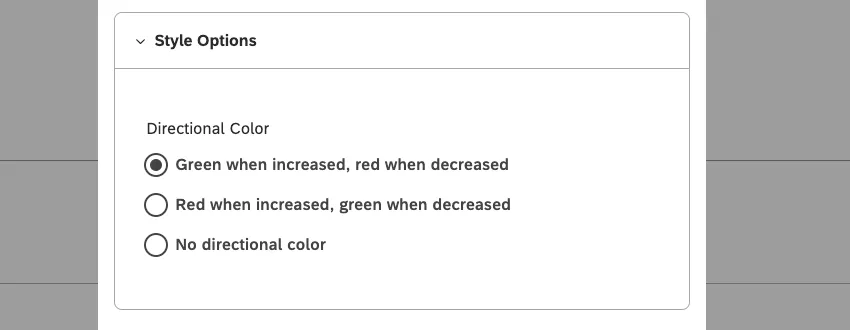
Style Options
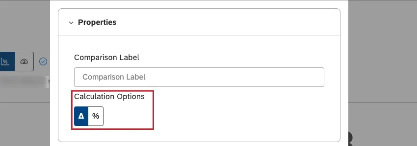
Qtip: This is only available if comparison is configured.
Select the color to mark the calculation’s increase and decrease as positive or negative, depending on what you’re measuring. This option is available only for % Change and Δ Change calculations.
Numeric Attributes and Sentiment
For numeric attributes and sentiment, you can choose between the following directional colors:
- Green when increased, red when decreased.
- Red when increased, green when decreased.
- No directional color.
Δ Effort Calculation
You can choose between these directional colors:
- Blue when increased, orange when decreased.
- No directional color.
Copying Widgets
You can can create copies of your widgets. You can copy widgets one at a time and copy multiple widgets at once. In addition to this, you can copy widgets over to different dashboards.
Qtip: You must be editing a dashboard to copy its widgets.
Ownership of Copied Widgets
When you copy your own widget, you get an exact copy. However, when you copy a widget owned by another user, the resulting widget may differ from the original due to the change of ownership.
- If you don’t have access to the original project’s content provider, you will be asked to specify a different source of data for the copied widget.
- If your data access level is lower (more restricted) than that of the original widget owner, your widget will display the same report with less data (honoring the restriction).
- If your data access level is higher (less restricted) than that of the original owner, your widget will display the same report with more data (ignoring the original restriction).
- When your access level is the same as that of the original owner, you will get an exact copy.
- If a private Designer filter is applied to a widget, you will see a corresponding warning that recommends that you ask for that filter to be shared with you, or that you create a similar one yourself.
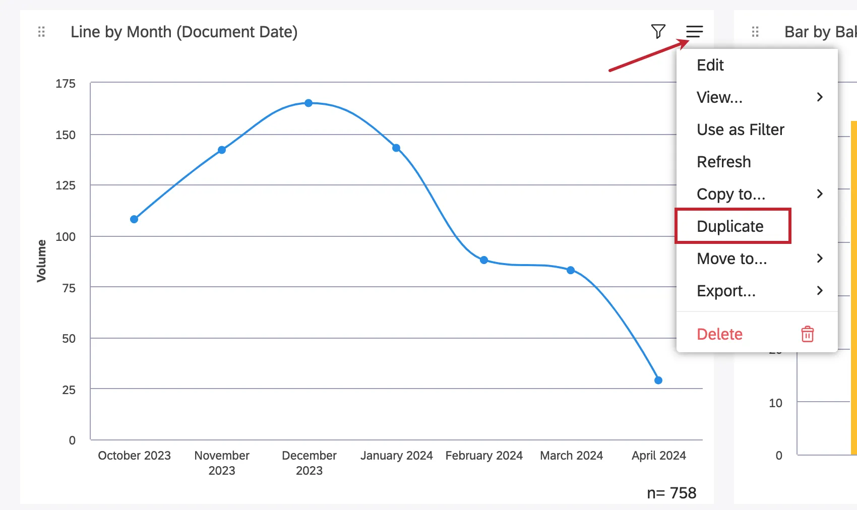
Duplicating a Widget in the Same Dashboard
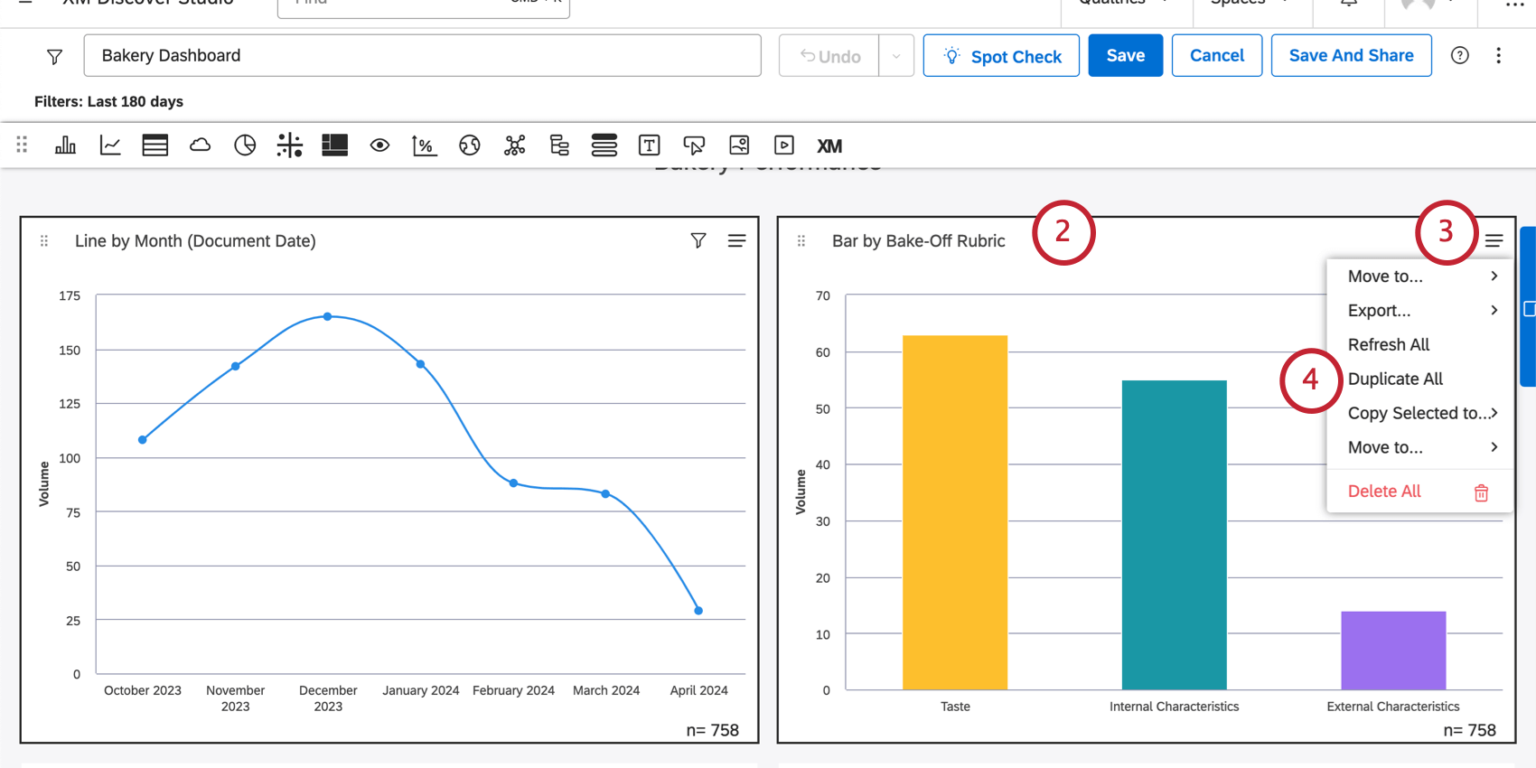
Duplicating Multiple Widgets in the Same Dashboard
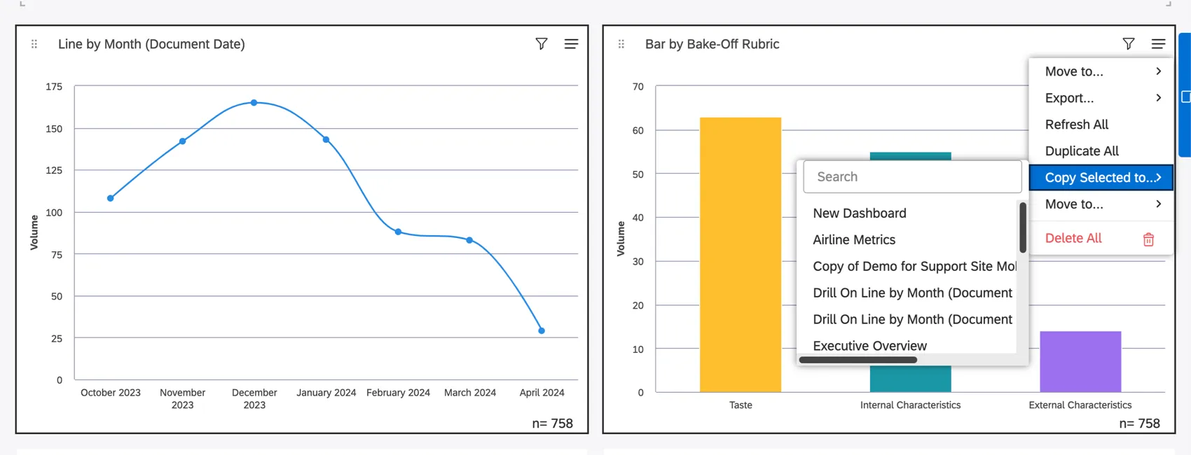
Copying Widgets to Another Dashboard
Attention: You must have edit access to the dashboard you want to copy your widgets to.
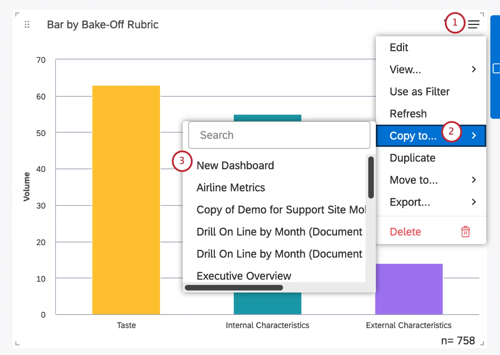
Qtip: You can also create a new dashboard for your selected widgets by clicking New Dashboard. This option requires a Create Dashboard permission.
Qtip: If you create a new dashboard, the dashboard’s filters will be copied over to the new one. Dashboard filters are not copied if you copy widgets to an existing dashboard.
Qtip: You can also use the Shift button to select multiple widgets to copy to another dashboard. The option will be called Copy Selected to.
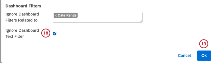
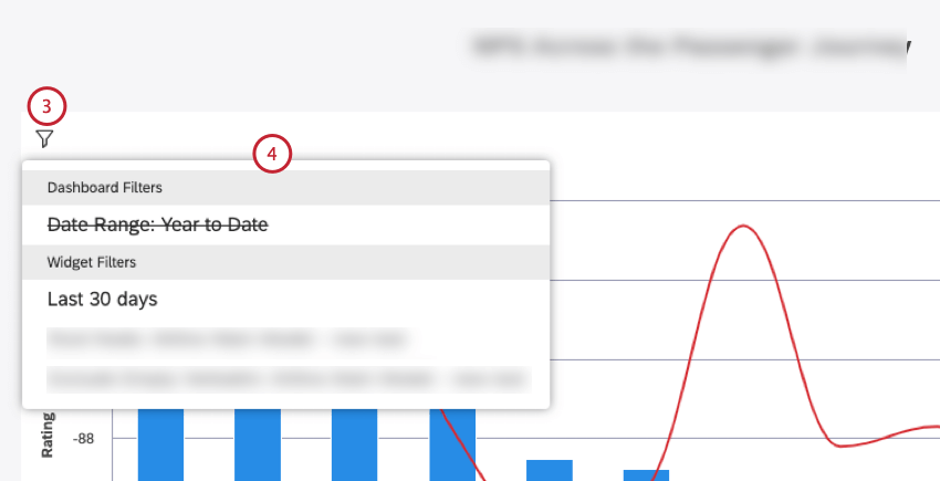
Applying Filters to a Widget
You can apply filters to widgets to narrow down the data displayed in your reports. You can filter widgets by date, apply predefined or saved filters, and define ad hoc filter conditions.
Qtip: When filtering widgets, keep in mind that additional filters may be applied to them from outside of widget properties: for example, from dashboard filters or from Widget as Filter selections. You can always see which filters are currently applied to your widgets.


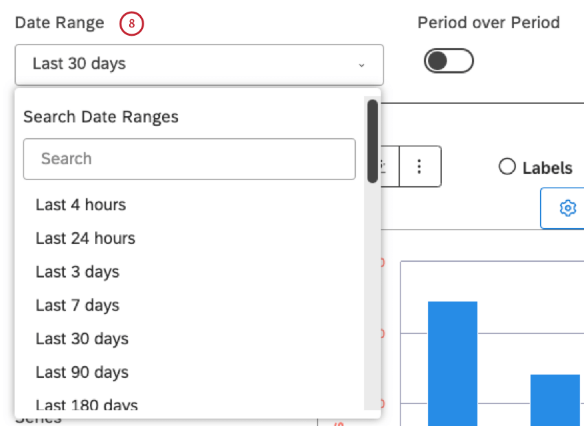
Qtip: For all available date options, please see Date Range Filters.
Qtip: If a date filter is applied to the dashboard, the widget inherits the dashboard date range—unless you choose to ignore it.
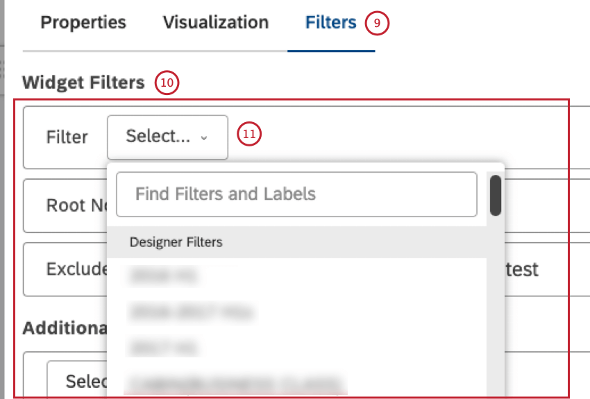
- Designer Filters: select 1 of the filters created in Designer (assuming you have access to them)
- Studio Filters: select the filters created in Studio
- CX Predefined Filters: select one of the predefined sentiment, Effort, or Emotional Intensity filters, and use the Effort Detected (Predefined) option to filter documents with at least one sentence containing an expression of effort (both hard and easy)
- Scorecard Filters: select 1 of the filters based on the Intelligent Scoring rubric’s target: one for passing documents (Rubric-name Passing Score), and 1 for failing documents (Rubric-name Failing Score). Attention: Studio dashboards and widgets do not honor Designer filters that use verbatim-level rules. To ensure expected results, we recommend avoiding using these filters in Studio.

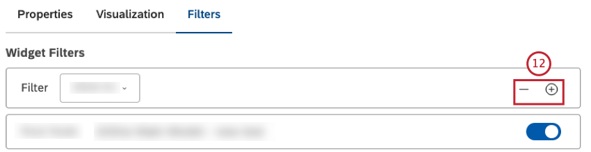
Qtip: If several filters are selected, the widget will return data that satisfies ALL of them (meaning they have an AND relationship).
Filter conditions have an AND relationship. Filter values in the same condition have an OR relationship.
Qtip: The Widget Filters section also displays filters applied as a result of drilling, linking, or using category models with root-node rules or with empty verbatim exclusion. These filters are not counted toward the 5-filters limit. You can remove them (or toggle them on and off in case of model-related filters), but not modify them. See the Viewing Filters Applied to a Widget section below.
- Text Filter: add a search field to your widget to enable viewers to filter widget data by one or more keywords or a phrase (using quotes) that appears in the document’s verbatim field (for more information, please see Using the Text Filter)
- Topics: select a category model to filter data by its topics (or an entire model)
- Attributes: select a reportable structured attribute to filter data by its values
- NLP: Filter data by words and other linguistic entities detected by the XM Discover’s Natural Language Processing (NLP) engine (for more information, please see the NLP Conditions subsection below).
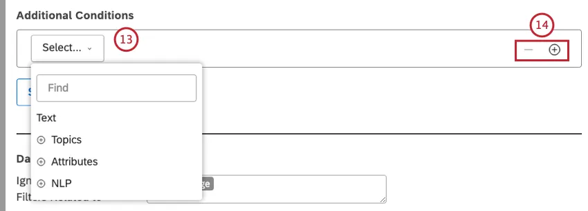

Qtip: If several conditions are specified, the widget will return data that satisfies ALL of them (meaning they have an AND relationship).
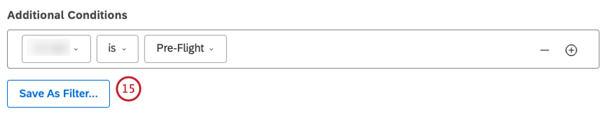
Attention: The Save As Filter… option is not available when using Text Filter.

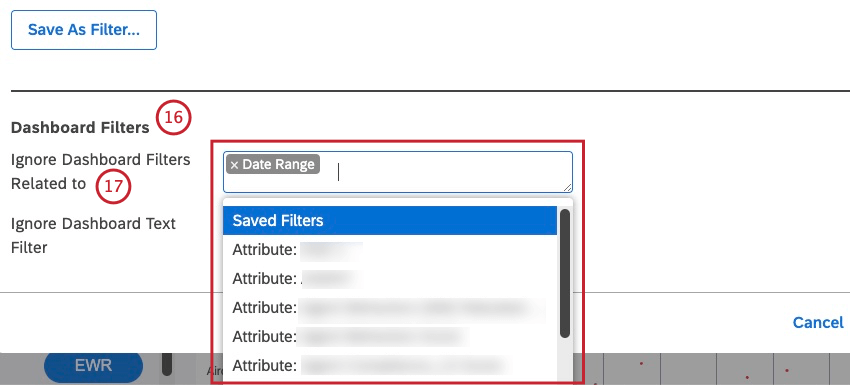
- Date Range
- Saved Filters
- Attribute-based filters start with the Attribute: Prefix followed by the name of the attribute (for example, Attribute: Age)
- Topic-based filters start with the Model: Prefix followed by the name of the categorization model (for example, Model: Lodging).
NLP Conditions
This list shows the available options for NLP conditions:
- Words: Filter data by words or entities:
- All Words: Filter data by regular words.
- CB Brand: Filter data by brand mentions.
- CB Company: Filter data by company mentions.
- CB Currency: Filter data by monetary quantities, for example, varying currency names, symbols, and abbreviations.
- CB Email Address: Filter data by email addresses mentioned in feedback.
- CB Emoticon: Filter data by emojis and emoticons used in it.
- CB Event: Filter data by holidays and events mentioned in feedback.
- CB Industry: Filter data by industry relevance.
- CB Person: Filter data by names of people mentioned in feedback.
- CB Phone Number: Filter data by phone numbers mentioned in feedback.
- CB Product: Filter data by product mentions.
- CB Profanity: Filter data by profanity words.
- Associated Words: Filter data by pairs of associated words.
- Hashtags: Filter data by hashtags—words or unspaced phrases prefixed with a hash symbol (#).
- Enrichment: Filter data by the following enrichment options:
- CB Chapters: Filter data by Conversational Chapters that represent semantically related segments of the conversation (such as Opening, Need, Verification, Solution Step, and Closing).
- CB Detected Features: Filter data by types of NLP features detected (for example, data containing industry or brand mentions).
- CB Emotion: Filter data by emotion types detected by the NLP engine (such as Anger, Confusion, Disappointment, Embarrassment, Fear, Frustration, Jealousy, Joy, Love, Sadness, Surprise, Thankfulness, Trust).
- CB Sentence Type: Filter data by the type of sentence.
- Content Type: Filter data by it being contentful or noncontentful.
Content Subtype: Further filter noncontentful data by its subtypes (such as ads, coupons, article links, or “undefined” type).
Qtip: For contentful records, subtype is always contentful as well.
- Language: Filter data by language:
- Auto-detected language: Filter data by automatically detected languages (if language auto-detection is enabled for a project).
Processed language: Filter data by languages in which feedback was actually processed. Languages not supported by XM Discover are marked as OTHER.
Qtip: Depending on what’s available in the data, there can be more enrichments.
- Language: Filter data by language:
- Auto-detected language: Filter data by automatically detected languages (if language auto-detection is enabled for a project).
- Processed language: Filter data by languages in which feedback was actually processed. Languages not supported by XM Discover are marked as OTHER.
- NLP Query: Define a complex search query using four rule lanes, from top to bottom: OR, AND, AND, NOT.
- OR: Provide one or more keywords to find in customer feedback.
If you only use the OR lane, your query will return feedback that contains any of the keywords specified here. - AND 1 : This lane is optional. Provide one or more additional keywords to find in customer feedback together with any keyword from the OR lane.
Your query will return feedback that contains any of the keywords from the OR lane plus any of the keywords from the AND lane. - AND 2 : This lane is optional. Provide one or more additional keywords to find in customer feedback together with any keyword from the OR lane plus any keyword from the AND 1 lane.
NOT : This lane is optional. Provide one or more keywords to exclude from query results. Your query will only return feedback that does not contain the keywords specified here.
Qtip: Each rule lane can contain a query of up to 1,000 characters.
- OR: Provide one or more keywords to find in customer feedback.
Widget Filters vs. Dashboard Filter
Studio also lets you use dashboard-wide filters that affect multiple widgets at once. When both dashboard-wide and widget-specific filters are applied, they are combined as follows:
- By default, dashboard-wide saved filters, attribute, or topic filters have an AND relationship with widget filters.
- You can set a widget to ignore specific types of dashboard filters.
- Unless you set your widget to ignore the dashboard date range, the dashboard date range completely replaces the widget date range.
Viewing Filters Applied to a Widget
- Widget Text Filter: Provides a field where you can enter a search query for widget data.
- Organization Filters: Shows filters applied as a result of dashboard personalization.
Dashboard Filters: Shows dashboard-level filters.
Qtip: Ignored dashboard filters are displayed with a line through them.
- Linked Filters: Shows filters inherited from the parent widget when Widget as Filter is used.
Widget Filters: This section includes all the filters that are part of the widget definition, as well as Designer or Studio saved filters.
Qtip: Additional filters applied as a result of drilling or using category models with root-node rules are displayed with a corresponding prefix:
- Exclude Empty Verbatim: Indicates that data in a widget is grouped using a model set to exclude records without text.
- Drill Filters: Shows filters inherited from dashboard drilling.
- Drilled: Shows filters inherited from widget drilling.
- Root Node: Indicates that data in a widget is grouped using a model with a root-node rule (that is, a rule that is applied to all the model’s topics).
Adjusting Widget Report Colors
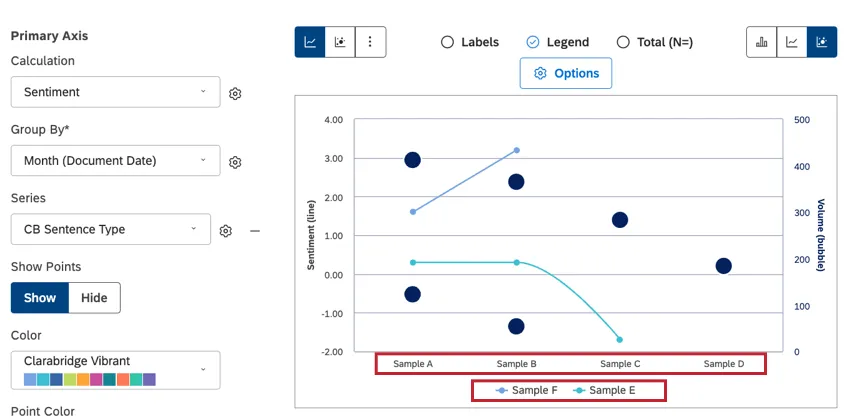
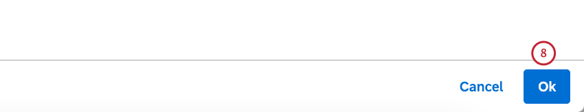
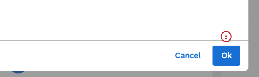
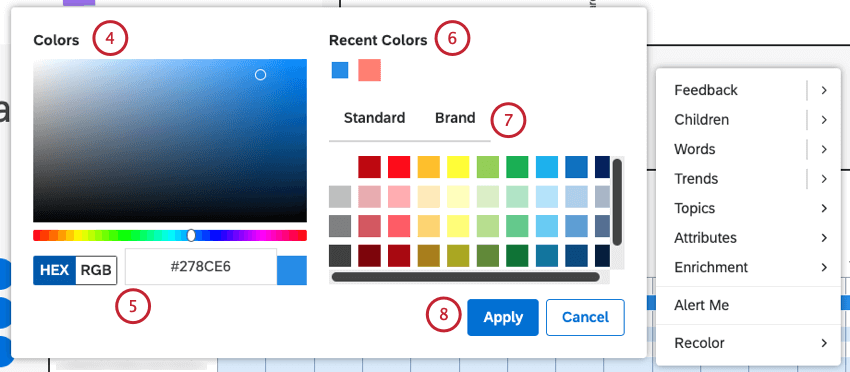
Qtip: Click Ok at the bottom-right of the Edit Widgets window to save your color adjustments. Save your dashboard by clicking Save at the top-right of the dashboard. The majority of reporting widgets enable you to adjust the colors of your report items. You can apply colors or patterns to bring an additional level of information to your reports, brand them, or highlight specific items using the Recolor option and Apply Pattern Fills option.


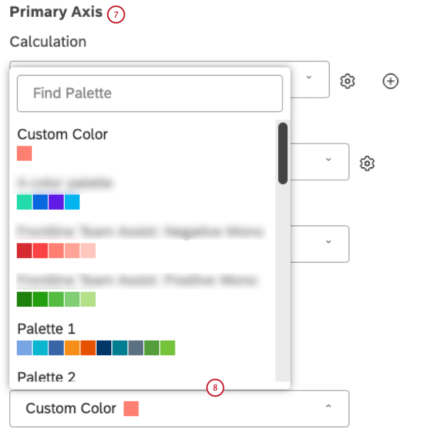
- Custom Color: Color reporting items in a single color. Select the color using the color picker below.
- Palette 1, 2, 3: Select one of the out-of-the-box system color palettes.
- Studio Standard: Apply a dynamic palette that adapts report colors to dashboard preview mode (Default or Dark).
- Custom (Studio): Select one of the custom color palettes created in Studio.
Designer: Select a custom color palette that can be modified in Designer.
Qtip: We recommend using Studio color palettes instead.
- 3 Sentiment Color: Color reporting items according to their average sentiment using 3 sentiment bands (Negative, Neutral, Positive).
- 5 Sentiment Color: Color reporting items according to their average sentiment using 5 sentiment bands (Strongly Negative, Negative, Neutral, Positive, Strongly Positive).
- Effort (3 Bands): Color reporting items according to their average Effort score using 3 bands (Hard, Neutral, Easy).
- Effort (5 Bands): Color reporting items according to their average Effort score using 5 bands (Very Hard, Hard, Neutral, Easy, Very Easy).
- Emotional Intensity: Color reporting items according to their average Emotional Intensity score using 3 bands (Low, Medium, High).
- Color by Metric: Color reporting items by a Top Box, Bottom Box, Satisfaction metric, Filtered, or Custom Math metric using their calculation colors.
- Lighten (for historic period only): Use a lighter version of the current period colors.
Automatic Color Matching
Studio keeps track of identical report items that appear in different widgets within a single dashboard and automatically matches their colors or patterns provided those widgets use the same color palette.
If you refresh your dashboard, colors assigned to report items may change. They will still be consistent across widgets. This is because the first widget to finish rendering gets assigned colors first, and subsequent widgets pick up the colors from there. If widgets load in a different order, you may get different—but still matching—colors.
Qtip: If you manually recolor one of the matching report items, this will not affect related report items’ coloring. Automatic color matching only works within the same color palette.
Default Color Palette
You can choose a default color palette for a dashboard’s reporting widgets in dashboard properties. Changing this setting does not affect existing widgets. It only applies to the widgets added after making the change.
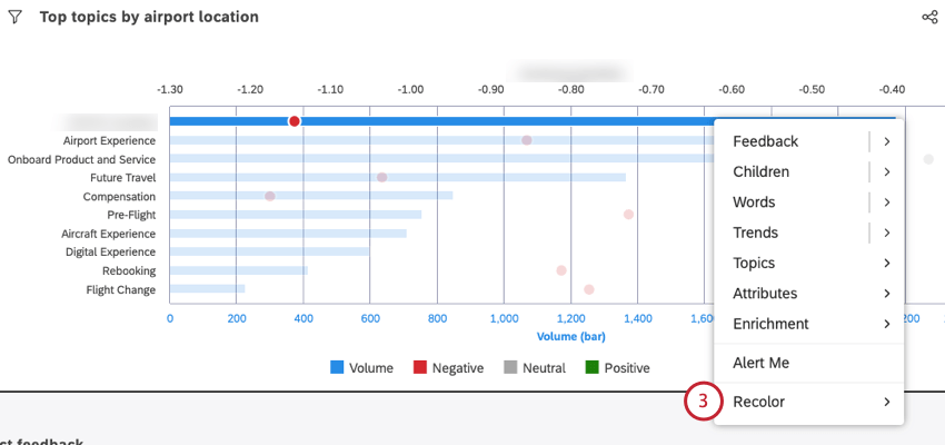
Recoloring Widget Groups
Qtip: Manual item recoloring may interfere with automatic color matching for related report items.
You can change the color of individual bars or data points in your widgets, also known as groups. By recoloring a group, you can highlight findings you think are noteworthy.
Recoloring Widget Groups
Viewing and Removing Recolored Groups
Sometimes you may want to see a list of all of the groups you’ve recolored. From this window, you can change the color, or remove it altogether.
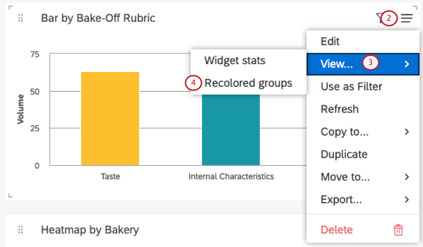
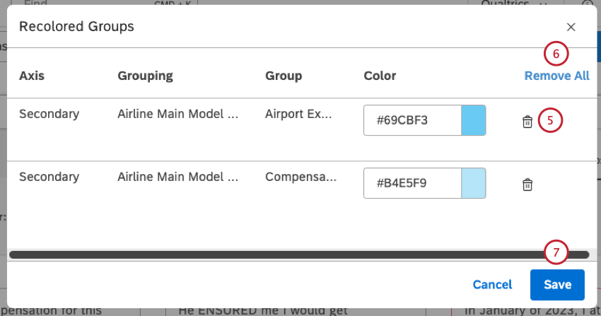
Qtip: As custom colors are removed, those groups will return to dashboard and widget default colors.
Widget Stats Mode
Qtip: To use this feature, you must have the Can Edit permission for the specific dashboard.
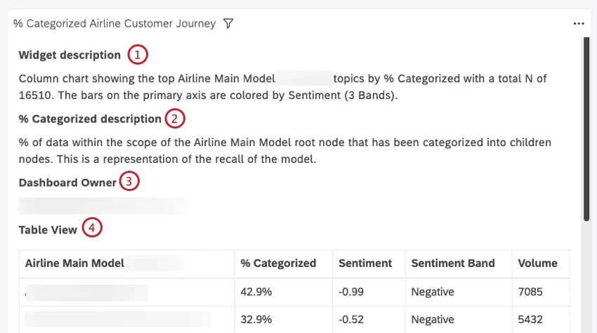
Use widget stats mode to view the request details and data behind graphs.
Qtip: Report viewers can access similar data as a table mode that provides report data without request details.
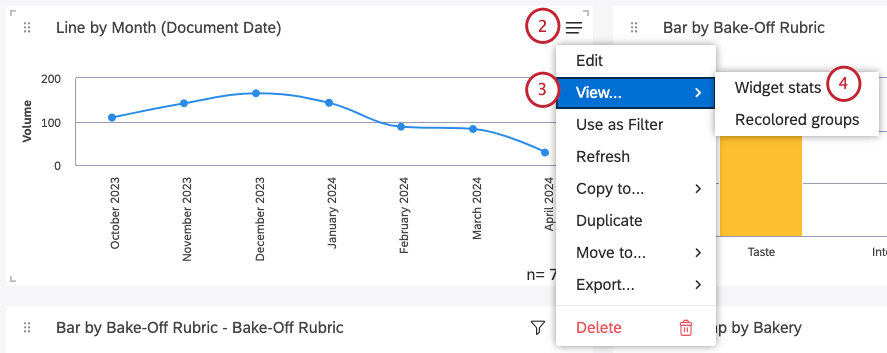
Opening Widget Stats Mode
Qtip: A dashboard can be open in either view or edit mode in order to use widget stats mode. However, a book must be open in view mode.
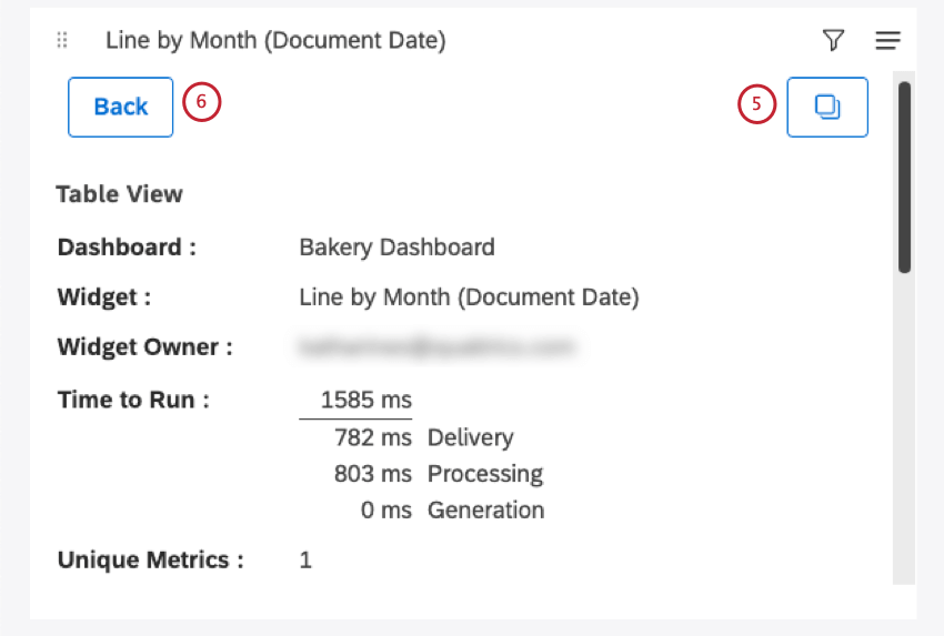
Information in Stats Mode
Whenever you open widget stats mode, you’ll see the following information:
- Dashboard: The name of the dashboard.
- Widget: The title of the widget.
- Widget Owner: The user who has full control over the widget.
- Time to Run: The total time (in milliseconds) it took to run the report. A detailed breakdown is provided for troubleshooting purposes:
- Delivery: Shows how long it took to deliver the request from your browser to Studio, plus how long it took to deliver the reporting data from Studio to your browser. This is primarily a reflection of your Internet connection quality and speed.
- Processing: Displays how long it took for Studio to process the request (check permissions, data access and so on) and formulate the appropriate request to the content provider, plus how long it took for Studio to validate the response it got from the content provider. This is primarily a reflection of Studio’s responsiveness.
- Generation: Shows how long it took for the Content Provider to query the dataset and aggregate the data requested by Studio. This is primarily a reflection of the content provider’s responsiveness.
- Unique Metrics: The number of unique metrics used in this report. This includes metrics used to group, calculate, and sort data. For example, in a Table widget that displays the top 10 topics by Volume AND a single Custom Math metric that references 5 other metrics in its expression, the number of unique metrics is 6. Custom Math expressions themselves are not counted.
Qtip: Volume is always counted as a unique metric, even when it is not selected as a calculation or sorting option.
- Report ID: Report request ID (used for troubleshooting).
- Performance ID: Dashboard run ID (used for troubleshooting).
- Cache: The status of cache for this report.
- Total Count: The total number of documents that match report conditions and filters (also displayed in the form of n= total).
- Report Data: A table with report data.
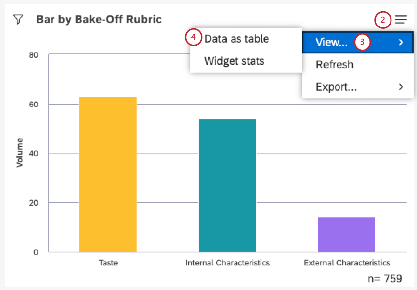
Viewing Widget Data as a Table
You can view a table of the data used in your widget.
Qtip: Report editors can access a similar Stats mode that provides request details in addition to report data.
Qtip: You can only see this option in view mode. This option does not appear when editing the dashboard.
Information in Data Table Mode
The data table shows the following information:
Qtip: If you’re looking at a feedback widget displayed as a document, and you have the Results Pane enabled, you’ll also see these tables:
- Document View: A table with all sentences from the current document’s central pane.
- Results View: A table with all sentences from the Results pane.
Exiting the Data Table View
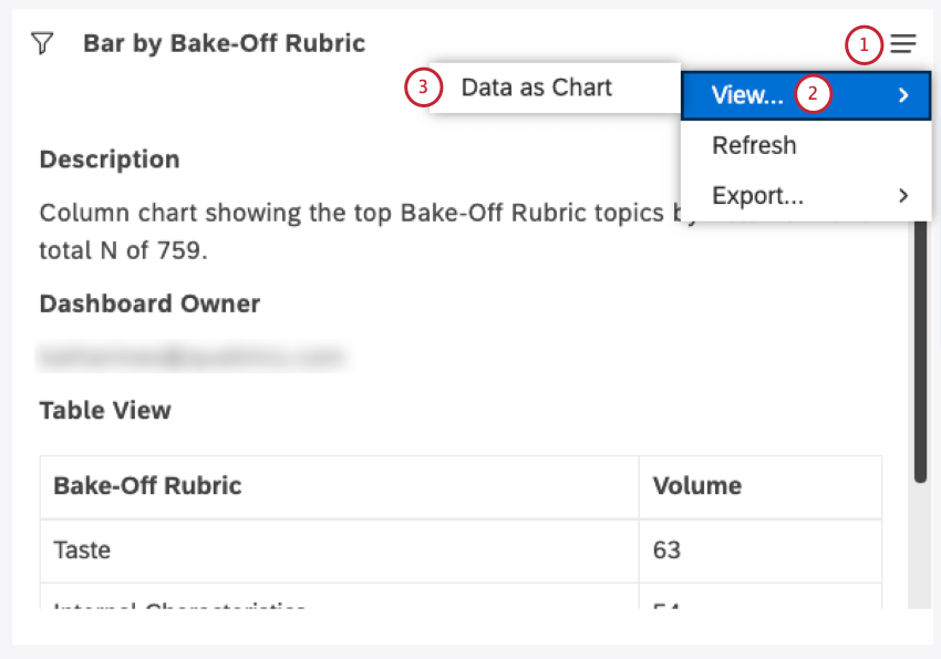
Qtip:For Table and Feedback widgets, this option is called Return to Report.
Refreshing Report Data
Qtip: Reports become unavailable until refreshing is finished.
To make sure your reports are always up to date, Studio lets you refresh them. When you refresh a report, Studio reruns it using the latest available data from its content provider.
In most cases, Studio refreshes reports automatically whenever you open them. You can also refresh your reports manually at any time. You may want to refresh manually, for instance, if your dashboard has been open for some time or when you need to make sure the report’s data is up to date.
Qtip: Whenever a report is run in Studio, its results are cached so they load faster the next time you open them. Cached results are only stored as long as there are no changes to the data in the content provider, meaning that cached results are always based on the latest available data.
There are 2 ways you can refresh report data:
- Refresh a Dashboard: Rerun all of the dashboard’s reports at once.
- Refresh Widgets: Rerun one or more selected reports for faster, more granular updates.
You can refresh the dashboard and widgets regardless of whether you are in editing or viewing mode. This means both editors and dashboard viewers can get the benefits of a dashboard refresh.
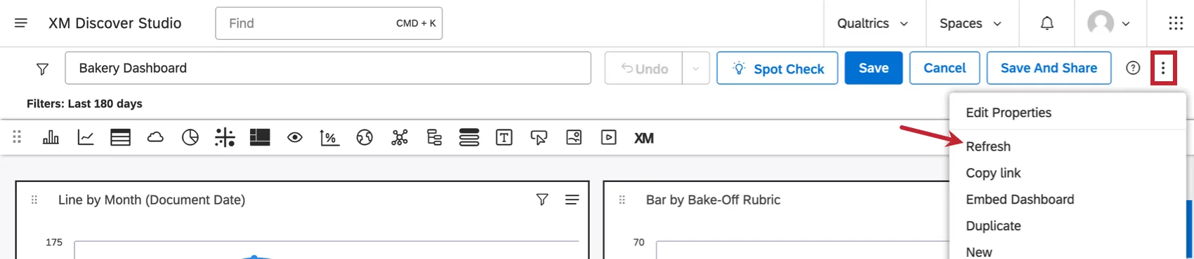
Refreshing a Dashboard
There are several ways to refresh a dashboard:
- Refresh the browser tab in which the dashboard is open.
Expand the options menu in the dashboard’s header and select Refresh.
- Set up a refresh schedule for a dashboard.
- Run a dashboard in full-screen mode and choose your preferred refresh frequency.
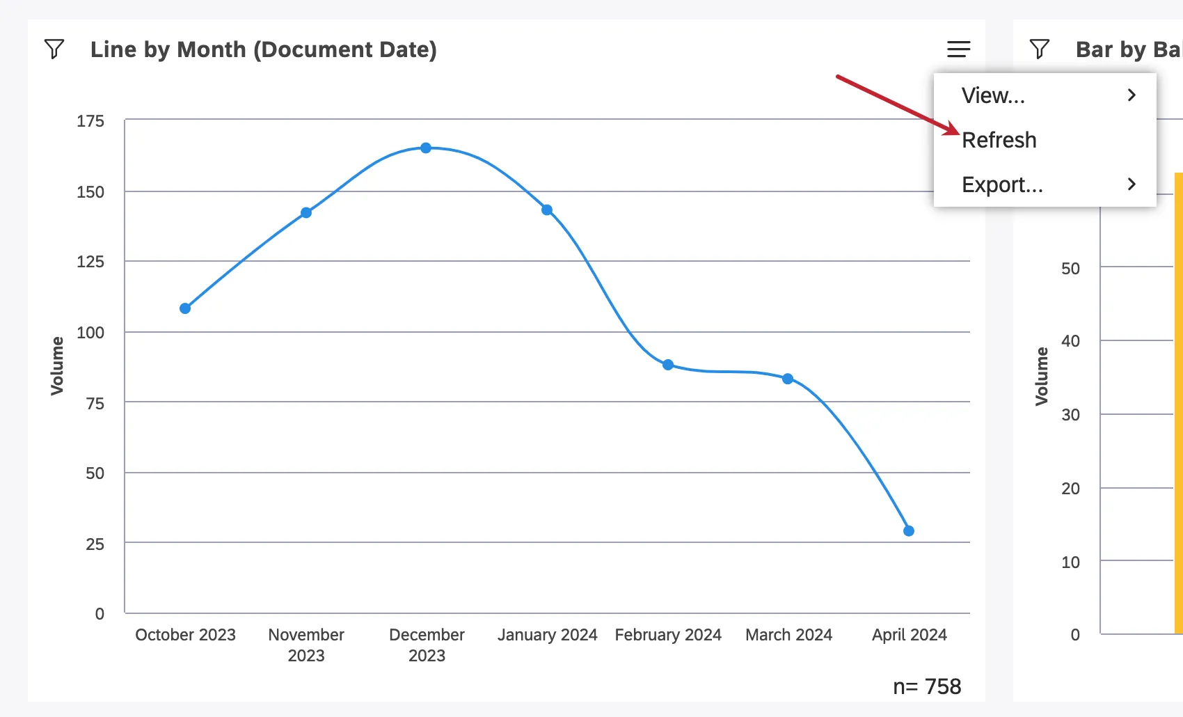
Refreshing a Single Widget
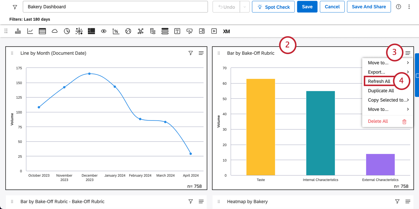
Refreshing Multiple Widgets at Once
You can only refresh multiple widgets in editing mode.
Caching in XM Discover
Qtip: Cache only works at the widget level; aggregations for dashboard filters are not cached.
XM Discover uses caching to store results of frequently requested reports in order to serve them faster. After any report is requested in Studio, its results are cached. Whenever the same report is requested again and cached results are still available and valid, they are used to serve the report faster.
Qtip: You can increase usage of cached data across your account based on your business needs.
How Do Cached Results Become Invalid?
Cached results become invalidated when any of the following happens:
- Sentiment is tuned and recalculated for the project.
- Any changes are made to the category model (this only applies to reports that reference that specific model).
- Any changes are made to report settings.
Provided these changes are not constant and can be anticipated, you can automate reports refreshing to run in the background and periodically cache your reports after data changes for better performance.
How Do I Know Whether Cache is Used?
You can check whether a report uses cached data in the widget stats mode:
- No Cache means the report was generated “from scratch.”
- Cached means the report returned cached results.
That's great! Thank you for your feedback!
Thank you for your feedback!