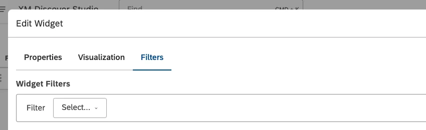
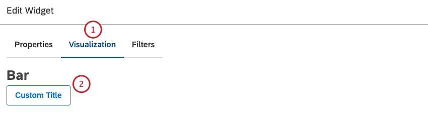
Select the
Visualization tab.
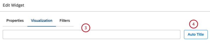
To enter your own widget title, click Custom Title.
Enter a custom report title into the box.
Alternatively, click Auto Title to keep the automatically generated report title.
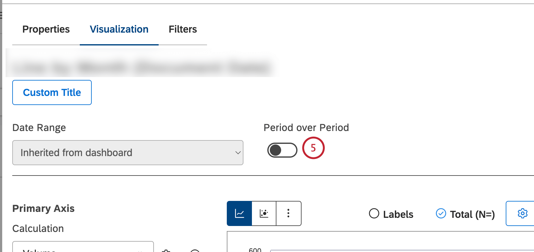
You can turn the
Period over Period toggle on to enable current versus historical period comparison and compare data over two time periods. Please see
Period Over Period Reporting for more information.
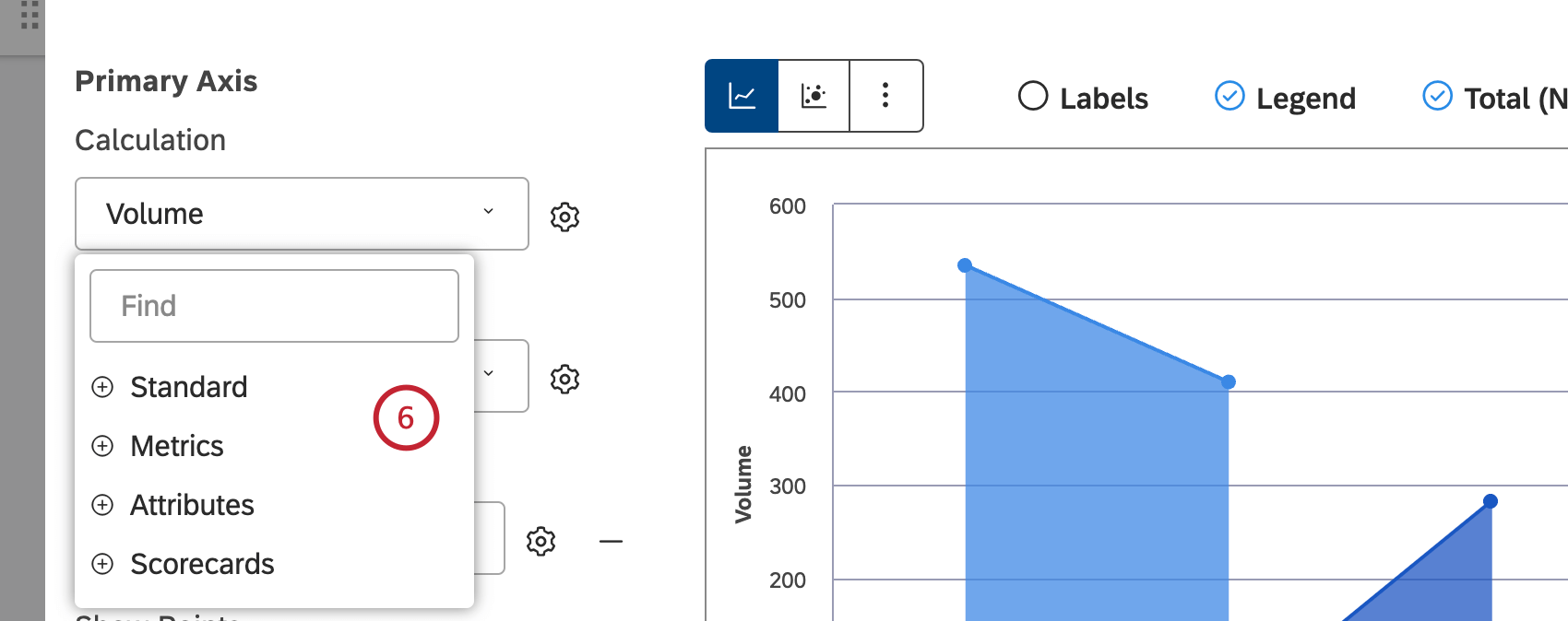
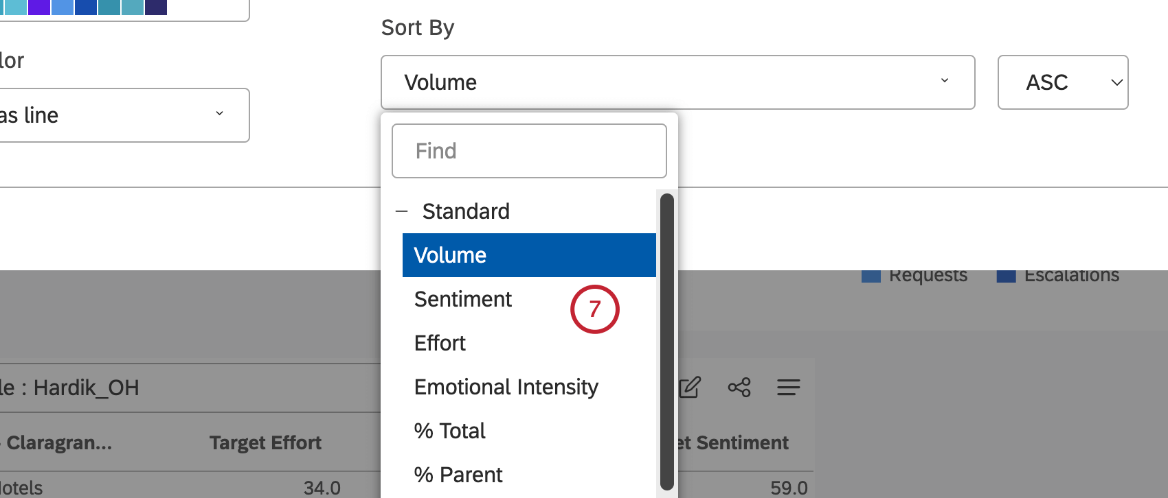
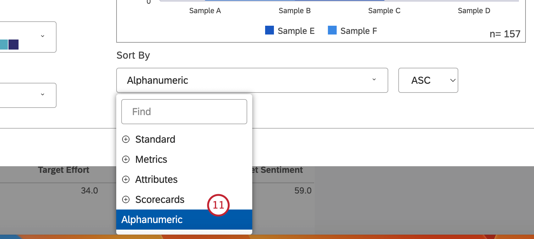
In the
Primary Axis section, you can select 1 of the following metrics by which selected groupings should be sorted along the primary axis:
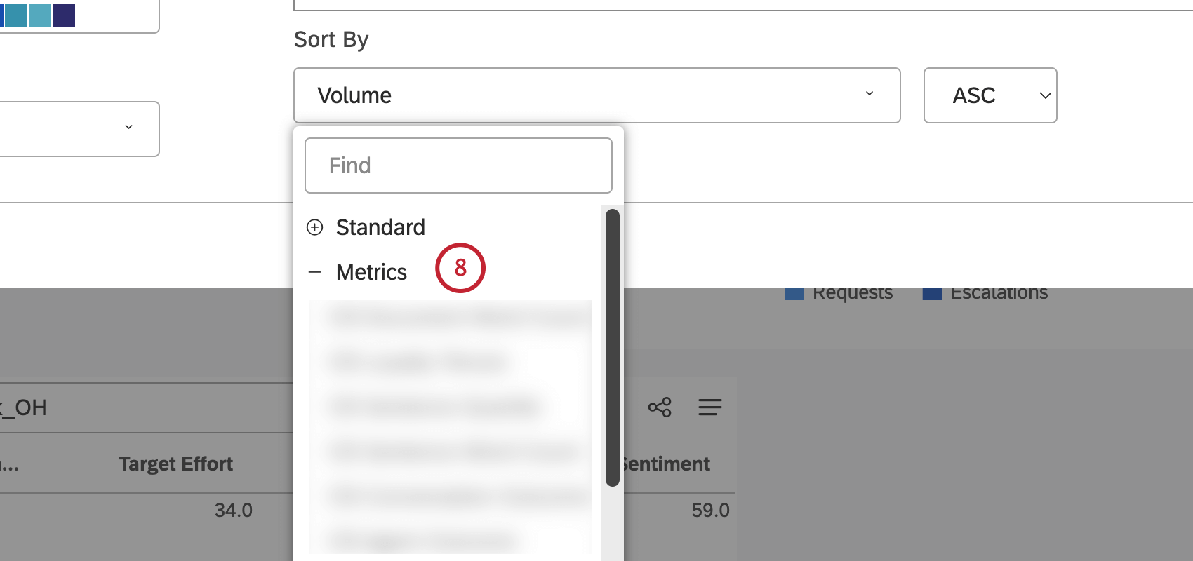
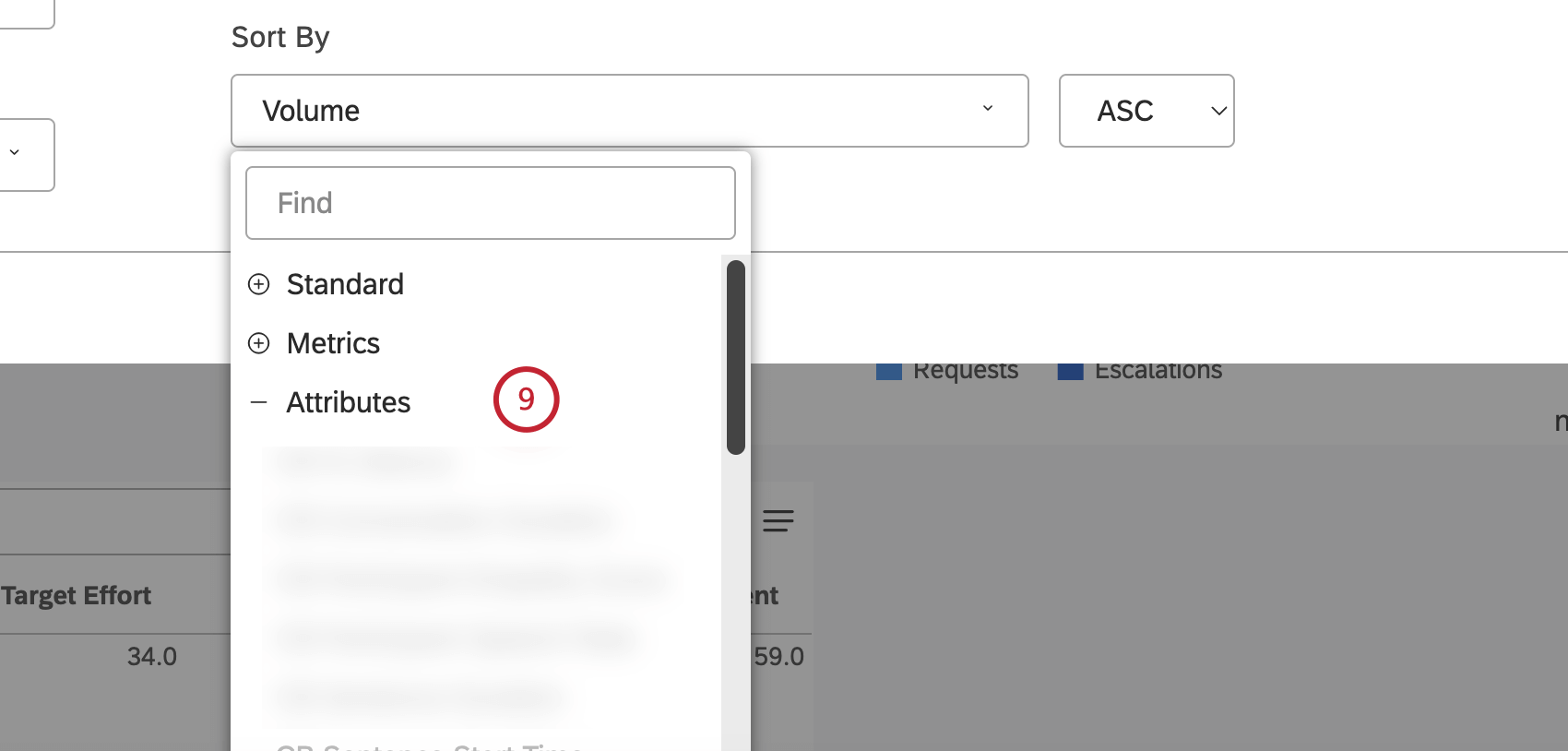
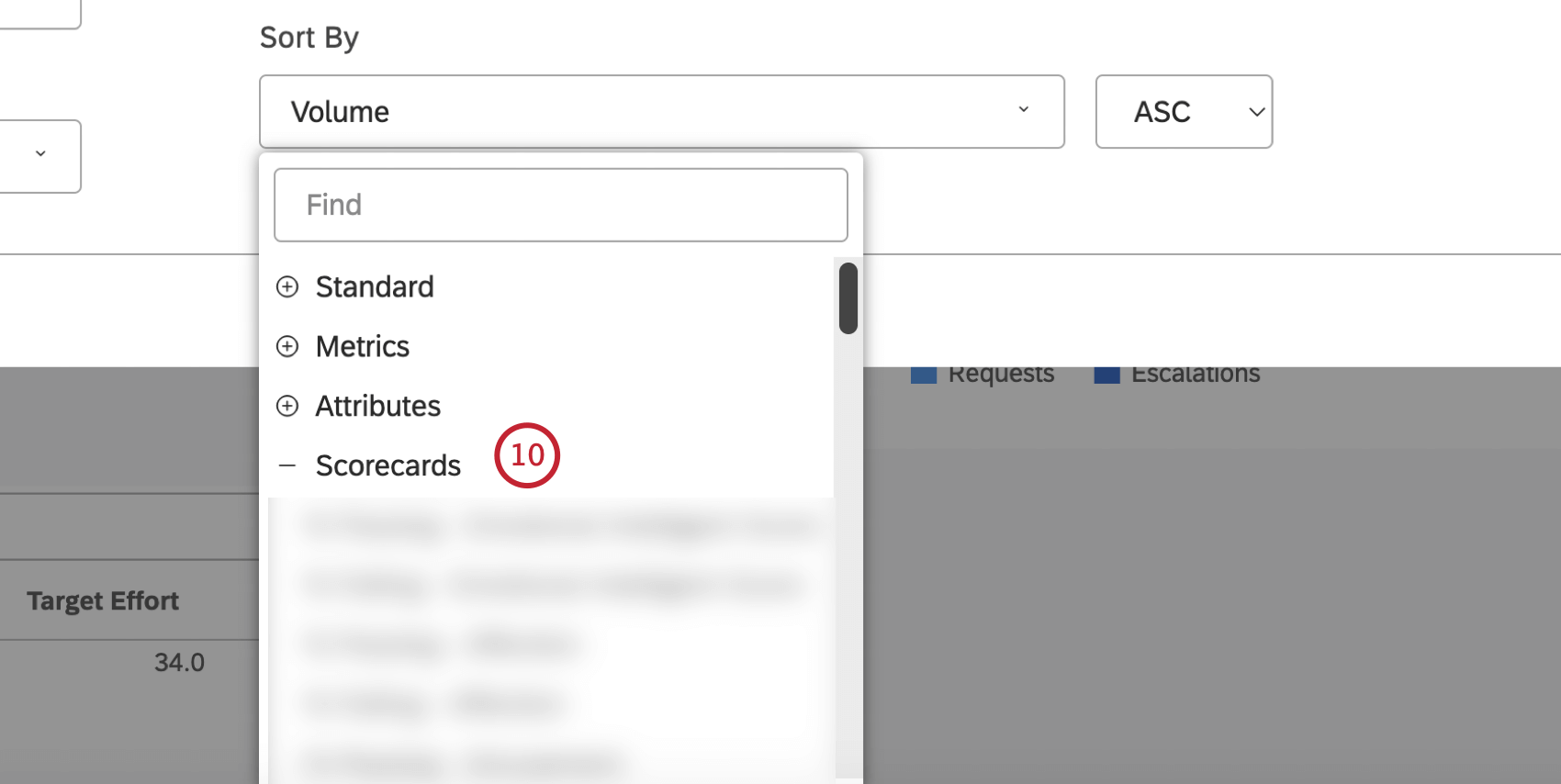
Standard, Metrics,
Attributes,
Scorecards or Alphanumeric. Calculation options that are not likely to be useful are grayed. A calculation is grayed out when it is either empty or contains only a single value under the current filters (both widget-level and dashboard-level). This should help you focus your reports on the more meaningful metrics without having to apply the trial and error method. You can select grayed out calculations if you need to. For an overview of available calculations, please see
Calculations (Studio).
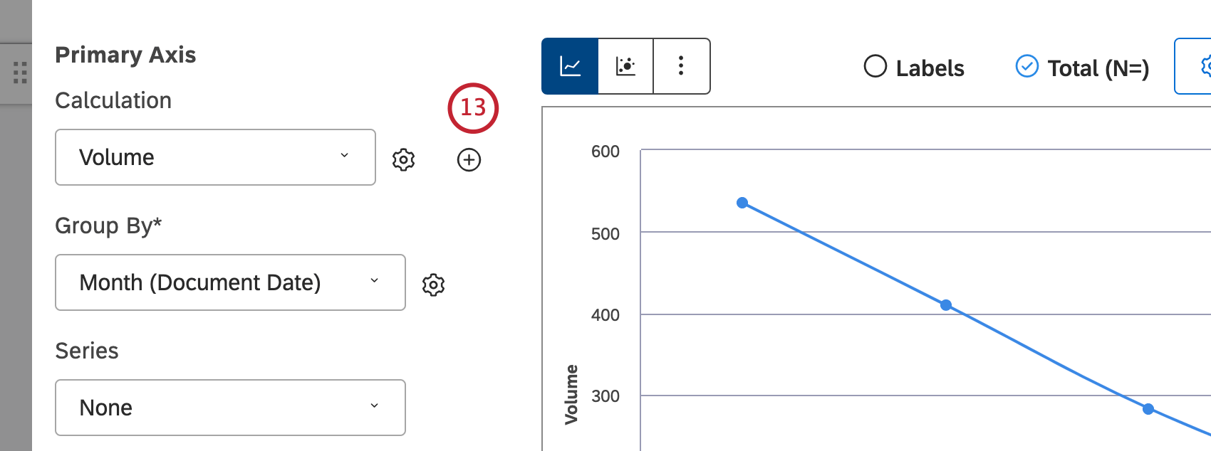
You can sort the
Standard metric by 1 of the following options:
Volume to sort by the number of documents related to the selected groupings,
Sentiment to sort by the average sentiment of sentences from documents related to the selected groupings,
Effort to sort by the average effort score of sentences from documents related to selected groupings,
Emotional Intensity to sort by the average emotional intensity of sentences from documents related to selected groupings,
% Total to sort by the volume percentage in relation to a report’s total or
% Parent to sort by the volume percentage in relation to a parent item.
You can sort the
Metrics metric by a metric defined in Studio.
You can sort the
Attributes metric by averages of a numeric attribute.
You can sort the
Scorecards metric by the selected scorecard outcomes:
% Passing: Sort by the percentage of documents that passed the selected rubric’s target or
% Failing: Sort by the percentage of documents that failed the selected rubric’s target.
The
Alphanumeric metric can be sorted by primary groupings alphanumerically, using the natural order.
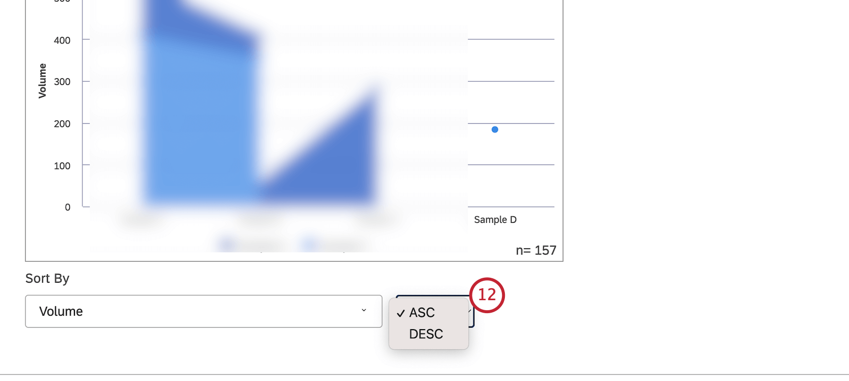
Select
ASC to apply ascending sorting or
DESC to apply descending sorting.
Click the plus (
+ ) icon to add up to 5 calculations. These calculations will be plotted as independent lines sharing the same axis. When trending by non-volume metrics (like NPS® scores), keep in mind that null values are not displayed as zeroes; instead, they are not displayed at all.
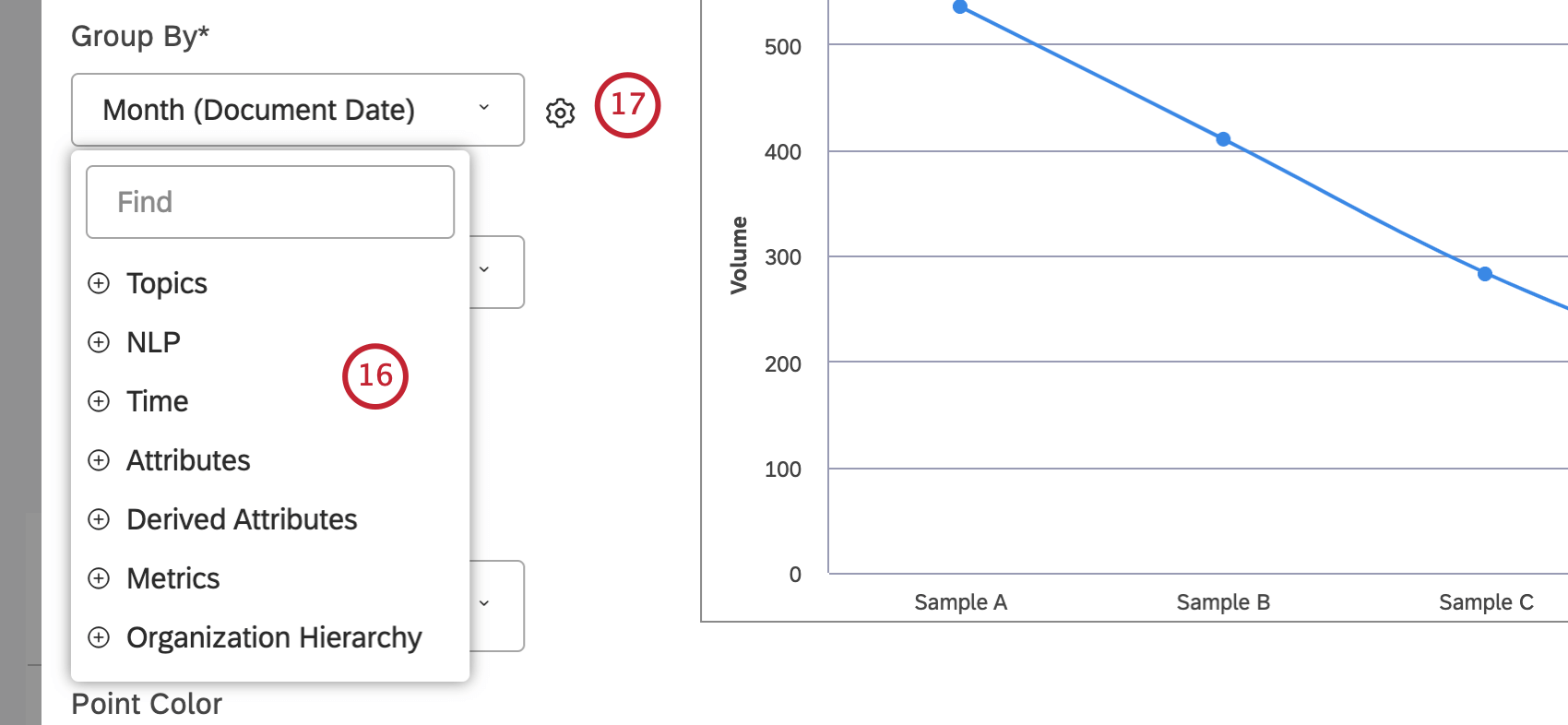
Select the option by which to group data for your report.For an overview of the available data groupings, please see
Grouping Data. Use search to find anything you want to group by. Grouping options that are not likely to be useful are grayed out for your convenience. A grouping is grayed out when it is either empty or contains only a single value under the current filters (both widget-level and dashboard-level). This should help you to focus your reports on the more meaningful data groupings without having to resort to the trial and error method. You can select grayed out groupings if you need to.
After you select a grouping option, click the gear icon next to it to configure the subset of data that should be included into that grouping for the report. For an overview of available grouping settings, see
Grouping Settings.
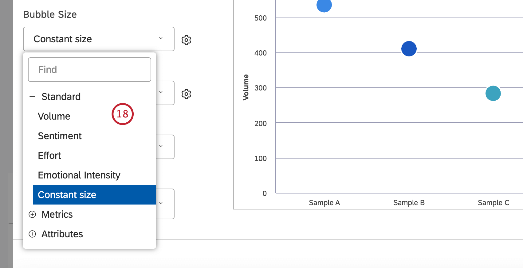
If you select the bubble chart report visualization, you can set the bubble size to reflect 1 of the following additional metrics:
Standard,
Metrics or
Attributes. For the Standard metric, you can select
Volume if you want the bubble size to reflect the number of related records,
Sentiment if you want the bubble size to reflect the average sentiment of sentences from related records,
Constant size (default) if you want all the bubbles to be the same size or
Effort if you want the bubble size to reflect the average effort score of sentences from related records. You can adjust the overall bubble size by clicking the cog icon and selecting a number from 10 (largest size) to 1 (smallest size). The default size is 5. For the
Metrics metric, bubble size reflects the value of a Top Box, Bottom Box, Satisfaction, Filtered, or Custom Math metric. For the
Attributes metric, bubble size reflects the calculated value of a selected attribute.
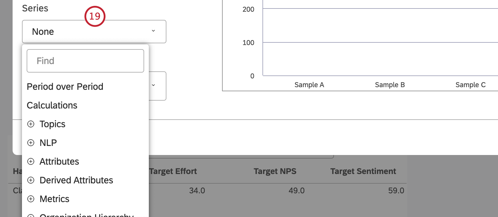
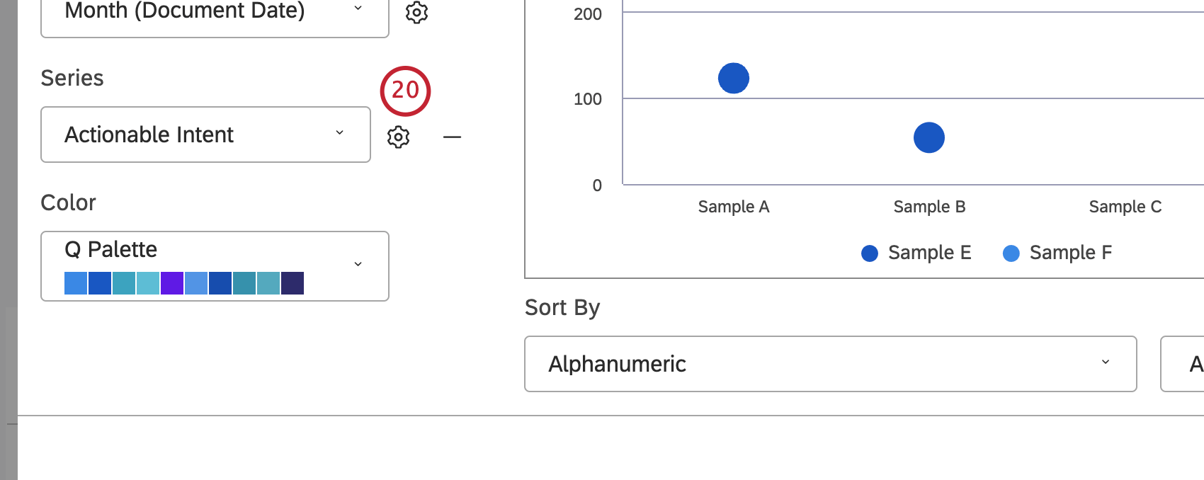
You can select a secondary option to cluster data groups by or leave the
Series selector empty to use just the primary grouping. The
Series grouping is enabled automatically if you turn the
Period over Period switch to
On or if the secondary grouping is automatically set to
Period over Period. If you select more than 1 calculation, the secondary grouping is automatically set to
Calculations.
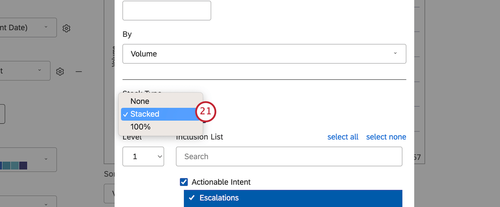
Enabling the
Series grouping allows you to turn your line chart into a
stacked area graph for better visualization of part-to-whole relationships. To do this, click the cog icon next to the
Series option.
If primary grouping is by any NLP option, secondary grouping is not available for performance reasons. When a widget has two groupings: a time-based grouping followed by a second grouping of any kind, Studio normalizes the display of subgroups across the periods of time.
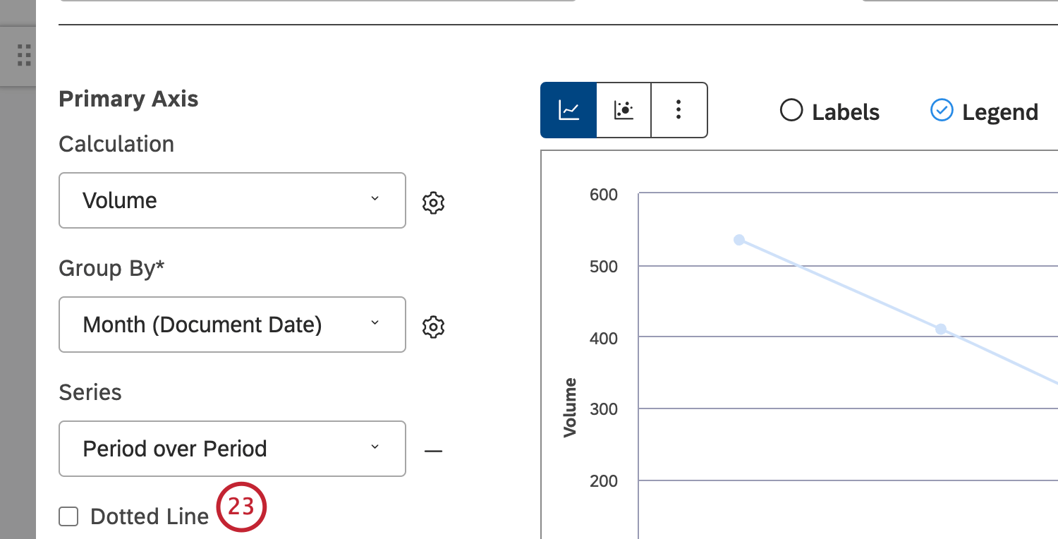
See Trend Report Best Practices (Studio) for details.When running current period vs. historical period comparison in Line Chart mode, you can set the secondary grouping to
Dotted Line for enhanced visualization.
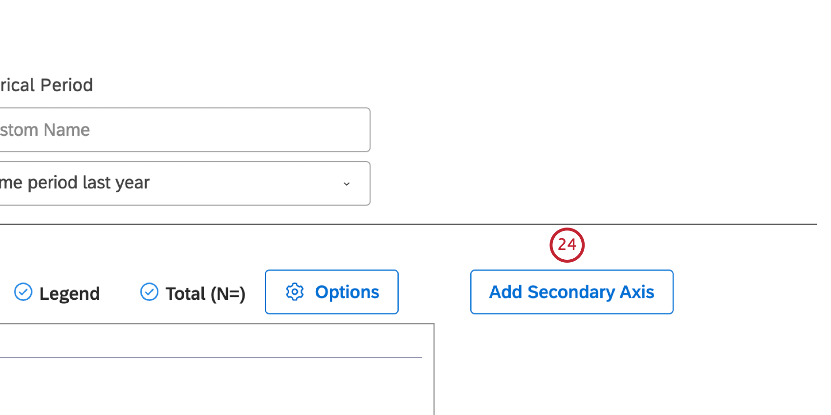
You can add a secondary axis that lets you plot a secondary metric on top of the chart. To add a secondary axis, click
Add Secondary Axis. To remove a secondary axis, click
Remove Secondary Axis.
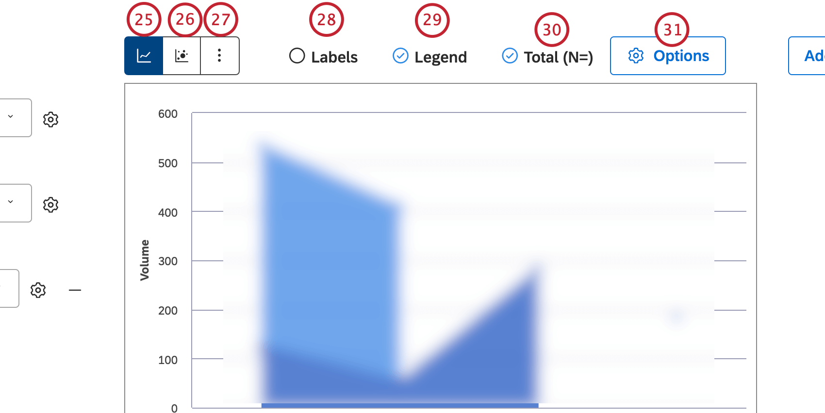
Select the
Line Chart layout option to present report items as a series of data points connected by a straight line.
Select the
Bubble Chart layout option to present report items as bubbles.
Qtip: You can also set the bubble size to reflect related metrics.
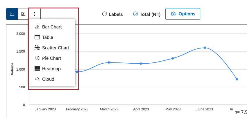
Click More Graphs to switch to other widget types while retaining the current report settings (where applicable).
Select the Labels checkbox to show numeric labels next to report items. Deselect the Labels checkbox to hide numeric labels next to report items.
Select the
Legend checkbox to show a chart legend. Deselect the
Legend checkbox to hide a chart legend.
Qtip: Viewers can hide and show specific report items by clicking them in a legend.
You can visually cluster secondary groupings within their parent groups while only showing primary grouping names along the axis. Select the
Total (N=) checkbox to show the total number of
documents that match report conditions and filters. For more information on document volume, please see
Displaying Total Volume on Widgets (Studio). Deselect the
Total (N=) checkbox to hide the total number of documents that match report conditions and filters.
Qtip: This option is only available when primary and secondary groupings are selected without stacking.
Qtip: To set the default dashboard-wide value for new widgets, use the n= setting in dashboard properties.
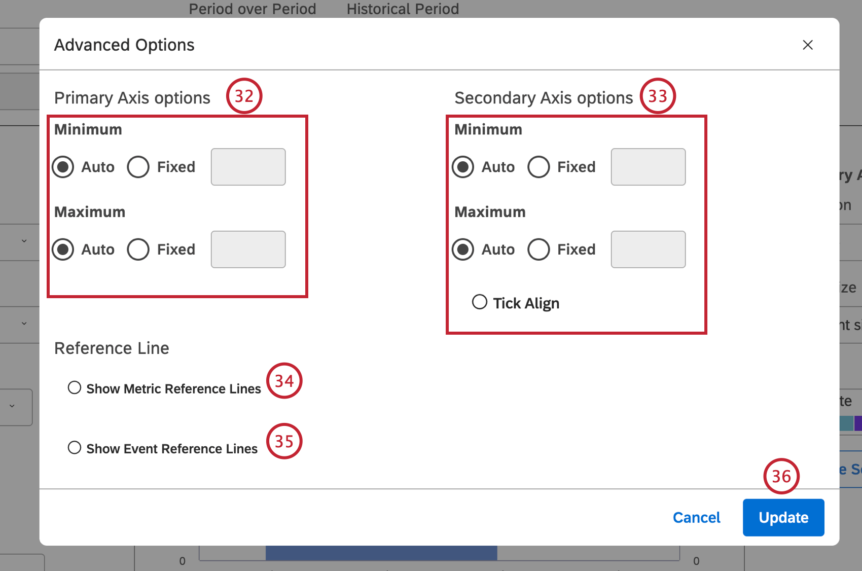
Click Options to define primary and secondary axis limits, and add reference lines.
In the
Advanced Options window, you can define the lower (Minimum) and upper (Maximum) limits for each axis. In the
Primary Axis options section, select 1 of the following options:
Auto to set the limits automatically, based on the report data or
Fixed to specify the limit manually.
In the Secondary Axis options section, select 1 of the following options: Auto to set the limits automatically, based on the report data, Fixed to specify the limit manually or Tick align to tie the secondary axis values to the primary axis grid lines (for better visualization).
Select the
Show Metric Reference Lines if you are running a trend report to add static metric values to a report. For more information, please see
Adding a Metric Reference Line.
Select the
Show Event Reference Lines to add events and time spans to a trend report. For more information, please see
Adding an Event Reference Line.
Click Update in the Advanced Options window.
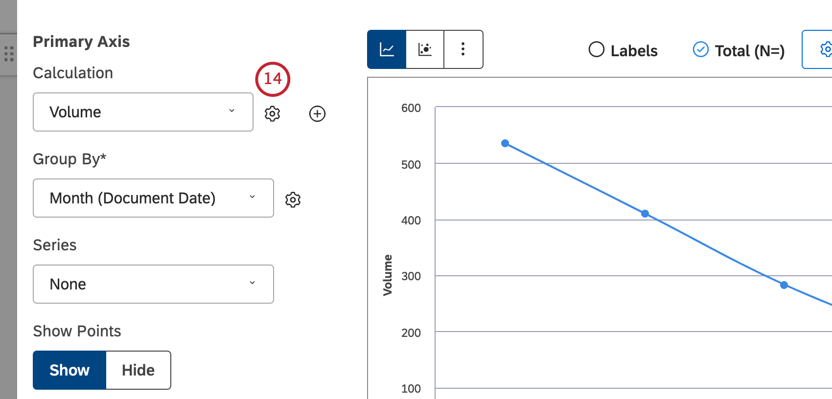
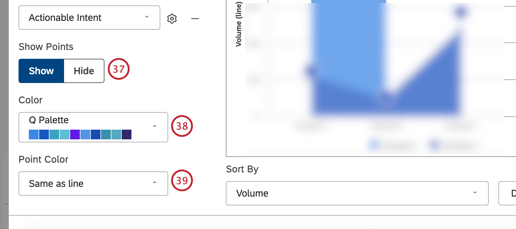
Click
Show to display data points. Click
Hide to data points.
You can also adjust the report colors. Select the
color palette for the current period data plotted along the primary vertical axis.
Select the color of data points for the line chart.
Select the color palette for the historic period. This requires the
Period over Period switch to be set to
On.
Qtip: The Lighten option uses the lighter version of the current period color.


