
Bar Widget (Studio)
What's on this page
About the Bar Widget
Qtip: To modify dashboard widgets, a user must have an Edit Dashboard permission and be granted Can Edit permission for the specific dashboard. For information about widget permissions, please see Editing Widget Properties.
Attention: To ensure optimal Studio performance there is a limit on the number of widgets that can be added to each dashboard. For more information, please see Maximum Widgets per Dashboard.
The bar widget is a Studio report visualization that presents data as vertical or horizontal bars with an optional secondary axis. For information about editing widget properties and more, see the Widgets (XM Discover) page.

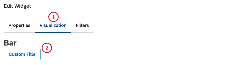
Adding a Bar Widget
Qtip: Click Ok at the bottom-right of each of the Properties, Visualization and Filters tabs to apply the settings in each of these tab. Click Save at the top of the dashboard.
Properties Tab
You can edit bar widget properties in the Properties tab.
For information about adding a widget, see Adding a Widget.
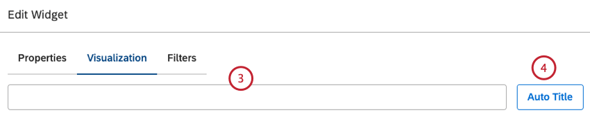
Visualization Tab
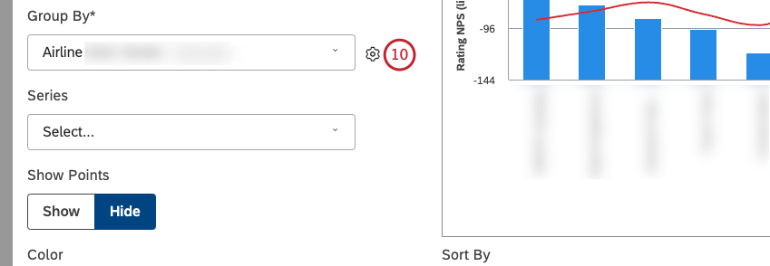
You can define report settings in the Visualization tab.
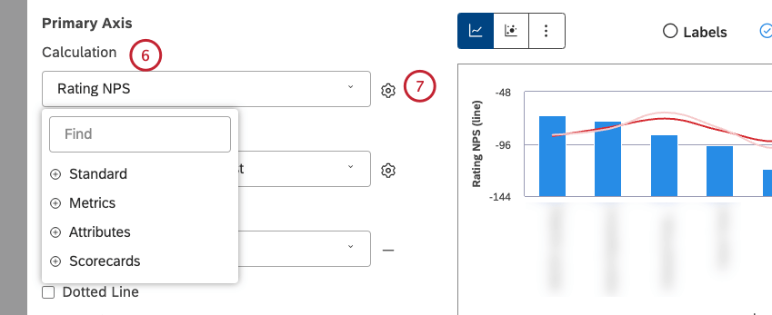
Qtip: Calculation options that are not likely to be useful are grayed. A calculation is grayed out when it is either empty or contains only a single value under the current filters (both widget-level and dashboard-level). This should help you focus your reports on the more meaningful metrics without having to apply the trial and error method. You can select grayed out calculations if you need to.
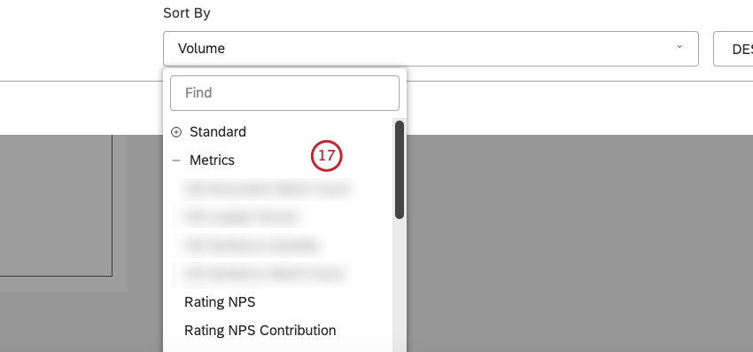
Qtip: You can define default settings for calculations based on specific attributes in the Projects section.
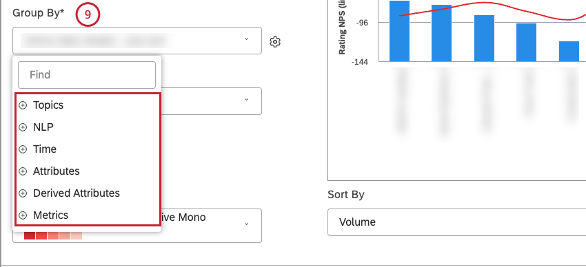
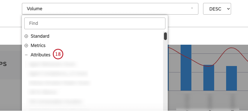
Qtip: Grouping options that are not likely to be useful are grayed out for your convenience. A grouping is grayed out when it is either empty or contains only a single value under the current filters (both widget-level and dashboard-level). This should help you to focus your reports on the more meaningful data groupings without having to resort to the trial and error method. You can select grayed out groupings if you need to.
Qtip: If primary grouping is by any NLP option, secondary grouping is not available.
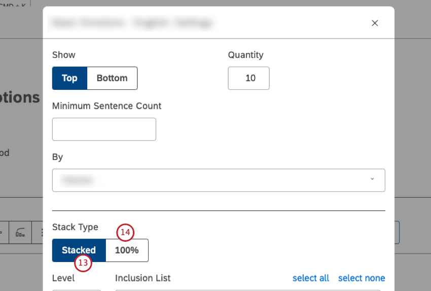
Qtip: When stacking bars, the bar height is based on the parent calculation value (the group by option), and then broken down the bar based on the returned segments’ proportions to each other. This means that the combined volume of individual segments will not always correspond to the total volume of the stack. For more information, please see Stack Size.
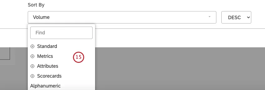
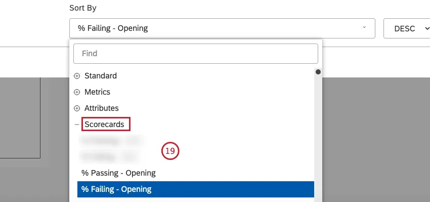
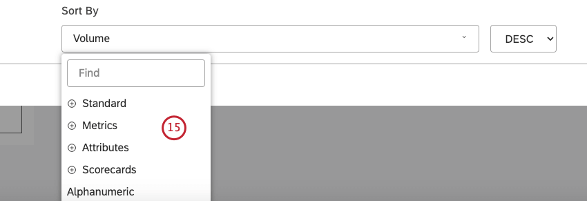
- Standard
- Metrics
- Attributes
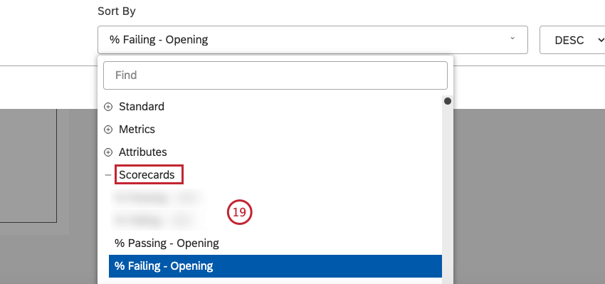
- Scorecards
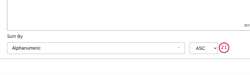
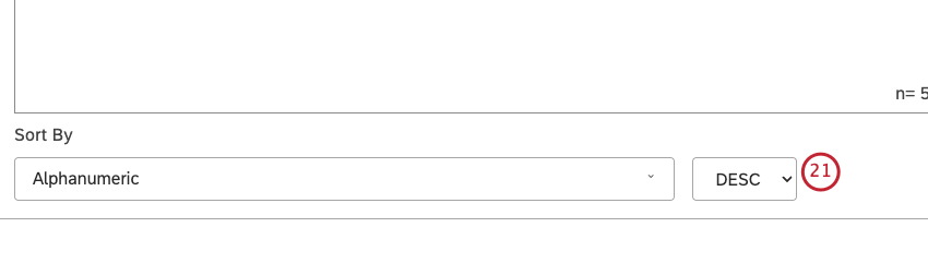
- Alphanumeric
- Model Display Order: Sort widget data based on the display order of the topic model in Designer.
- Volume: Sort by the number of documents related to the selected groupings.
- Sentiment: Sort by the average sentiment of sentences from documents related to the selected groupings.
- Effort: Sort by the average effort score of sentences from documents related to selected groupings.
- Emotional Intensity: Sort by the average emotional intensity of sentences from documents related to selected groupings.
- % Total: Sort by the volume percentage in relation to a report’s total.
- % Parent: Sort by the volume percentage in relation to a parent item.
- % Passing: Sort by the percentage of documents that passed the selected rubric’s target.
- % Failing: Sort by the percentage of documents that failed the selected rubric’s target.
Qtip: Select DESC to apply descending sorting.

Qtip: For information on how sorting is applied if more than 1 level of grouping is selected, please see Creating Multi-Level Connections.
- Ascending: Negative stacks / Detractors at the top, positive stacks / Promoters at the bottom.
- Descending: Positive stacks / Promoters at the top, negative stacks / Detractors at the bottom.
- Same as Sort By: Uses the Sort By metric.
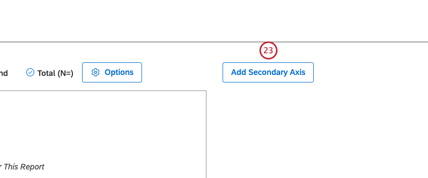
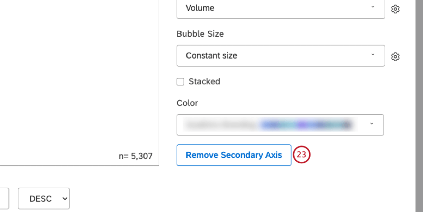
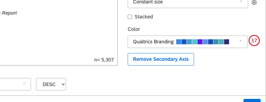
Qtip: To remove a secondary axis, click Remove Secondary Axis.

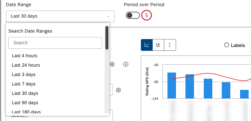
Qtip: When pareto layout is selected the secondary axis type is locked to Line Chart, and calculation is locked to Cumulative % Total. For the primary axis, stacking and secondary grouping options are removed. Time groupings and the Period over Period option are disabled. Report items are sorted by volume.
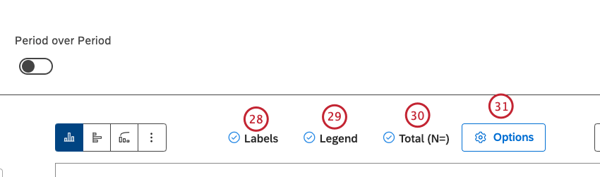
Qtip: Viewers can hide and show specific report items by clicking them in a legend.
Qtip: The option to show and hide a chart legend is only available when a bar graph is set up to display stacked bars or several groupings.
Qtip: This option is only available when primary and secondary groupings are selected without stacking.
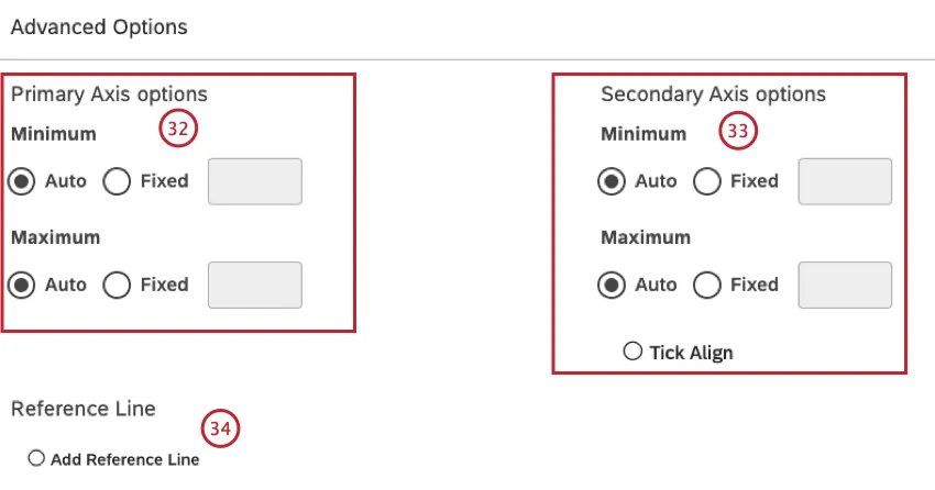
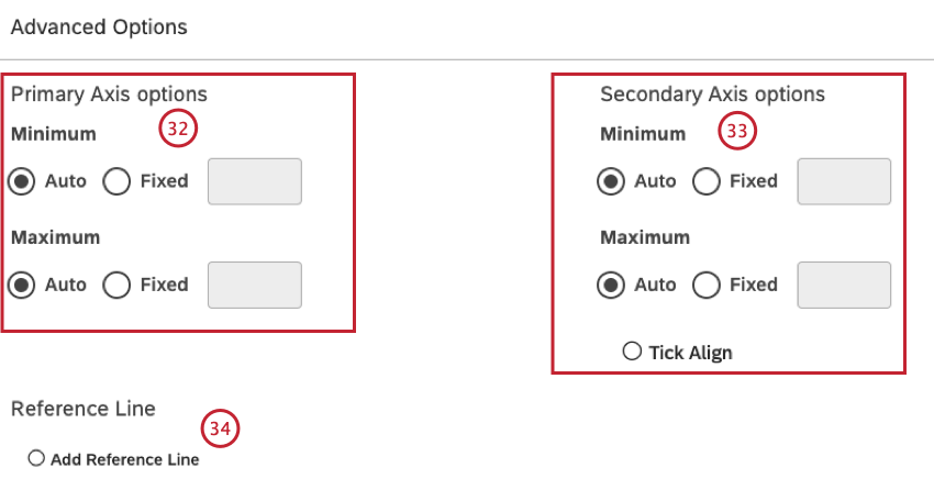
Qtip: To set the default dashboard-wide value for new widgets, use the n= setting in dashboard properties.
- Auto: Set the limits automatically, based on the report data.
- Fixed: Specify the limit manually.
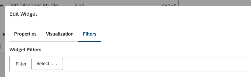
Filters Tab
In the Filters tab, you can further narrow down report data. For information on widget filters properties, please see Applying Filters to a Widget.
Sorting by Multiple Groupings
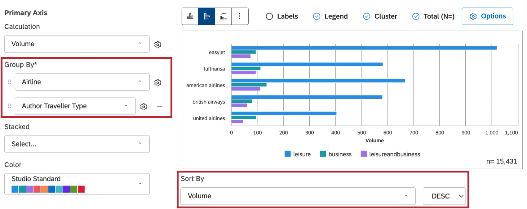
When a widget has only one grouping added to it, it’s clear what order the different data points are being sorted in. But as you add more groupings to a bar widget, there’s more data to consider.
Here’s the order groups are sorted by in bar widgets:
Example: Using the example above, it’ll look at volume by airline first.
Example: EasyJet has the highest volume of responses, so it’s the top ranking airline by volume. Within this airline, the traveler types rank in the following order: leisure, business, followed by a combination of leisure and business.
Example: Let’s say there are 2 more traveler types not included in EasyJet: religious and educational. To determine the order these traveler types would appear, we’d look at their volume in Lufthansa, since it has the second highest volume of the airlines ranked here. No matter their order, these 2 new categories would come after leisure, business, and the leisure/business combination.
Qtip: Sorting by multiple groupings behaves differently for period over period reporting. For more details, see Sorting by Multiple Groupings.
Period Over Period Reporting
Period over period reporting allows you to compare data between 2 time periods. For information about period over period reporting, see Period Over Period Reporting.
Widget Calculation Settings
You can report on a number of calculations in your data, including volume, metrics and attributes, and more. For more information, see Calculations (Studio).
Bar and Column Widget Tips
This section provides you with tips to help you make the most of your bar and column charts.
Columns vs. Bars
The bar and column charts are most commonly used for comparisons.
The column chart is a great choice when comparing up to 7 items.
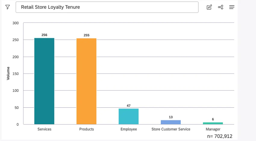
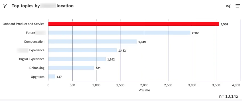
The bar chart is a better choice when comparing more than 7-10 items.
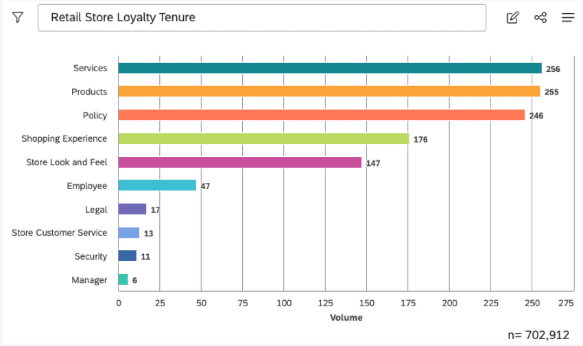
If labels are long, it is better to expand the chart to ensure the labels can be read or use a bar chart to display the labels horizontally.
Choosing a Color Palette
In general, we recommend avoiding the use of distracting colors such as bright yellow or neon. Darker blues, greens, and oranges work best. For narrative dashboards, use red to call attention to a key message. Keep columns and bars in solid or muted color (like gray), then drill down to recolor each bar or column you wish to highlight.
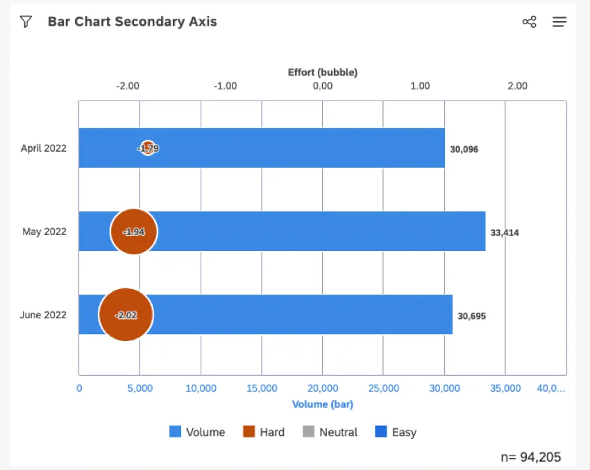
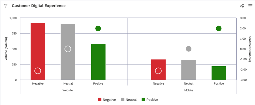
Secondary Axis
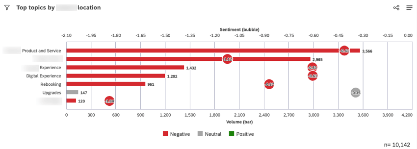
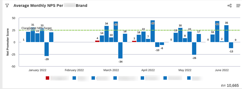
Add a secondary axis to easily measure key performance indicators such as NPS, ratings, CSAT, or sentiment.
For sentiment, select the Sentiment (3 bands) color option to easily distinguish between negative, neutral, and positive feedback. For other KPIs, we recommend using a custom color.
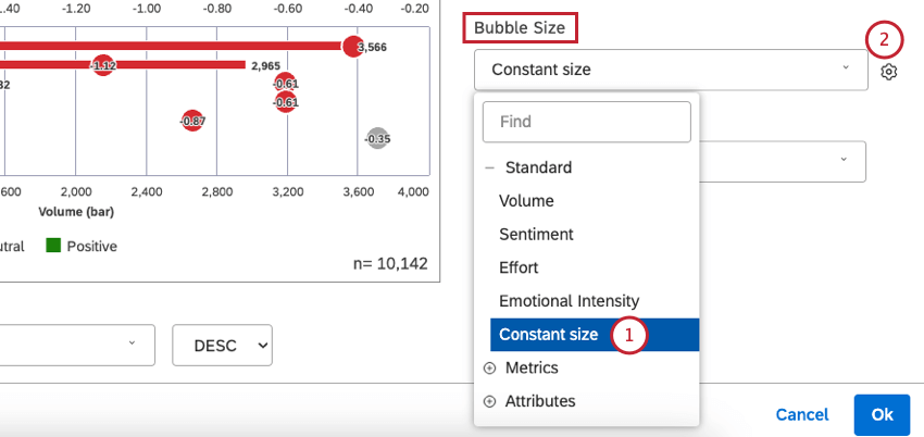
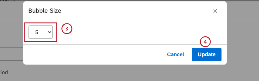
If you are using a bubble chart for a secondary axis, consider enlarging the bubbles to make them more visible. To change the bubble size:
Reference Lines
You can add a target, average, or threshold reference line to call attention to important metrics and give additional context to the analysis. For more information on reference lines, see Adding Reference Lines to Widgets.

Secondary Grouping
Add a secondary grouping to a bar or column chart to view additional comparison insight analysis.

Narrative Dashboard Titles
For narrative dashboards, active titles are more effective than passive ones. A passive title only describes what is being measured. An active title focuses on the message you want the audience to remember. For example, instead of the passive title “NPS Comparisons of Qualtrics with Top 2 Competitors,” use an active title like “Qualtrics consistently received the highest NPS compared to the Top 2 Competitors.” This allows dashboard viewers to easily and quickly understand the summary and intent of the graph.
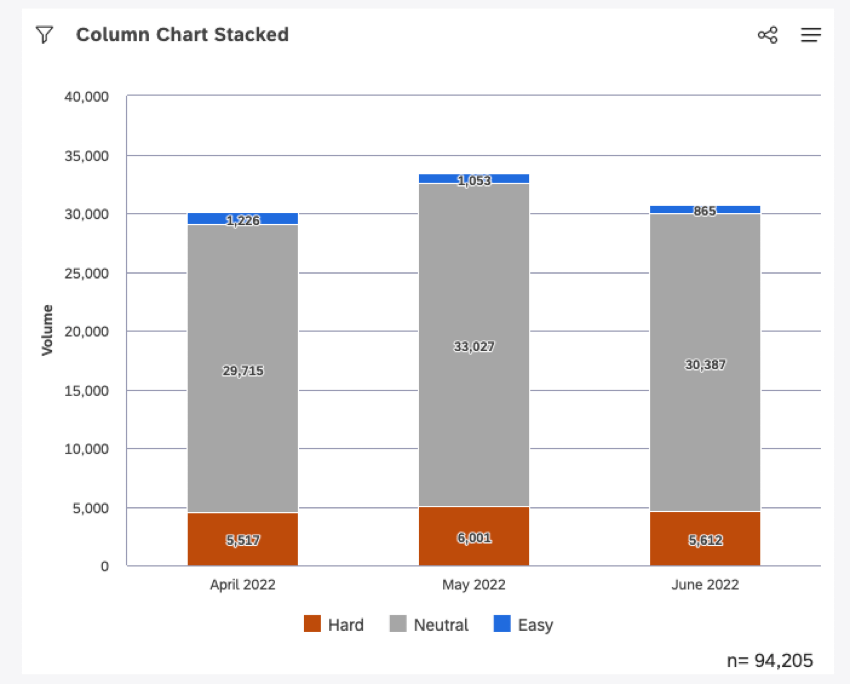
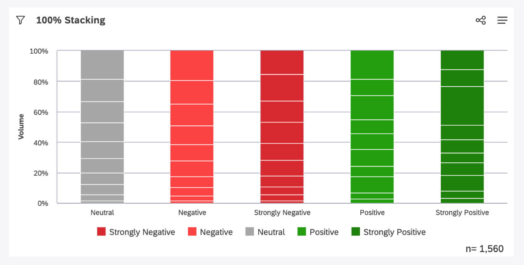
Stacked Reports
A stacked column or bar chart option can display changes in composition. We recommend having no more than 3-5 stack partitions.

100% stacking makes it easier to see the relative difference between stacks within each data grouping.
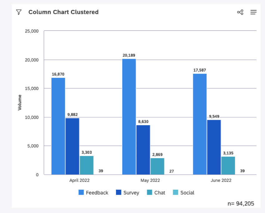
Clustering
The cluster option for the column or bar chart visually clusters secondary groupings with their associated parent groups while only showing primary group names along the axis.

That's great! Thank you for your feedback!
Thank you for your feedback!