
Network Widget (Studio)
What's on this page
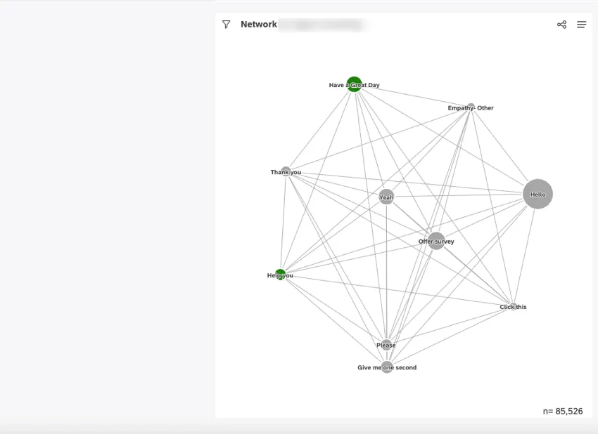
About the Network Widget
Qtip: To modify dashboard widgets, a user must have an Edit Dashboard permission and be granted Can Edit permission for the specific dashboard. For information about widget permissions, see Editing Widget Properties.
Attention: To ensure optimal Studio performance, there is a limit on the number of widgets that can be added to each dashboard. For more information, see Maximum Widgets per Dashboard.
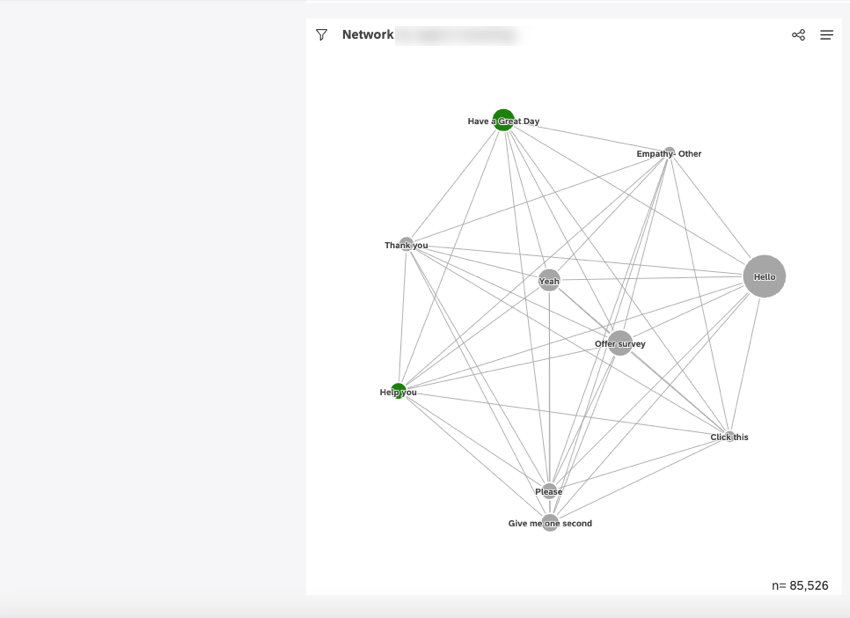
You can use the network widget to display data as an explorable web of connections. In a network widget, data groupings are displayed as nodes. Nodes that have a qualifying number of co-occurrences are connected with lines. Proximity between nodes is based on raw volume, meaning that large-volume topics usually have tighter clusters around them due to there being more co-occurrences.
For information about editing widget properties and more, see Widgets (XM Discover).
Adding a Network Widget
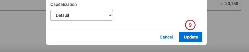
Qtip: Click Ok at the bottom-right of each of the Properties, Visualization and Filters tabs to apply the settings in each of these tabs, and then click Save at the top of the dashboard.
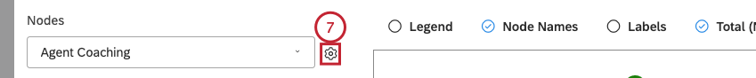
Properties Tab
You can edit widget properties in the Properties tab. For information about adding a widget, please see Adding a Widget.
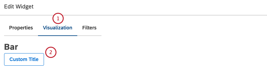
Visualization Tab
You can define report settings in the Visualization tab.
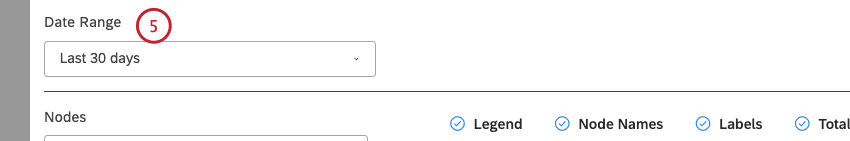
Qtip: Unless you set your widget to ignore the dashboard date range, the dashboard date range completely replaces the date range defined here.
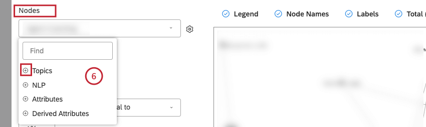
- Topics
- NLP
- Attributes
- Derived AttributesFor an overview of available data groupings, see Grouping Data.
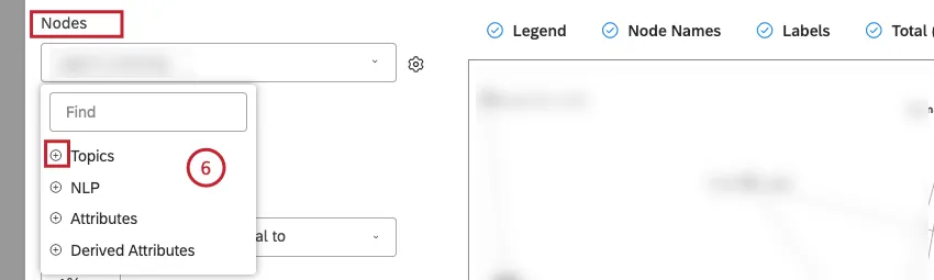 Qtip: Click the plus ( + ) icon to view more options.
Qtip: Grouping options that are not likely to be useful are grayed out. A grouping is grayed out when it is either empty or contains only a single value under the current filters (both widget-level and dashboard-level). This should help you focus your reports on the more meaningful data groupings without having to apply the trial and error method. You can select grayed out groupings if you need to.
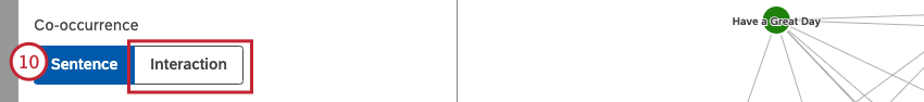
Qtip: Alternatively, select Interaction to draw a line between topics if they occur within the same interaction (for example, within the same chat, call, or individual feedback).
Qtip: If you select Interaction, any other widgets that may potentially filter this widget with sentence-level criteria will be unlinked. Since interaction co-occurrence is based on an entire document, it loses references to sentence-level data such as sentiment, effort, and other NLP enrichments.
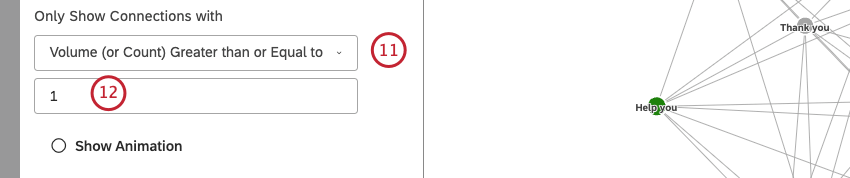
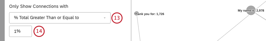
Qtip: The bigger this number is, the less lines will appear in the widget, but the lines that do appear are likely to be more significant.
Qtip: The bigger this number is, the less lines will appear in the widget, but the lines that do are likely to be more significant.
Qtip: We recommend increasing the Only Show Connections with parameter when using interaction-based co-occurrences between topics to account for the wider net of discovery.
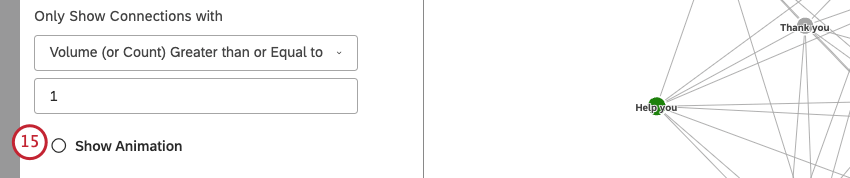
Qtip: Deselect this checkbox to disable node animation.
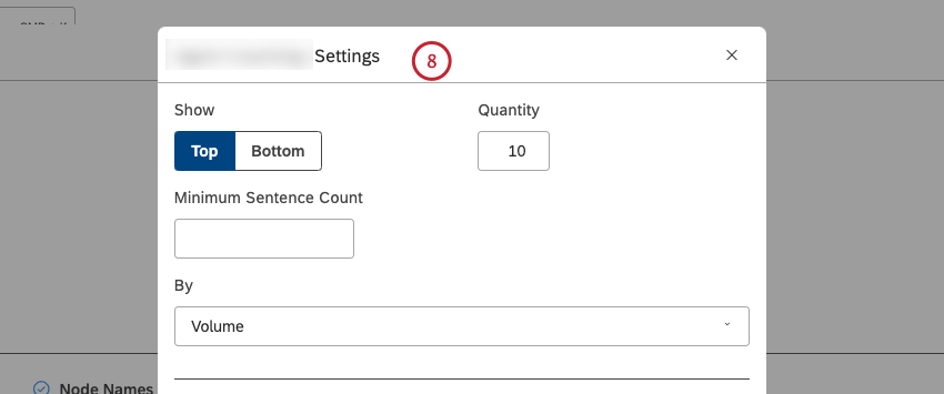
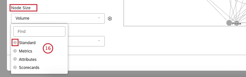
- Standard: See step 17 for information about sorting options.
- Metrics: Node size reflects the value of a top box, bottom box, satisfaction, filtered, or custom math metric.
- Attributes: Node size reflects the calculated value of a selected attribute.
- Scorecards: Node size reflects the percentage of documents that pass or fail a selected rubric’s criteria.
 Qtip: Click the plus ( + ) icon to view more options.
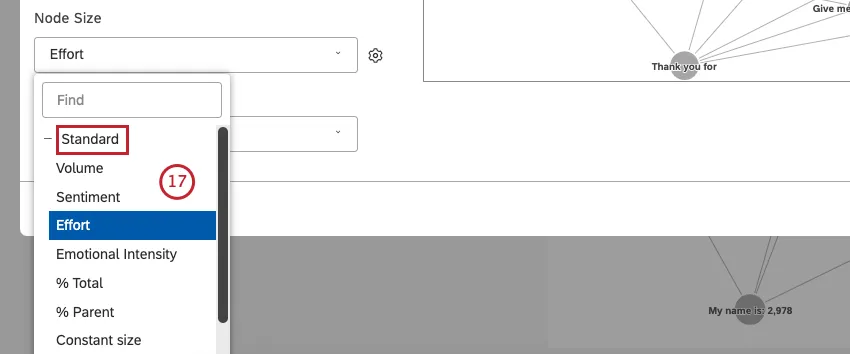
- Volume (default): Node size reflects the number of related documents.
- Sentiment: Node size reflects the average sentiment of sentences from related documents.
- Effort: Node size reflects the average Effort score of sentences from related documents.
- Emotional Intensity: Node size reflects the average strength of emotions expressed in related documents.
- % Total: Node size reflects the grouping’s volume contribution to the widget’s total volume.
- % Parent: Node size reflects the grouping’s volume contribution to its parent grouping’s volume.
- Constant size: Make all nodes the same size.

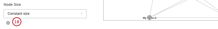
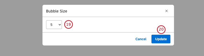
Qtip: The default size is 2.
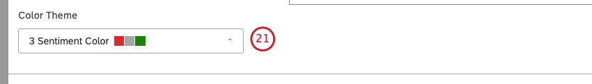
Qtip: By default, nodes are colored according to their average sentiment using 5 sentiment bands.
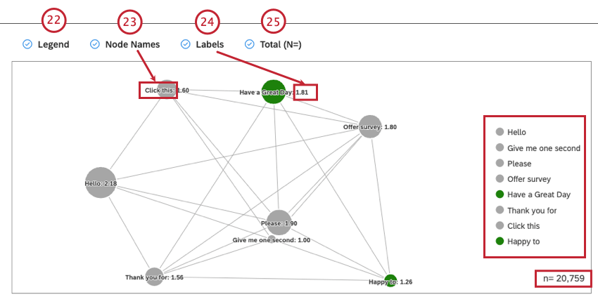
Qtip: Deselect the Labels checkbox to hide numeric labels next to report items.
Qtip: Deselect this checkbox to hide node names.
Qtip: Viewers can hide and show specific report items by clicking them in a legend.
For more information on document volume, see Displaying Total Volume on Widgets (Studio).
Qtip: Deselect this checkbox to hide the total number of documents that match report conditions and filters.
Qtip: To set the default dashboard-wide value for new widgets, use the n= setting in dashboard properties.
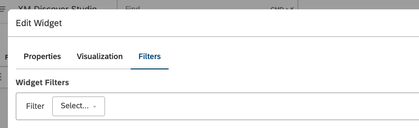
Filters Tab
In the Filters tab, you can further narrow down report data. For information on widget filters properties, please see Applying Filters to a Widget.
That's great! Thank you for your feedback!
Thank you for your feedback!