
Trend Report Best Practices (Studio)
What's on this page
About Trend Report Best Practices
Trend reports demonstrate how your metrics have changed over time.
Example: A line graph displays how your team’s customer satisfaction rating has changed over the past year.
Creating a Trend Report
There is no single correct way to create a trend report. However, we’ll provide some best practices, like common widgets, how to choose a time attribute, and where to set time scales and date ranges.
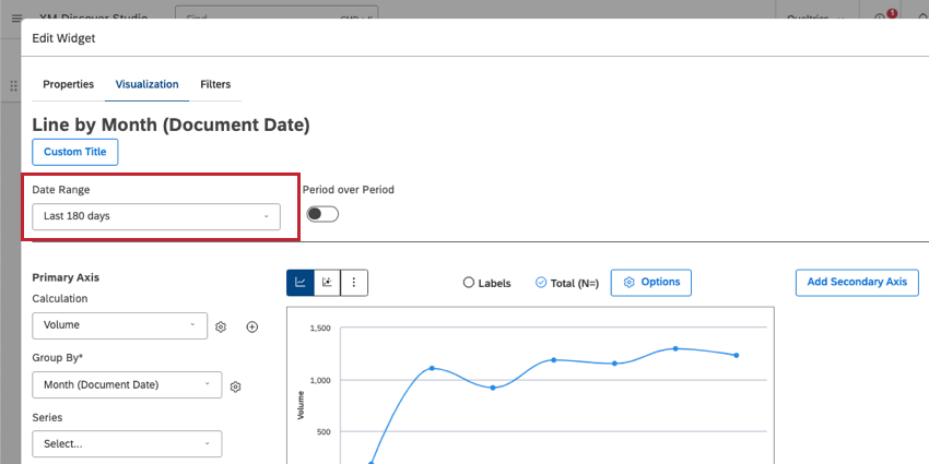
Widget
You can use many different kinds of widgets for trend reporting. We recommend using a line or bar widget. By default, these widgets are often set to report a calculation over a given time scale.
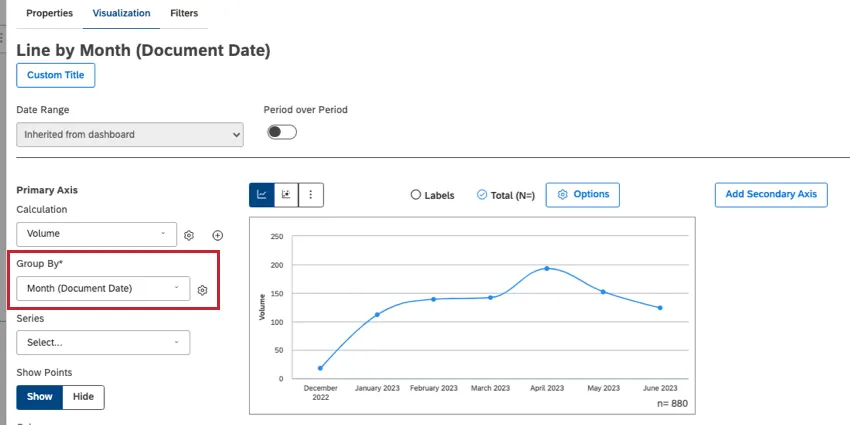
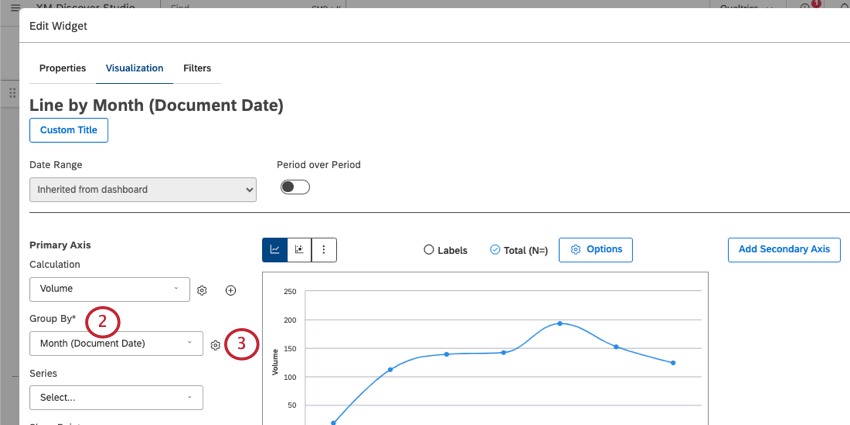
Time Attribute
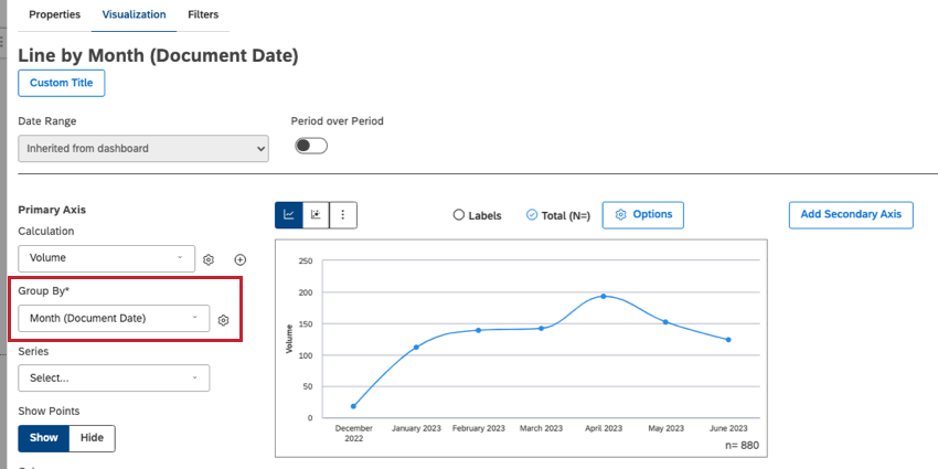
To run a trend report, you need to group data by any time attribute. Users often choose Document Date, but other types of dates may be available in your feedback.
Qtip: See a list of date and time attributes we offer by default in the platform.
Time Scale
Define a unit of time to group your data by. For example, you can choose an hour, a day, a week, a month, a quarter, or a year.
You choose a time scale when selecting a time attribute to Group By (shown above, next to the line chart).
Qtip: Period over period reporting is not available if you group by year.
Date Range
Decide the cut-off for your report, also known as the start and end dates.
The date range can be set using the dropdown in your widget properties.

You can also add a date range to your entire dashboard using date range filters.
Handling Empty Periods
Empty periods are periods of time where no data was collected. You can decide how you want to handle empty periods with the following steps:
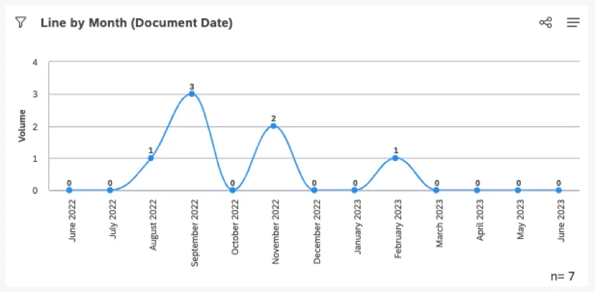
Qtip: In a line graph, empty periods appear as a flat line of data along the bottom of the x-axis.
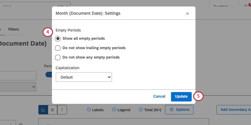
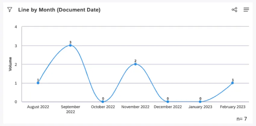
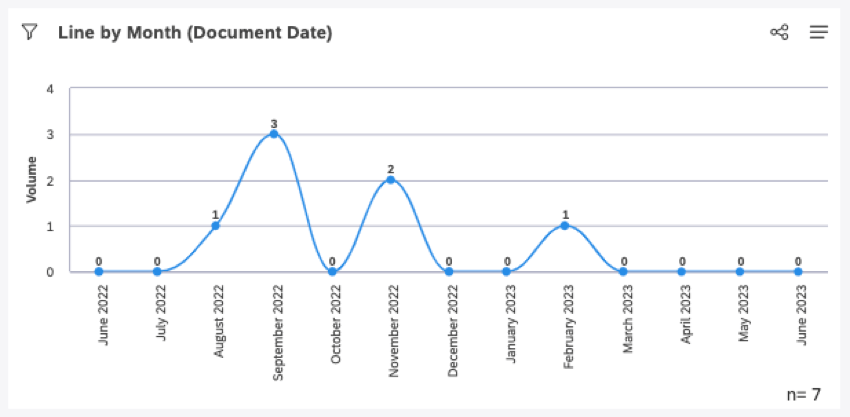
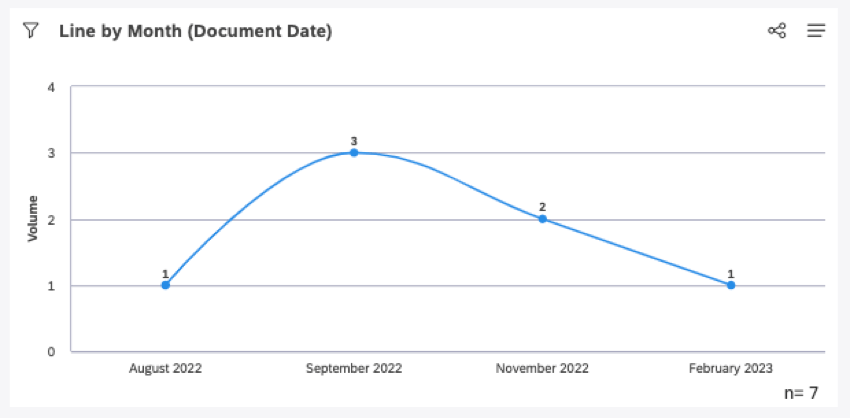
- Show all empty periods: Include all empty periods to maintain the visual continuity of the timeline. The latest date is defined by the latest date range cut-off, regardless of whether there is data for that time period or not. Example: This is a line chart showing volume by month over the past year. This chart has several missing periods of data, all represented as zeros on the chart.

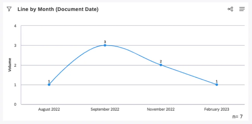
- Do not show trailing empty periods: Include all empty periods except for the ones that trail off at the start and end of the graph. The latest date is defined by the latest non-empty date within the date range. Example: This is the exact same data as the previous graph. The empty data in June – July 2022 and March – June 2023 has been removed. We still see an empty period in the middle of the graph.
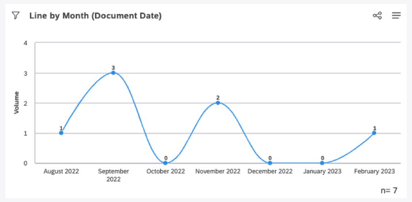
- Do not show any empty periods: Only show periods that contain data. The latest date is defined by the latest non-empty date within the date range. Example: This is the exact same data as all of the previous graphs. All empty periods have been removed, so it’s important to read the axis to get an accurate picture of the data.
Normalizing Data Grouped by Time
When grouping data by day, week, month, quarter, or year, XM Discover normalizes the display of subgroups across the periods of time to improve reporting of potentially volatile data. This process only happens when a widget has 2 groupings applied: one time-based grouping, followed by a second grouping of any kind.
This scenario is most common in line widgets being used as trend reports with multiple lines. In this ase, the “second grouping” is added as a series.
Example: This line chart shows the top 5 words by volume over the last 90 days.

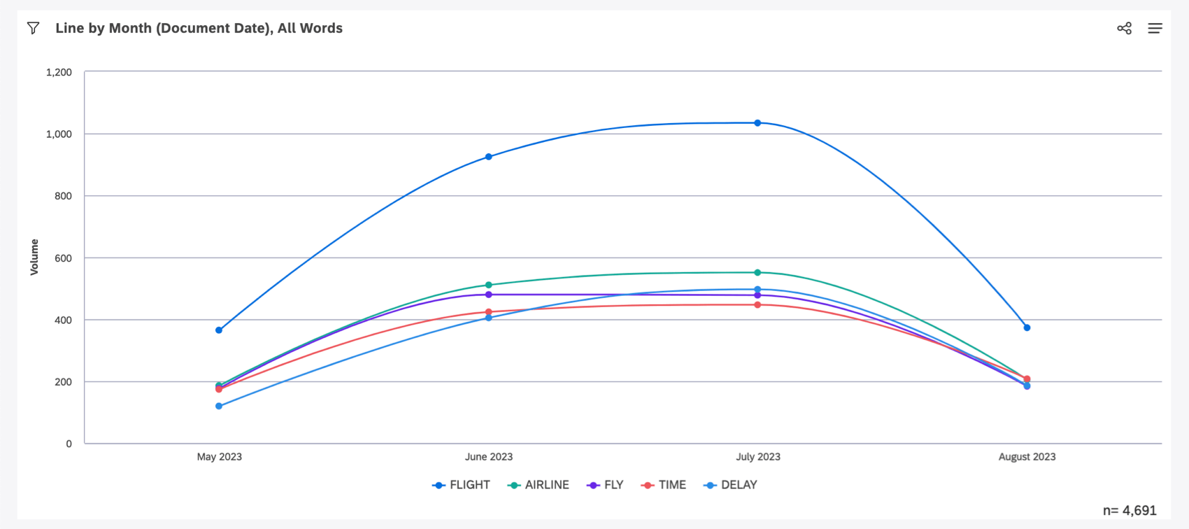
First, XM Discover determines the top 5 words by volume over the last 90 days. These are flight, airline, fly, time, and delay. Then we calculate these specific 5 words’ volumes for each month that occurred in the last 90 days.
It’s important to note that each month may have a unique set of top 5 words, and each set may or may not include flight, airline, fly, time, or delay. It’s even possible that these 5 words are not the top 5 words by volume for any specific month shown on the graph. However, they are definitely the top 5 most commonly occurring words by volume over the entire 90 day period.
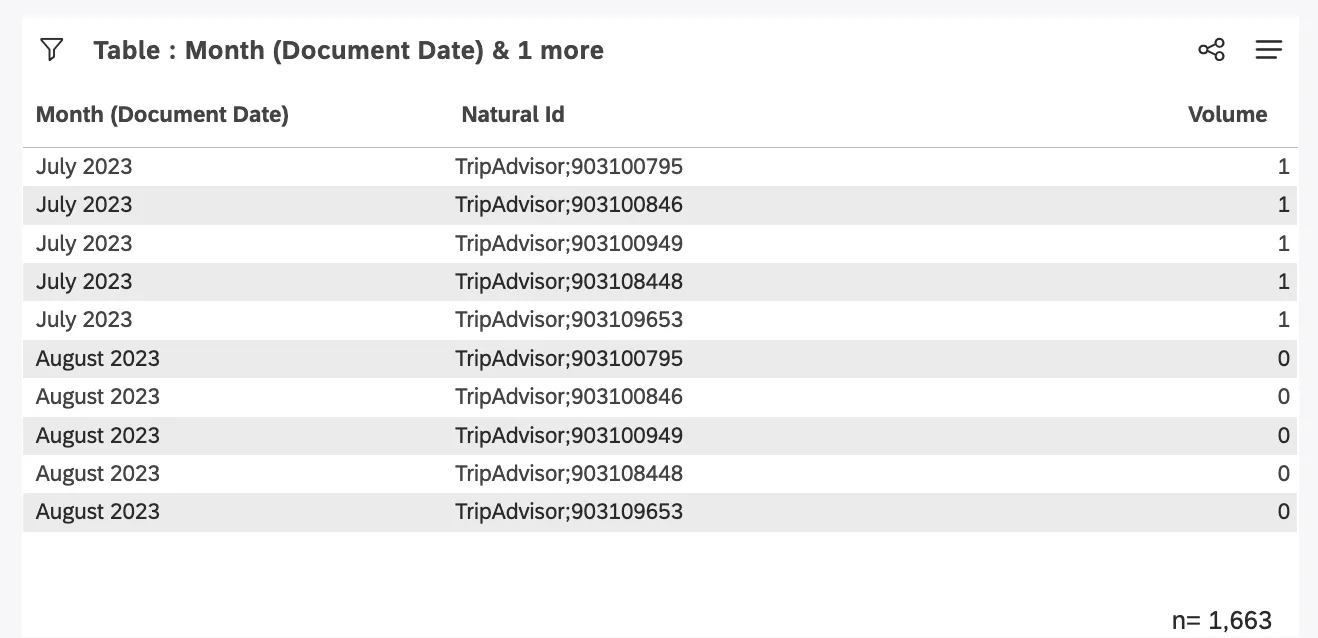
Grouping by Unique Identifiers
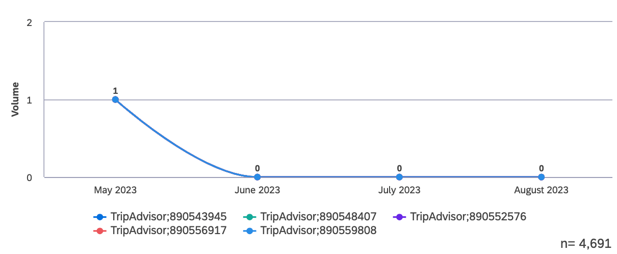
When using a unique identifier as your second grouping, such as Natural ID, normalization may produce results you may not expect. Due to the repetition of a secondary group across the time periods displayed, it may appear as if a single interaction with a customer occurred across multiple days, weeks, or months.
Example: We changed our top 5 words widget so it instead shows top 5 Natural IDs for each month over the last 90 days.

The widget accurately shows each Natural ID as having a volume of 0 for every month it did not occur, and 1 for the month it did occur. On table widgets this may be less intuitive, since months display with multiple Natural IDs, each with a Volume of 0. This is expected as a byproduct of normalization.
FAQs
Are there any limits to how much trend data I can generate?
Are there any limits to how much trend data I can generate?
To include a longer time period of data, we recommend choosing larger time scales.
That's great! Thank you for your feedback!
Thank you for your feedback!