
Step 5: Designing Your Subject Report
What's on this page
About Subject Reports
The goal of a subject report is to provide subjects with feedback they can easily draw conclusions from and take action on. When you first create a 360 project, we’ll automatically generate a fully built out report. You are free to edit or reuse as much of this default report as you would like, or to start over and create your own report. This page describes some subject report building best practices.
Building Your Own Report
When structuring a report, it helps to start with a broad scope, and then get narrower as you go. For example, you may start with general information such as guidance on what the subject will see in the report, how to understand results, and statistics on how many people responded. To write instructions on the report, try using a text area. To show a summary of the assessment’s completion and the evaluators who responded, try the report summary table.
When you created your 360 survey, you probably broke your questions out into different scoring categories that follow specific skills and areas of expertise. You can start with a scoring overview table and set it to show an overview of all categories. Since this is high-level, we don’t get into the items within each scoring category yet.
From there, you can get more detailed. Compare the subject’s self evaluation with how others rated them using a high and low scores table or a gap chart.
Most reports end by listing out the specific items in each category and how the subject scored on them, displayed in a series of scoring overview tables.
Qtip: See the 360 Reports Basic Overview support page for a full breakdown of how to build your own report.
Reporting Best Practices
This section lists some best practices and advanced tips that can vastly improve your subject reports.
Qtip: Always make sure your recode values are consistent with your scoring. If you do not, this could cause discrepancies in the data the report displays for scoring categories versus individual questions within those categories.

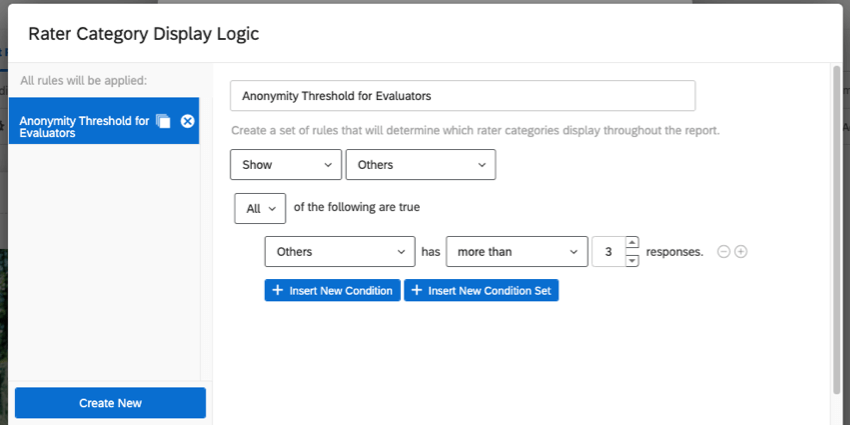
Example: You can create a rule that says to only show “others” data (i.e., evaluations submitted by someone other than the subject themself) if there’s at least 3 responses from “others.” This prevents the subject from reading the report and calculating what ratings each specific evaluator gave them.

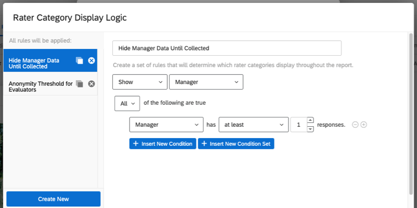
Example: You can create a rule that says to only show manager data if there’s at least 1 manager response.

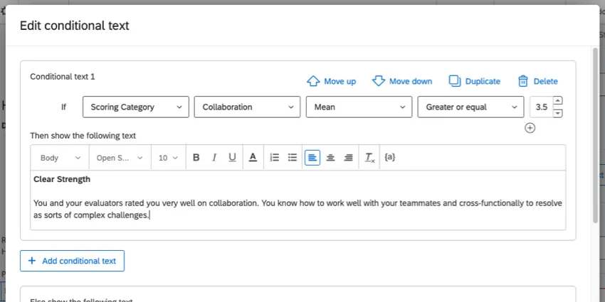
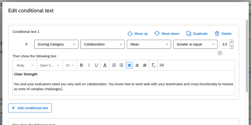
Example: A score of 3.5 or higher on the scoring category “collaboration” is considered very good. If the subject’s average score for this category is 3.5 or higher, we want to show them conditional text that highlights the fact that collaboration is a clear strength they demonstrate.
Qtip: If you’re interested in highlighting strengths and areas of improvement to subjects, try the hidden strengths / improvement areas table.
FAQs
How can I stay up to date on new Qualtrics features?
How can I stay up to date on new Qualtrics features?
To access these release notes, you need an XM Community account. These accounts are free for any users with a Qualtrics account. This support page contains information for how to register an XM Community account.
Once you're logged into the XM Community, head over to the Weekly Product Updates Introduction Post. This post contains all the information you need to get started with subscribing to product updates!
That's great! Thank you for your feedback!
Thank you for your feedback!