
Enhancing Your Data for Analysis (Discover)
What's on this page
About Enhancing Your Data for Analysis
The Discover platform isn’t limited to importing and displaying your data exactly as you have it saved. Across Connectors, Designer, and Studio, you can transform your data, whether by structuring it a different way, or creating KPI calculations to report on. Before you create dashboards for your stakeholders, let’s talk about the many ways you can enhance your data for analysis.
Create Custom Transformations in Connectors
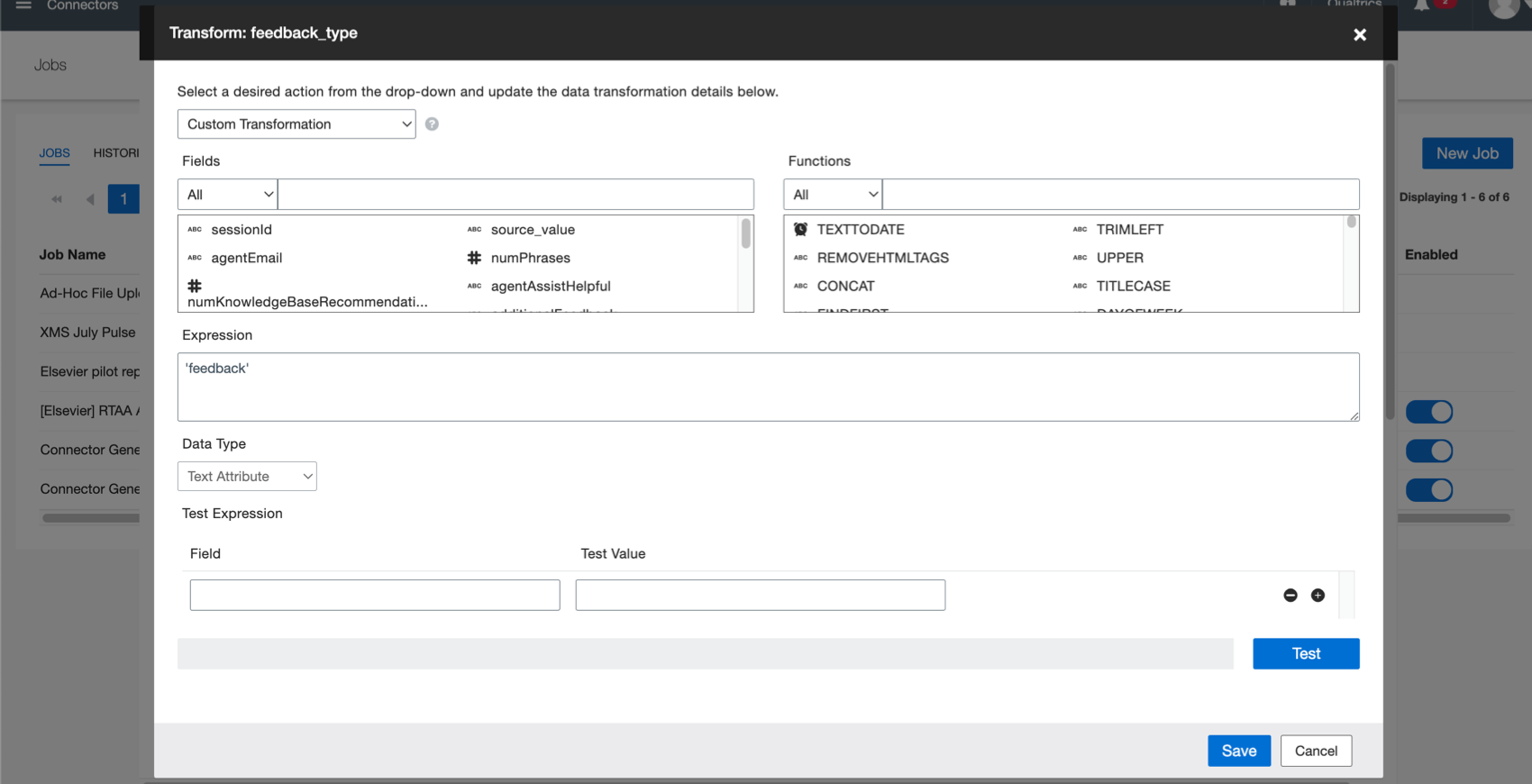
When pulling data from one place to another, you need to define your fields and what they mean. Custom transformations not only let you map your data, but enhance it. For example, you can:
- Replace values.
- Determine a format for date and time.
- Round numbers.
- Estimate the exact number of days from a date range.
- Join strings together. (Also called concatenation.)
- Generate IDs.
- Set custom dates.
- And more!
For more details, see Custom Transformations.
Derive Attributes in Designer
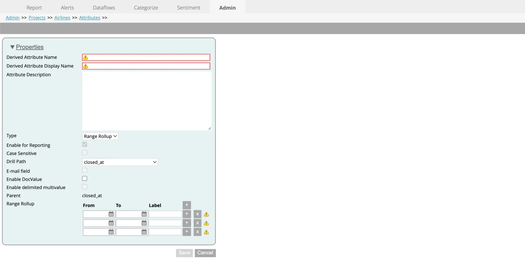
Derived attributes are additional data fields created from existing attributes.
Example: “Age Range” (values such as “<18,” “18-34,” “35-49,” “50+”) can be derived from the separate attribute “Age.”
Once a derived attribute is created, it can be used just like any other attribute in reporting, filtering, and category rules.
Derived attributes can be created in a variety of ways.
- Use a dimensional lookup, just like in Microsoft Excel!
- Split numeric or date data into ranges.
- Derive attributes from your category models, turning unstructured data into structured data.
To learn more about different ways to create derived attributes and how to use each one, see the Derived Attributes
Assess Performance with Intelligent Scoring
Intelligent scoring is a feature across Designer and Studio where you can score behaviors in feedback and interactions. By creating a rubric, you can structure otherwise unstructured data.
These flexible rule-based scores are used to assess all interaction types, including contact center compliance and agents’ soft skills, like empathy. You can also track various customer experiences, such as likelihood to churn, likelihood to purchase, potential fraud, and so on.
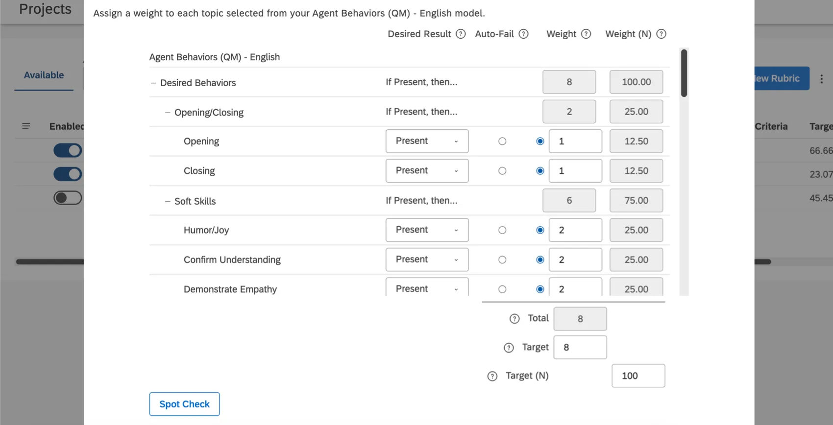
Automatically scoring interactions can help you prioritize your experience management initiatives and determine how and when to best train your team. You can view performance on an individual level or create detailed dashboards that show trends across entire teams.
For more details, see Getting Started with Intelligent Scoring.
Create Metrics in Studio
You can create your own KPIs in Studio using metrics. These metrics can then be used across reporting, in filters, widgets, and drilling, giving you insight into your organization’s performance. To learn more, see Creating Metrics.
Here are some examples of how to get the most out of metrics:
Example: You want to group calls into 2 categories: short calls and long calls. Use the CB Call Duration attribute to make a top box (long calls) and a bottom box (short calls).
When you use your new metrics in reporting, you can break the data out by satisfaction, and see the percent of satisfied customers in each call length group.
Example: Use filtered metrics to quickly report on performance by group. For example, you could split sentiment by region, and have a North America Sentiment, Latin America Sentiment, Europe Sentiment, and so on.
Then, when you use these metrics in widgets, you can group data by other insights. For example, you can group by product and see each region’s sentiment towards each product.
Custom math metrics in particular can be used to transform data in many ways.
- Convert units, such as seconds into minutes, cents into dollars, or even time spent into money.
- Generate an average score.
- Calculate complex, compound metrics.
- Transform a scale, e.g., from 5 points to 100.
- Structure unstructured data.
Example: If you know an employee’s hourly rate and how long an interaction took, you can figure out how much an interaction or incident cost.
Example: If you have structured data coming in as text labels (” very satisfied”, “satisfied,” etc.) and you want to transform it to a quantitative rating, you can use a custom math metric to assign a weight to each of the attribute values. For example:
(metric[volume very dissatisfied]*1 + metric[volume dissatisfied]*2 + metric[neutral]*3 + metric[volumesatisfied]*4 + metric[volume very satisfied]*5) / [volume]
That's great! Thank you for your feedback!
Thank you for your feedback!