
Gauge Chart Visualization
What's on this page
About Gauge Charts
Gauge Charts can help you quickly determine how a given field is performing versus how it is expected to perform. With a Gauge Chart, the visualization displays your chosen metric along a scale that displays color according to where your metric falls on the expected scale. The arrow below the value ranges will show you where your current metric falls on the scale.

For example, if the score on the above screenshot reaches to a certain point, the arrow would point to the green section as it reached the highest points of the available scale.
Customization
For basic visualization instructions and customization, visit the Visualizations Overview support page. Continue reading for visualization-specific customization.
Basic Set-up
After you have decided your source and metric, there are two main customization options for Gauge Chart visualizations: the value ranges and the corresponding colors.
Qtip: When setting your value ranges, if you would like to indicate decimals for cutoff points, please be sure to use a dot (.) instead of comma (,) when typing your entry.
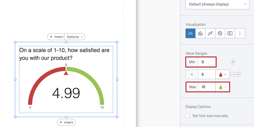
Under Value Ranges, specify what the metrics SHOULD be. In the question used as an example below, respondents can only choose from 0-10, so the Min is 0 and the Max is 10.
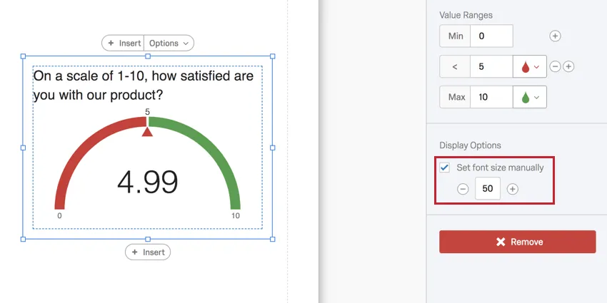
The 5 in the middle represents where a given color cuts off. In this case, any integer below 5 will be red.
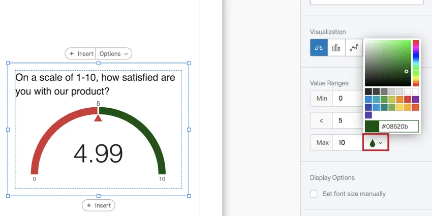
Next, you can change the colors for ranges of your Gauge Chart. Click on the drop icon to choose a color.
To add another range, click the plus sign (+). Type into the field to determine where this range ends and the next one begins.
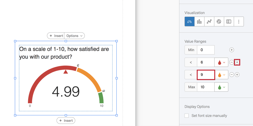
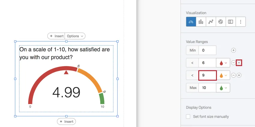
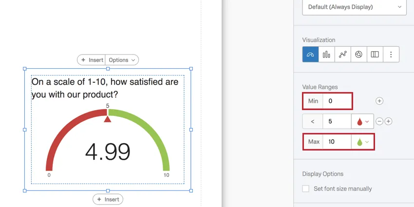
Example: In the screenshot above, the respondents’ mean score is displayed. Since it is below 6, it is red. If it rises to 6 or above, the gauge will turn orange. If it rises to 9 or above, it’ll turn green.
Click the minus sign (–) next to a range to delete the boundary and eliminate a color.
Display Options
Select Set font size manually to adjust the font size of the number in the center of the gauge.
NPS Metric
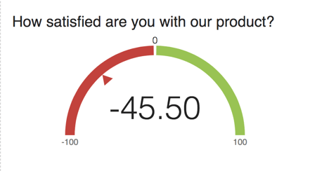
If you set the Metric to NPS, the gauge chart will automatically configure its range to a minimum of -100 and a maximum of 100.
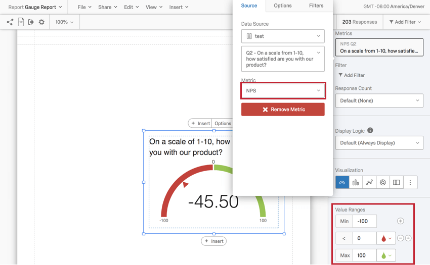
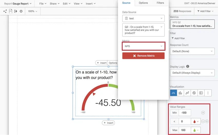
This is because the gauge is calculating a Net Promoter Score®. The best Data Source for a Gauge Chart with an NPS Metric is a Net Promoter Score question®. See the linked page for more details on setting these questions up and for help understanding the calculations behind the score.
The NPS Metric can be set for other multiple-choice questions, but does not make as much sense conceptually. It will function best with multiple choice questions that have 11 point scales recoded from 0-10.
Compatibility
The Gauge Chart is only compatible with variables that can come in numeric formats.
- Single-Answer Multiple Choice
- Net Promoter Score
- Single-Answer Matrix Table
- Text Entry with Numeric Validation
- Form field questions with numeric validation
- Open text fields on other questions, such as Text Entry Matrix Tables, text entry columns on Side by Sides, and “Other” text boxes, that have numeric validation
- Side by Side Qtip: There should be multiple-choice single-answer column, or a text entry column with numeric validation.

- Slider
- Rank Order
- Constant Sum
- Pick, Group, and Rank
- Graphic Slider
- Drill Down
- Number and Number Set Embedded Data
- Formulas
- Numeric manual variables
Types of Reports
This visualization can be used in a few different types of report:
FAQs
I have multiple datasets on my dashboard. Can I use this feature with all of my widgets?
I have multiple datasets on my dashboard. Can I use this feature with all of my widgets?
- Changing which dataset your widget shows: Not all widgets can have their referenced dataset switched. Some can only use the default dataset. For a compatible list, see this section.
- Showing multiple datasets in the same widget: Not all widgets can show multiple datasets’ results at the same time. For a compatible list, see this section.
That's great! Thank you for your feedback!
Thank you for your feedback!