
Topic Filters vs. Topic Inclusions (Studio)
What's on this page
About Topic Filters vs. Topic Inclusions
In Studio, you can filter your data by specific topics, or you can choose which specific topics to include in your widget. While these may sound like similar functions, these 2 features have different purposes, and can produce different data results.
The simplest way to understand the difference between the 2 is to remember what each function is for. Filtering the data narrows down the results displayed so that you only see data fitting certain criteria. Including and excluding topics changes how many topic groupings are included in your widget, which can be further affected by the filters you apply to your data.
Qtip: Topics are tagged at the sentence-level, which affects how topic filters work in widgets. Topic filters remove any sentences that are tagged with the selected topic; there may still be documents mentioning this topic represented in the widget if the document has other topics that fit the filter criteria. When viewing a document in the document explorer, it will show the entire document, which might contain topics that were originally filtered-out.
Example: Topic Volume Over Time
Let’s create 2 line widgets that we’ll use in our examples throughout the rest of this page. One widget uses a topic filter and the other widget uses the inclusion list.
Example 1: For the first widget, we’re only going to group data by Quarter (Document Date).
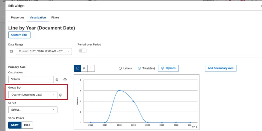
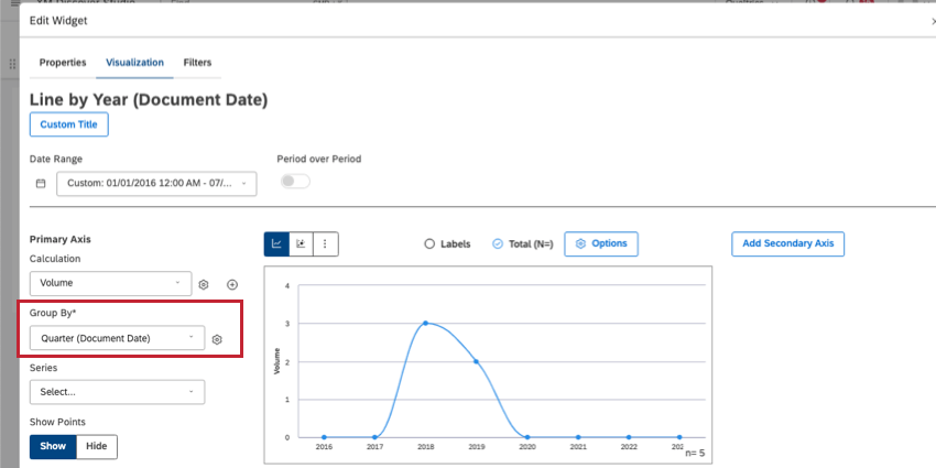
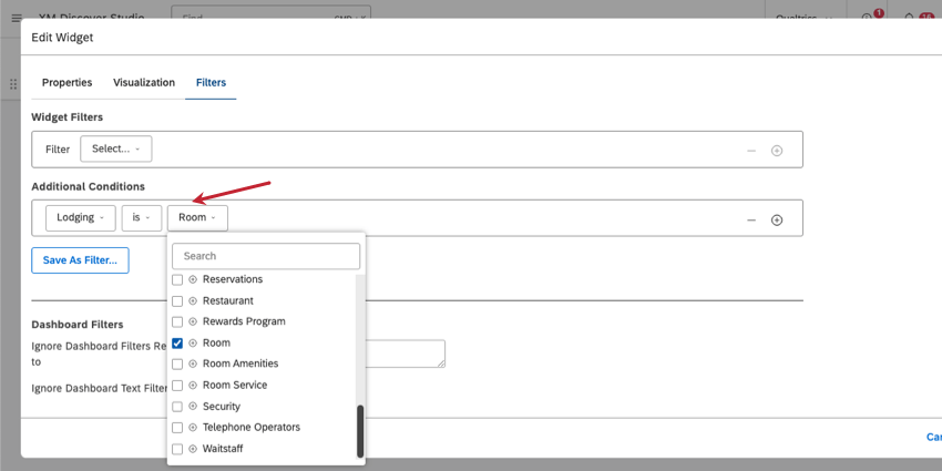
Then in the Filters tab, we set additional conditions to the Lodging topic, with Room selected.

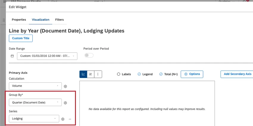
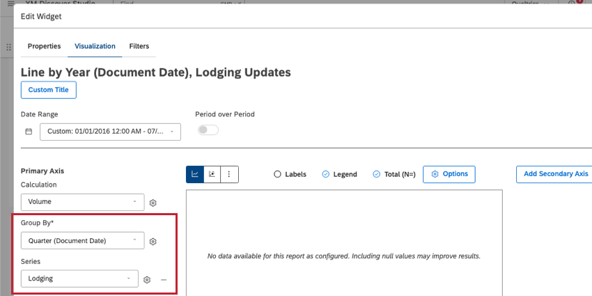
Example 2: For the second widget, we’re going to group data by Quarter (Document Date). Then under Series, we select our Lodging topic.
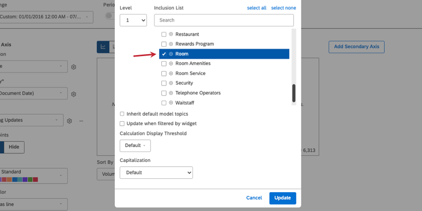
Then in our inclusion list, the only topic we select is Room.

Comparing Widgets by Volume
Let’s compare these widgets using volume as a calculation (default).
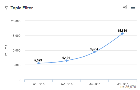
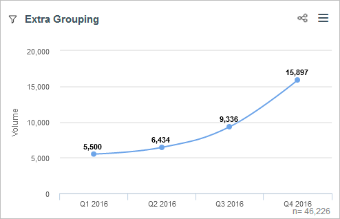
Widget 1: Topic Filter
The first line widget is grouped by quarter and filtered by the “Room” topic. Below, you’ll see the exact volume for each quarter.
You might see this same data if you drilled to Room from another widget, or set a dashboard-wide filter.
Widget 2: Inclusion List
The second widget is grouped by quarter, then by topic. This kind of topic grouping is sentence-level rather than document-level.
Example: You may have 1 document of feedback that mentions lodging 3 times.
Volume always reflects the number of documents, never sentences, so the numbers you see in this widget act more as estimates. Estimations for the Room topic in this widget are within a few percent or less of the exact results you see in the first widget.
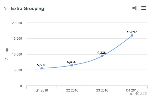
Total volume (n =) is very different between the 2 widgets, too. You’ll notice if you add up the values in the second widget, they don’t equal the data points you see. That’s because n reflects the number of documents in the dashboard filter, not the inclusion list.
(This dashboard filter is not shown in the screenshots.)
Comparing Widgets by Percent Parent
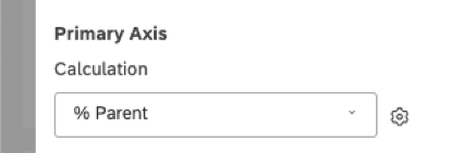
In this example, we change our widgets’ calculations to % Parent and compare the results.

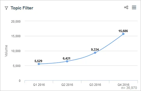
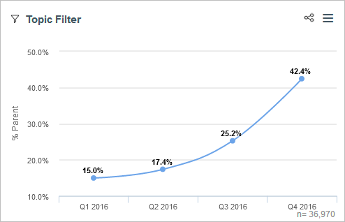
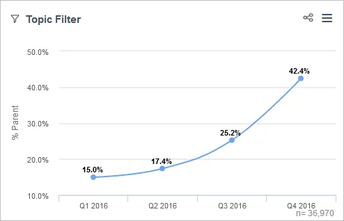
Widget 1: Topic Filter
The first widget calculates the percentage each quarter contributes to its parent. Since there is no parent grouping, the total volume for the whole date range is used as the parent.
Here, we see Q4 2016 accounted for 42.4% of all Room-related responses from 2016.
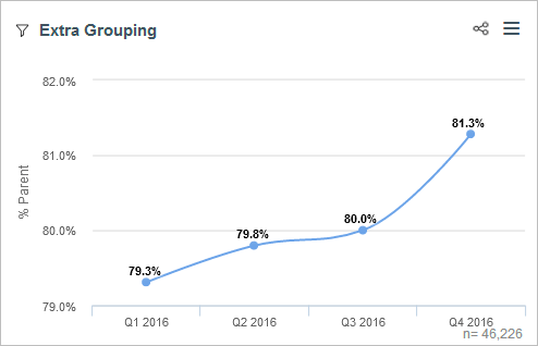
Widget 2: Inclusion List
The second widget calculates the percentage each topic contributes to its parent, which is a quarter (our primary grouping). Rooms were mentioned in 81.3% of all responses collected in Q4 2016.
Conclusions
Both widgets are valuable and answer different questions. However, these widgets can look superficially similar while displaying different results, such as in the volume example.
The first widget (topic filter) answers the question: When we look at the total of the feedback related to the topic “Room” collected in 2016, what percent of it was collected in Q4 2016?
The second widget (inclusion list) answers the question: When we look at the total of the feedback collected in 2016, what percent of it was related to the topic “Room?”
In general, we recommend sticking to filters over the inclusion list. Because the inclusion list changes the groups included in your widget, including and excluding topics can drastically impact % Parent and % Total, resulting in superficially disparate results.
We recommend using as few groupings as necessary to answer your question. This will improve widget performance, improve accuracy (depending on the question you want your data to answer), and will be easier to interpret.
That's great! Thank you for your feedback!
Thank you for your feedback!