
Brand Imagery Reporting (BX)
What's on this page
Common Imagery Reporting
Imagery reporting focuses on a consumer’s perceptions of a brand through the brand’s association with relevant attributes. It analyzes the aggregate beliefs, ideas, and impressions consumers hold regarding the brand, and helps brands understand their position in the marketplace. Here are several imagery statement examples:
- “[Brand] is good value for the money.”
- “[Brand] is for people like me.”
- “[Brand] is a brand I love.”
- “[Brand] is a brand that really understands me.”
Imagery statements will vary from client to client and from industry to industry. They will be tied closely to the brand and its advertising strategy.
Auto-Generated Content
The Setup Assistant in the Brand Tracker project allows you to add brands and imagery statements with a maximum of 30 brands and 30 imagery statements. Once these are entered and the setup is completed, the following are created for you:
- Questions for each imagery statement, listing the brands as answer options.
- Carry forward, so that respondents won’t be asked to rate brands they’re unaware of.
- Custom metrics to make imagery attributes compatible with certain widgets.
In addition, these dashboard pages are created:
- Imagery: Includes an attribute bar and trending chart for every brand and attribute, in both orientations (by attribute and by brand). You or the customer can delete out the orientation that is unnecessary. As part of the setup for this page, all related data mappings and custom metrics are auto-generated.
- Correspondence Analysis: Includes a Correspondence Analysis widget showing data for all brands and imagery attributes. As part of the setup, all related data mappings are auto-generated.
- Overview: A general overview page that also includes a few Simple Charts (an attribute bar and trending line chart) for just your brand.
Attention: If changes are made to the imagery questions or the brand list after the Setup Assistant is completed, then the survey and these dashboard pages will need to be updated manually.
Widgets Commonly Used for Imagery Reporting
Simple Charts
A variety of Simple Chart widgets can be used to report on brand imagery.
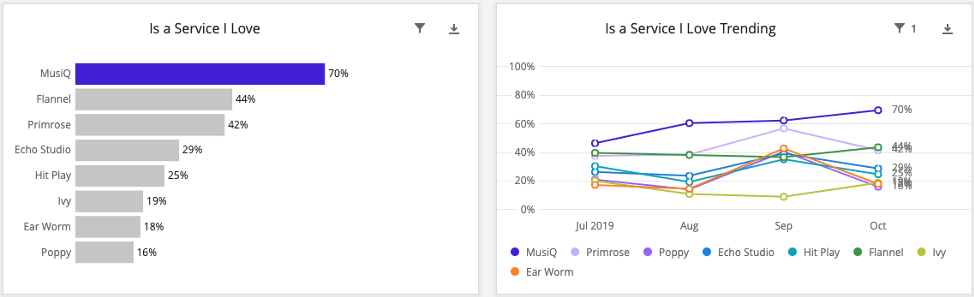
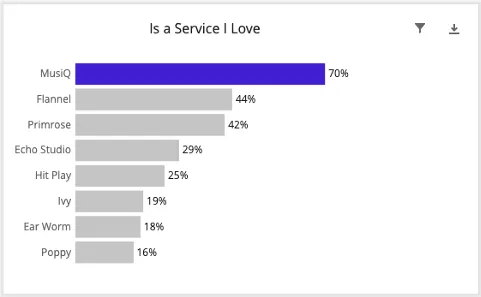
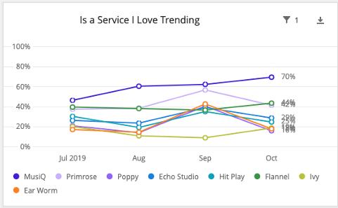
The simplest are charts where the data is displayed as either competitive or standalone bar charts for each brand or attribute. These are usually accompanied by line charts that display trends for the same data. Competitive charts are organized by attribute, with percentages shown for each brand.
Standalone charts are organized by brand, with percentages shown for each attribute. The percentages are the number of respondents who consider that brand to be associated with that attribute. Generally, the base size in the calculation is the number of people who were aware of the brand to begin with.
Qtip: An issue with this type of reporting is the brand size effect. Essentially, users of a brand are more likely to give a response about that brand in a survey than former users and those who have never used the brand. This means that bigger brands get more responses than smaller brands, almost regardless of the brand attribute. This skews the brand image in favor of bigger brands. We have two widget types that help address this brand size effect: The Correspondence Analysis widget and the Brand Imagery widget.
Correspondence Analysis Widget
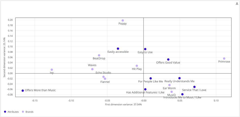
Correspondence analysis (also known as perceptual mapping) is a great tool to identify relationships between and within brands and different attributes, and its analytical approach removes the brand size effect. It can also help clients see the relative perceptions of these brands and how the client’s brand compares with competitors.
This widget takes the form of a scatter plot, with brands and attributes plotted as dots along the graph. We can analyze relationships between different brands based on their proximity to one another—the closer, the more similarly they are perceived by respondents.
Distinctive Image Associations Widget
Distinctive image associations is the process of deriving true brand-attribute associations by adjusting brand image ratings to account for brand size and attribute importance. It is an insightful analysis tool used to determine how a brand is positioned relative to its competitors across all attributes.
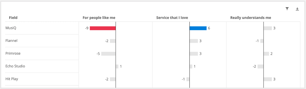

This widget calculates the expected image data values for each brand-attribute pairing (taking into account both brand size and attribute importance) and then displays the deviation from that expected value. The calculation is similar to the underlying calculation in the Correspondence Analysis widget, but the display indicates where a brand scored lower or higher than expected. Differences greater than ±5 are considered significant.
Radar Chart Widget
The Radar Chart widget is a two-dimensional chart designed to plot one or more series of brand associations by providing an axis for each brand attribute present in the survey, arranged radially as equi-angular spokes around a central point. The values for adjacent attributes in a single series are connected by lines, which creates a “brand profile” view that can be useful to look at. These high-level profiles can help you visually diagnose what a brand stands for, simply by looking at the overall footprint of the brand of interest relative to its competitors.
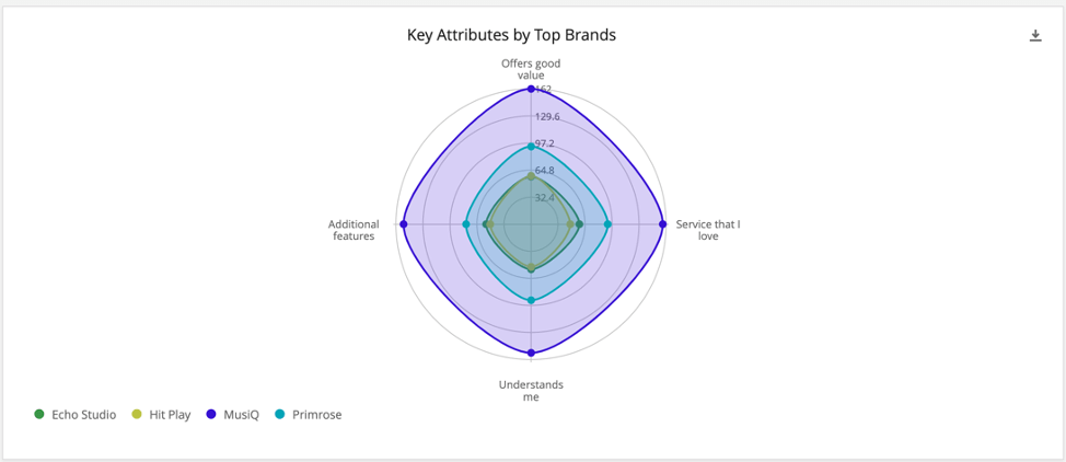
Survey Setup
Qtip: Remember, the Brand Tracker’s setup assistant will generate this content for you. You just need to decide what kind of imagery attributes you’d like to include.
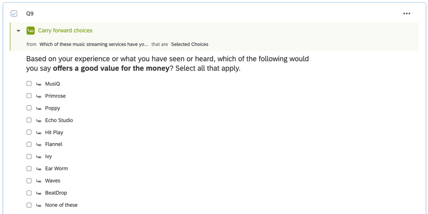
The recommended imagery question format is a Multiple Choice question in Multiple Answer format, where you ask about each attribute in a separate question and provide a list of the brands the respondent is aware of.
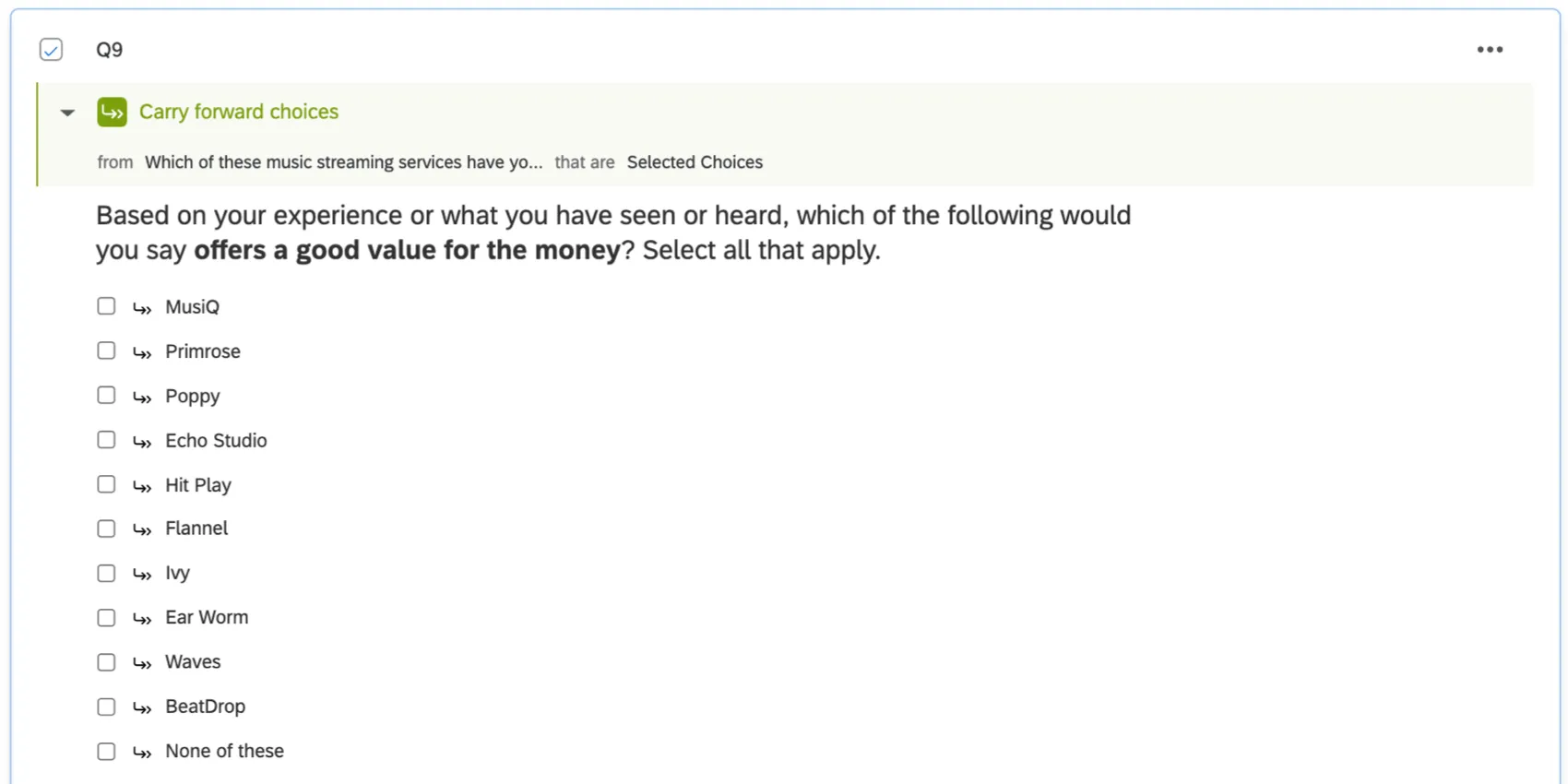
Whether oriented by brand or attribute, this question type is compatible with all imagery chart types.
Qtip: Matrix Tables in Multiple Answer format are also compatible, though not recommended since the tendency of respondents straightlining is much higher.
Customizing with Scales
Qtip: This content is not generated by the auto-setup assistant.
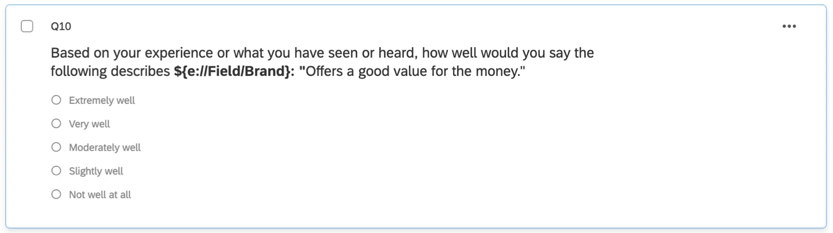
You may want greater granularity in their imagery data than offered by Multiple Answer questions, and so prefer scales. These should be Multiple Choice questions in single answer format.
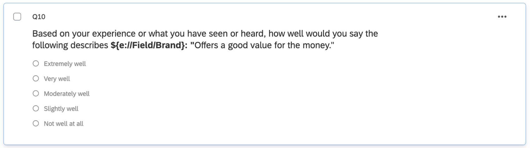
Qtip: Be careful – scale questions can easily increase the time it takes for respondents to complete the survey, since they will be repeated per attribute per brand. Condensing into a Matrix Table is also not recommended, since this will not decrease the time spent completing the survey, but does increase straightlining.
Qtip: The scale-style setup is compatible with Simple Charts and Radar Charts, but not Correspondence Analysis or Brand Image Profile.
Custom Metrics in the Dashboard
Qtip: Remember, the Brand Tracker’s setup assistant will generate this content for you. This guide is here in case you want to do manual customization.
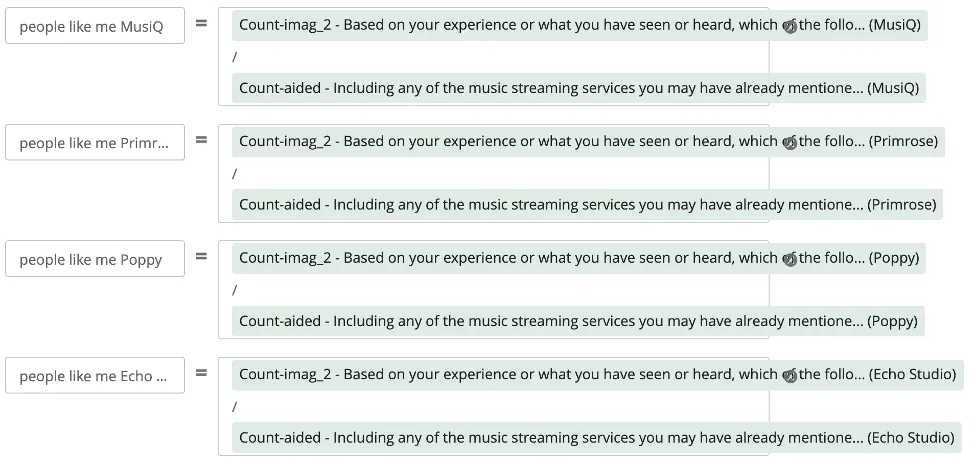
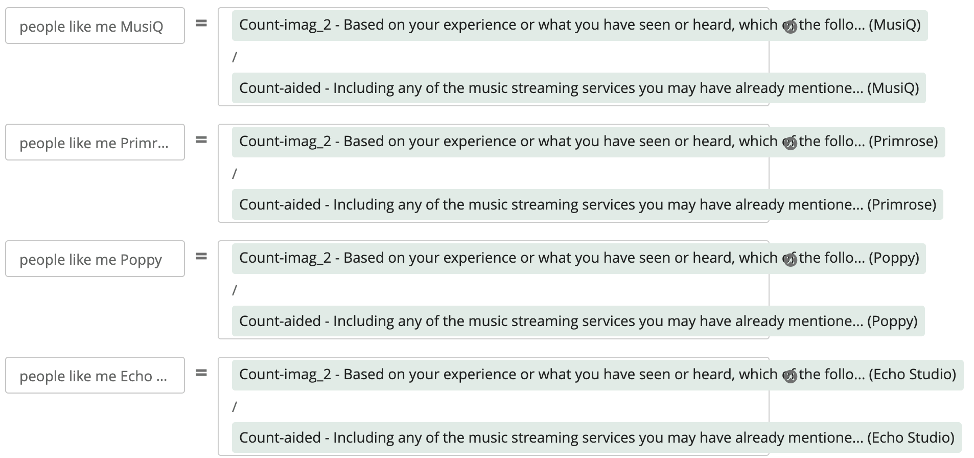
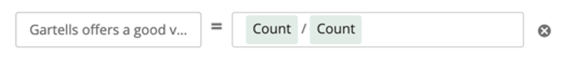
Let’s move to the dashboard. When reporting on imagery attributes in Simple Charts, the base size needs to be set to the number of people who were aware of the brand. To do this, you need to create a custom metric for each brand for each imagery attribute.
Example: Let’s say you have ten brands and fifteen imagery attributes. This means you will ultimately create 150 custom metrics.
For these imagery metrics, create a custom metric that takes the number of people who selected that brand in that attribute question and divide by the number of respondents aware of the brand.
Setting Up Widgets for Brand Imagery Reporting
Attribute Bar Charts
These charts are created per attribute or per brand, depending on your preferences. In this example, we’ll go through how to add them per attribute, with each brand listed as the different bars of the graph.
Trending Line Chart
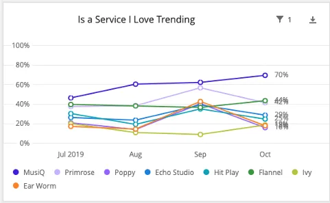
These charts are created per attribute or per brand, depending on your preferences. In this example, we’ll go through how to add them per attribute, since that is also how we formatted our bar chart.
Setting Up a Correspondence Analysis Widget
See the Correspondence Analysis widget support page for exact steps.
Qtip: Set the legend colors to your company’s color palette.
Setting Up a Distinctive Image Associations Widget
See the Distinctive Image Associations widget support page for exact steps.
Setting Up a Radar/Spider Chart
See the Radar Chart widget support page for exact steps.
FAQs
I want to use scales for my imagery questions. What implications does this have for the dashboard?
I want to use scales for my imagery questions. What implications does this have for the dashboard?
Rather than making custom metrics, you may want to try creating field groups. For example, you can create Top Box / Bottom Box metrics, then potentially display them as stacked bars in a Simple Chart widget.
I’ve set up the Brand Image Profile widget, but the numbers look strange. What might be happening?
I’ve set up the Brand Image Profile widget, but the numbers look strange. What might be happening?
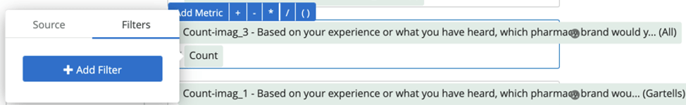
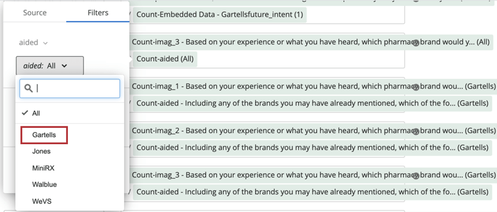
How do custom metric filters interact with page filters in BX dashboards?
How do custom metric filters interact with page filters in BX dashboards?
That's great! Thank you for your feedback!
Thank you for your feedback!