
Customizing Dashboard & Book Appearance (Studio)
Suite
Customer Experience
Product
Qualtrics
What's on this page
About Customizing Dashboard and Book Appearance
You can customize dashboards and books by applying preview color themes and pattern fills.
You can use the Preview Color Theme selector to apply a non-default color theme to a dashboard or book. Here’s how preview color switching works:
- Preview Color Theme only applies to your current view of a dashboard or book. As soon as you navigate away from the dashboard or book, your preferred color theme is applied.
- Preview Color Theme does not affect other users.
- To set a default color theme to the entire Studio, use the Color Theme setting in user preferences. Qtip: When choosing report colors, try out a dynamic color palette called Studio Standard that adapts to dashboard preview mode.

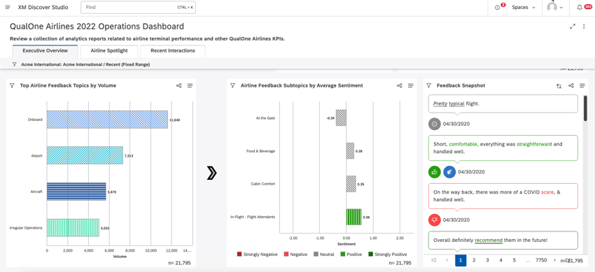
You can use Pattern Fills to apply patterns instead of colors to better visualize and more easily distinguish data across your dashboards and books.
This setting applies to all dashboards and books you have access to, but does not affect other users.
Qtip: Similar to automatic color matching, identical patterns are automatically assigned to matching data points across the dashboard or book.
Applying Dashboard and Book Customizations
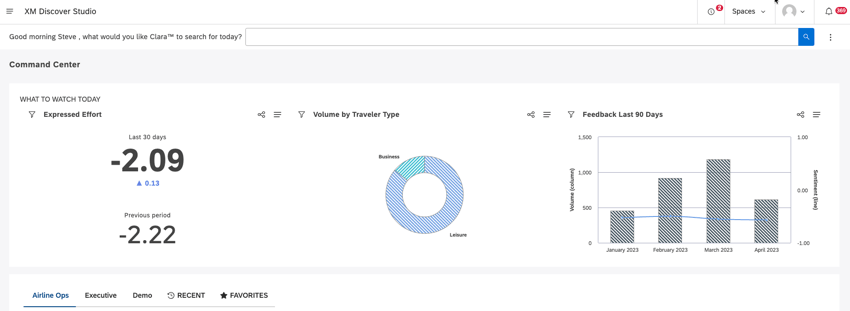
Go to the Studio homepage.

Scroll down to the Explore Dashboards and Books section.
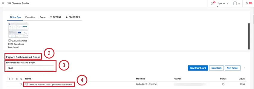
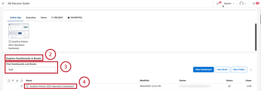
Search for the dashboard or book using the Find Dashboards and Books search box.
Click the dashboard or book title to open the dashboard.
Expand the options menu in the header.
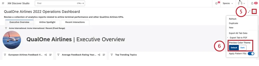
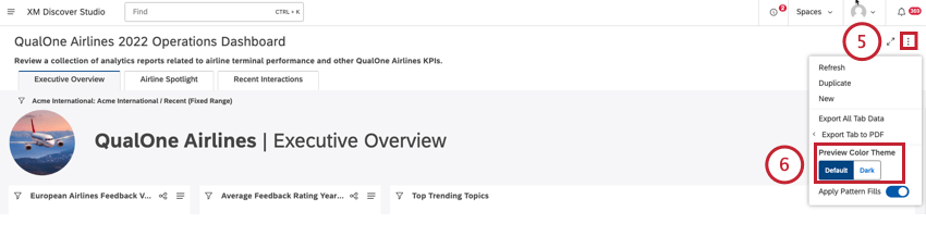
Locate the Preview Color Theme selector.
Select the color theme that you wish to preview:
- Click Default to apply a standard color theme with a light background. Qtip: If custom branding is defined at the account level, then the custom color scheme is applied.
- Click Dark to apply a color theme with a dark background to use in low light situations and lessen eye strain if you have a sensitivity to light. Dark theme overrides all custom branding. Qtip: Dark mode is a preview-only user-level preference. The user you share the dashboard with will see it in their preferred theme.Qtip: Once you select a color theme to preview, it applies to a current dashboard or book until you navigate away from the dashboard or book.
Use the Apply Pattern Fills switch to choose the preferred view:
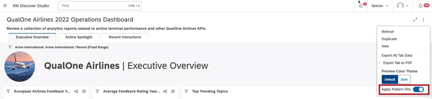
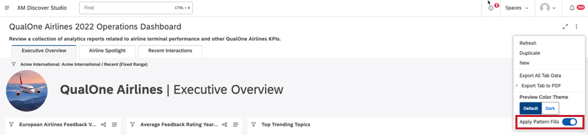
- On: Use patterns instead of solid color.
- Off: Use colors selected in widget settings. Qtip: Pattern fills don’t apply to Table and Metric widgets.Qtip: Selector widget buttons display a swatch of the corresponding pattern. Droplist and Search navigation types don’t support pattern fills.
That's great! Thank you for your feedback!
Thank you for your feedback!