
Customizing Studio Appearance
What's on this page
About Customizing Studio Appearance
Attention: A Manage Settings permission is required to perform the actions on this page.
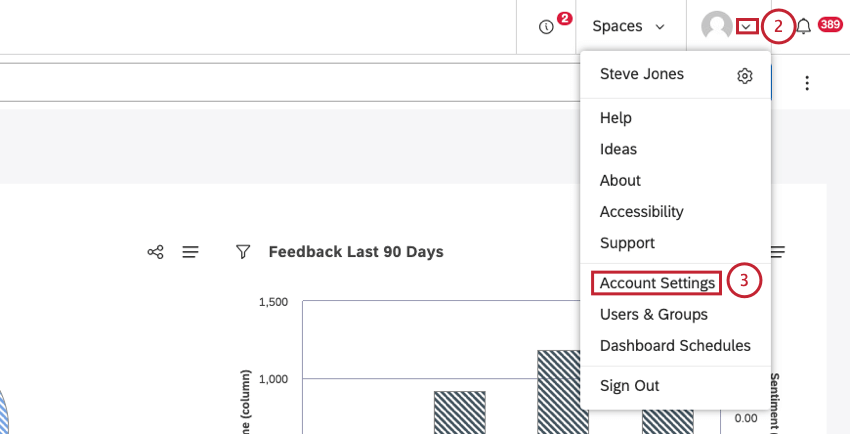
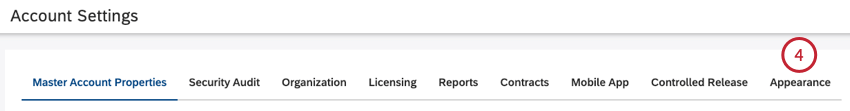
You can change the appearance of Studio to reflect your organization’s branding. Custom appearance applies to all users of your master account. The following customization options are available:
- Custom Logo: Change the logo (throughout Studio).
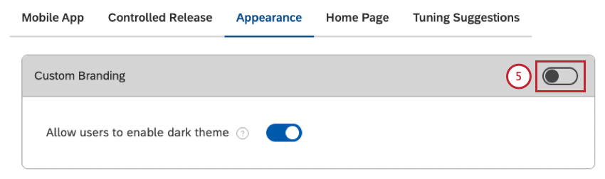
- Custom Branding: Change user interface colors (outside the widgets).
- Conversation Display: Customize the way interactions display in Document Explorer and Feedback widget.
- Color Palettes: Change report colors (inside the widgets).
Custom Logo
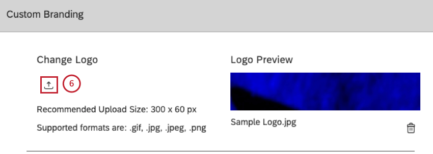
You can customize your Studio appearance by changing or removing the site’s logo. The logo appears in Studio’s header and is visible on every page. Clicking the logo opens homepage of Studio. When users save or distribute their dashboards as a PDF, the export files also contain the logo.
Recommended Logo Dimensions
Studio will automatically scale the image to fit the reserved space for best display in both Studio and PDF exports. We recommend these dimensions for logos:
- Width: Less or equal to 300 pixels.
- Height: Less or equal to 60 pixels.
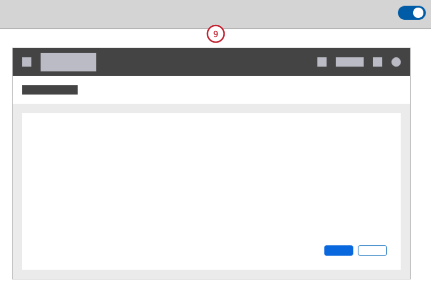
Changing the Logo
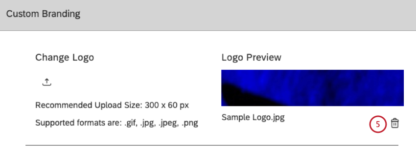
Removing the Logo
In addition to replacing the logo with your own image, you can remove the Studio logo altogether. When the logo is removed, Studio displays a text title of the user’s current section instead. Clicking the title opens Dashboard Explorer (the same behavior as clicking the logo).
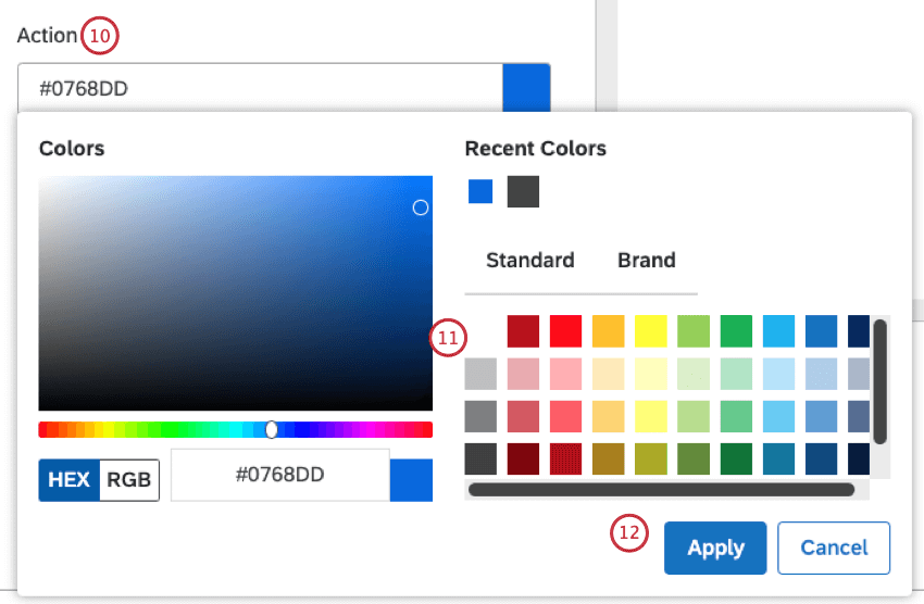
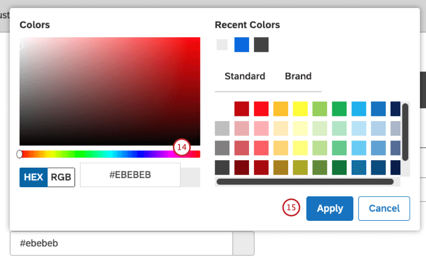
Applying Custom Branding
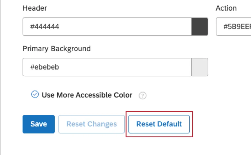
You can customize Studio appearance by changing the colors of key user interface elements shown in this table:
| UI Element | Used For | Default Color |
|---|---|---|
| Header | Studio’s header background | #444444 |
| Primary Background |
| #ebebeb |
| Action |
| #0768dd |
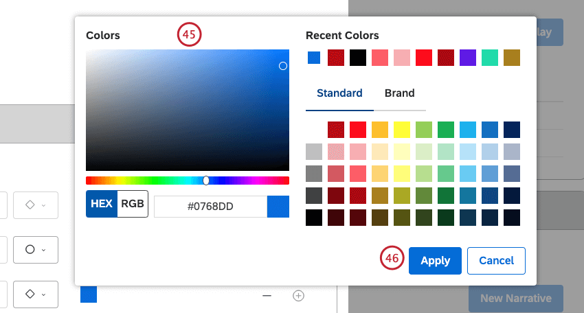
In the Custom Branding section you can change Studio’s color scheme and the logo. To learn how to change the logo, see Changing the Logo.
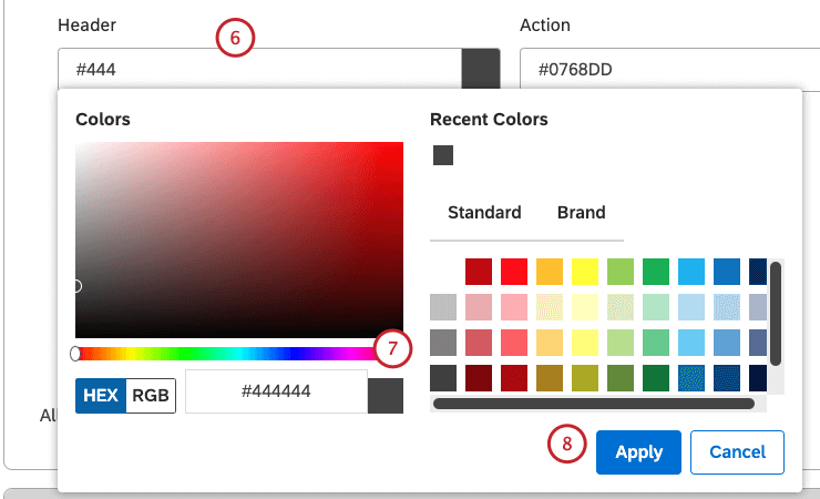
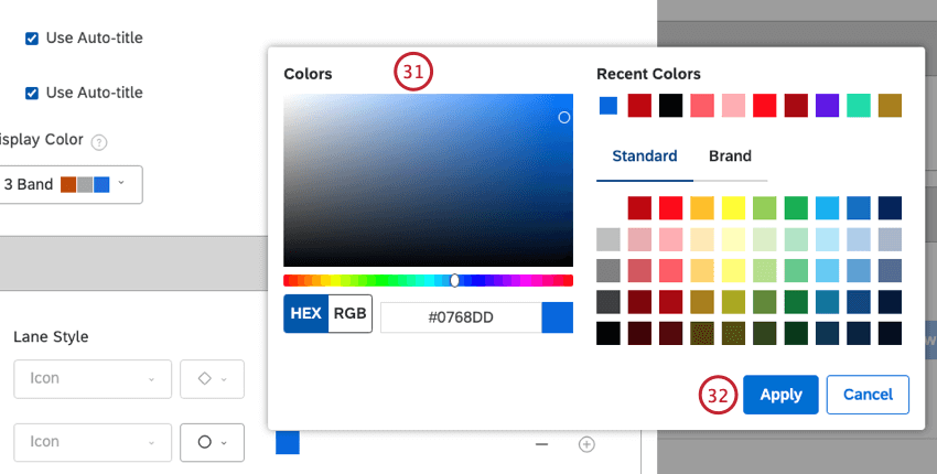
Qtip: Please see the Custom Branding Elements section below for details of the Studio UI elements that can be customized and default colors.
Qtip: Before changing the colors, write down existing color codes so you can revert to them later. You can revert to the default colors at any time by clicking Reset Default.

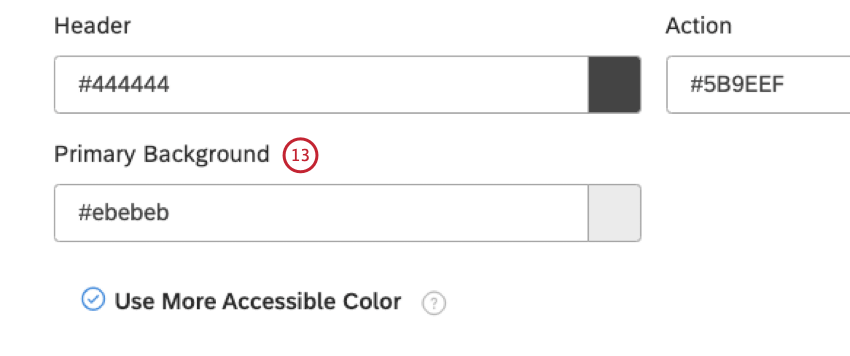
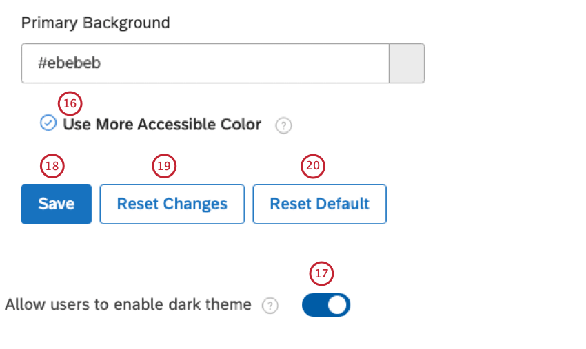
Qtip: We recommend enabling this option for better accessibility.
Customizing Conversation Display
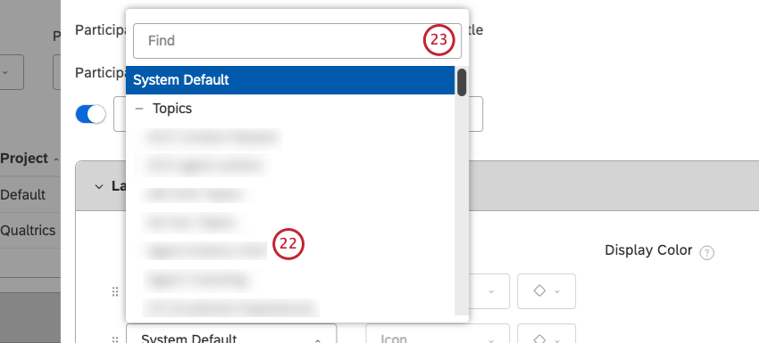
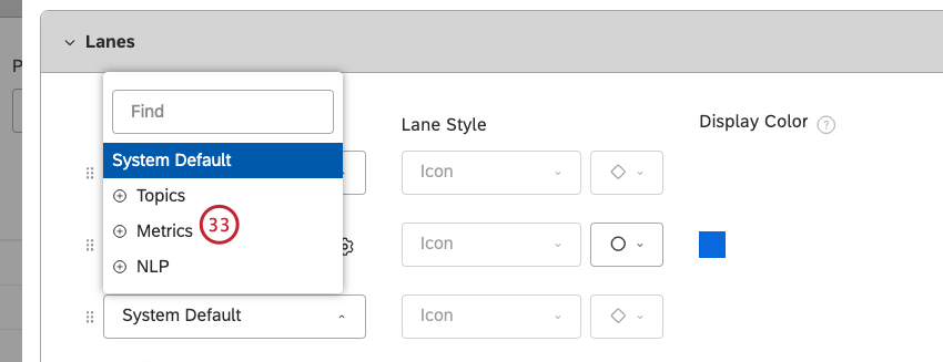
You can adjust conversation display settings to customize the way interactions display in document explorer and feedback widgets. You can set display settings on 2 levels: account-wide defaults and project-specific settings. Project-specific settings override account-wide defaults.
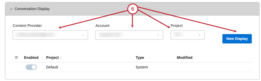
- Select the content provider from the Content Provider Qtip: You only need to select a content provider, account and project if you are a member of more than one of these.

- Select the account from the Account menu.
- Select the project from the Project menu.
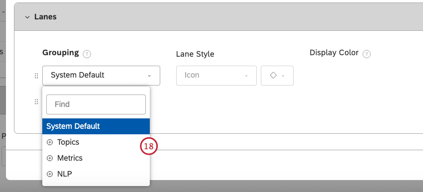
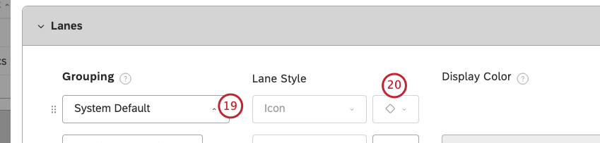
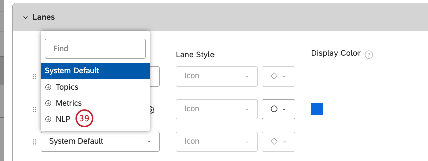
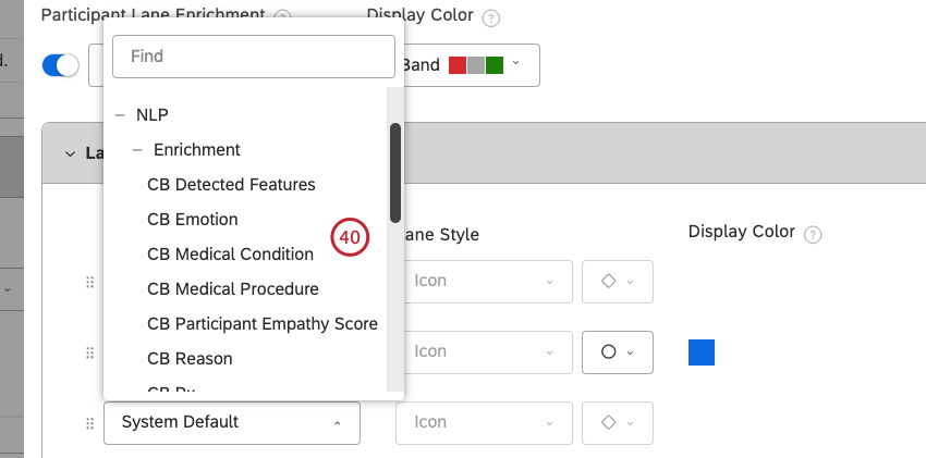
- Click the New Display section.
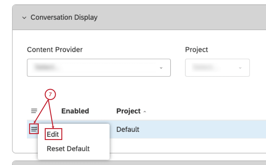
- Expand the actions menu for a default project or a custom project.
- Select Edit.
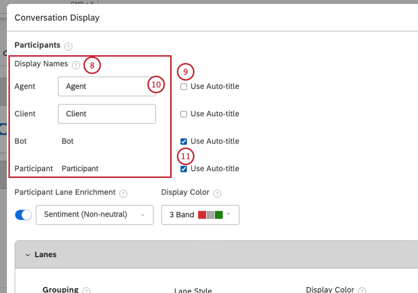
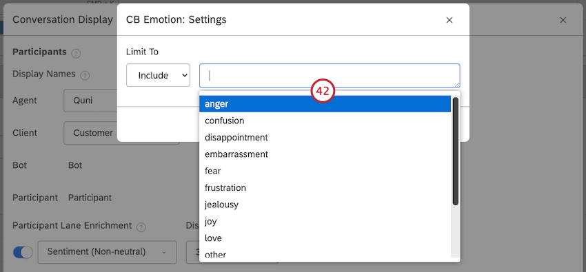
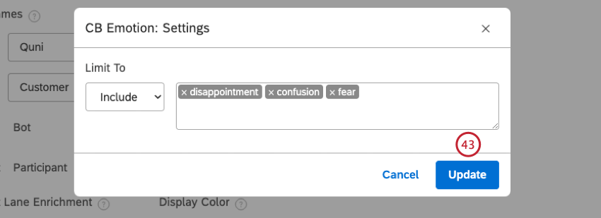
- Agent: A participant identified as a company representative.
- Client: A participant identified as a client.
- Bot: A participant identified as a chatbot or an Interactive Voice Response (IVR) bot.
- Participant: A participant not identified as one of the above types.
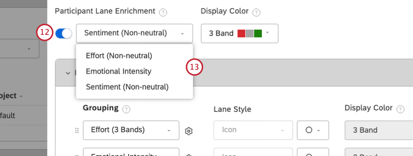
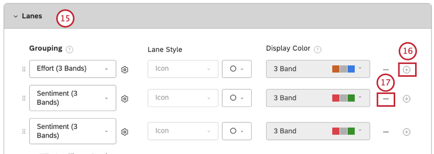
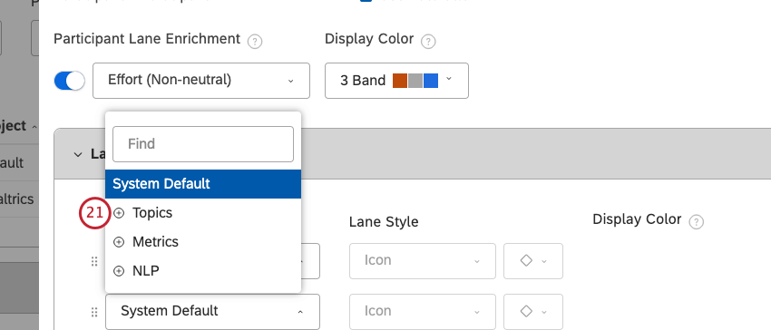
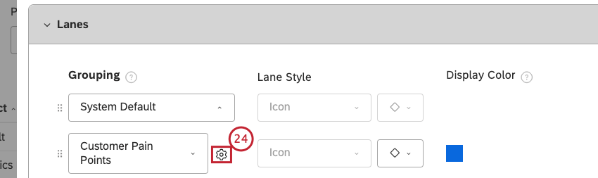
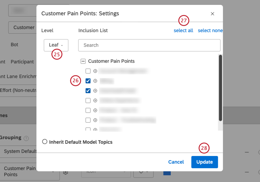
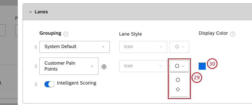
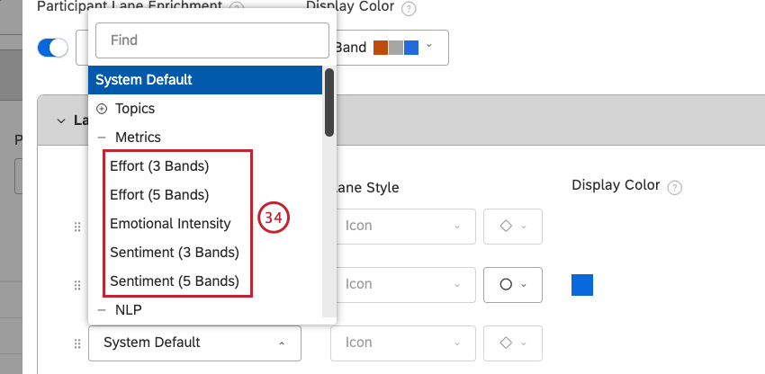
- Effort (3 Bands)
- Effort (5 Bands)
- Emotional Intensity
- Sentiment (3 Bands)
- Sentiment (5 Bands)
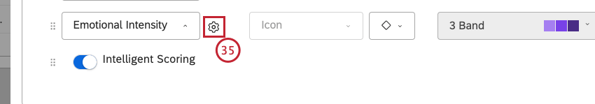
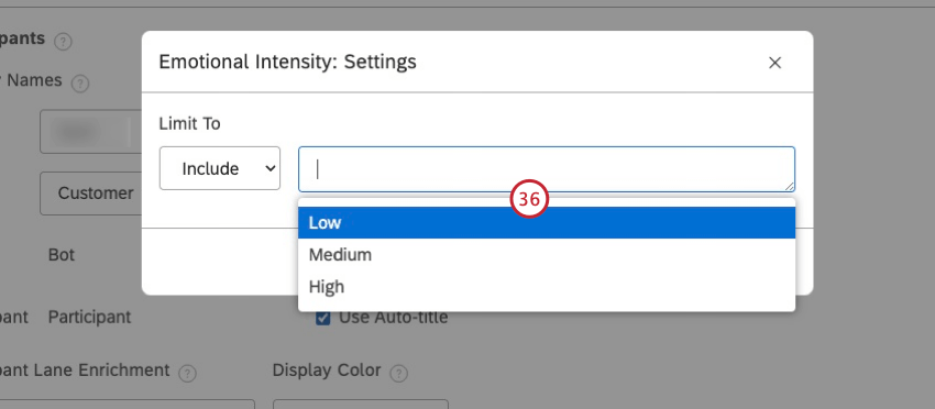
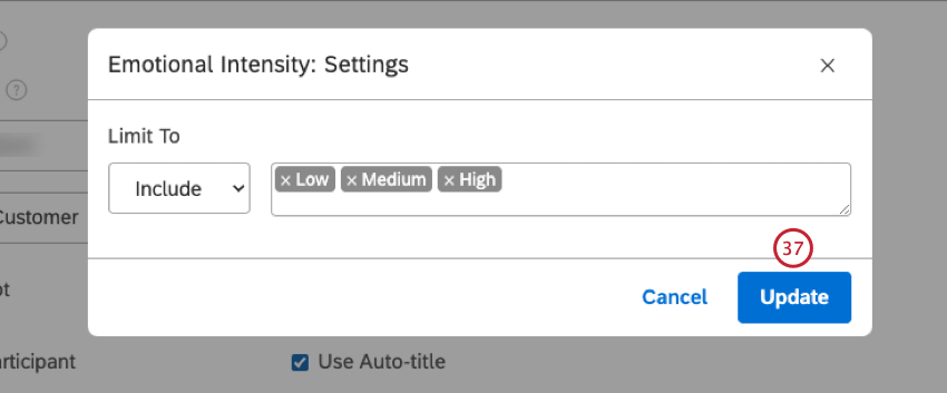
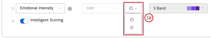


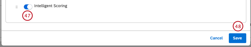
Qtip: This is only available for accounts with Intelligent Scoring.
Qtip: To reset conversation display settings to defaults, expand the actions menu next to the Default project and select Reset Default.
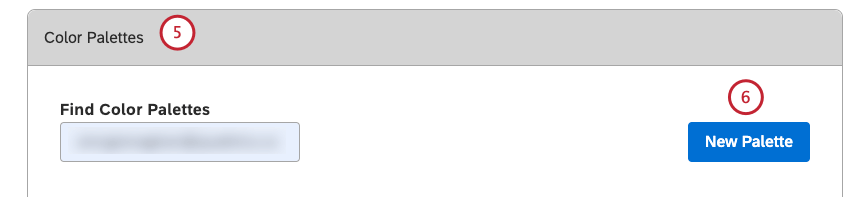
Color Palettes
In addition to using out-of-the-box system color palettes, you can customize your Studio reports by creating custom color palettes of up to 10 different colors.
You can perform these actions using color palettes:
- Create a custom color palette
- Import a color palette
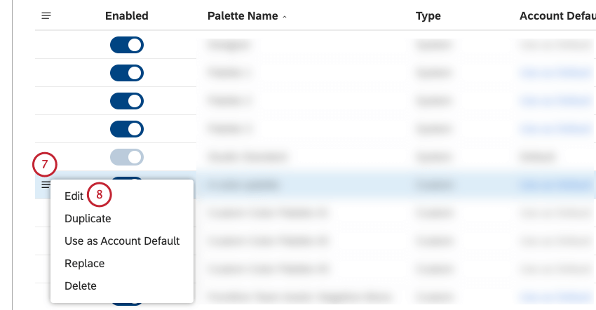
- Enable a color palette
- Disable a color palette
- Duplicate a color palette
- Replace one color palette with another
- Set a default color palette
- Delete a color palette
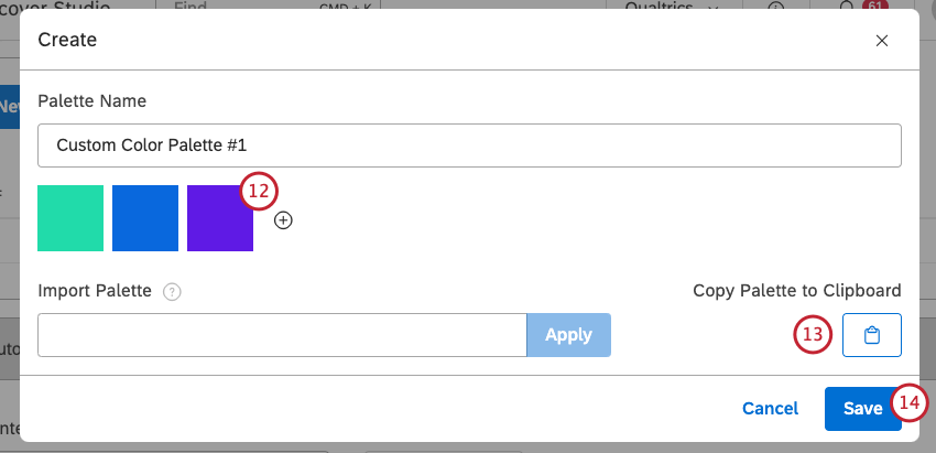
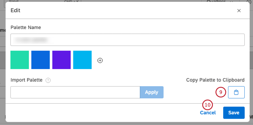
Creating a Custom Color Palette
Qtip: You can create a maximum number of 20 custom color palettes in Studio.
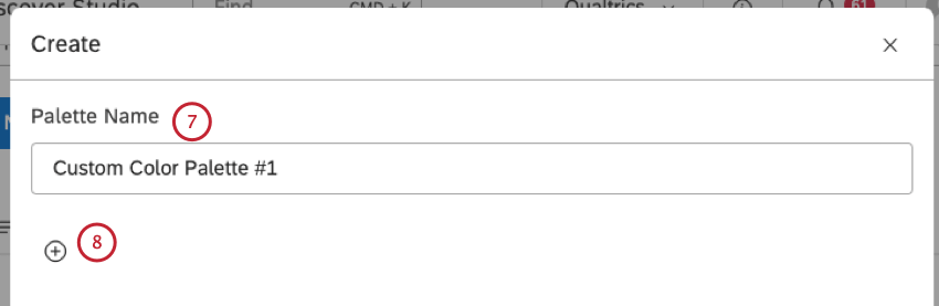
Qtip: You can add up to 10 colors to your color palette.
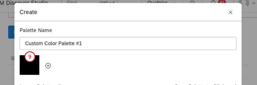
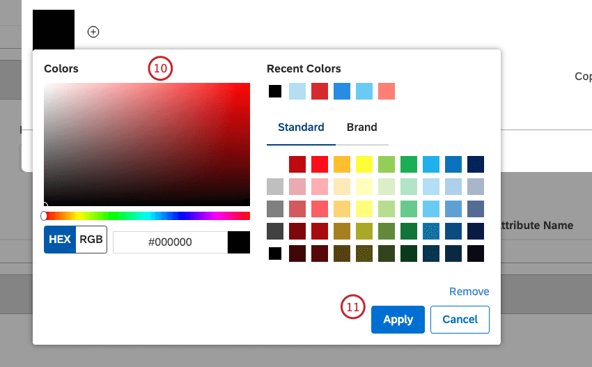
Qtip: Leftmost colors appear in reports more often and are used for more prominent items.
Importing a Color Palette
You can import a color palette by providing up to 10 HEX color codes separated by commas.
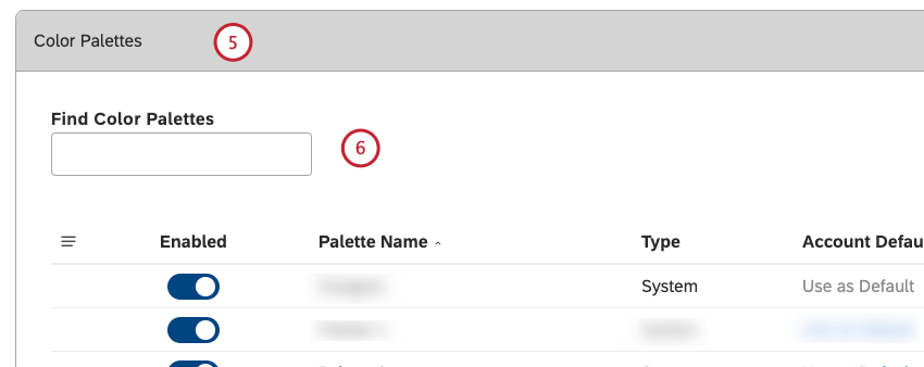
Qtip: You can enter the name of the color palette into the Find Color Palettes box to find it.
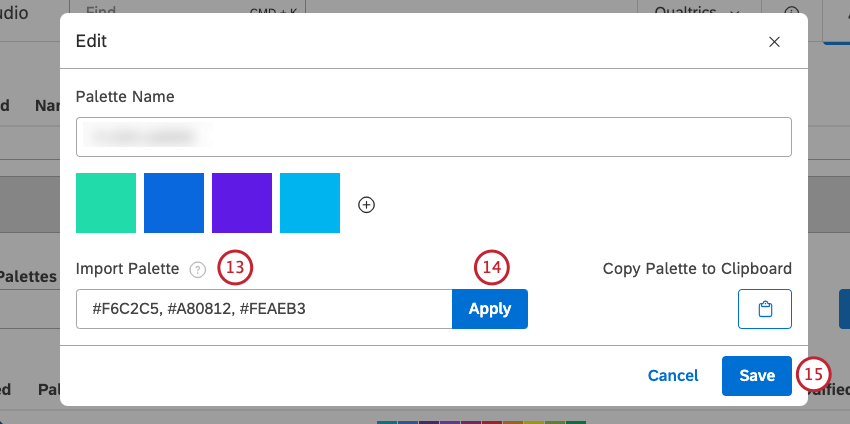
Qtip: The HEX color codes must be preceded by a hashtag (#). Invalid codes will be ignored.
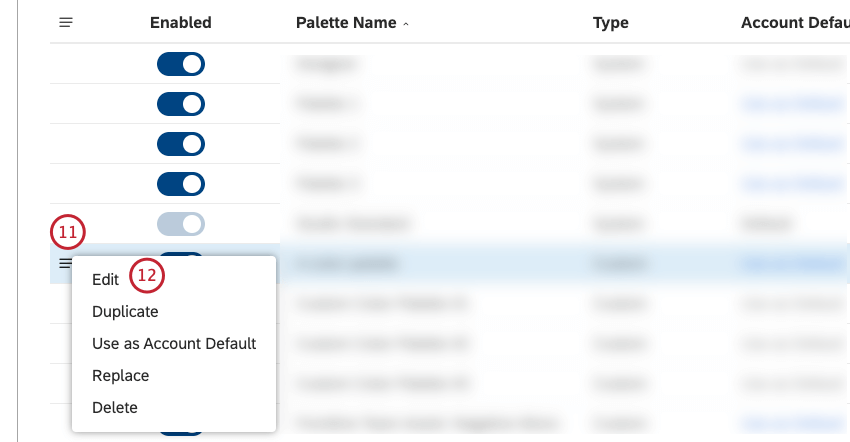
Enabling and Disabling a Color Palette
When you first create a custom color palette, it is disabled, meaning you can continue editing it without impacting other users. Once your color palette is ready, you can enable it so it becomes available in report color settings.
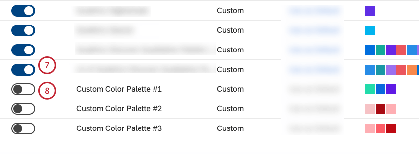
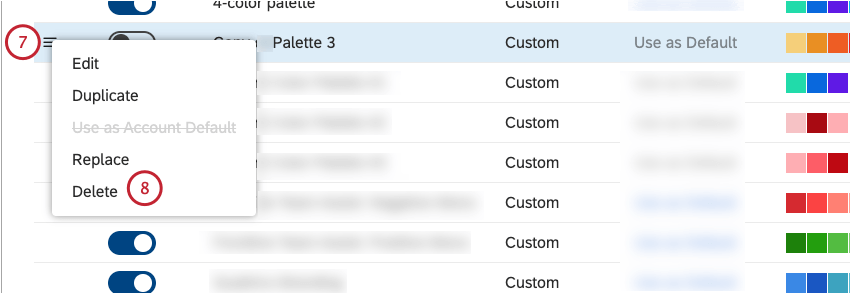
Qtip: You cannot disable system palettes or a user-defined color palette that is set as default.
Duplicating a Color Palette
You can duplicate an existing color palette, which can be useful if you want to edit several colors or change their order.
Qtip: Copies of Studio Standard palette are treated as custom color palettes and do not have dynamic color switching between dashboard preview modes (Default or Dark).
Qtip: Enter the name of the color palette into the Find Color Palettes box to find it.
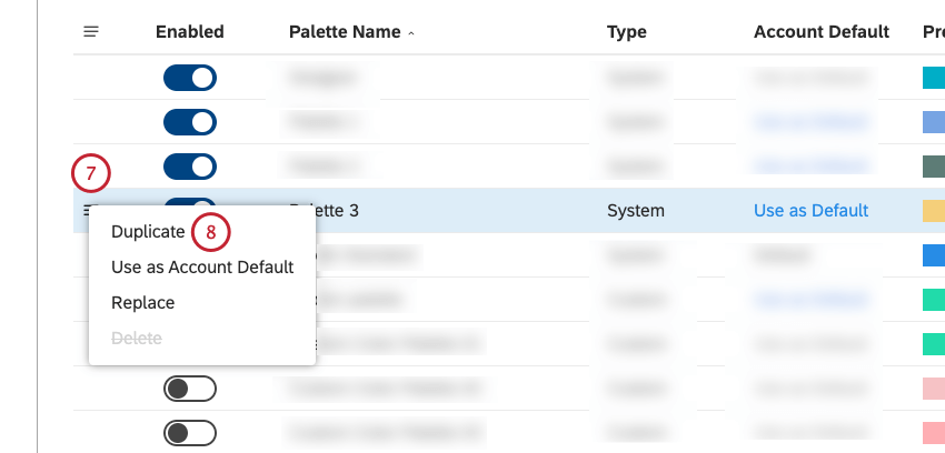
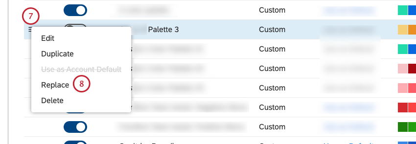
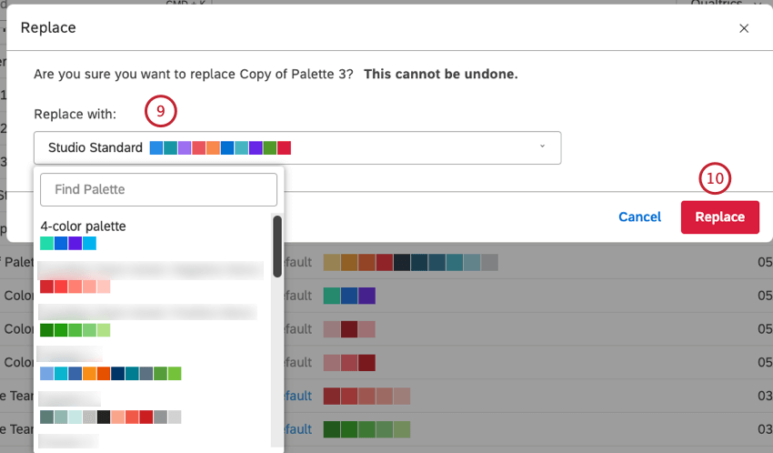
Replacing a Color Palette
You can replace one color palette with another in all widgets that use it.
Qtip: You can remove all references to the Designer color palette by replacing it with a Studio color palette.
Qtip: Enter the name of the color palette into the Find Color Palettes box to find it.
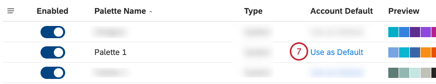
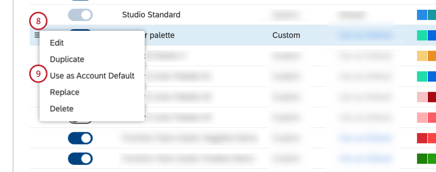
Setting a Default Color Palette
You can set a default color palette for all new dashboards in your Master Account.
Attention: A color palette must be enabled before you can use it as a default color palette.
Qtip: To find a color palette that is currently set as default, look for the word Default in the Account Default column.
Qtip: Enter the name of the color palette into the Find Color Palettes box to find it.
Deleting a Color Palette
Attention: System color palettes cannot be deleted.
You can delete custom color palettes you no longer need.
Qtip: Enter the name of the color palette into the Find Color Palettes box to find it.
That's great! Thank you for your feedback!
Thank you for your feedback!