
Getting Started with Online Reviews (Qualtrics)
What's on this page
About Online Reviews with Qualtrics
When we consider how to better our businesses, whether by perfecting a product or a customer experience, it’s important to meet customers wherever they are. Online reviews can provide us a lot of insight into how people experience our companies and services. With Qualtrics, one of the best ways to dive deep into those reviews is using a Reputation Management project.
Reputation Management projects help you integrate your current feedback programs and reports with review data from all around the web. Create dashboards for your stakeholders or action requests with a series of automated workflows.
Creating a Reputation Management Project
Reputation Management projects can be created in the catalog, just like any other project.
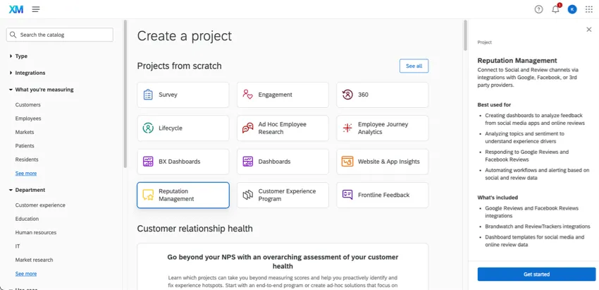
Once you’ve given your project a name and folder, you’ll be asked to pick from a few different types. We’ll walk you through the benefits of each type and when to use it.
Qtip: Users who want to create these projects must have the permission Create Reputation Management Project. A Brand Administrator has to enable this permission for the user. See also Extensions Permissions for connecting specific apps.
Your Business Reviews vs. Competitor Reviews
Once you’ve created a Reputation Management project, your first step is to specify whether you’re connecting your own reviews or your competitors’ reviews.
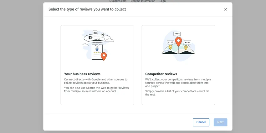
- Your business reviews: If this is your first online reviews project, we recommend selecting this option! While there are a few different ways to connect your review data, the goal is the same: you plan to grab reviews for your organization and add them to Qualtrics. See the next section for help making your next selection.
- Competitor Reviews: Once you’ve got your own organization’s review data in project, you may be interested in analyzing how you performance compared to competitors. The Competitor Reviews flow lets you match your organization’s locations with each of their local competitors. See Competitive Reviews for complete setup steps.
Ways to Connect Your Business Reviews
When you select Your Business Reviews, you’ll be given a few different ways to choose from in order to connect your business reviews to Qualtrics.
Connect to Google Places
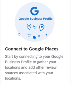
If you have a Google Business account, then we highly recommend using this option. Not only does this solution let you pull Google Reviews into Qualtrics for dynamic reporting and workflows, but you can respond to your reviews from right inside Qualtrics dashboards!
For detailed steps, see Connecting to Google Places.
Search the Web
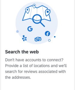
If you don’t have an account on any of the major review sites, it’s no problem. With this solution, Qualtrics will search the web for reviews associated with your business. That way you can pull in Facebook, Google Reviews, TripAdvisor, and more, all into one place!
For detailed steps, see Searching the Web for Reviews.
Add Review Sources
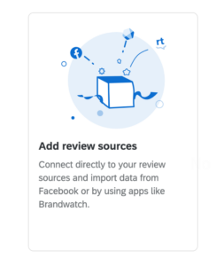
Connect directly to apps like Facebook or ReviewTrackers.
For detailed steps, see Adding Reviews from Sources.
Qtip: For Google Business, we recommend using Google places.
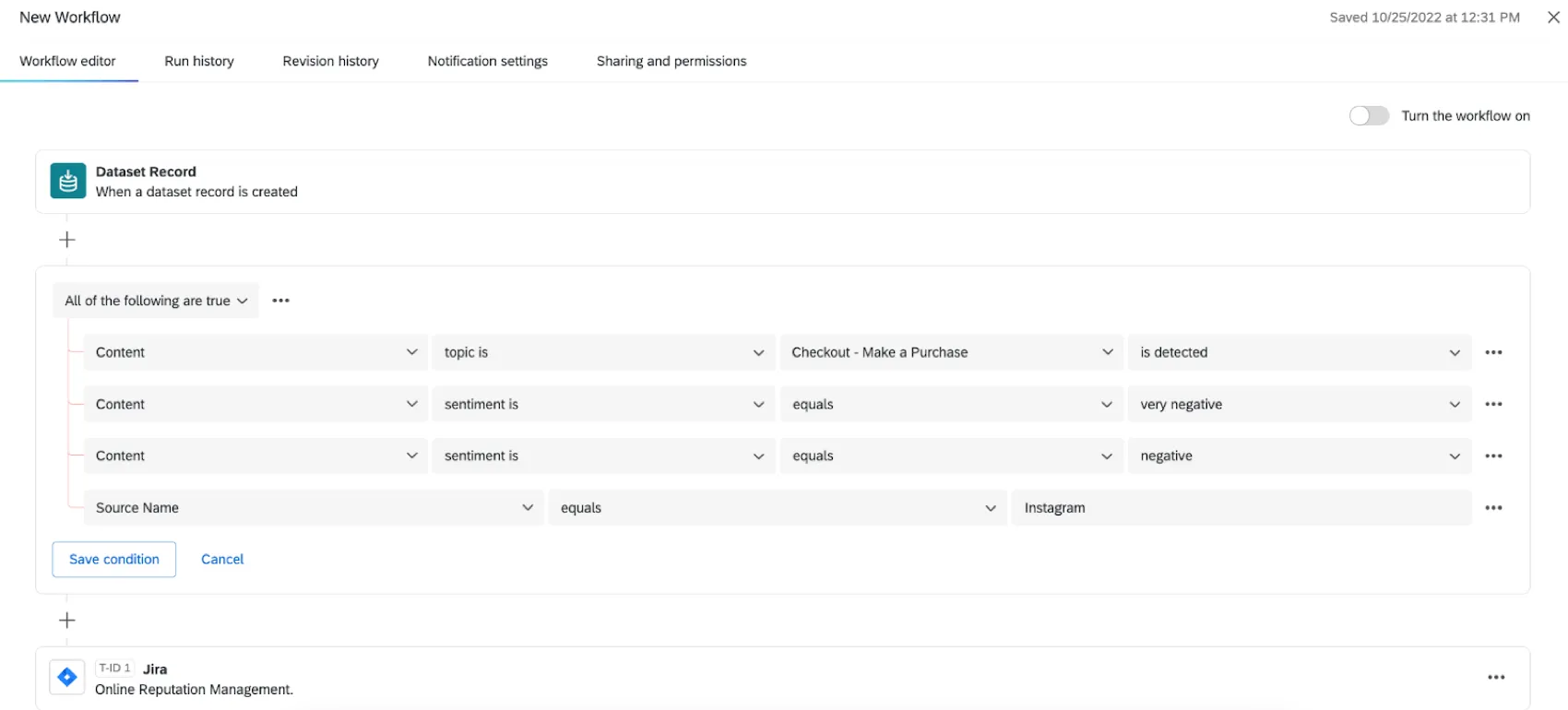
Taking Action on Online Reviews
Once you’ve created a Reputation Management project, you can take action on the insights you’ve collected with workflows. For more information on creating a project, see Types of Reputation Management Projects. Workflows allow you to automate different tasks in and outside of Qualtrics, from the creation of a ticket to the distribution of an email.
To learn more, see Workflows in Online Reputation Management.
Creating Dashboards for Online Reviews
Dashboards are reports you can share with your stakeholders. Bring social data from your Reputation Management projects into reports with other customer experience data you’ve collected, illuminating your results.
To learn more, see Online Reputation Dashboards.

Qtip: If you’ve connected to Google Places or Facebook, you can also let dashboard users respond to online reviews from directly inside the dashboard! See Online Reviews Widget for Facebook and Google Dashboards.

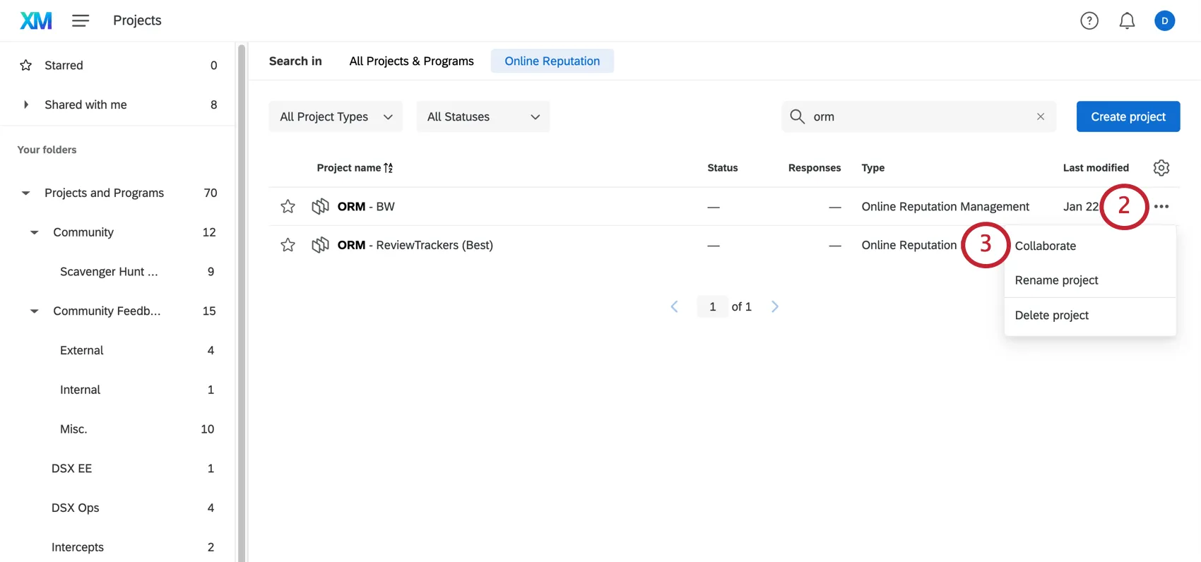
Renaming and Deleting Reputation Management Projects
When you go to the Projects page, click the 3 dots menu next to a project to either rename it or delete it.

- Rename project: Rename the project.
- Delete project: Delete the project. Once a Reputation Management project is deleted, it cannot be retrieved, so be absolutely sure before you do this!
Sharing Reputation Management Projects
You can collaborate on these projects with other users in your license.
Sharing a Reputation Management Project
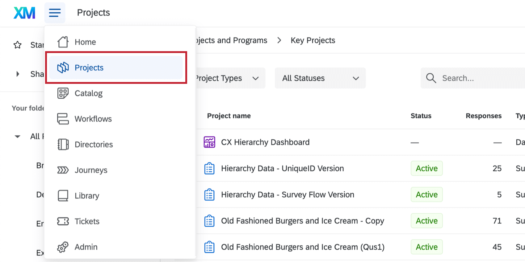
Navigate to the Projects page.

Click the 3 dots next to the project you want to share.
Click Collaborate.
Type in the name or email of your collaborator and select them from the list. You can add multiple collaborators.

Determine what level of access the user should have:

- Admin access: The user can edit the project. This is the same level of access you have as the creator of the project, meaning users with this permission can connect or disconnect apps, modify the data, or delete the project altogether.
- Read and reply access: The user can view the data and use online reviews widgets in associated dashboards. The user will not be able to edit the project’s apps or data, rename it, delete it, or invite others to collaborate on it.
When you’re finished adding collaborators, click Save.
Qtip: There is no automatic way to add users to new ORM projects. New users cannot be automatically added via SSO integration or directory syncs. To grant access, a project owner or admin must manually add each user to the specific ORM project.
Qtip: If Reputation Management data is included on the dashboard but the project hasn’t been shared with a user, they will only see the reviews, and won’t be able to reply on online reviews widgets.
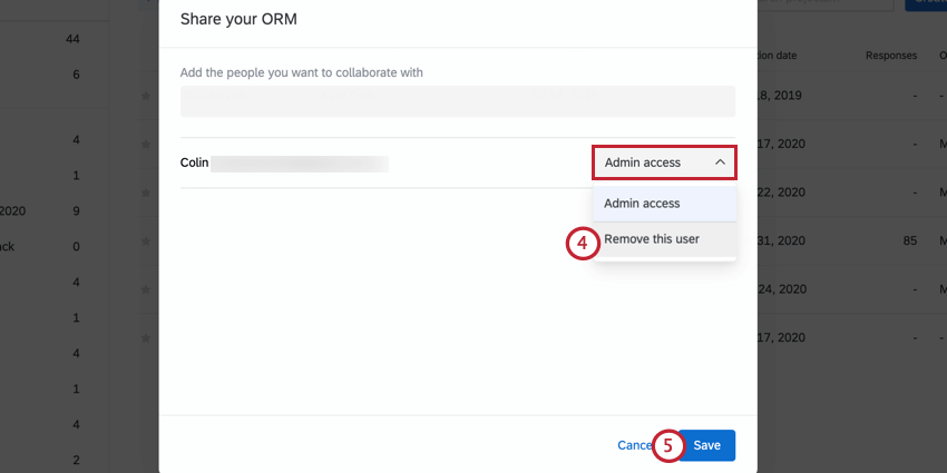
Removing Collaborators from a Project

That's great! Thank you for your feedback!
Thank you for your feedback!