
Matrix Statements in a Single Widget
Suite
Customer Experience
Employee Experience
Strategy & Research
Product
Qualtrics
What's on this page
About Viewing Matrix Statements in a Single Widget
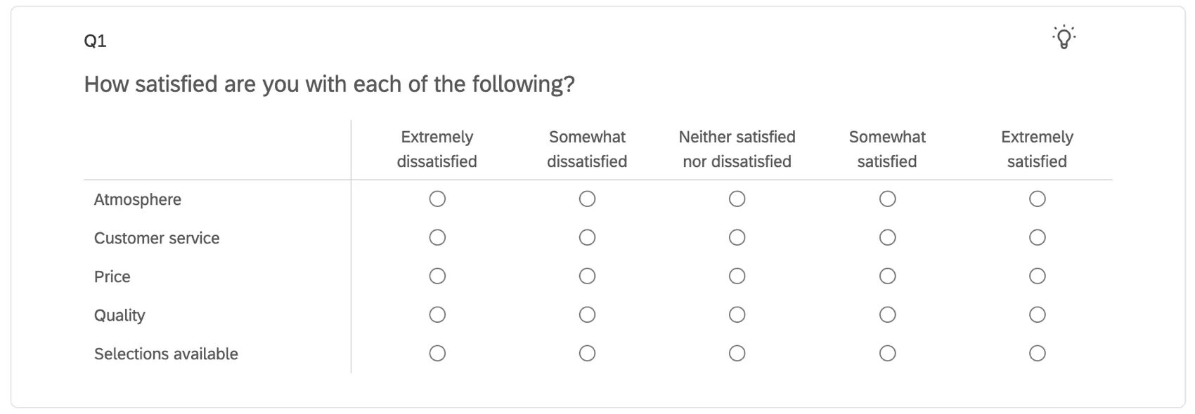
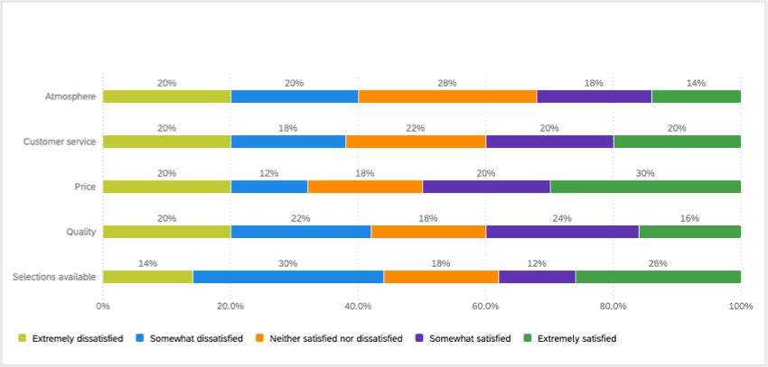
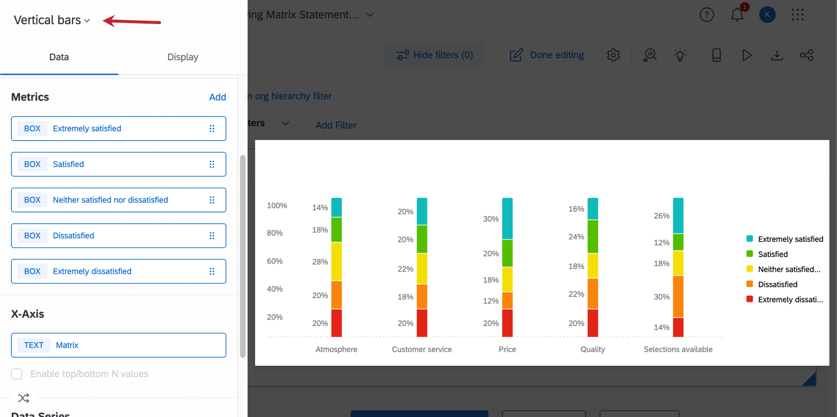
Matrix table questions are useful for asking about multiple items in one question. And if you’ve asked these questions together, you probably want to report on their data in the same widget. This page outlines how to view all of the statements of a single answer matrix table into one horizontal bar widget.
Qtip: The example we use on this page is a matrix table with a 5-point scale, but the steps can be modified for whatever number of scale points you have.
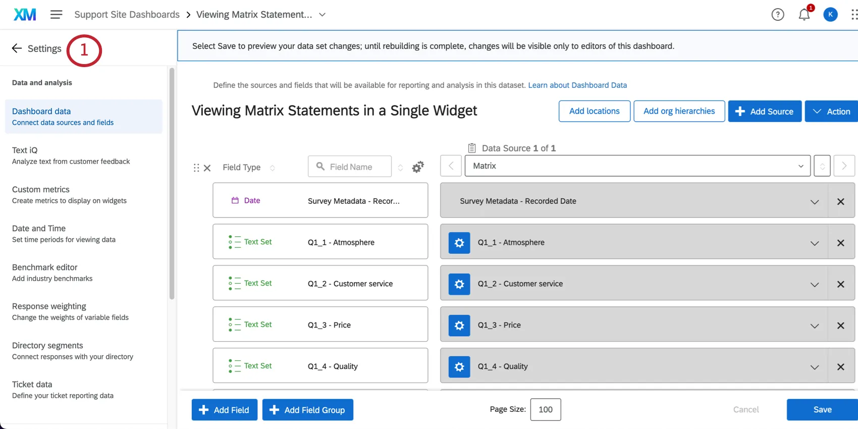
Mapping the Matrix Table into Your Dashboard
Go to your dashboard’s dataset.
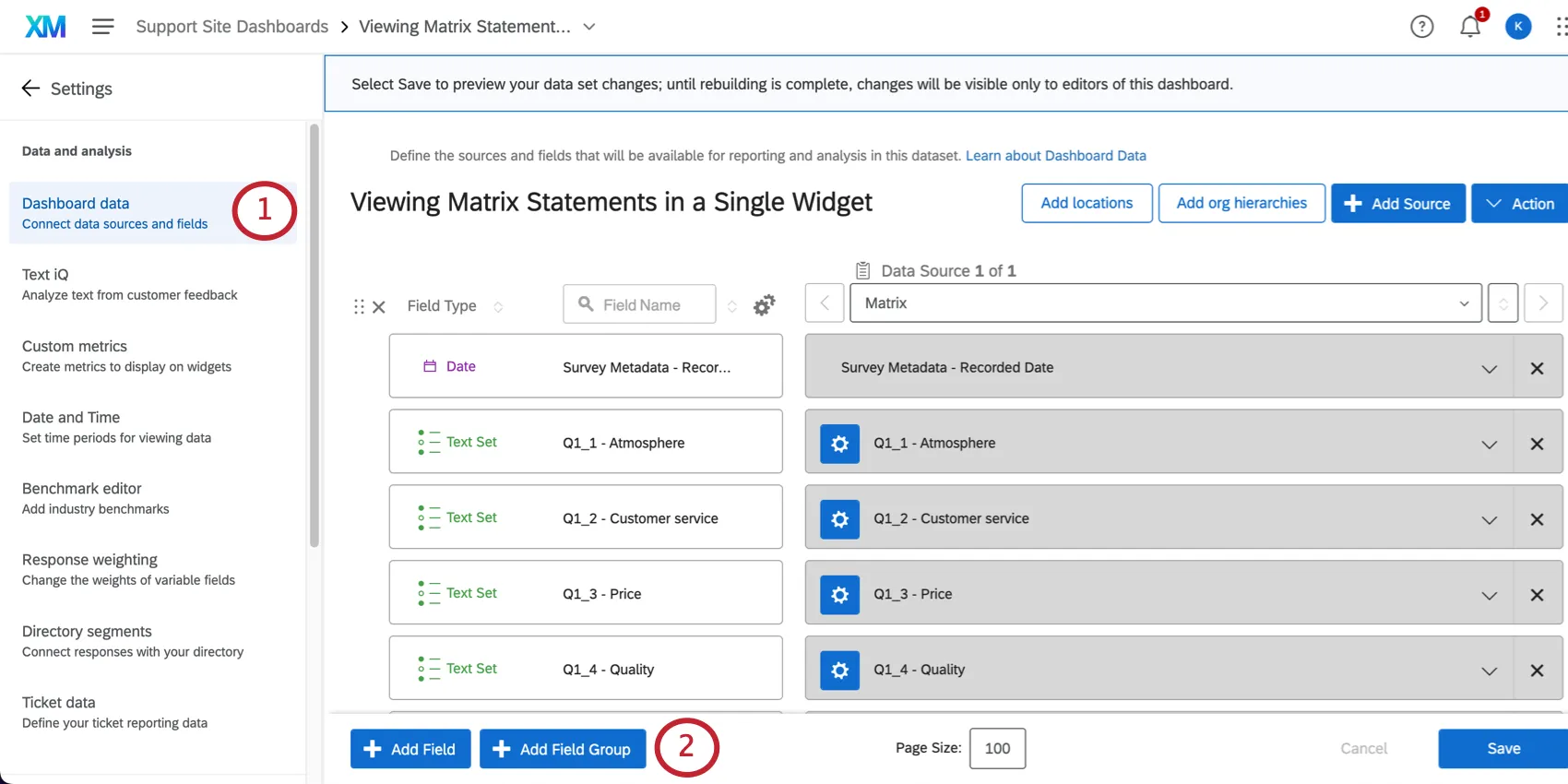
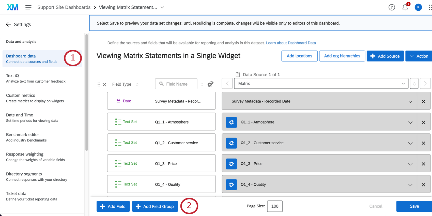
Click Add Field Group.
Name the field group something like Matrix.
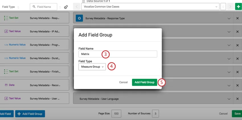

Set the field type to Measure Group.
Click Add Field Group.
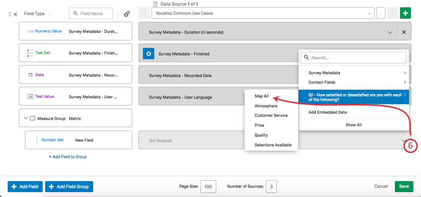
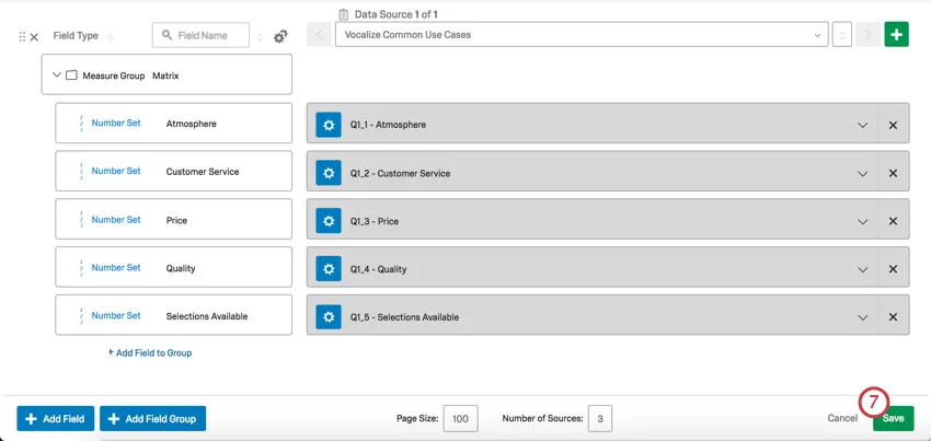
Click on the dropdown that says Not Mapped, select your Matrix Table from the list of survey questions in the dropdown, and select Map all.

Click Save.

Creating the Horizontal Bar Chart
Go back to your dashboard by clicking the arrow next to Settings.

Click Add Widget.

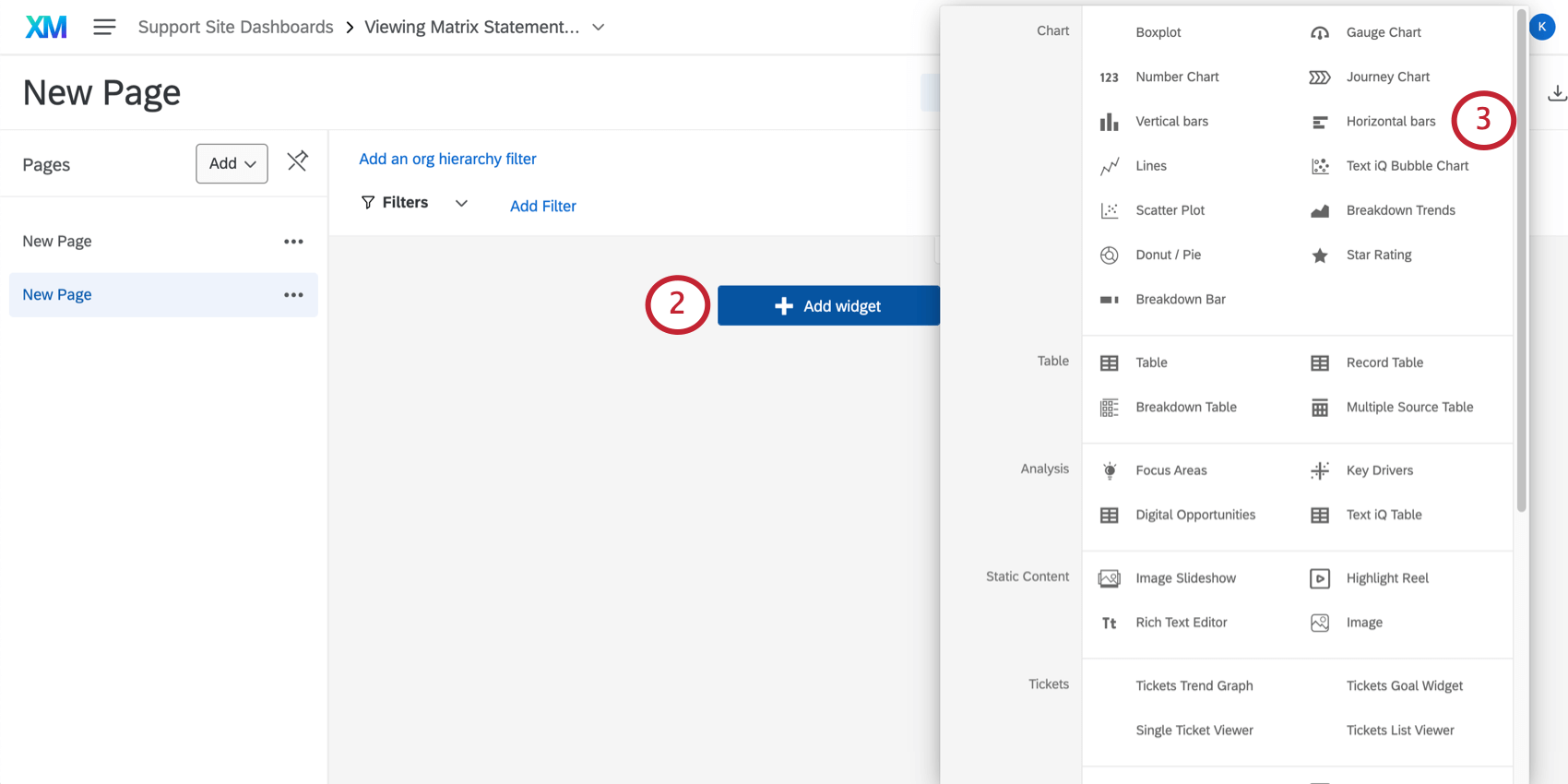
Select Horizontal bars.
Qtip: You need to be in editing mode to create a widget. To get into editing mode click the pencil icon in the top-right. If it says Done Editing, then you are already in editing mode.
Under Metrics, click Add.
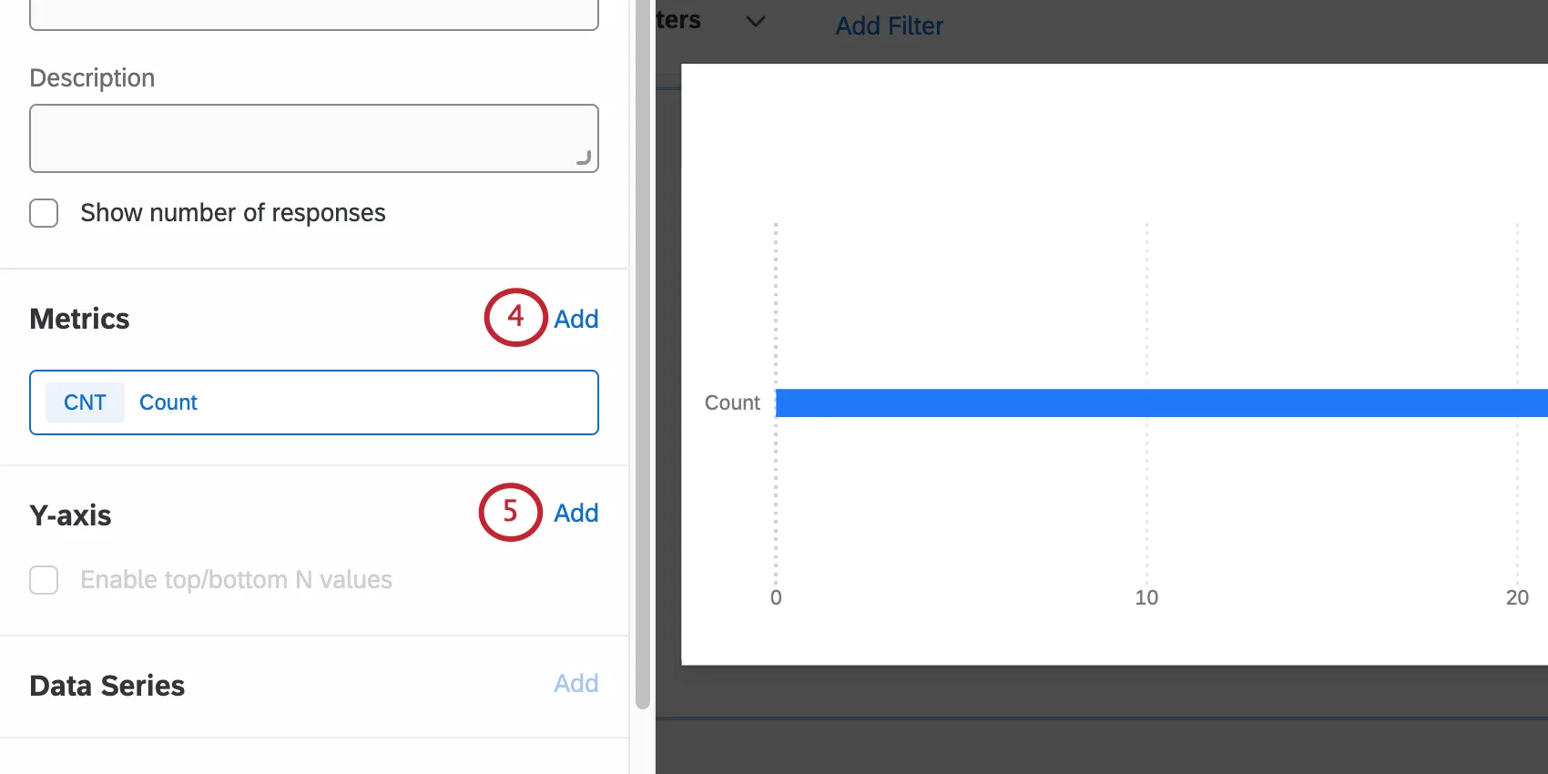
Qtip: Only add one metric for now. If more than one metric is added, the y-axis will no longer be an available option and you will not be able to complete the next step. Additional metrics will be added later.
Under Y-axis, click Add, then select Matrix.
Under Metrics, click Add 4 more times to add the remaining 4 metrics.

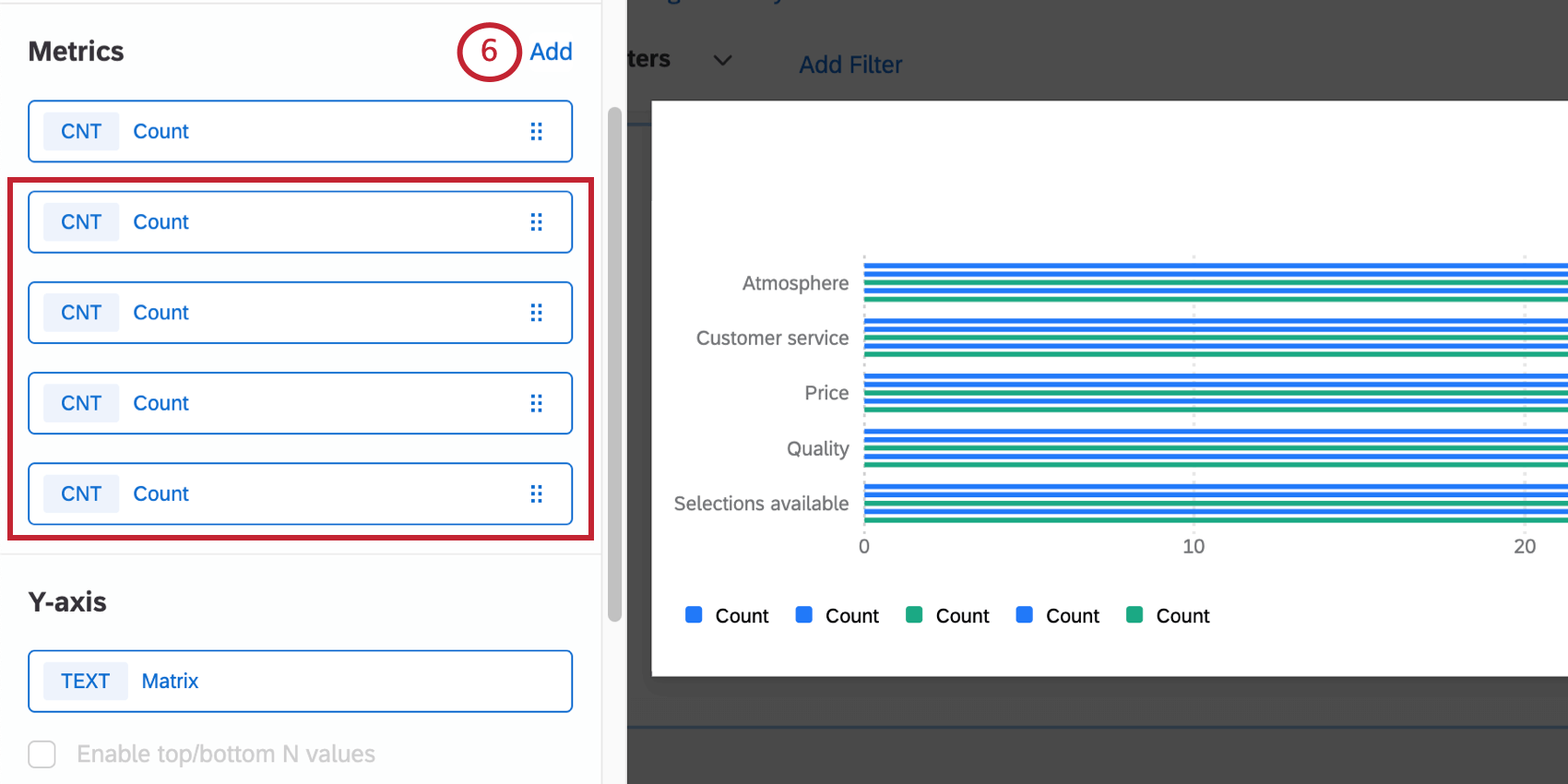
Qtip: The example we use on this page is a matrix table with a 5-point scale, but the steps can be modified for whatever number of scale points you have. For example, for a 6-point scale, you’d have 6 metrics total.
Click one of the metrics.

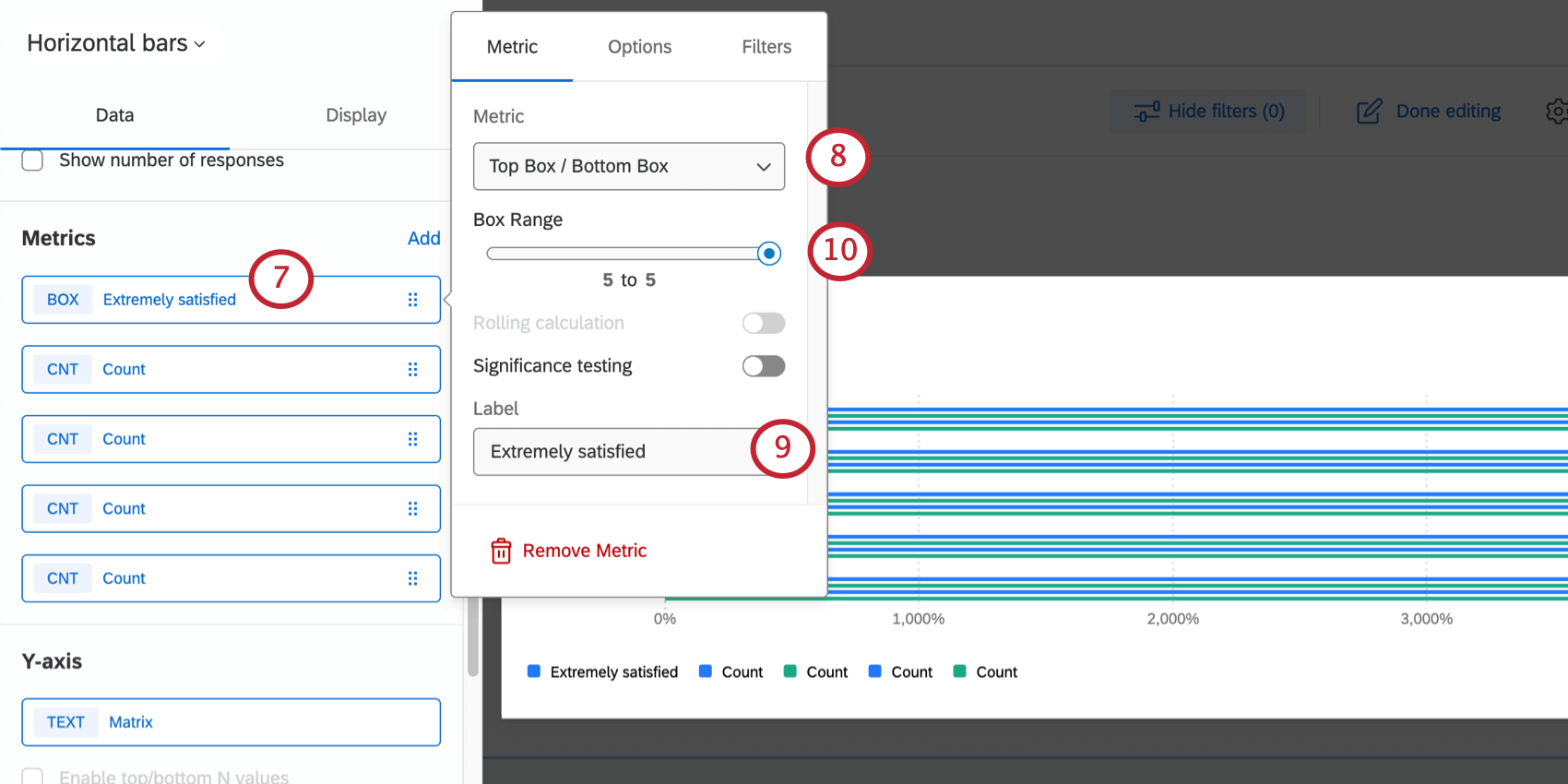
Under the Metric dropdown, select Top Box / Bottom Box.
Change the Label to a scale point.
Qtip: We recommend going in order from lowest to highest. (E.g., Extremely dissatisfied, somewhat dissatisfied, neither satisfied nor dissatisfied, somewhat satisfied, and then lastly, extremely satisfied.)
Change the Box Range for each metric according to the following:
- Extremely dissatisfied: Change the Box Range to 1 to 1.
- Somewhat dissatisfied: Change the Box Range to 2 to 2.
- Neither satisfied nor dissatisfied: Change the Box Range to 3 to 3.
- Somewhat satisfied: Change the Box Range to 4 to 4.
- Extremely satisfied: Change the Box Range to 5 to 5. Qtip: The example we use on this page is a matrix table with a 5-point scale, but the steps can be modified for whatever number of scale points you have. For example, for a 6-point scale, you’d have 6 metrics, and the sixth metric’s box range would be 6 to 6.

Select Options.
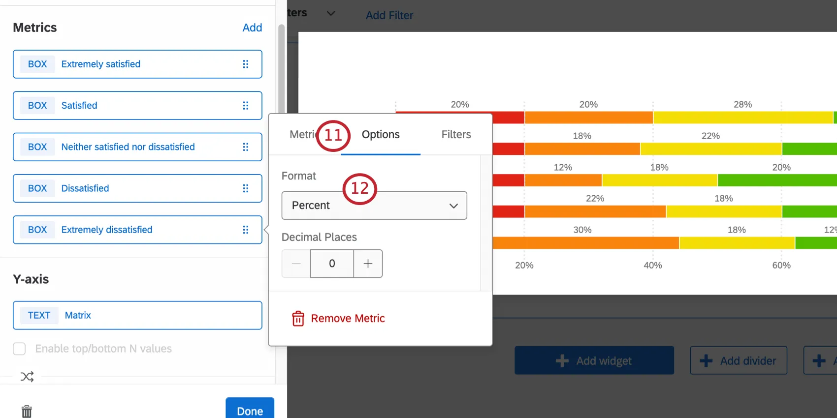
Under Format, select Percent.
Complete steps 7-12 for each metric.
Go to Display.
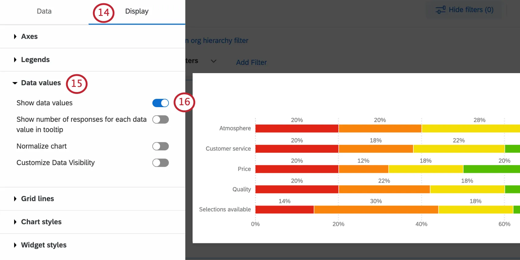
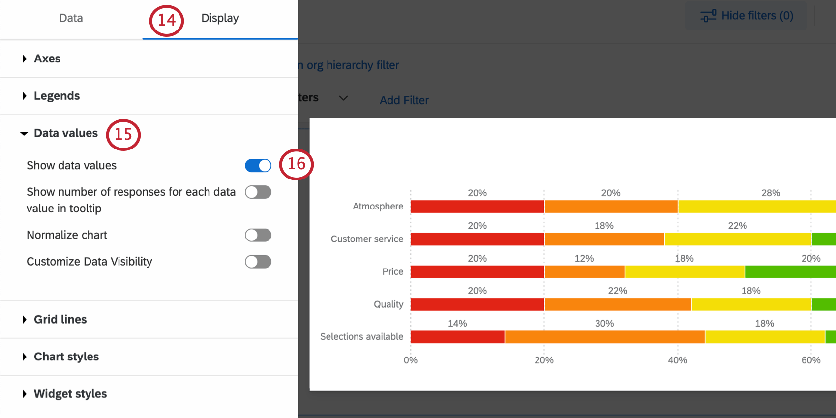
Expand Data values.
Select Show data values.
Go to Chart styles.

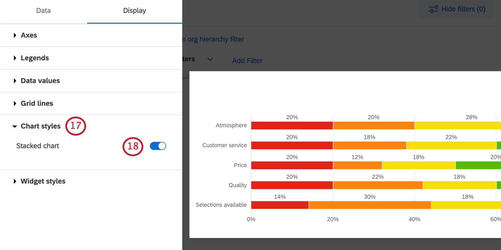
Selected Stacked chart.
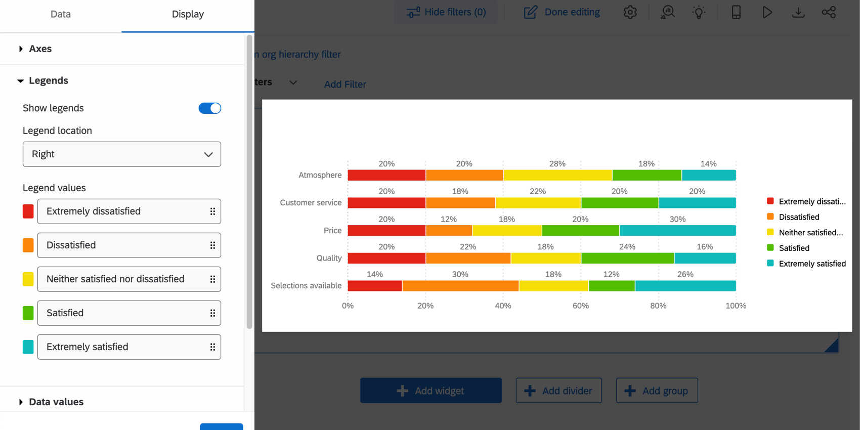
If needed, you can adjust the chart’s colors and the order of items under Legends.

Qtip: If your data values are not appearing, make the widget larger.
Qtip: Vertical bar charts are compatible with the same settings. To switch, all you need to do is change the topmost dropdown to Vertical bars, and all your settings will be applied automatically.

That's great! Thank you for your feedback!
Thank you for your feedback!