
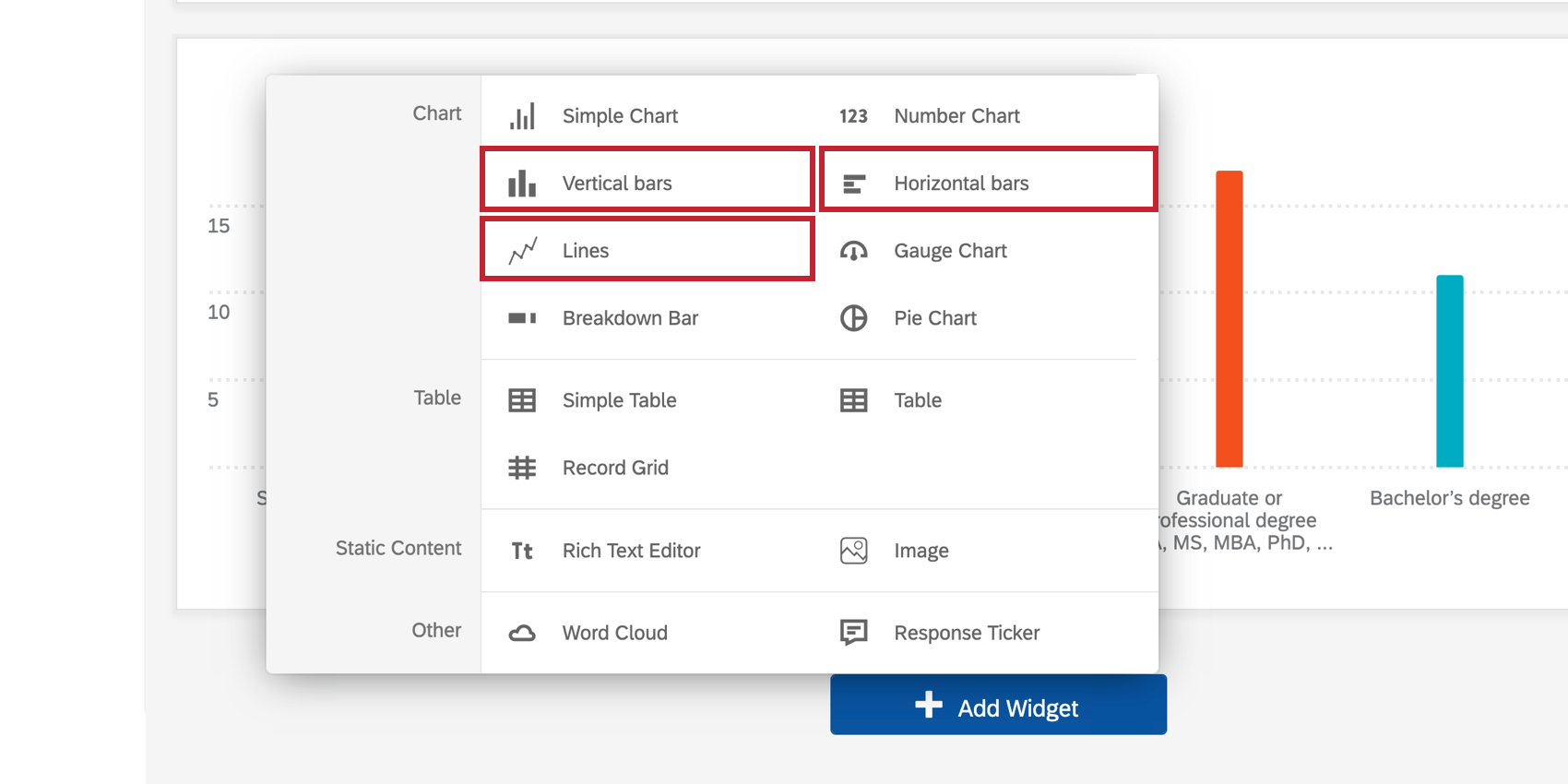
Line & Bar Chart Widgets
What's on this page
About Line and Bar Chart Widgets
Chart widgets allow you to display data in a range of customizable ways. Changing the chart metrics, setting colors, and choosing display options allows you to tailor charts to fit a wide range of situations.

- The Line chart type displays the data points connected by a continuous line.

- The Horizontal Bar chart type creates a bar chart that is oriented horizontally.

- The Vertical Bar chart type creates a simple vertical bar chart.

Types of Dashboards
Line and bar widgets can be used in a few different types of dashboard. This includes:
- CX Dashboards
- Results Dashboards
- Employee Engagement
- Lifecycle
- 360
- Pulse
- Ad Hoc Employee Research
- Employee Journey Analytics
- Brand Experience
Field Type Compatibility
Line and bar widgets are compatible with the following field types:
- Number Set
- Date
- Text Set
- Multi-Answer Text Set
- Drill Down
- Measure Group
Only fields with the above types will be available when selecting your Axis Dimension or Data Series for a simple chart.
Qtip: If you’re using response weighting on data, the cardinality limit must be below 350.
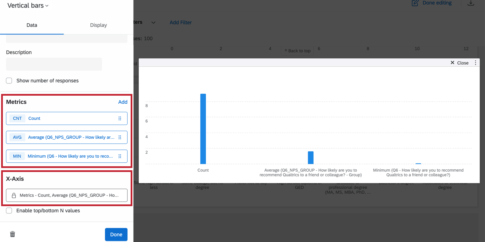
Setting Up a Line or Bar Widget
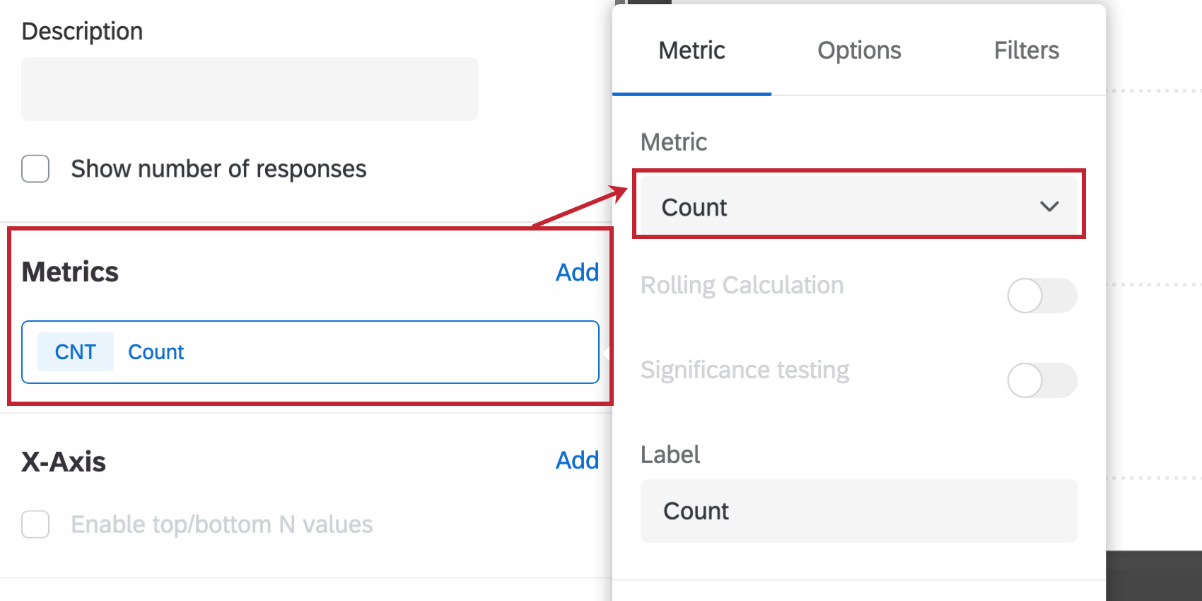
Qtip: When selecting a metric, every metric except count will need a field specified. Only a field with the type Number Set or Multi-Answer Text Set will be available. For more on metric options and filters, see Widget Metrics.
- Rolling Calculation: Rolling calculations are a means of applying a metric over a set of data points composed of multiple periods. The rolling calculations options are Rolling Averages and Rolling Metrics. See Rolling Calculations in Widget Metrics for more information.
- Significance testing: Charts can help you understand whether the differences you see over time or between groups are statistically significant, and therefore worthy of driving important business decisions. See Significance Testing in Simple Charts & Simple Tables (CX) for more information.
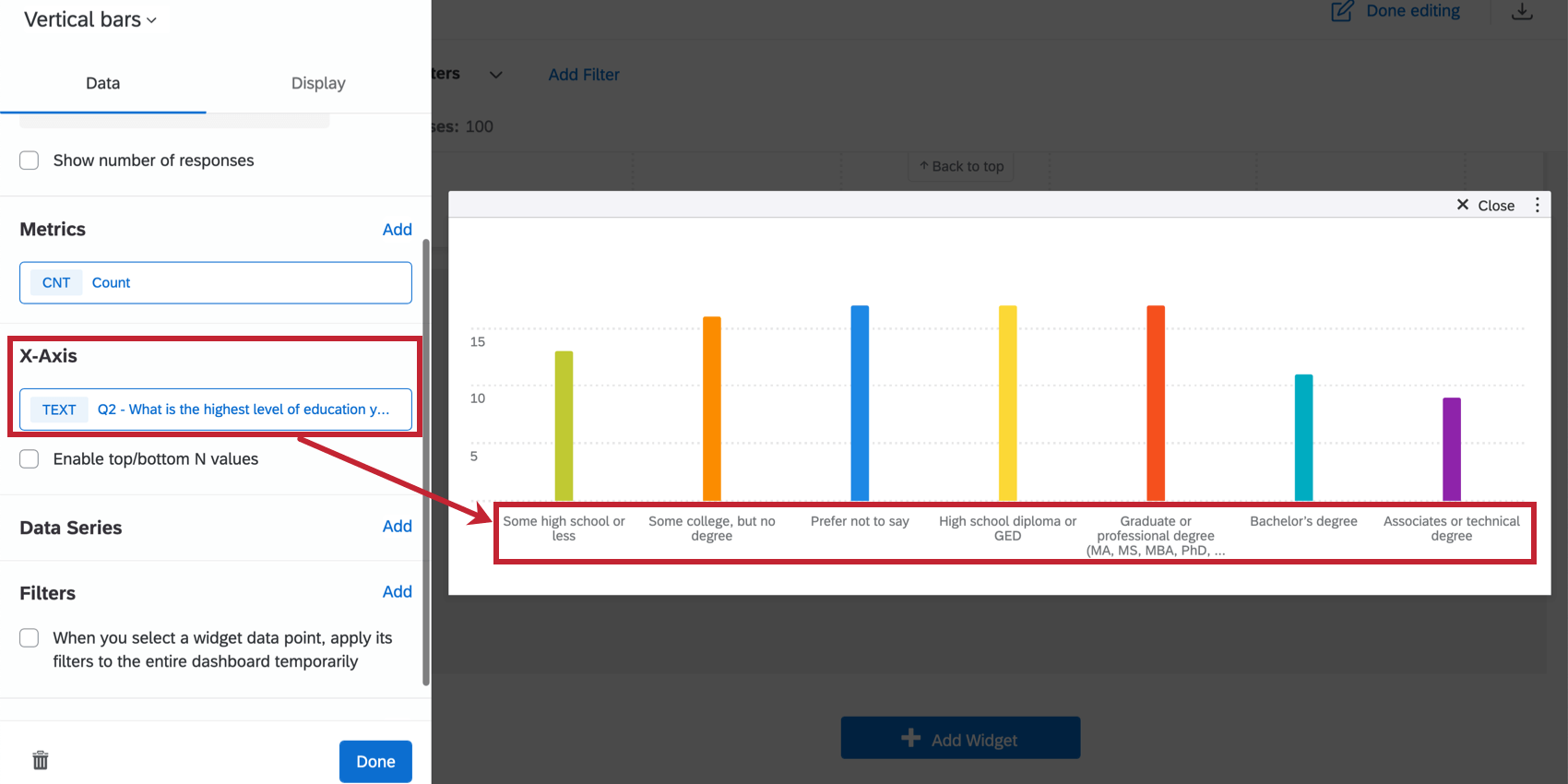
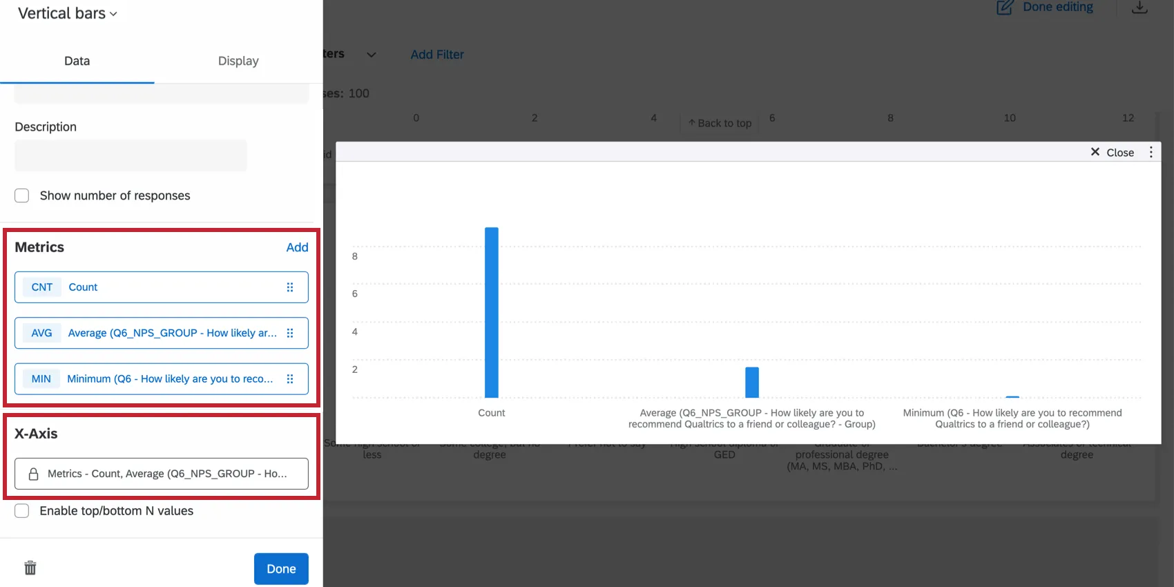
Qtip: You will only be able to specify your axis dimension if your widget has only 1 metric on it. If you use more than 1 metric in your chart, the x-axis dimension will automatically display metrics and use your selected metrics as a breakout instead.
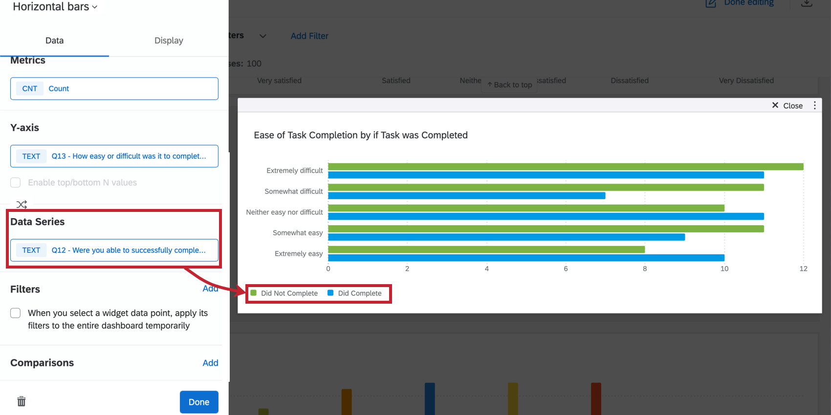
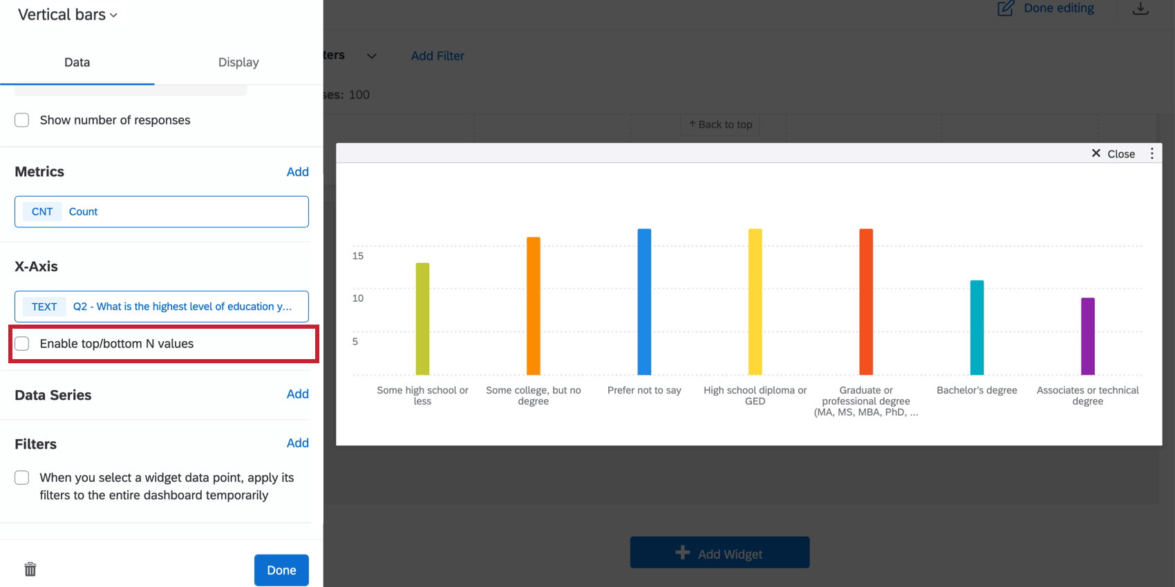
Qtip: If you choose to add a data series, you will only be able to add fields with the type Text Set, Multi-Answer Text Set, Number Set, or Date. If you do not add a data series and only have a single metric and x-axis dimension added, you will have the option to Only show top/bottom N values. Check this box to specify whether you would like to show only Top or Bottom values and to specify how many of these values you would like shown.

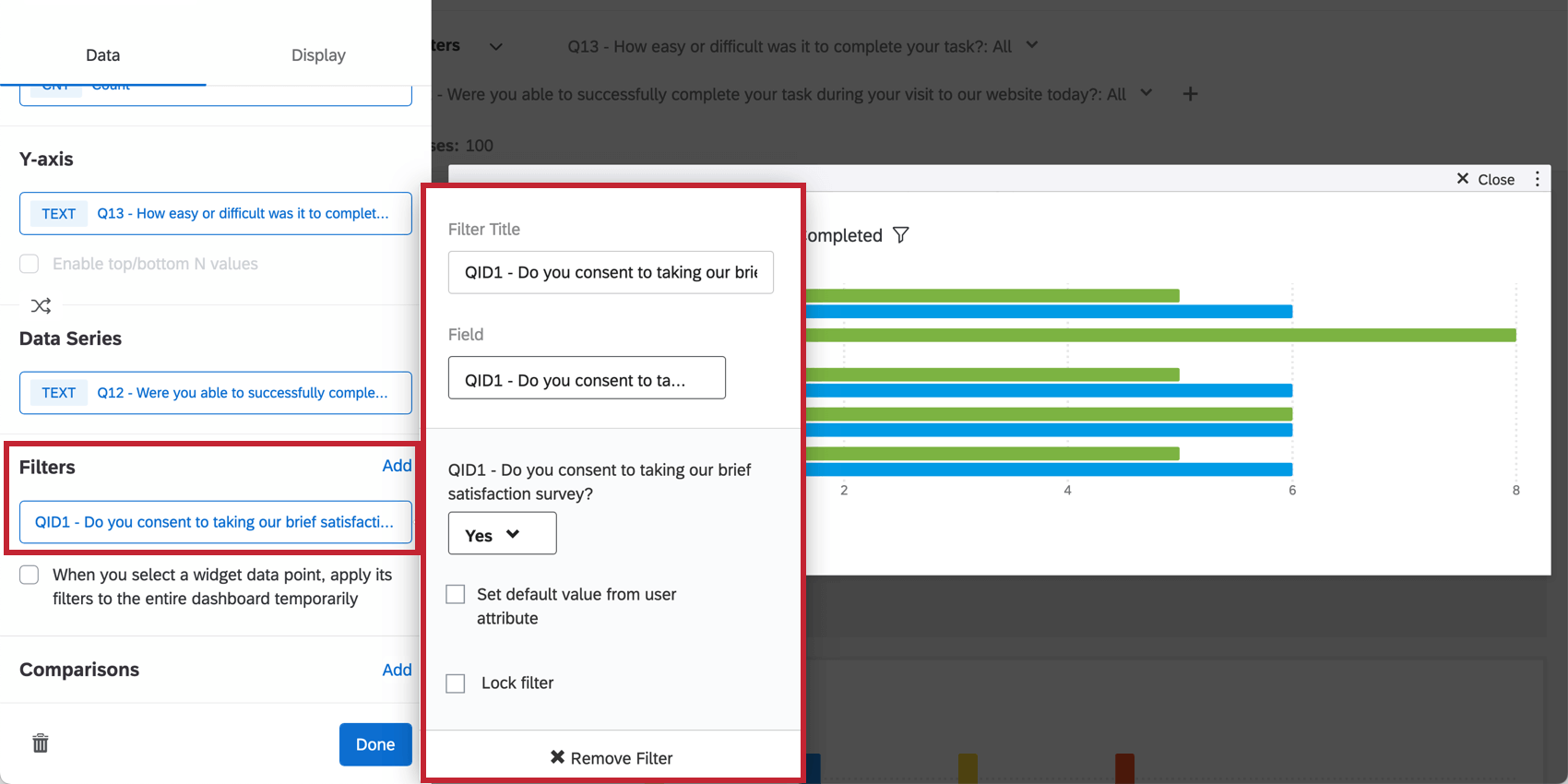
Qtip: See Adding Widget Filters for more details. The Filtering CX Dashboards page also contains helpful information on locking filters, basing filters on the dashboard viewer’s metadata, and more.
Qtip: Despite the name, this option does not apply a filter to the entire dashboard. Just the page.
Qtip: The legend values must be placed at the bottom when comparisons are enabled.
Qtip: You can add metrics until the cardinality of your widget reaches 350. If you exceed this limit, you will see the message “Too many results, please add a filter.” To display data in your widget, filter the widget so the cardinality of displayed fields is below 350. You can calculate the cardinality of your widget’s data by multiplying the total number of possible values for each field together. For example, if your widget displays 2 different fields, one with 100 possible values and another with 3 possible values, then your widget’s cardinality is 300.
Widget Customization
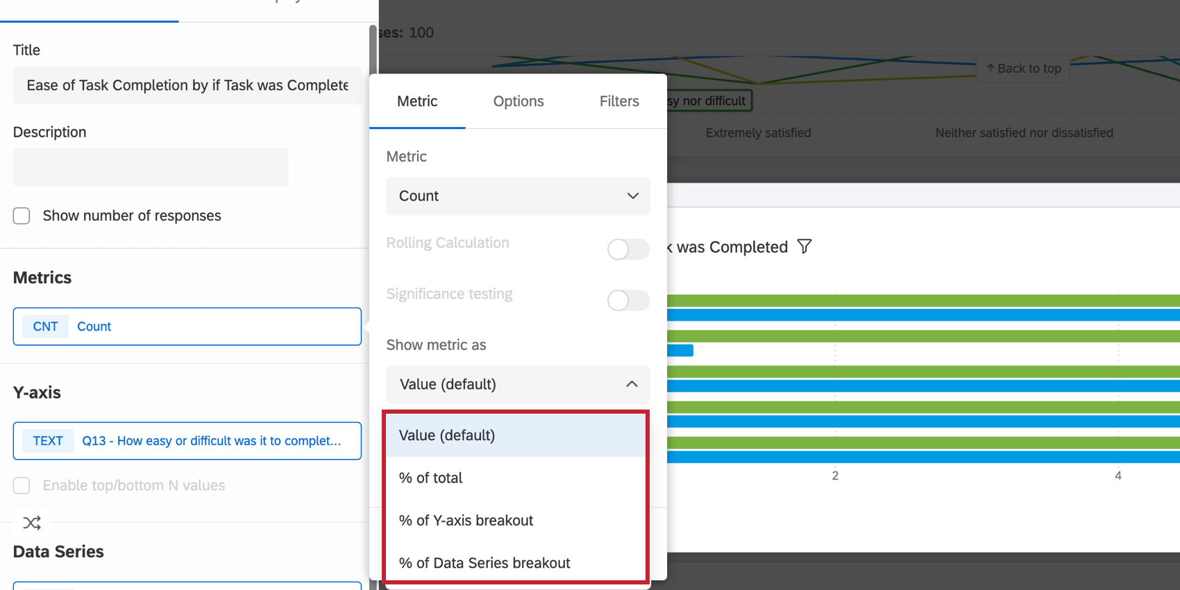
COUNT METRIC OPTIONS
When you select count as your metric type and have both an axis and data series defined, additional options will be available for displaying your metric. Click the dropdown under Show metric as to select your option.
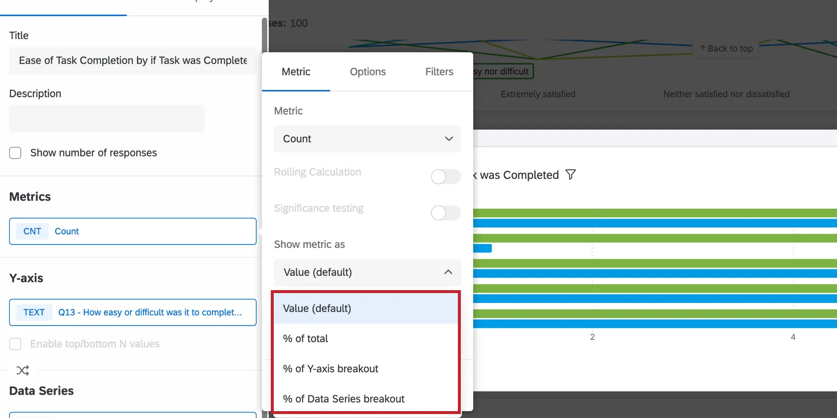
- Value (default): The chart will show the numeric count of each data point. The chart will display a number.
- % of total: The chart will show the result of the calculation (numeric count/total number of responses) as a percentage.
- % of axis breakout: The chart will show the result of the calculation (numeric count/total number of responses in the axis dimension) as a percentage.
- % of Data Series breakout: The chart will show the result of the calculation (numeric count/total number of responses in the data series) as a percentage.
Breakout Options
When you select a field group or measure group as your dimension (axis or data series), additional breakout options will be available when you click on your dimension.
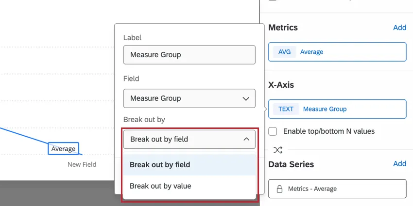
Use the Break out by dropdown to choose how you want breakouts to display:
- Break out by field: The chart will break out the result of your selected metric by fields defined within the group.
- Break out by value: The chart will break out the result of your selected metric by union of all field options within the group.
Display Options
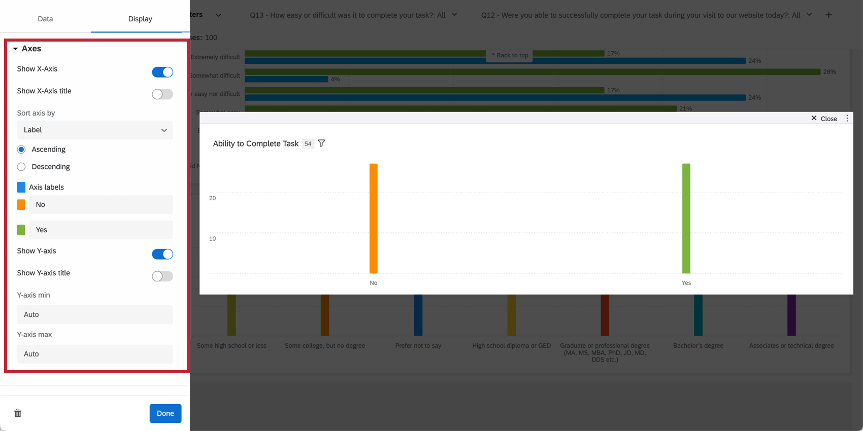
AXES
The display of the axis values can be adjusted to customize the layout of the data being presented.

- Show X-Axis: Displays your x-axis values.
- Show X-Axis title: Add a title to your x-axis.
- Sort axis by: Change the order of your data by selecting a sort option from the dropdown choices. If you choose Custom, you will be able to drag and drop the axis values below into whatever order you would like. To rename your axis values, simply click on the axis value’s name under Axis labels and type whatever name you would like. Qtip: This option sorts your labels based on their values as they are mapped in your dashboard’s data mapper (CX|EX). Cosmetic edits to label values are not used for sorting. If the automatic sorting option does not accurately reflect your cosmetic labels, then use the “Custom” sorting option to define your desired sorting order.

- Data colors: Change the colors of your data by clicking the colored box to the left of each axis label. If you would like all the values to be the same color, click the box to the left of Axis labels and the color will be applied to every value in your graph.
- Show Y-axis: Displays your y-axis values.
- Show Y-axis title: Add a title to your y-axis.
- Y-axis min: Adjusts the minimum value for the y-axis.
- Y-axis max: Adjusts the maximum value for the y-axis.
- Secondary y-axis min: Adjust the minimum value for the secondary y-axis.
- Secondary y-axis max: Adjust the maximum value for the secondary y-axis.
DATA VALUES
You can determine how much data information is displayed by adjusting the data value settings.

- Show data values: Displays the value of the metric above each axis value.
- Show number of responses for each data value in tooltip: Displays in the tooltip the total number of responses accounted for in each data value. Qtip: This setting can only show the total responses for up to 10 data values at once. After 10 data values, the tooltip will only show the number of responses for the value you are hovering over.
- Normalize chart: display each data point in the chart as a percentage out of 100%. This is useful if your data is broken out with a data series and you would like to view the fraction of respondents that selected certain values as relative percentages instead of explicit counts. Qtip: Normalize chart calculates values the same way the “Metric Value / Row Total” feature does under additional Count Metric Options.
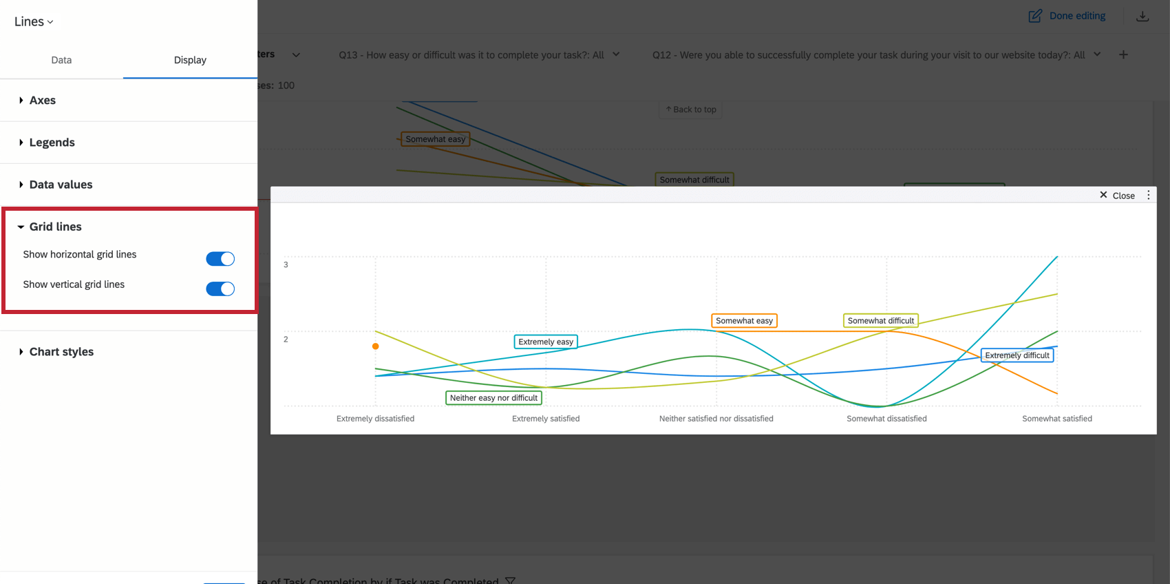
GRID LINES
Indicate whether or not you would like to display grid lines on your chart. If you are using a line chart, you will have a separate option to enable horizontal and vertical grid lines.
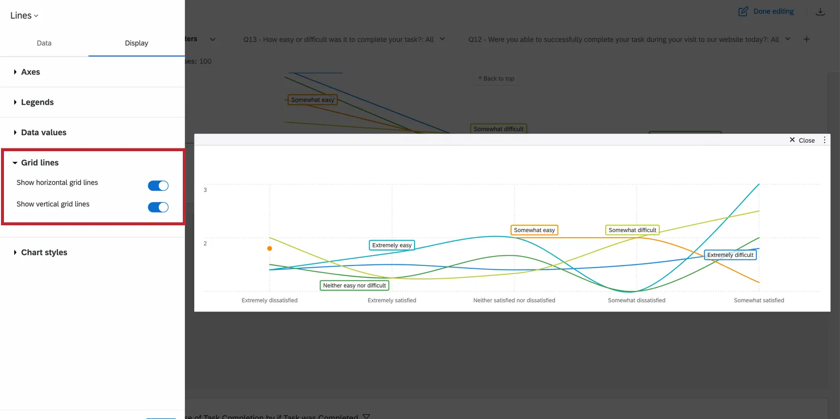
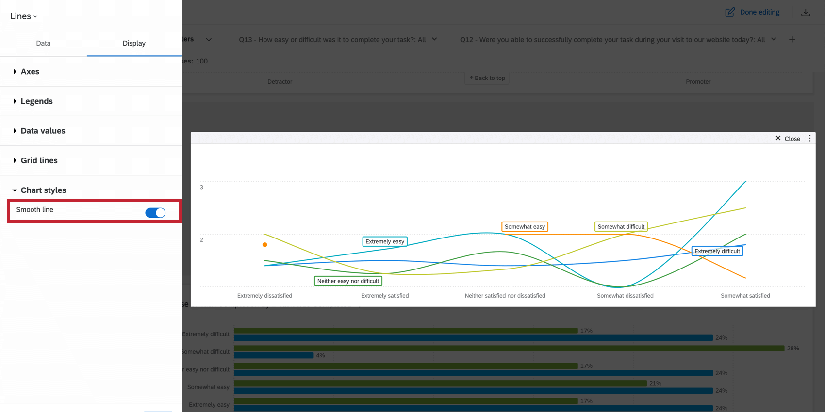
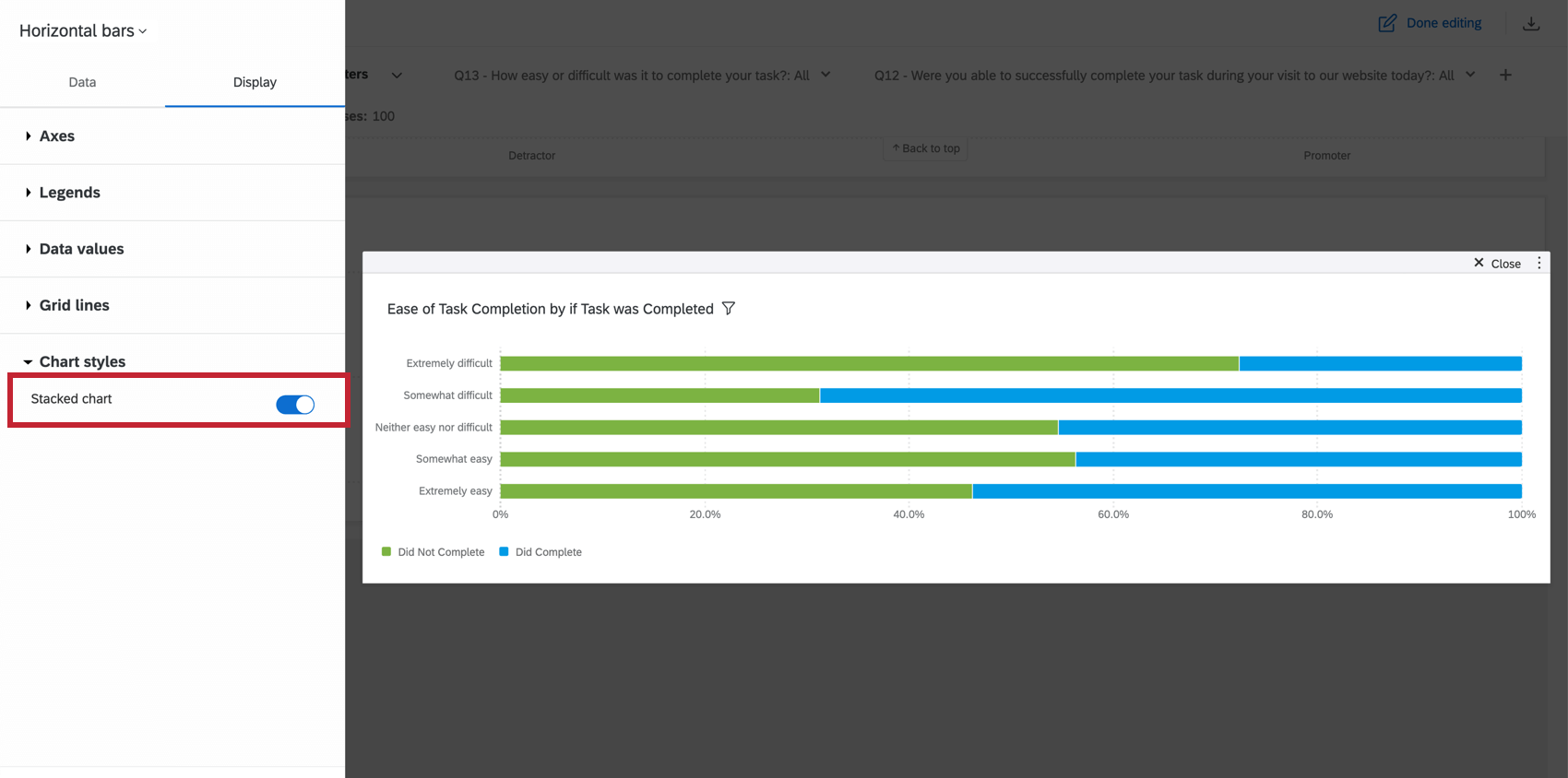
CHART STYLE
If you are using a Line chart, you can indicate whether or not you want to Smooth line. This creates a rounded effect to connect the data points.

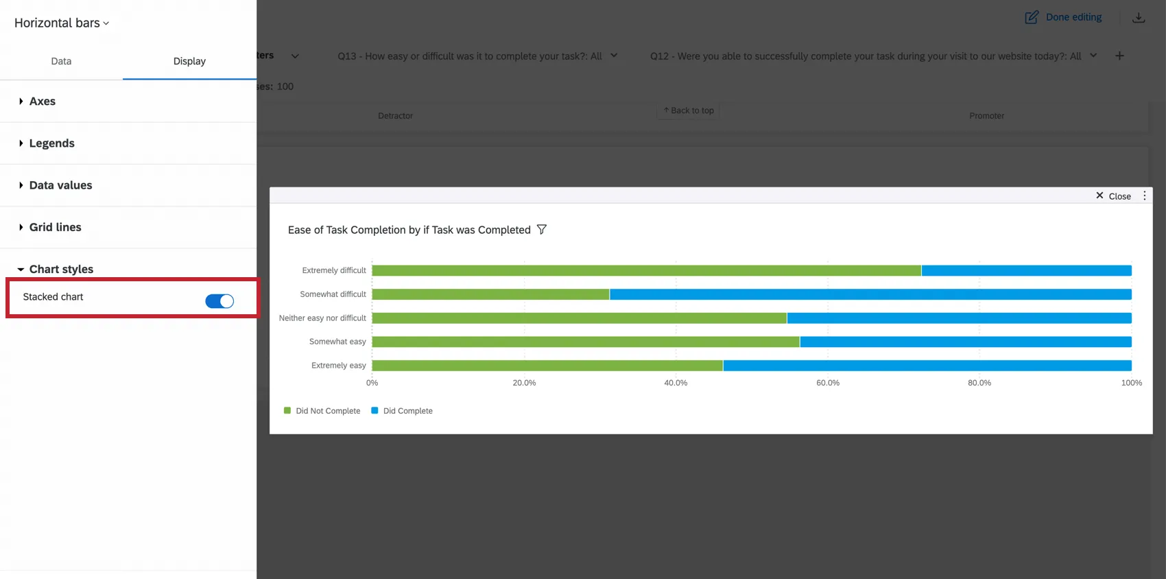
If you are using a Bar chart, you can indicate whether or not you want to Stack chart. This will condense the bars in your chart into a single stacked bar. If you have your widget broken out with a data series, there will be a stacked bar for each value of the data series field. This is particularly useful if you are normalizing the widget. In this case, the length of the bar will be 100% and it will be divided into sections to match the percentages of each data point.
Legends
Legends are a helpful way to show what different colors, bars, and lines correspond to which data points.
- Show legends: Enable this option to show the legend for your chosen metric.
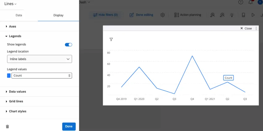
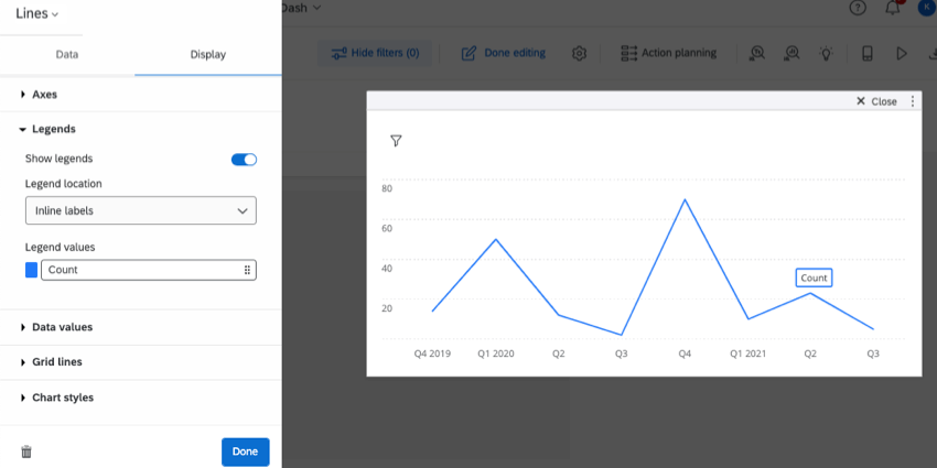
- Legend location: Your legends can be located at any of the following:
- Bottom: Show the legend along the bottom of the widget.
- Inline labels: Show labels directly alongside bars and lines. (Shown in screenshot above.)
- Right: Show labels to the right of the widget.
- Legend values: Change the color of a metric, or click it to change how it is labelled on the widget.
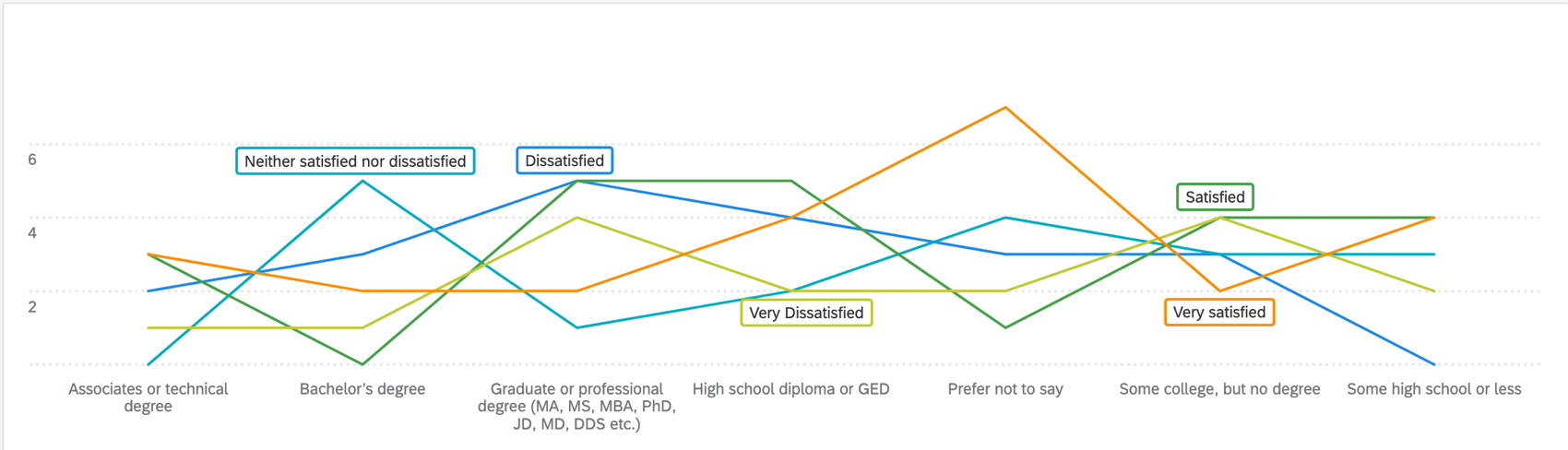
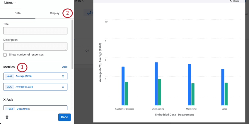
Secondary Axis
You can add a secondary axis to vertical bar charts, horizontal bar charts, and line charts. This secondary axis can be plotted as a vertical bar, a line, or a bubble.
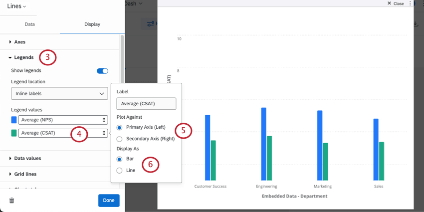
Qtip: The secondary axis label will still appear with the primary axis’s label.
- Bar (available for vertical bar charts, horizontal bar charts, and line charts)
- Line (available for vertical bar charts and line charts)
- Bubbles (available for horizontal bar charts)
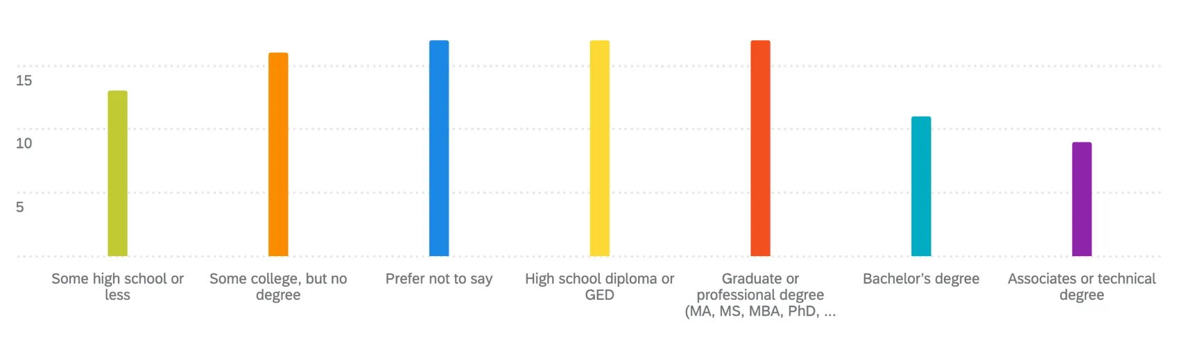
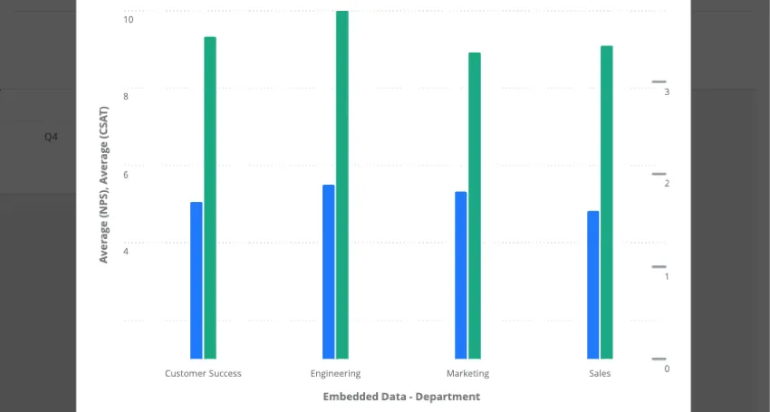
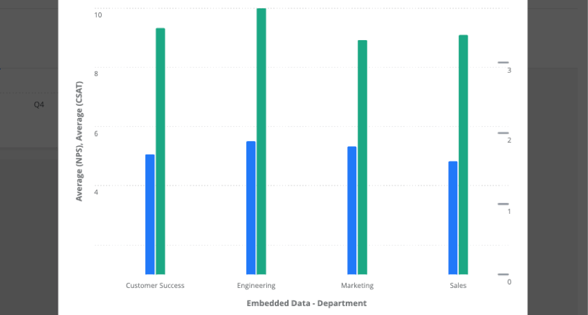
Example: The widget below shows NPS (a 10 point scale) along the left, and CSAT (a 4 point scale) along the right.
Significance Testing
Dashboards can help you understand whether the differences you see over time or between groups are statistically significant, and therefore worthy of driving important business decisions. With significance testing in line and bar charts, you can discover what data changes matter most.
See Significance Testing in Dashboard Widgets (CX) for more information. Although this is a CX Dashboards page, the functionality described is the same as in EX dashboards.
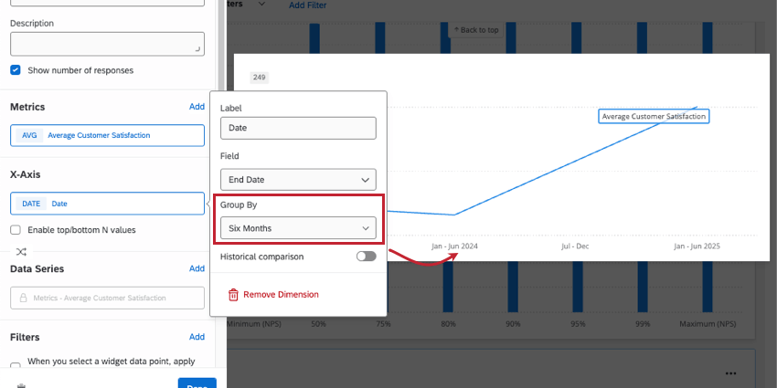
Breaking Data Out by Dates
Line, horizontal bar, vertical bar, and table widgets let you break out the data by date. When you break out data by date, you can choose the timeframes you want to measure change over; for example, so you can see performance month over month, or over each quarter.
Qtip: Where you add a date field varies by the widget:
- Line and vertical bars: X-axis or data series
- Horizontal bars: Y-axis or data series
- Table: Rows or columns
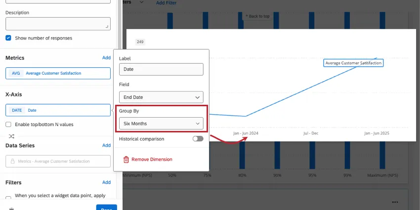
Once you add a date field to your widget, you can click it to decide how it’s grouped. In the example line graph above, you can see how selecting “six months” impacts how data is grouped on the x-axis. Your “group by” options include:
- Year
- Six months
- Quarter
- Month
- Week
- Day
- Automatic
- Custom week
- Custom year
- Custom quarter
- Custom month
If you’d like to use one of the custom options, make sure you’ve configured the dashboard’s Date and Time settings.
Qtip: Breaking out data by date is a great way to show change over time. For end-to-end steps of an example widget, see Average CES (Customer Effort Score) Over Time.
Qtip: For more information on the historical comparison setting shown, see Historical Comparison.
Automatic Grouping
When you choose to group date data by “automatic,” this will automatically group your data in a way that fits best in the widget while still being readable.
What grouping you get when you select “automatic” varies based on the data included in your widget. This includes any filters you have applied that might narrow down widget data.
- Months: Data will be grouped by months if there are more than 3 months worth of data (90 days) displayed in the widget.
- Weeks: Data will be grouped by weeks if there are between 2 weeks (14 days) and 3 months of data.
- Days: Data will be grouped by days if there are fewer than 2 weeks worth of data.
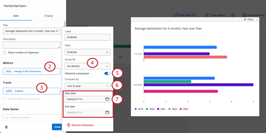
Historical Comparison
You can show how your data has changed over time with historical comparisons. If you have several years worth of data collected, this setting is a great way to show how feedback has changed over time.
Only line, vertical bar, and horizontal bar widgets have this historical comparison setting.
Example: You have data from 2019 – 2023 in our survey. You want to see how the monthly average CSAT compares across these years.

Qtip: For most time groups, you can only compare year to year. If you group data by day, you can also compare data month to month or week to week.
Example: You only want to compare data for 2022 and 2023. You set the start date to January 1, 2022 and the end date to December 31, 2023.
FAQs
What are aggregated metrics?
What are aggregated metrics?
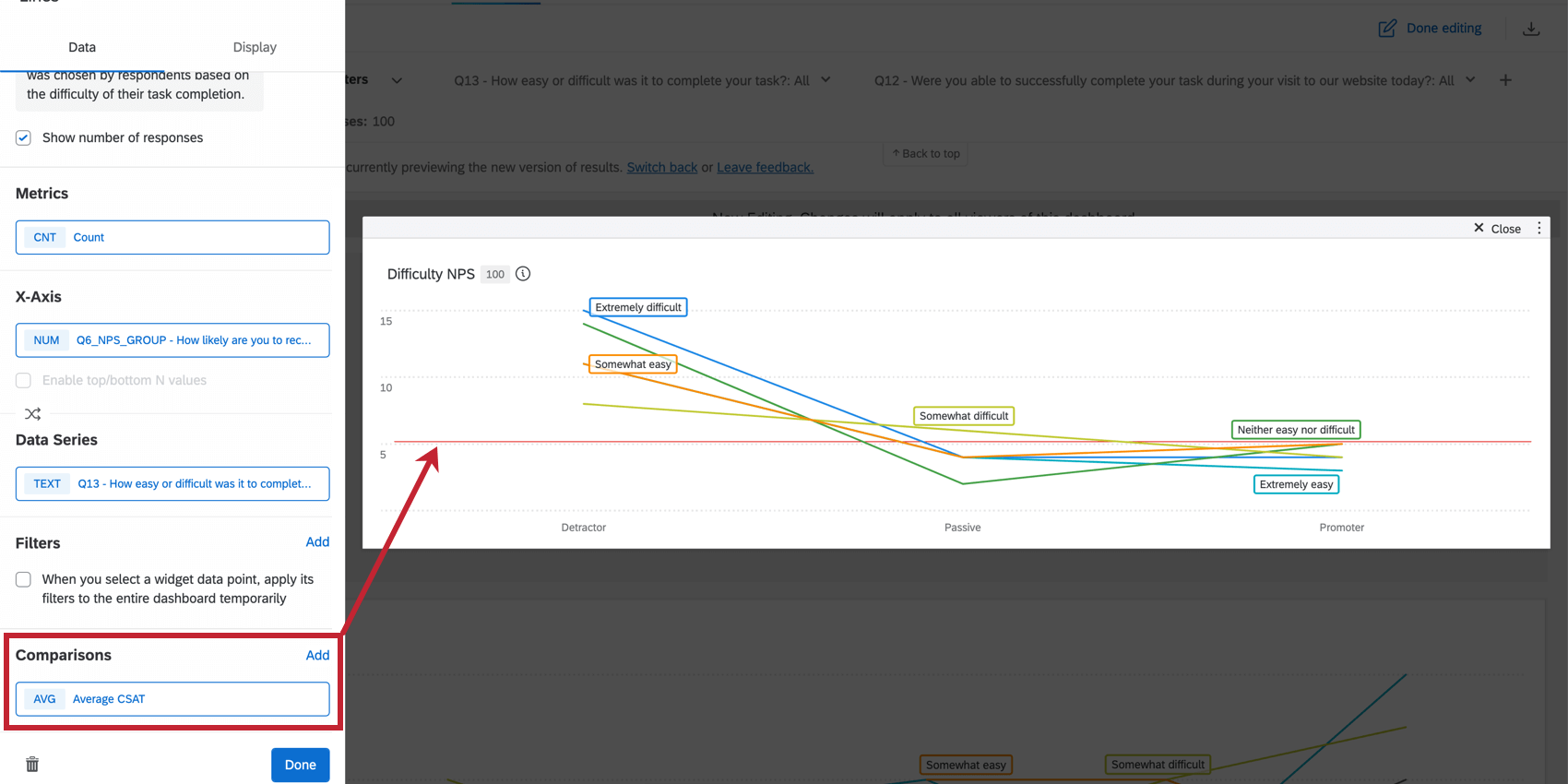
How do I add a comparison to my widget?
How do I add a comparison to my widget?
Why are my metrics adding up to 99 or 101 instead of 100?
Why are my metrics adding up to 99 or 101 instead of 100?
33.60 + 33.60 + 32.80 = 100
Whereas if you choose to display no decimals with the same dataset:
34 + 34 + 33 = 101
Widgets can’t show infinite decimals, which means that regardless of decimal settings, some data will eventually have to be rounded up. This means that small deviations, like adding up to 99 or 101 instead of 100, work as intended.
I have multiple datasets on my dashboard. Can I use this feature with all of my widgets?
I have multiple datasets on my dashboard. Can I use this feature with all of my widgets?
- Changing which dataset your widget shows: Not all widgets can have their referenced dataset switched. Some can only use the default dataset. For a compatible list, see this section.
- Showing multiple datasets in the same widget: Not all widgets can show multiple datasets’ results at the same time. For a compatible list, see this section.
That's great! Thank you for your feedback!
Thank you for your feedback!