
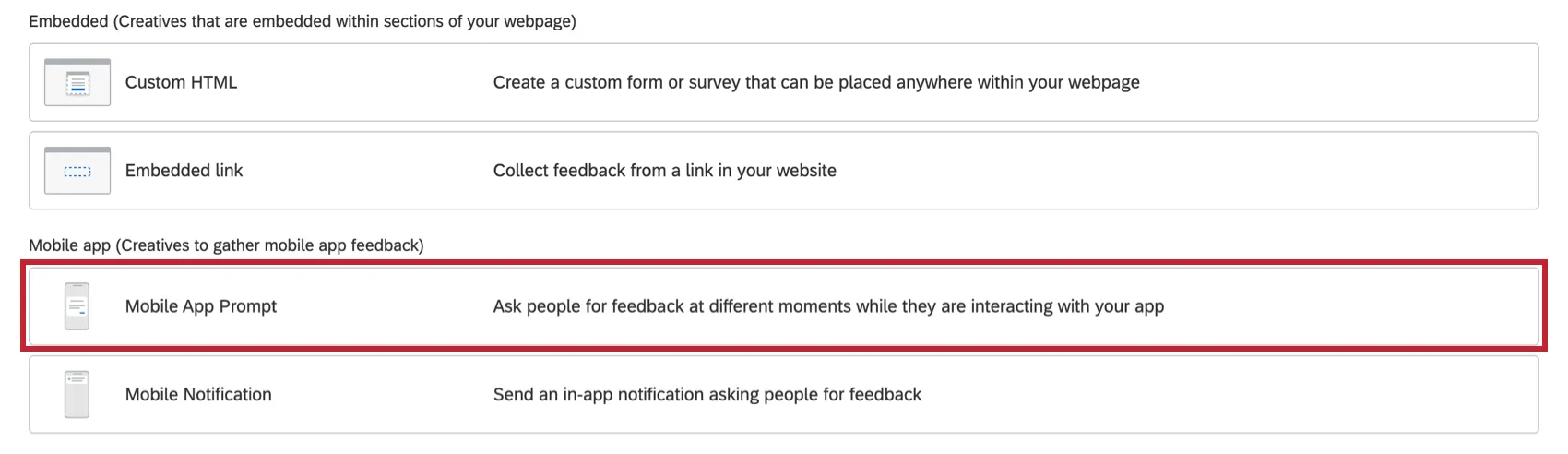
Mobile App Prompt Creative
What's on this page
Qtip: If you don’t have access to any of the features described on this page, reach out to your Account Executive. For more information about the differences between Digital Feedback and CustomerXM for Digital, see Digital Feedback vs. CustomerXM for Digital.
Attention: Mobile App Prompt Creatives require the use of the Mobile App SDK, which is set up with specific code created by Qualtrics. Qualtrics can only troubleshoot this code, not any custom code you add. Custom coding features are provided as-is and may require programming knowledge to implement. Our support team does not offer assistance or consultation on custom coding. You can always try asking our community of dedicated users instead. If you’d like to know more about our custom coding services, please contact your Qualtrics Account Executive.
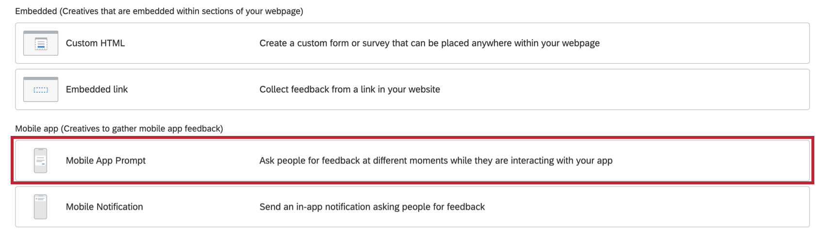
About the Mobile App Prompt Creative
Mobile App Prompt Creatives allow you to collect feedback on your mobile app instead of a website. Once you have purchased access to this feature, the Mobile App Prompt is available alongside other Creatives.
To learn about the process of setting up a Mobile App Feedback project, go to the linked support page.
Qtip: The Mobile App Prompt Creative is compatible with both Android and iOS.
Qtip: Read the Soliciting App Reviews support page for more information on using this creative to collect in-app reviews.
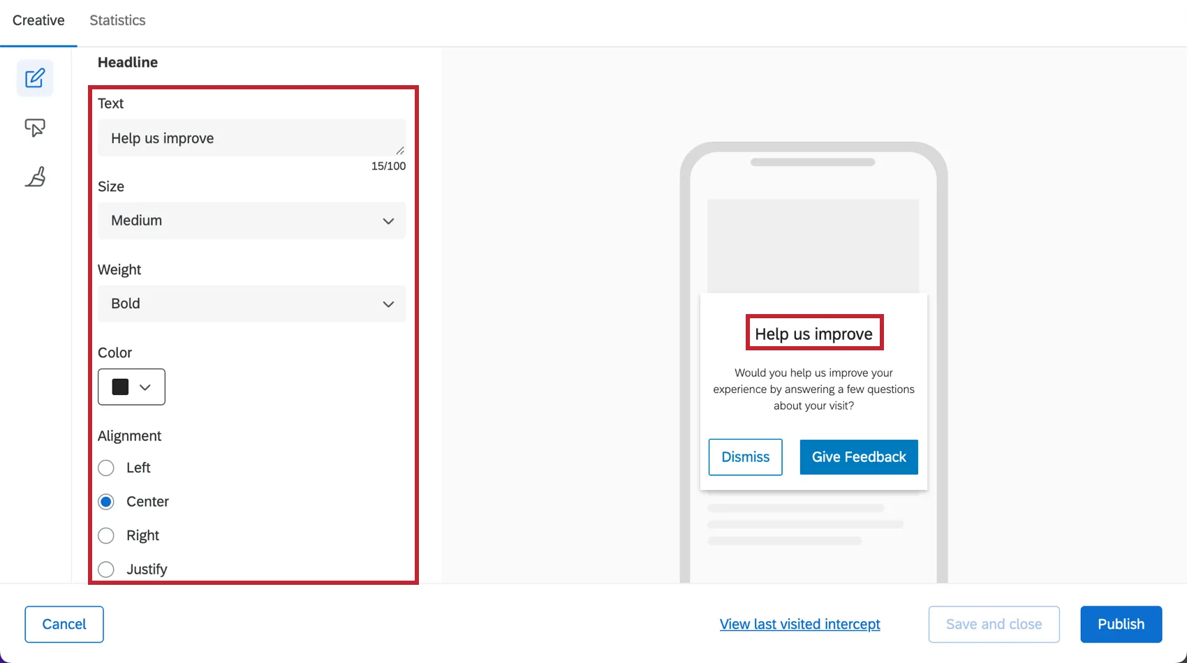
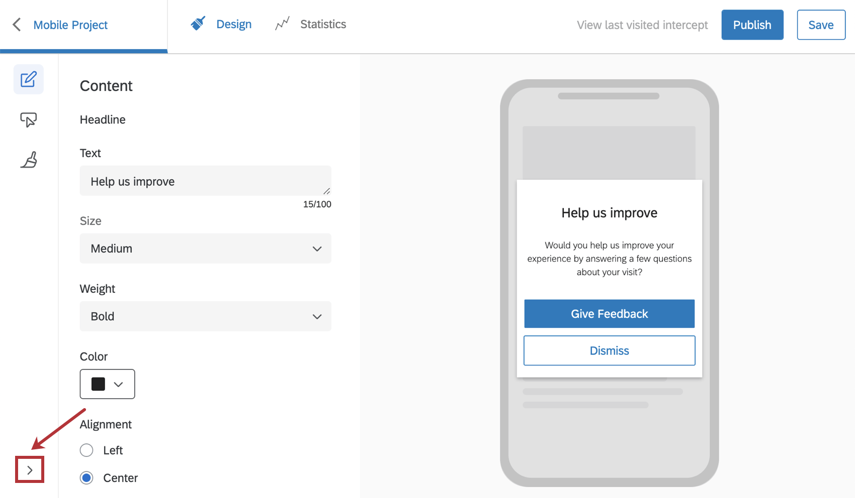
Content
In the Content section, you can specify the headline and description to display on your mobile creative.
Headline
In the Headline section, you can specify the title text for the mobile creative. You can also customize the color, font size, and alignment that you need for the title text.
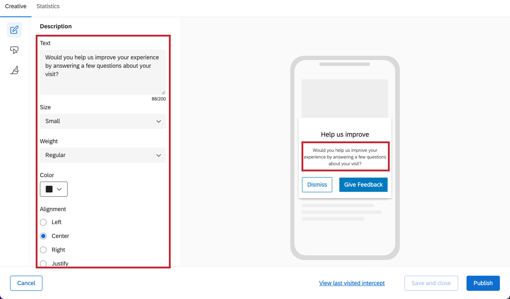
Description
In the Description section, you can specify what text to display on your mobile creative. You can also customize the color, font size, and alignment that you need for this text. Although the font sizes offered are the same, the Description will always appear smaller than the Title.
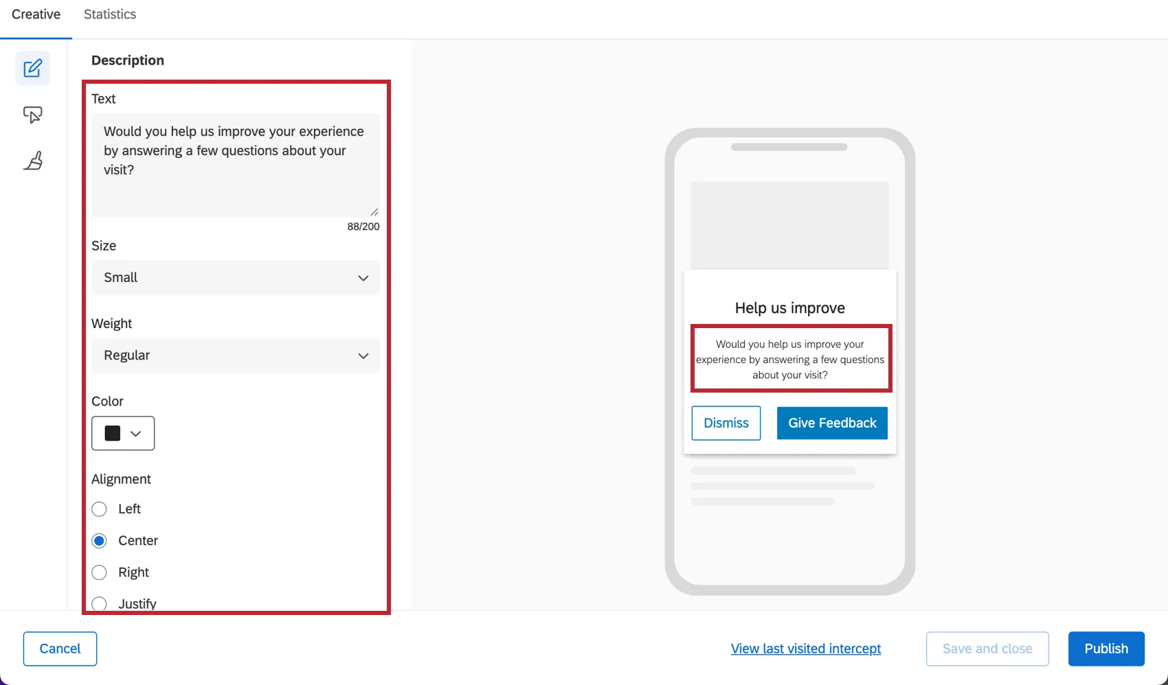
Qtip: If the Description text is too long, it will scroll on some devices.
Qtip: Click the arrow in the bottom left to display section labels. To display only the section icons, click Hide Labels.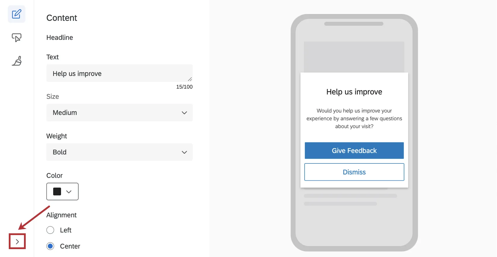
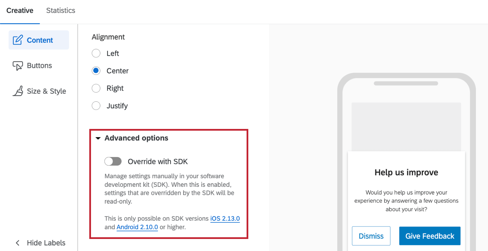
Advanced Options
Clicking Advanced Options allows you to enable the Override with SDK setting. When enabled, certain elements of your creative will be overridden with specific configuration details from the SDK. For more documentation on SDK, see our API documentation.
Qtip: When this option is enabled, some of the look and feel settings in other sections become read-only.

Attention: This option is only available on SDK versions 2.13.0 (iOS) and 2.10.0 (Android) or higher.
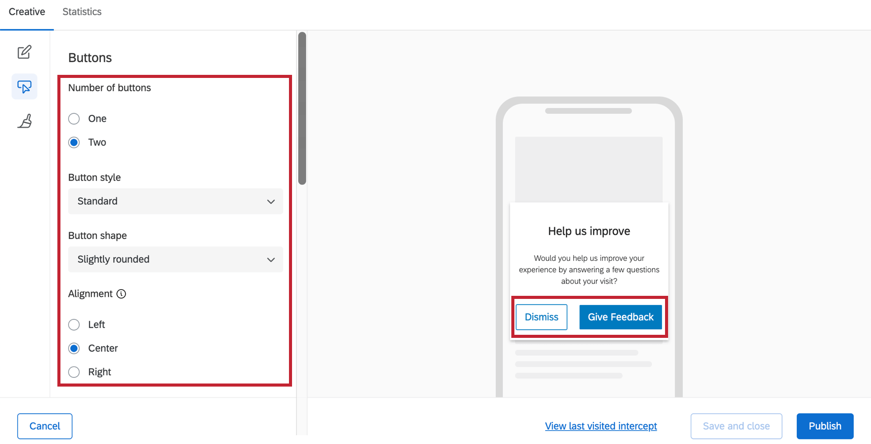
Buttons
In the Buttons section, you can decide on the number and styling of the buttons that will go on your mobile Creative.
- Number of Buttons: You can only have one or two.
- Button Style: Choose between Standard (shown below), Full-Width (flat buttons that stretch across the entire Creative), and Text.
- Button Shape: This option only appears for Standard buttons. Adjust whether the button’s corners are rounded or sharp.
- Alignment: Only appears with Standard and Text links. Determine how the buttons are aligned with the Creative, not each other.
- Link Color: This replaces many button customization options when Text is selected for Button Style. Determine the font color of the links. They must be the same.

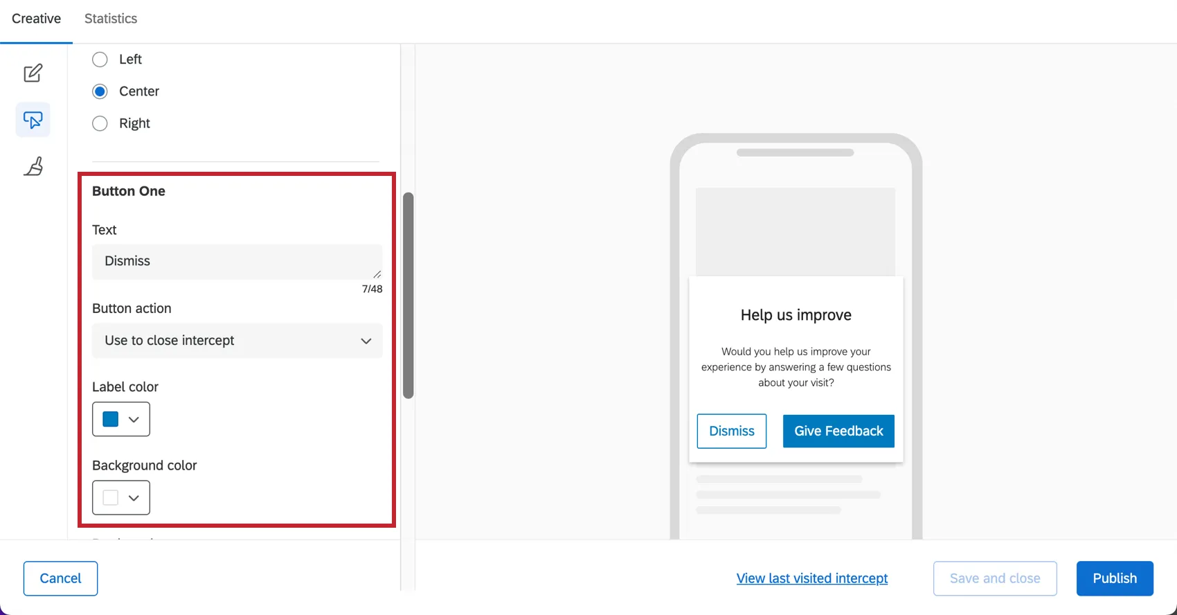
Edit the settings for the first button within the Button One section. When you want to move on to Button Two, scroll down to the Button Two section.
Once a button is selected, you have several text and color options to choose from for each button. You can also change the button behavior with Button Action. There are three options to choose from:
- Use to close intercept: The button closes the intercept.
- Use as intercept target: The button displays the intercept target behavior (e.g., bring up a survey).
- Use to solicit app reviews: The button directs visitors to the Apple Store or Google Play Store to give feedback on the app. See Soliciting App Reviews for more.
Qtip: SDK versions 1.6 and greater will also have the button action Use to solicit app reviews. See the attached support page for more details.
Qtip: If you only choose to show one button, then the button action can only be to close the intercept. This is typically done for cases where the mobile creative is being used to show a message.
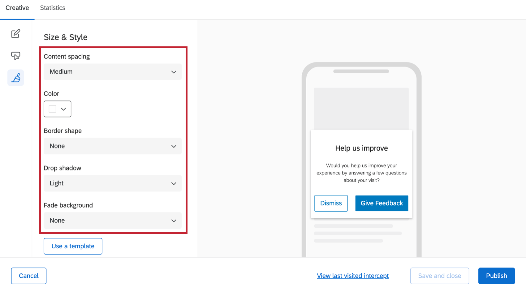
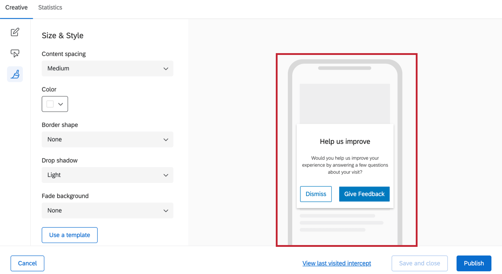
Size & Style
In the Size & Style section, you can control the spacing between the title, description and buttons. You can also control:
- Content Spacing: How far apart the content is.
- Intercept Color: Background color of the Creative
- Border Shape: Whether the corners are rounded or sharp.
- Drop Shadow: The shadow outlining the Creative.
- Fade Background: When the Mobile App Prompt is shown, you will see a background color for the screen behind it. This can be useful for drawing attention to your Creative and shutting out distractions. In this example, it’s a light gray.
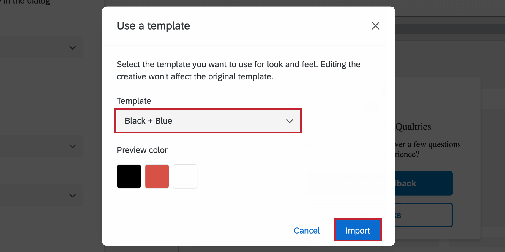
- Use a template: Use a survey theme as a template for the creative’s style settings. This will import the following settings of that survey theme:
- Primary Color
- Secondary Color
- Background Color
- Question Text Size
- Answer Text Size
- Question Spacing
- Foreground Contrast
Qtip: The settings in the creative are disconnected from the theme used as a template. The creative’s settings do not update if the template theme changes, and changing the creative’s settings will not change the template theme.
Preview
On the upper-right, there is always a preview of your design.

Mobile App Prompt Creatives are responsive to screen size and orientation. This means that your Creative will do its best to accommodate different conditions, and may look a little different from the preview, depending on the device, the screen size, and whether the screen has been turned to the side.
Save Creative and Publish Creative
Attention: Mobile App Prompts are the only Creative that don’t save your changes automatically. When you have made changes and want to leave the page, always click Save and close.
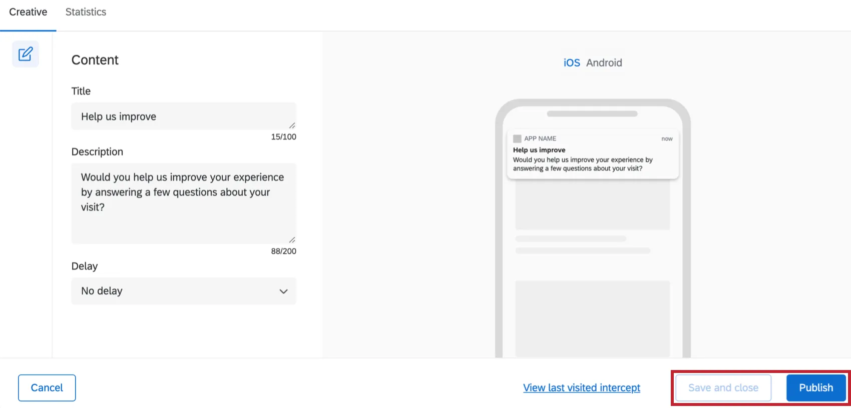
When you’re finished editing and would like your changes to appear on the app, click Publish in the bottom-right.
Setting Up Intercepts & Integrating with a Mobile App
For information on how to set up the rest of the Mobile App SDK, see Mobile App Feedback Projects.
That's great! Thank you for your feedback!
Thank you for your feedback!