
Common Studio Dashboard Builds
What's on this page
About Common Studio Dashboard Builds
This page contains best practices around dashboard-building. The types of dashboards we describe here help measure the success of business and strategic objectives by tracking ownership and accountability.
These dashboards are designed with the following objectives in mind:
- Visualize the voice of the customer.
- Deliver accurate, real-time views as to the “why” behind all channels of customer feedback.
- Identify specific, actionable insights.
Qtip: You do not have to follow the exact formats described here. These are just examples for you to develop as needed.
Operational Dashboard
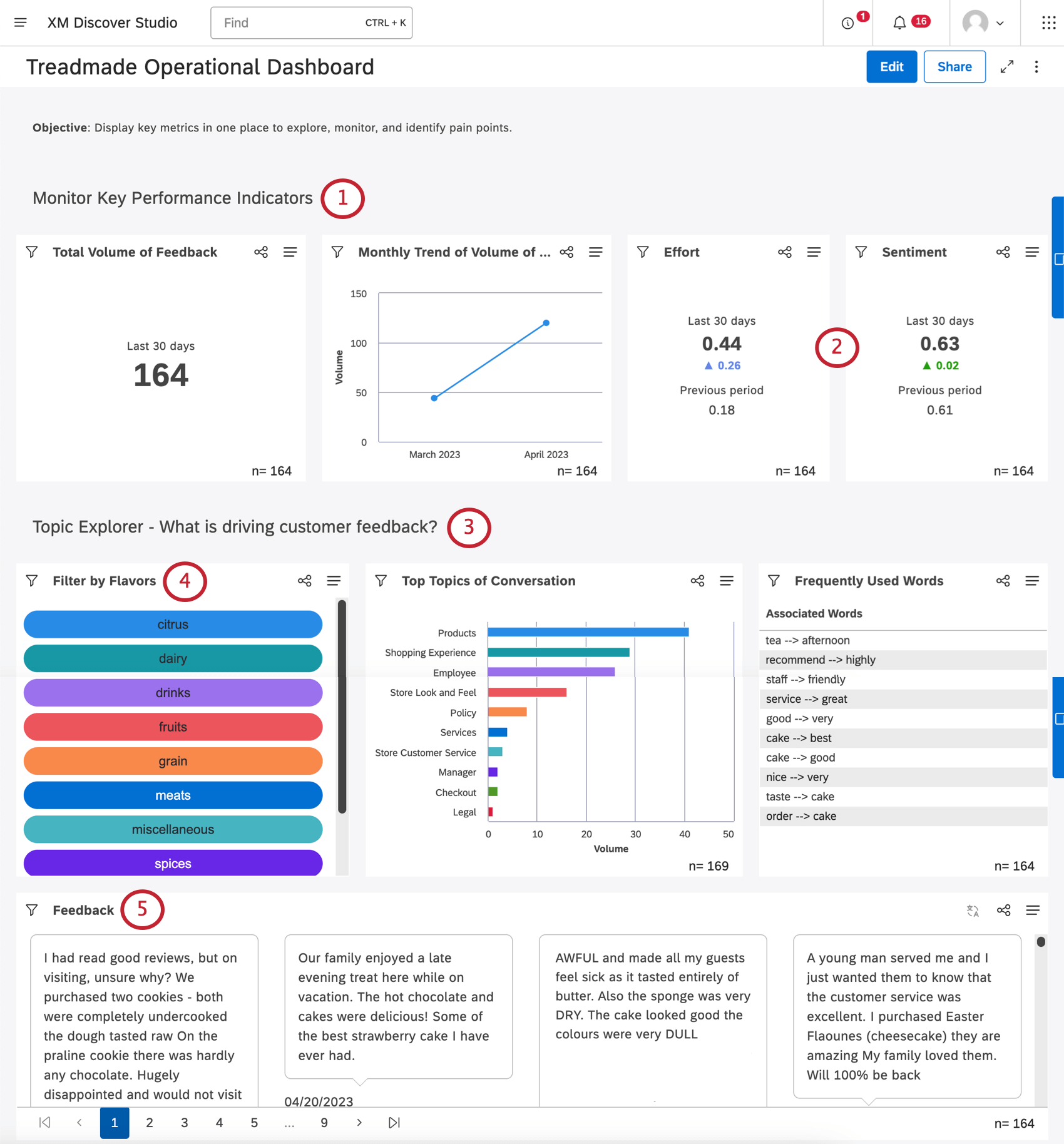
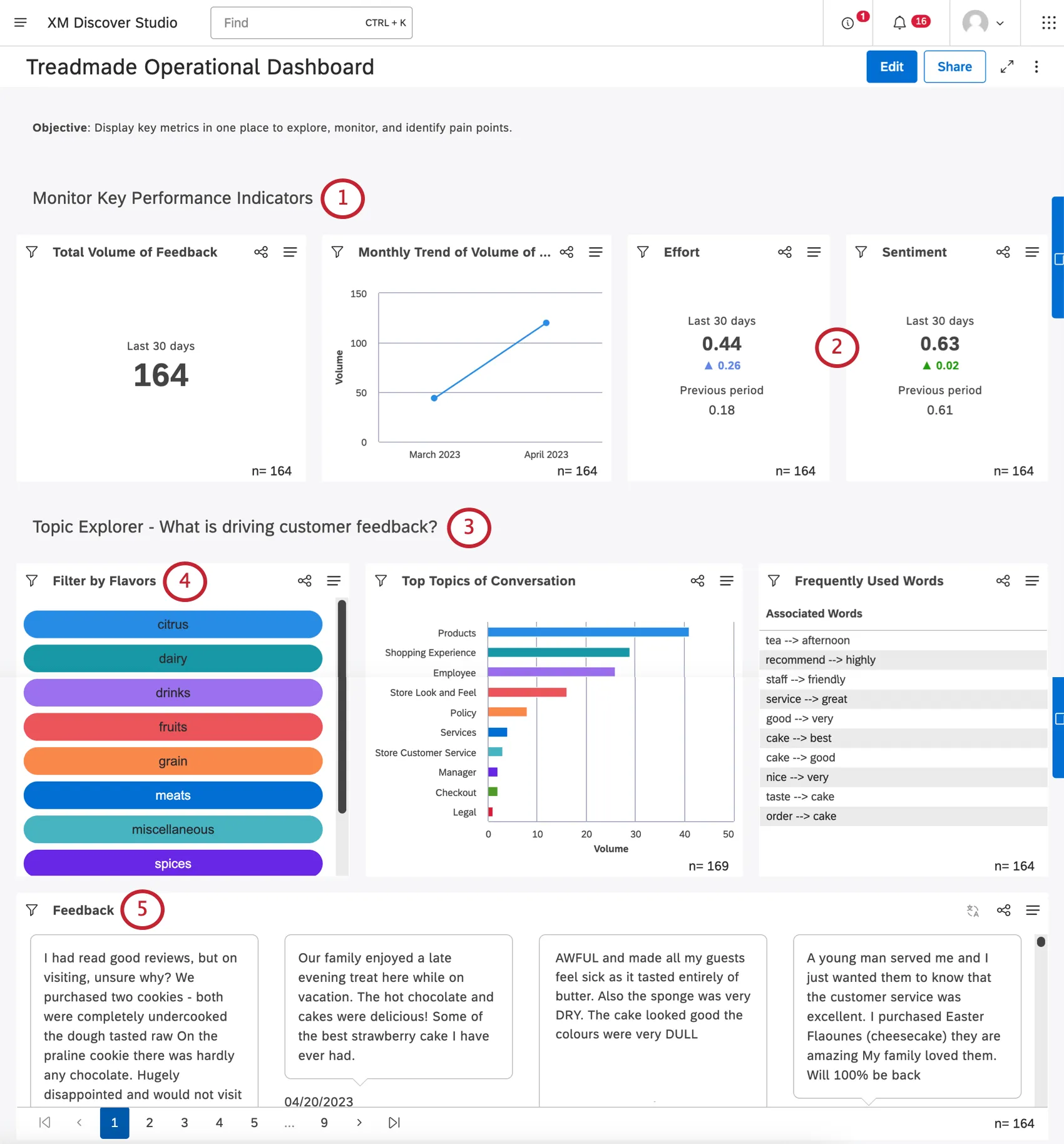
Operational dashboards are used as monitoring tools. They provide a comprehensive snapshot of the performance of your business in a given time period. Operational dashboards act as an exploration tool, allowing you to find and analyze pain points, otherwise known as the “pulse” of your customer feedback.
Here are some key features of operational dashboards:
- Always updating based on a chosen rolling date range, with data flowing in regularly.
- Provide interactivity, letting viewers click and explore any data point that catches their eye.
- Show important metrics, topics, and feedback in one place, so you can monitor for spikes, drops, and issues as they arise.
- Highlight abnormalities, allowing you to discover what is worth analyzing further in an analytical dashboard.
Elements of an Operational Dashboard
Qtip: Choose a rolling date filter (e.g., last 30 days) to watch the data change as new information comes in, or as time passes.
Qtip: See Using Widgets as Filters.
Qtip: To keep data live, it’s better to share a dashboard directly, rather than a PDF export.
Analytical Dashboard
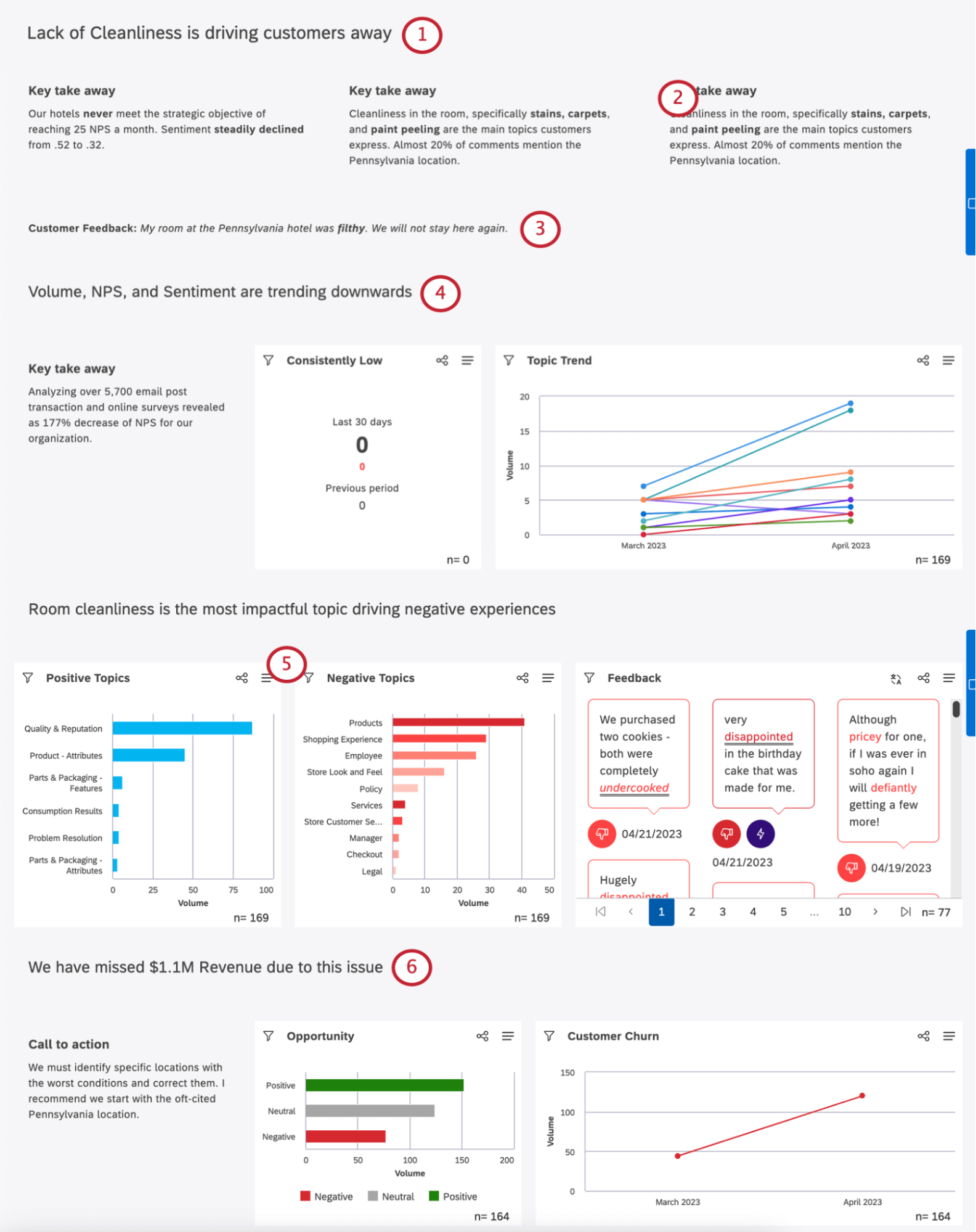
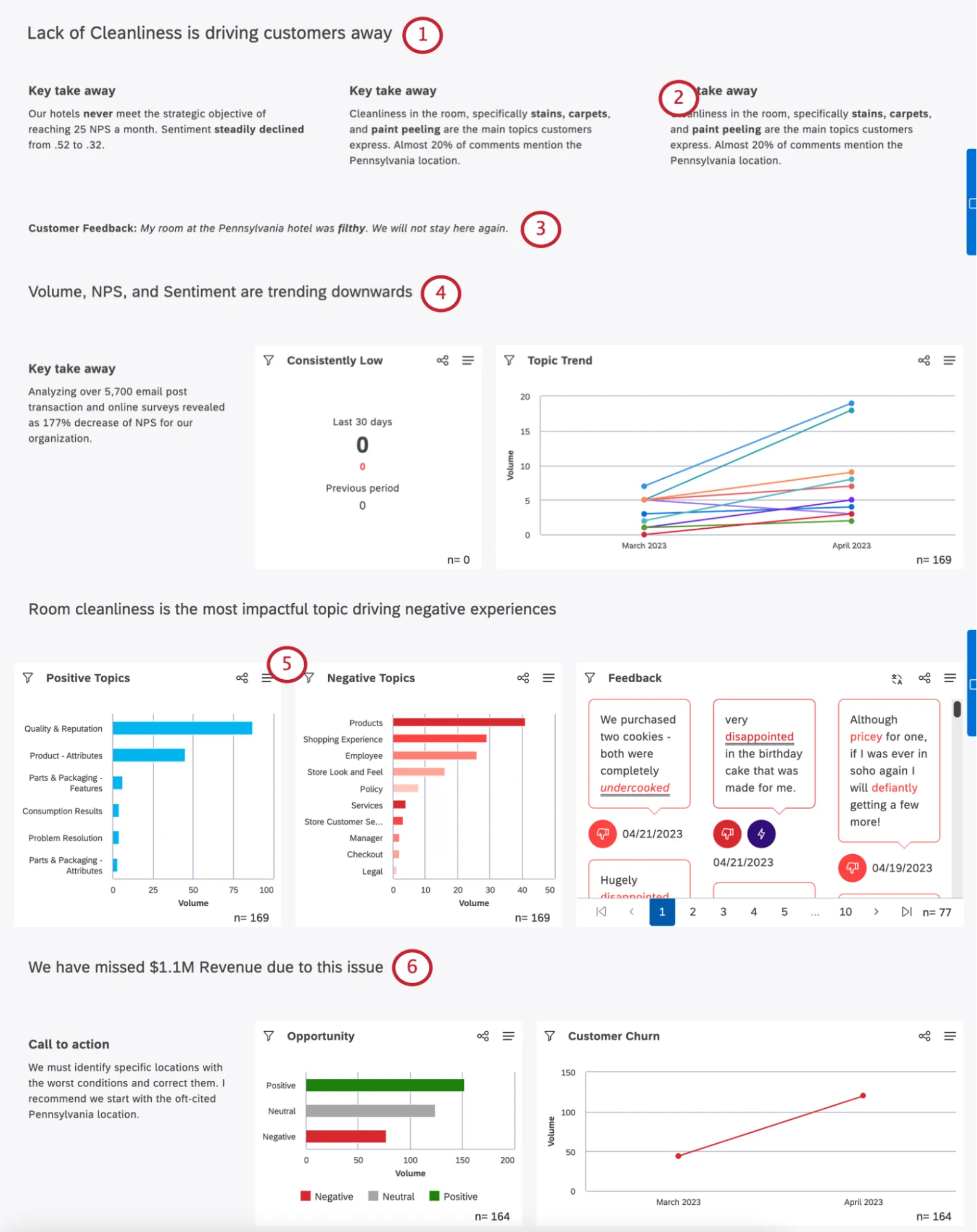
Analytical dashboards act as a static set of key takeaways. They’re a tool used to hone in on a specific business question in order to identify trends, changes to KPIs, and quantify impact. Results presented in analytical dashboards often stem from insights gathered from an operational dashboard.
Here are some key features of operational dashboards:
- Data that does not update. These dashboards focus on a defined timeframe and a dataset where the issue was identified.
- Static results. These dashboards do not allow for interactivity or data exploration.
- Prove a specific point, or tell a story using support data.
Elements of an Analytical Dashboard
Qtip: Choose a static date range filter (e.g., specific start date to specific end date). Data shown in an analytical dashboard should never change.
Qtip: Try locking filters to keep data static.
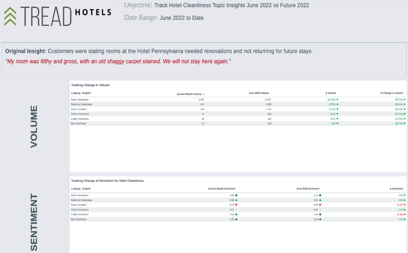
Strategic Dashboard
Strategic dashboards are retrospective. They look at benchmark performance data and compare them to the current period, or track performance over time in order to close the loop regarding a specific business question.
Here are some key features of strategic dashboards:

- Trigger decision-making and changes that produce the desired impact on the customer experience.
- Monitor KPIs before and after changes are implemented based on actionable insights, to determine the success of these actions.
- Quantify the impact of changes to KPIs from high-level to granular viewpoints. Keep the time period of impact consistent across the before and after, for equal comparisons.
- Monitor KPIs from the time the insight was found to present day, to gauge the impact of not acting upon insights.
That's great! Thank you for your feedback!
Thank you for your feedback!