
100 Percent Stacking (Studio)
What's on this page
About 100% Stacking
100% stacking is based on percentage, making it easier to see the relative difference between stacks within each data grouping.
Qtip: Sometimes 100% stacking percentages won’t add up to 100%. For more information on understanding your number stacking, see How Stacking Works.
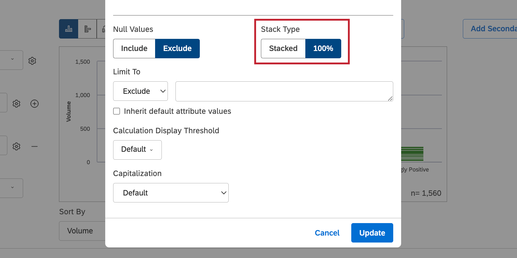
Enabling 100% Stacking
100% stacking can be enabled in different places, depending on the widget you’re using:
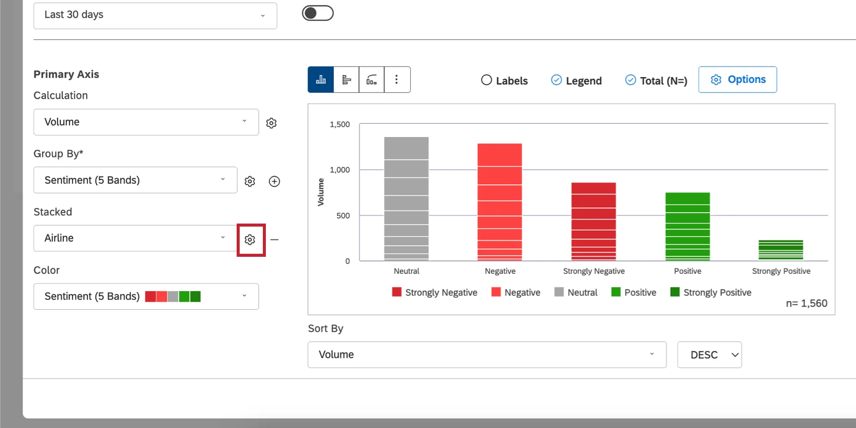
- Bar widget: Click the gear next to the Stacked field.
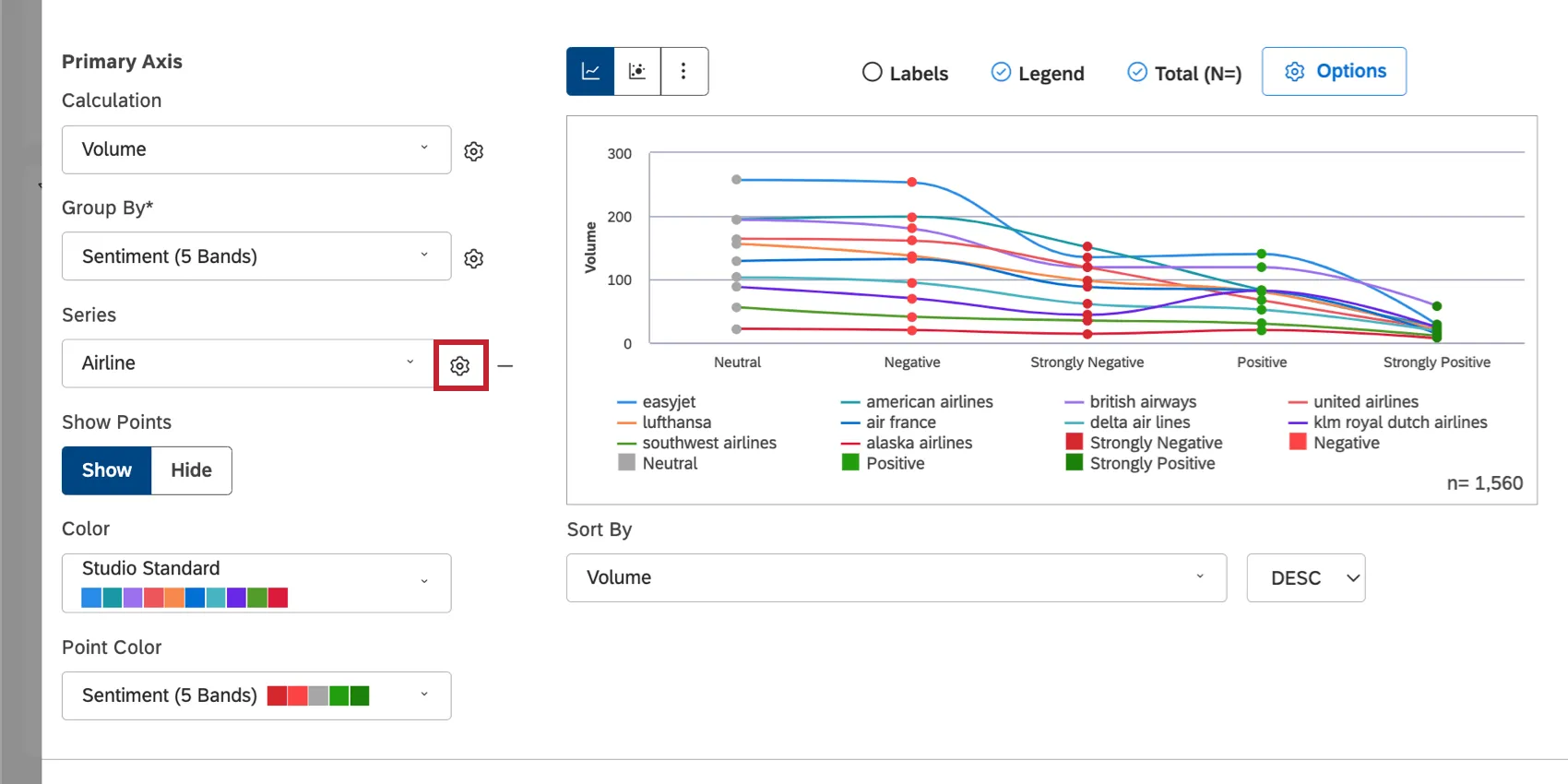
- Line widget: Click the gear next to the Series field.
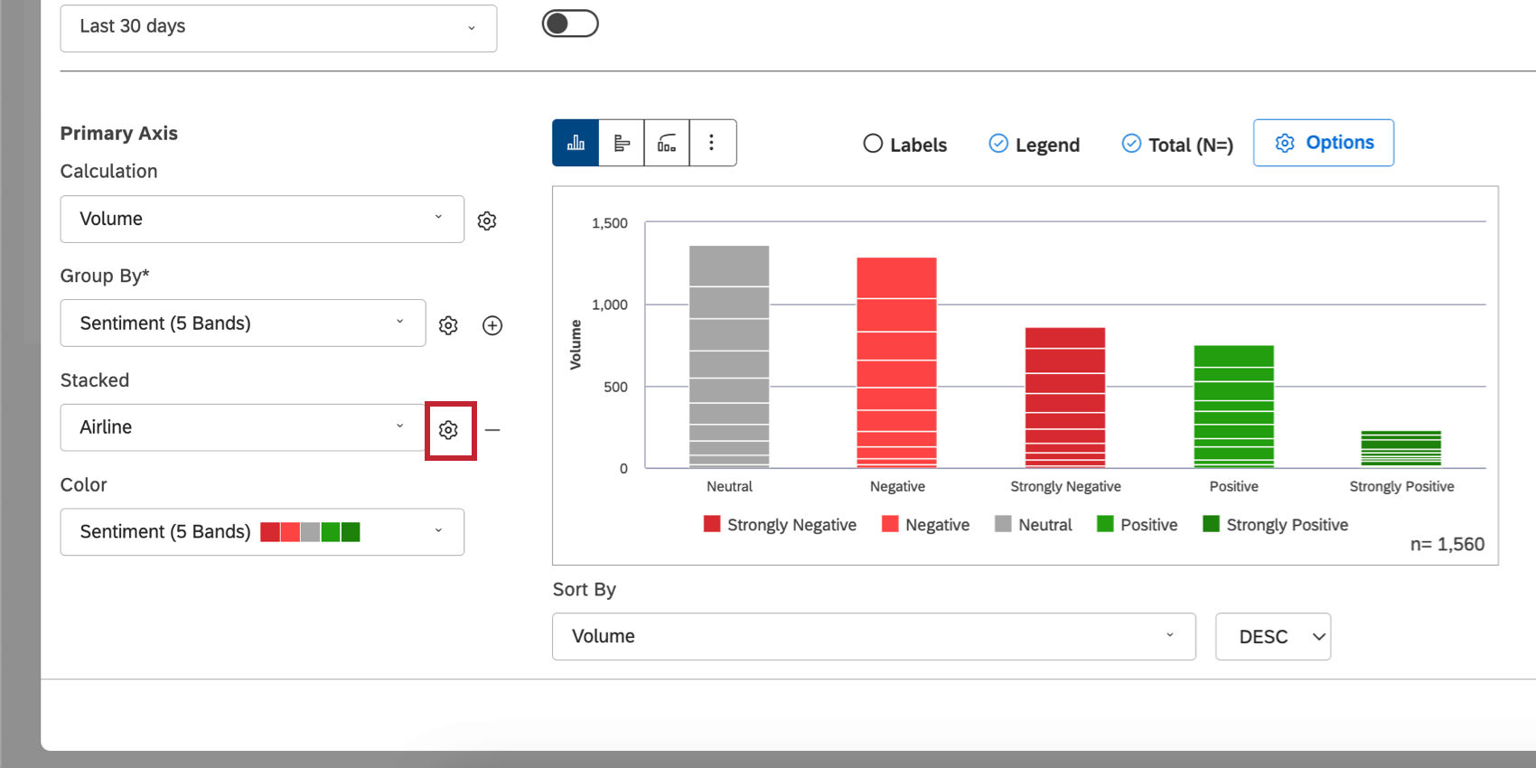

Under Stack Type, select 100%.

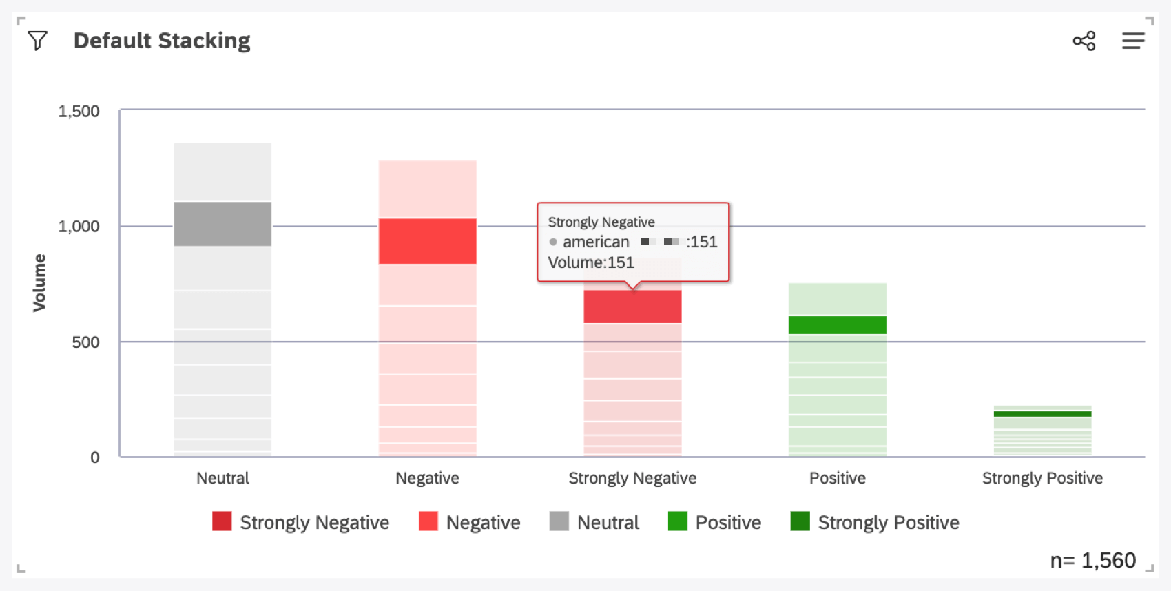
Default Stacking vs. 100% Stacking in Bar Widgets
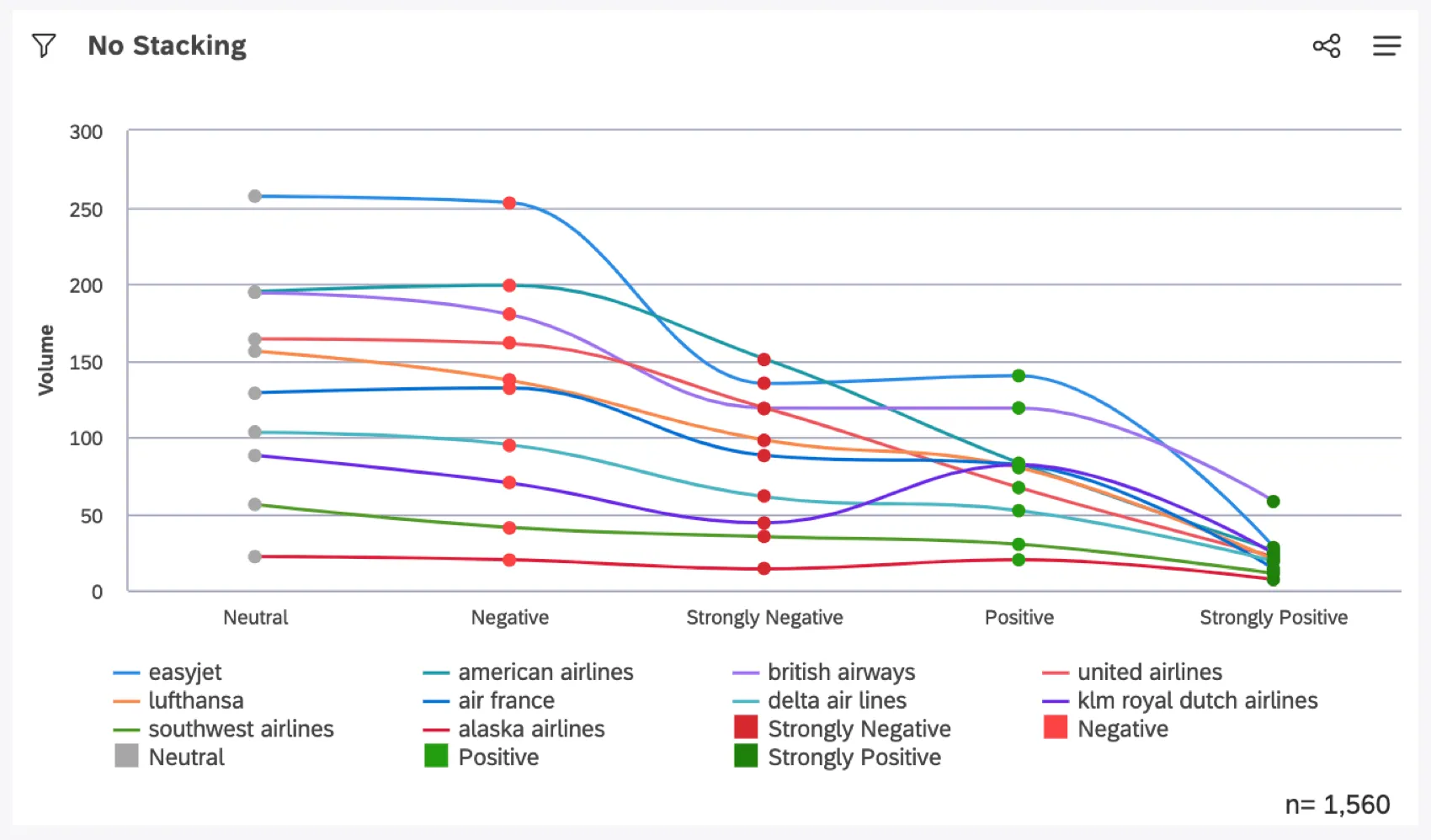
When your stack type is set to Stacked (the default), stacking is based on the Calculation set in your widget. Default stacking is better if you want to compare individual data groupings, such as cities.
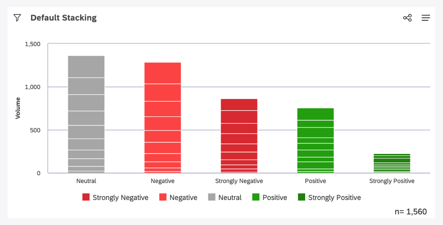
Example: Note how the y-axis is based on volume, and the stacked bars of this widget increase in size based on the volume of ear groups’ sentiment.

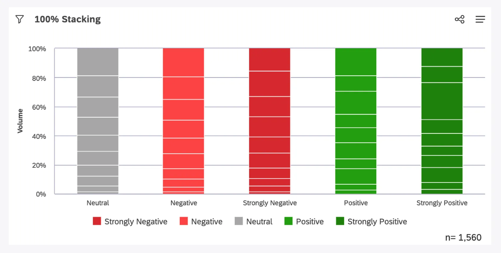
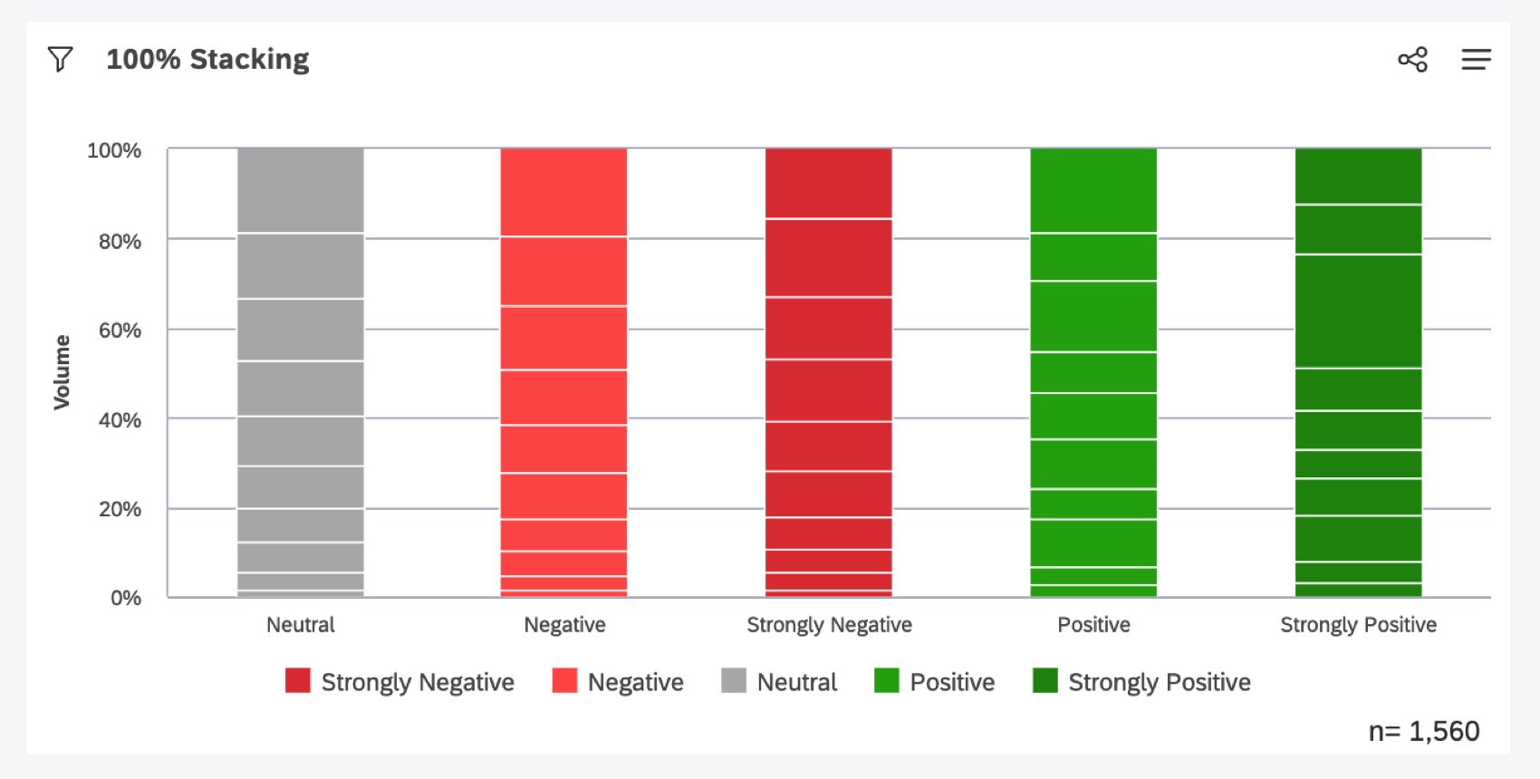
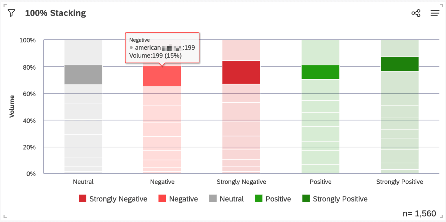
When your stack type is set to 100%, stacking is based on percentage. This option is preferable if you want to see the relative difference between stacks within each data group.
Example: Of the total volume collected for each sentiment, we see the percentage each group takes up.
Creating a Stacked Area Graph
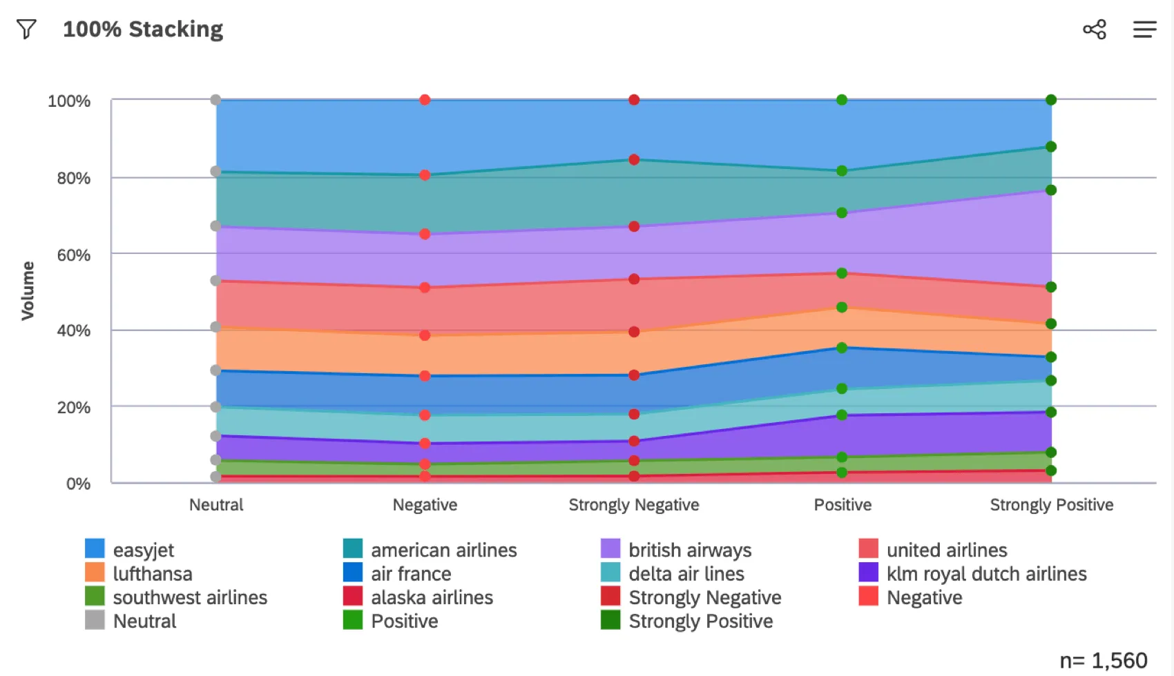
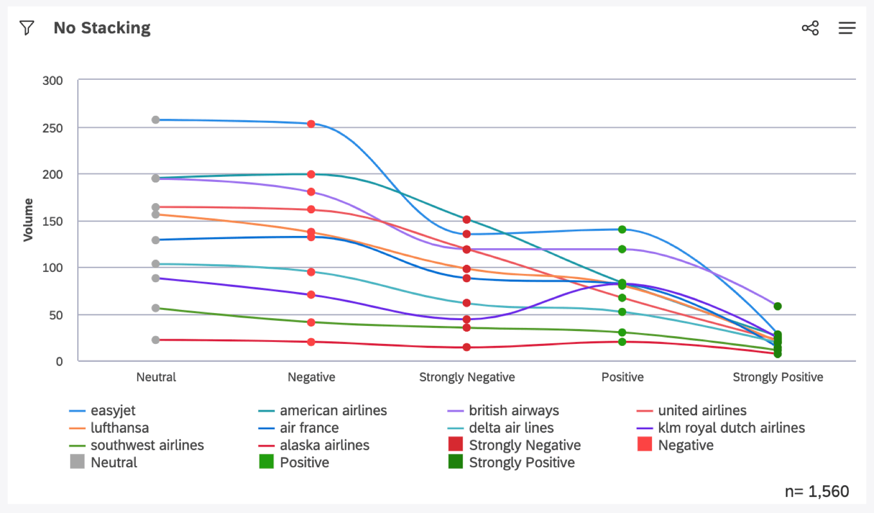
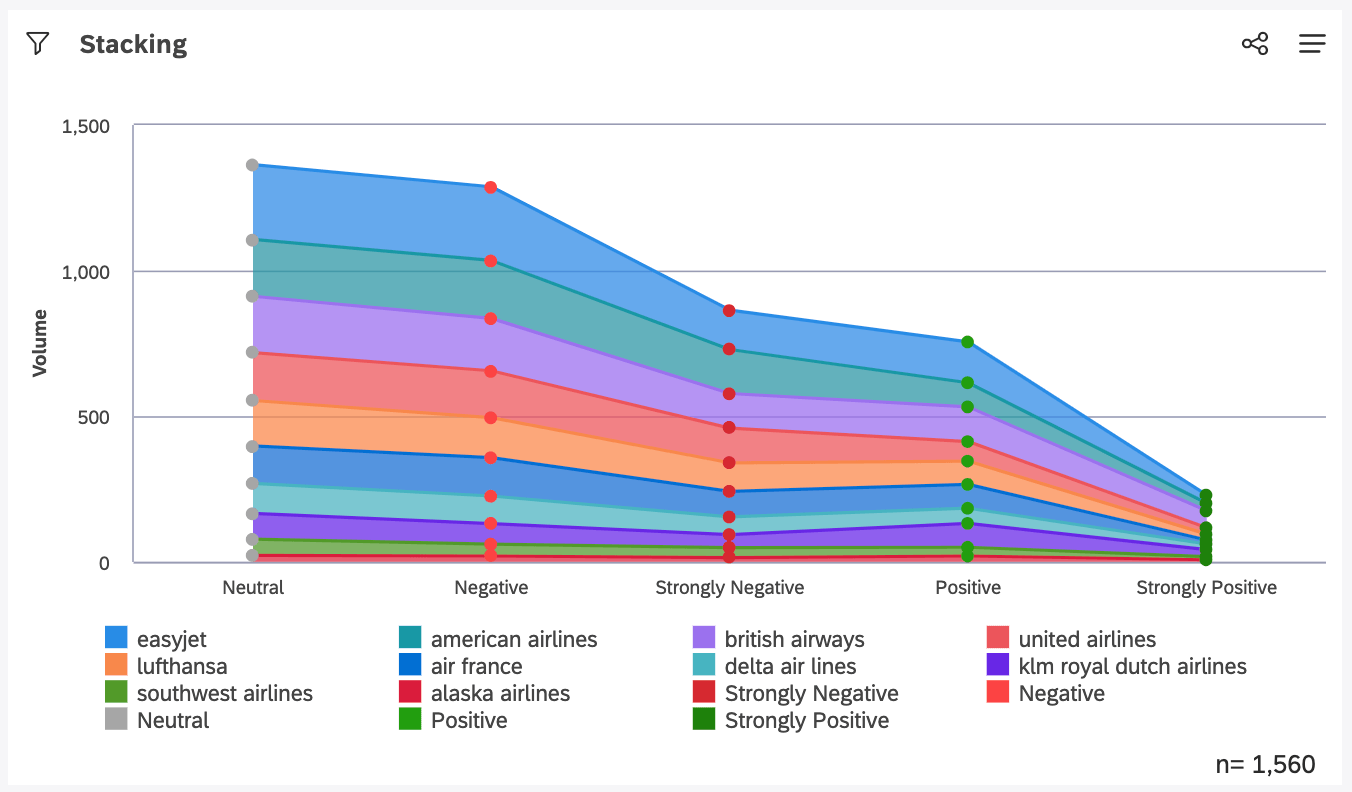
When you apply stacking to a line widget, you create a stacked area graph.
By default, when your stack type is set to None, you’ll see a line widget.
When your stack type is set to Stacked, the area beneath each line will be highlighted to further emphasize the difference between lines.

When your stack type is set to 100%, the highlighted area is based on percentage.
Example: Of the total volume collected for each sentiment, we see the percentage each group takes up.

Reading Tooltips in 100% Stacking Charts
When you hover over a data point or segment, a tooltip will show you all the related calculations. This includes the selected calculations for the primary and secondary (if any) axis, as well as the volume of documents.

Note that when 100% stacking is used, XM Discover calculates an additional figure that appears in the tooltip as a percentage, alongside with the widget calculations and the volume. This percentage provides a numeric representation of the size of the stacked group relative to the full bar. It is the sum of volumes for each stacked group divided by the total volume in the bar.
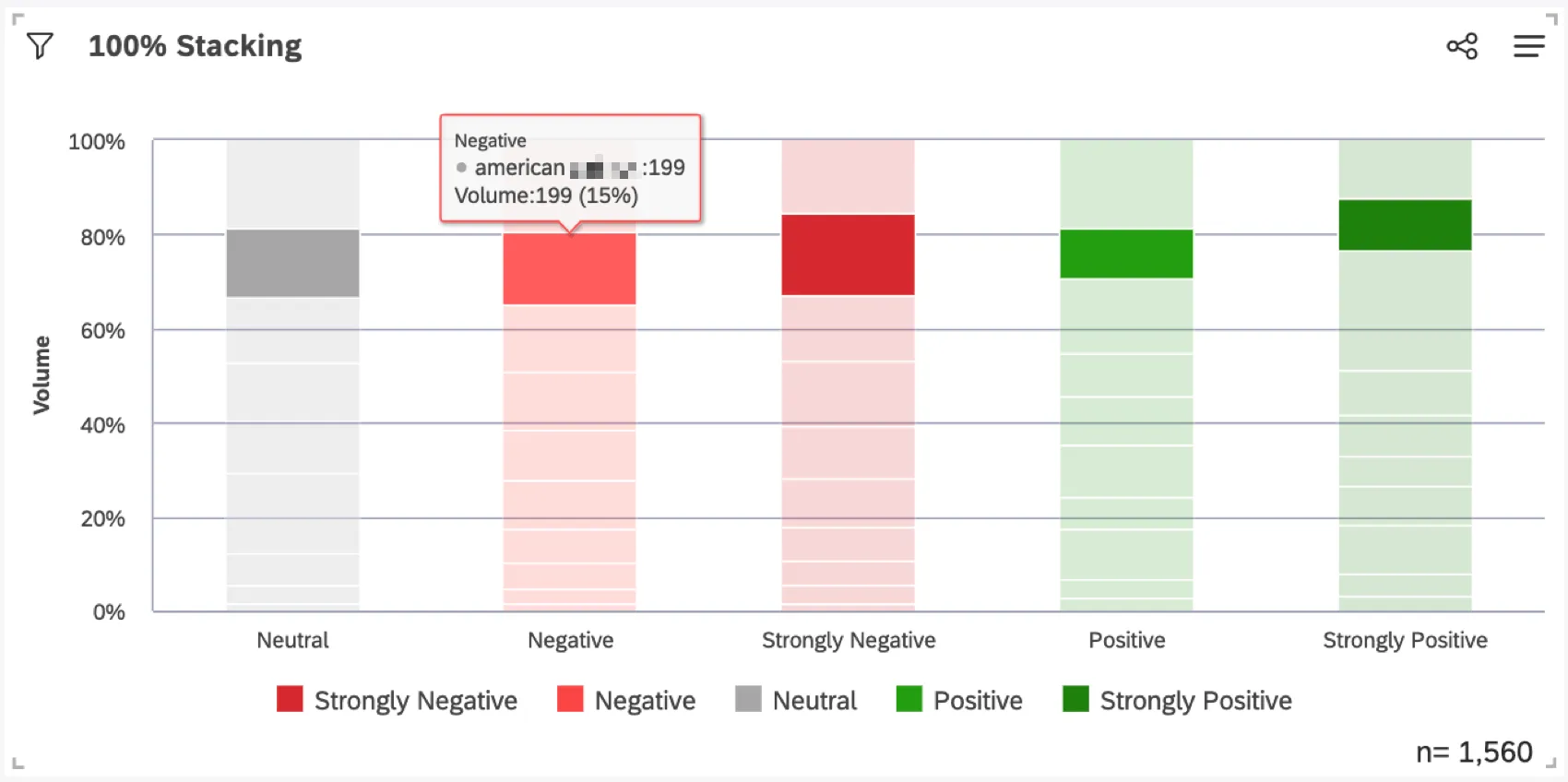
Qtip: This percentage is not related to percent total or percent parent calculations.
That's great! Thank you for your feedback!
Thank you for your feedback!