
Accessible Dashboard Design Tips (Studio)
What's on this page
About Tips for Accessible Dashboard Design in Studio
Qualtrics is committed to helping you create and maintain accessible content for your dashboard viewers. Here are some quick tips for building more accessible dashboards in Studio!
Design for Smaller Screens
Studio dashboards scale responsively for a variety of screen sizes, but some layouts adapt to smaller views more easily than others. Designing your dashboards with a one or two column layout will help to ensure that content isn’t drastically wrapped or truncated.
Use Text Alternatives for Images and Data Visualizations
Text alternatives for images provide visually impaired or non-sighted users with a description of any visual content on your dashboards. When editing your dashboard, you can add alt image text and descriptions to both your image widgets and data visualizations. For information on editing widget descriptions, please see the Editing a Visualization Widget Description section below.
Good alt image titles are specific and concise. Describe the image, logo or symbols as succinctly as possible while providing robust explanation of the image for users who are unable to see them. A good alt image title is typically less than 125 characters. For information about adding alt text to describe an image to make your dashboard more accessible to users who rely on a screen reader, please the Image Widget page.
Include Long Descriptions for Complex Images or Data Visualizations
Charts, graphs, and diagrams contain substantial information that cannot be conveyed in a short alt image title. In addition to a descriptive title, XM Discover automatically generates dynamic long descriptions for all widgets, except content widget types. These descriptions summarize the essential data points and point out relevant information that the visualization is intended to communicate. For information editing these descriptions, please see the Editing a Description to a Visualization Widget section below.
Don’t Use Images as Text
When text is flattened into an image, it cannot be “crawled” or read by screen readers and other assistive technologies. Instead of images, use our text block widget and heading styles (H1, H2, H3 and so on) to embed a semantic structure to the content within your dashboards. If you wish to display the organization of a category model or rubric on your dashboard, use the object viewer widget instead of inserting screenshots.
Use Color, Size, and Position to Convey Information
Be thoughtful in your use of color, size, and position of elements to convey information. Dashboard viewers should be able to understand content without relying solely on sensory characteristics.
Example:
- Reference widgets by name instead of their position on the dashboard (for example,”the widget to the right” is not meaningful to a user with a visual impairment).
- Differentiate data points with labels rather than with color alone.
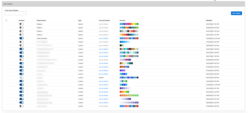
Custom Color Palettes
You can create and manage the color palettes used across Studio dashboards.
Pattern Fills and Dark Mode
Users with various levels of visual ability can apply pattern fills or choose a preview color theme for dashboards and books.
Qtip: These settings are user-specific. Other users viewing the same dashboard or book will not see the applied pattern fills or preview color theme.
Conditional Metric Colors
You can update your metric colors easily from the Studio Metrics page. When making changes, remember that this will affect the view for all users in your organization. For XM Discover metrics like sentiment and effort, icons are incorporated to complement the representative colors, decreasing the reliance on color as the only source of information.
Don’t Overcrowd Dashboards
Keep your dashboards as simple as possible to ensure that the content and interactivity is understandable and navigable for all users.
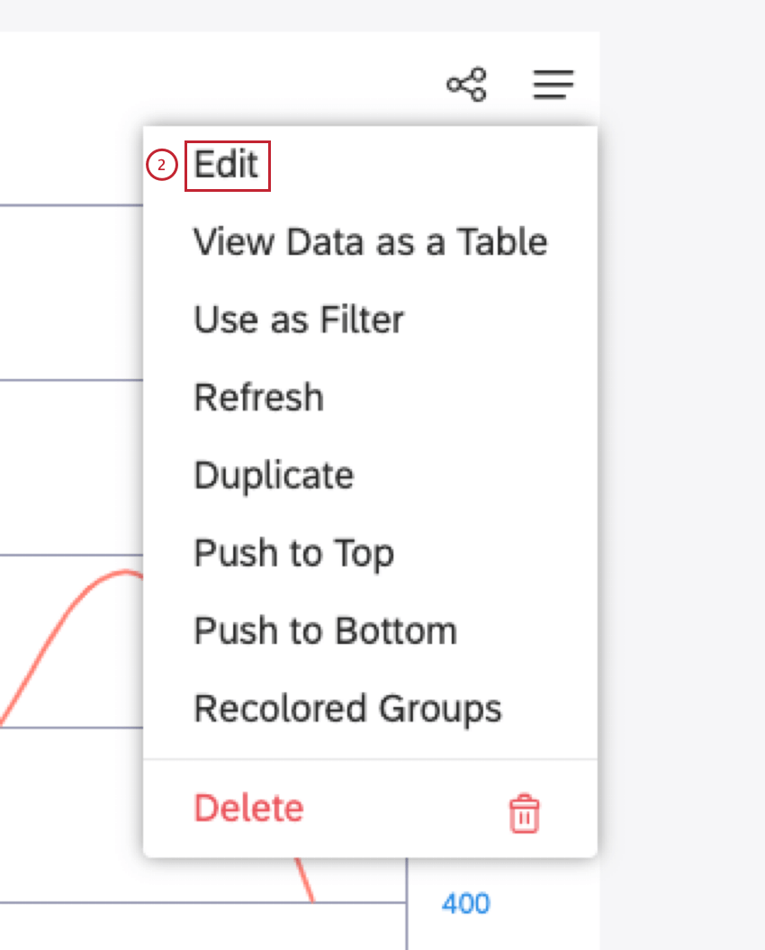
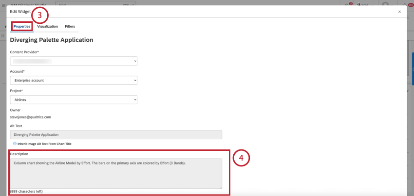
Editing a Visualization Widget Description
Qtip: The option to edit a description is not available for content widget types.
XM Discover automatically generates dynamic long descriptions for visualization widgets. These editable descriptions summarize the essential data points and point out relevant information that the visualization is intended to communicate.
Qtip: For information about adding alt text to describe an image to make your dashboard more accessible to users who rely on a screen reader, please see the Image Widget page.

Qtip: For information about descriptions, please see the Include Long Descriptions for Complex Images or Data Visualizations section above.
Qtip: For tips on writing accessible descriptions for interactive charts, see Highchart’s guide on How to Write Accessible Descriptions for Interactive Charts.
That's great! Thank you for your feedback!
Thank you for your feedback!